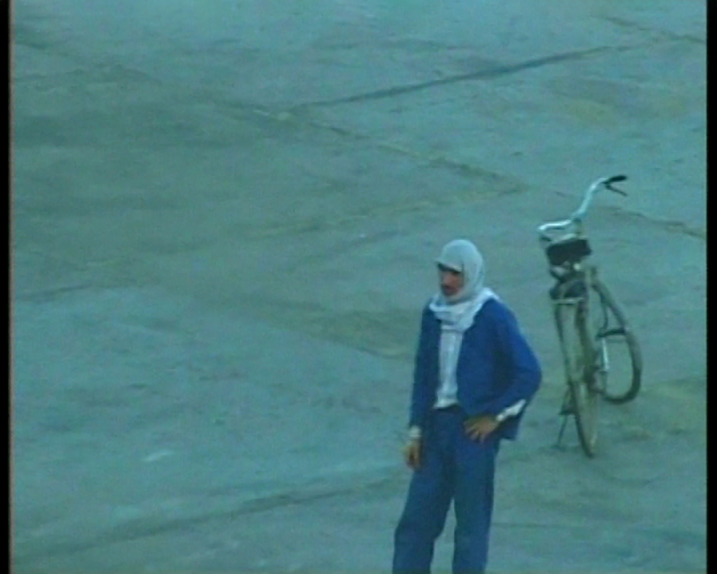
Film extracts from ‘Border’ (2004), a film by Laura Waddington.
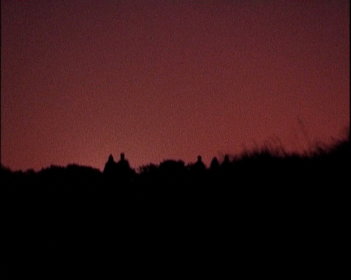
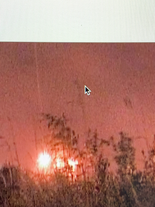
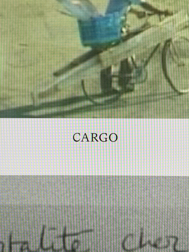
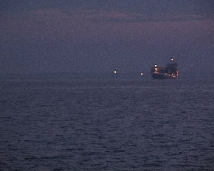
Film extracts from ‘Cargo’ (2001), a film by Laura Waddington.
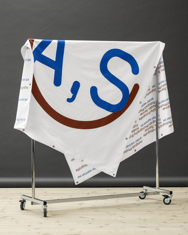
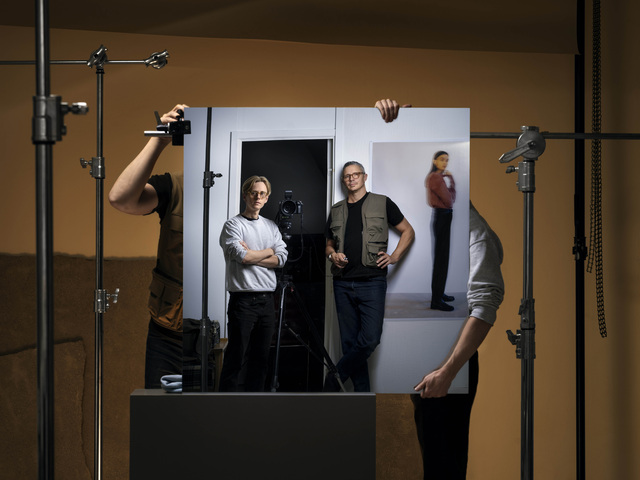
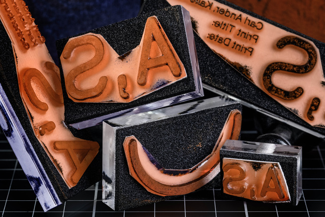
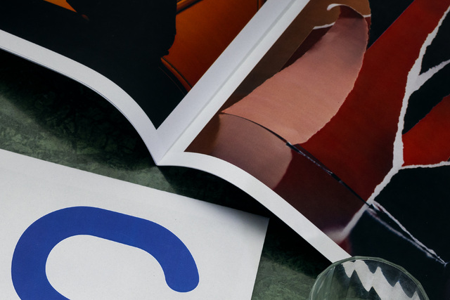
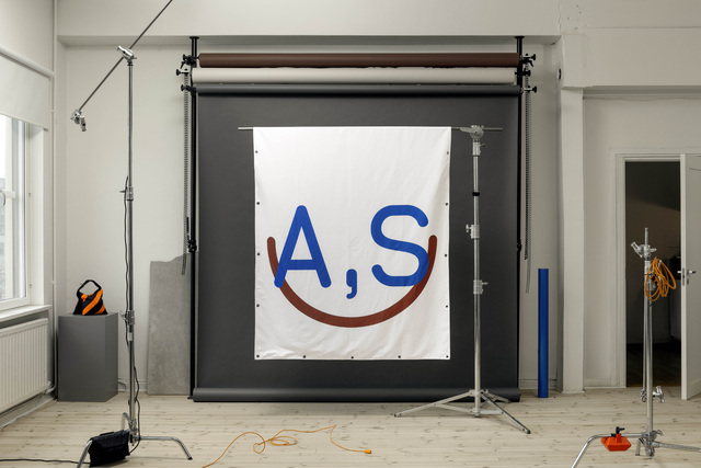
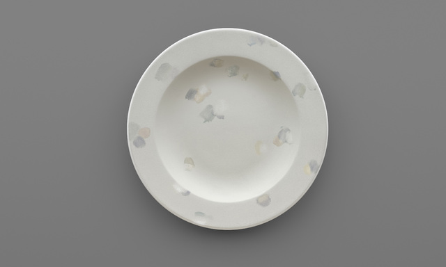
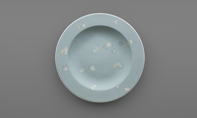
Details from the design process of Laura Waddington's website.
Details from the design process of Laura Waddington's website.
Film extracts from ‘Cargo’ (2001), a film by Laura Waddington.
Film extract from ‘Cargo’ (2001), a film by Laura Waddington.
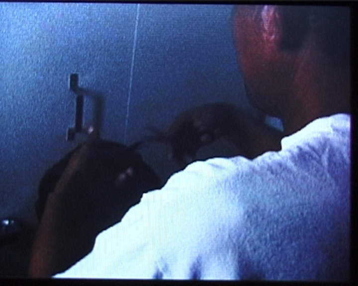
Unseen footage from the making of ‘Cargo’ (2001), a film by Laura Waddington.
Unseen footage from the making of ‘Cargo’ (2001), a film by Laura Waddington.