Blackbook Publications is an artist book collective, established in Gothenburg in 2009. The collective is a group of artists, including Simon Berg, Emanuel Cederqvist, Kalle Sanner, Agnes Thor and Lotta Törnroth. To date, Blackbook have published books and other printed material by artists from the scene of contemporary photography in Scandinavia. In addition to publications from the members of the collective, Blackbook have published books by artists such as Annika von Hausswolff and Linda Hofvander, Johan Markusson and Signe Vad.
In 2017, Blackbook Publications turned to Lundgren+Lindqvist for a complete redesign of their webshop. In addition to restructuring, designing and building the new webshop, the projects also included reshooting all the books published by the collective and redesigning the visual identity.
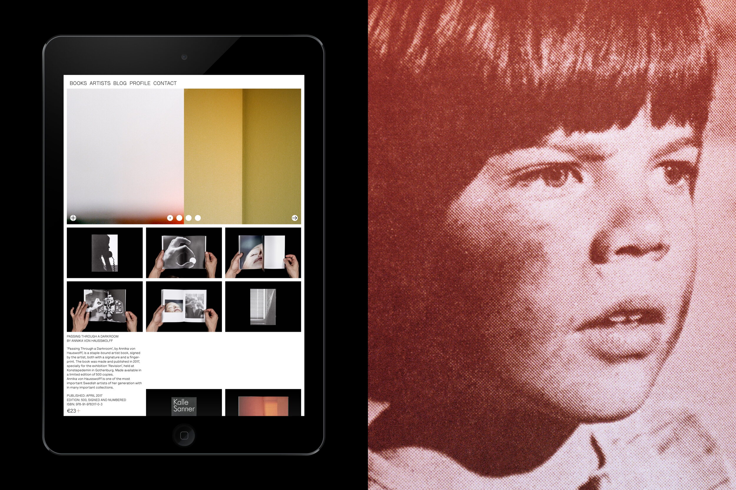
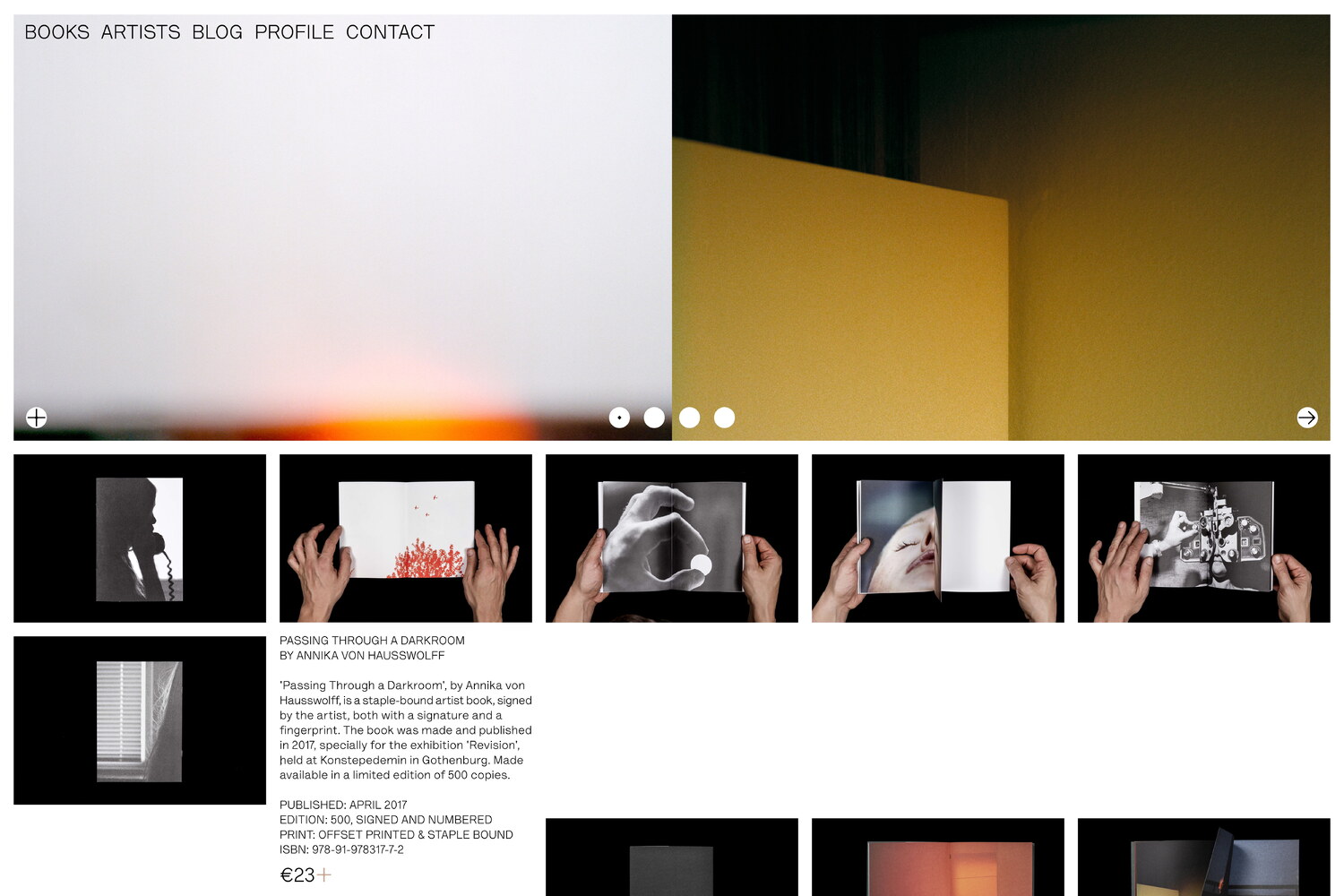
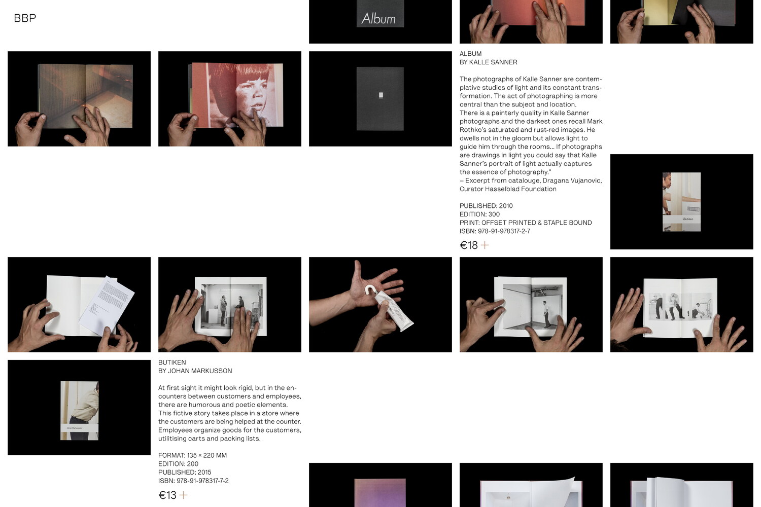
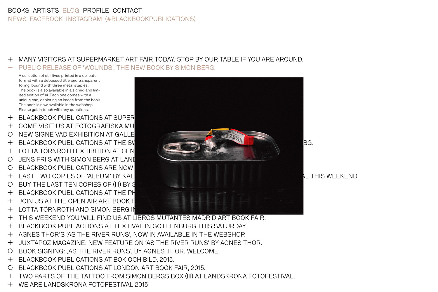
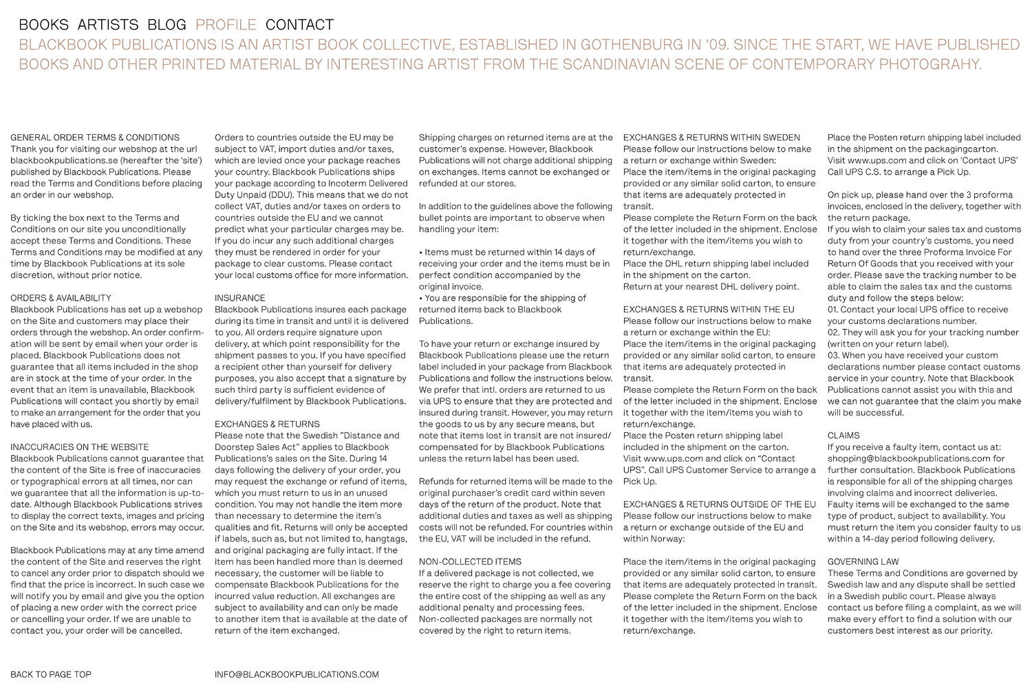
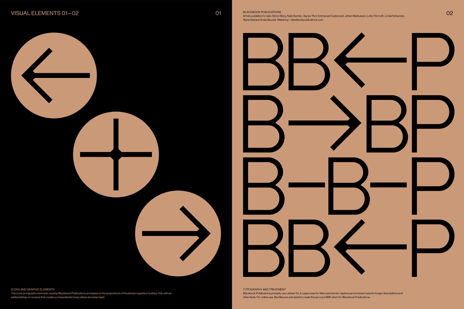
The webshop’s menu offers alternative ways of accessing the content, where books can be sorted after artist, or accessed through their titles. Instead of a traditional ‘about’ section, we opted for integrating the profile text and contact information into the menu overlay, allowing the visitor to quickly access the information without having to switch between different sections and leave the one that really matters; the presentation of the books. Upon scrolling down, the menu items (Books, Artists, Blog, Profile and Contact) are animated leaving only the initial B (of Books), B (of Blog) and P (of Profile) behind. The two latter are subsequently animated to attach to the initial B, together forming BBP for Blackbook Publications.
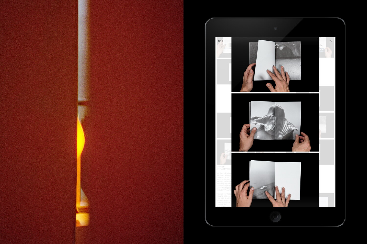
The webshop is built around a dynamic grid, in which each book is presented in a varied number of images, displayed as miniatures, followed by a short text and a technical specification. With the irregular number of images for the different books, and the way these adapt to the grid by continually dictating varied starting points for the following products, the site’s appearance, albeit coherent, shifts as the visitor scrolls down. Upon clicking an image, or the attached text, an overlay displaying the selected project is shown, with larger images and more information. The product can be purchased both from this view and from the overview.
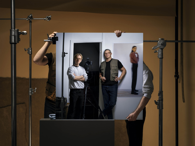
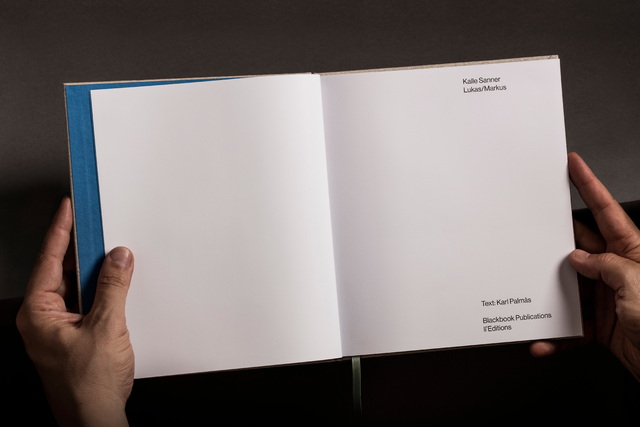
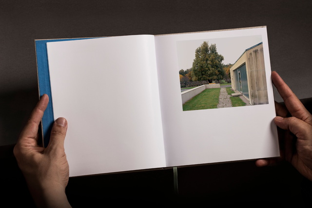
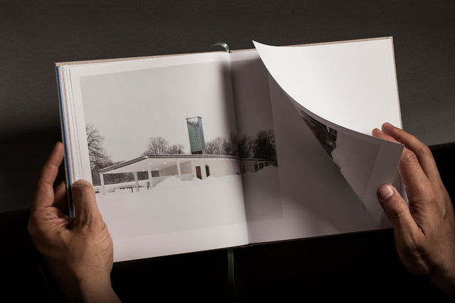
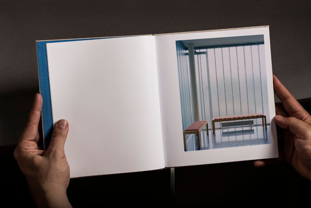
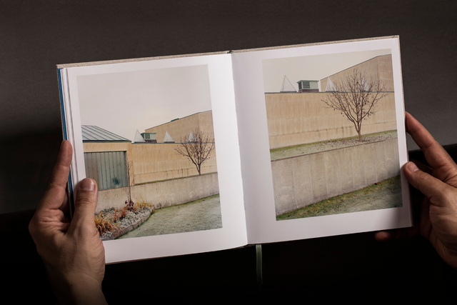
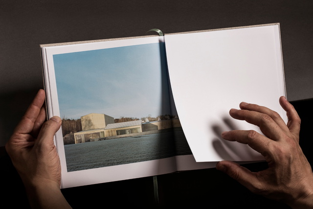
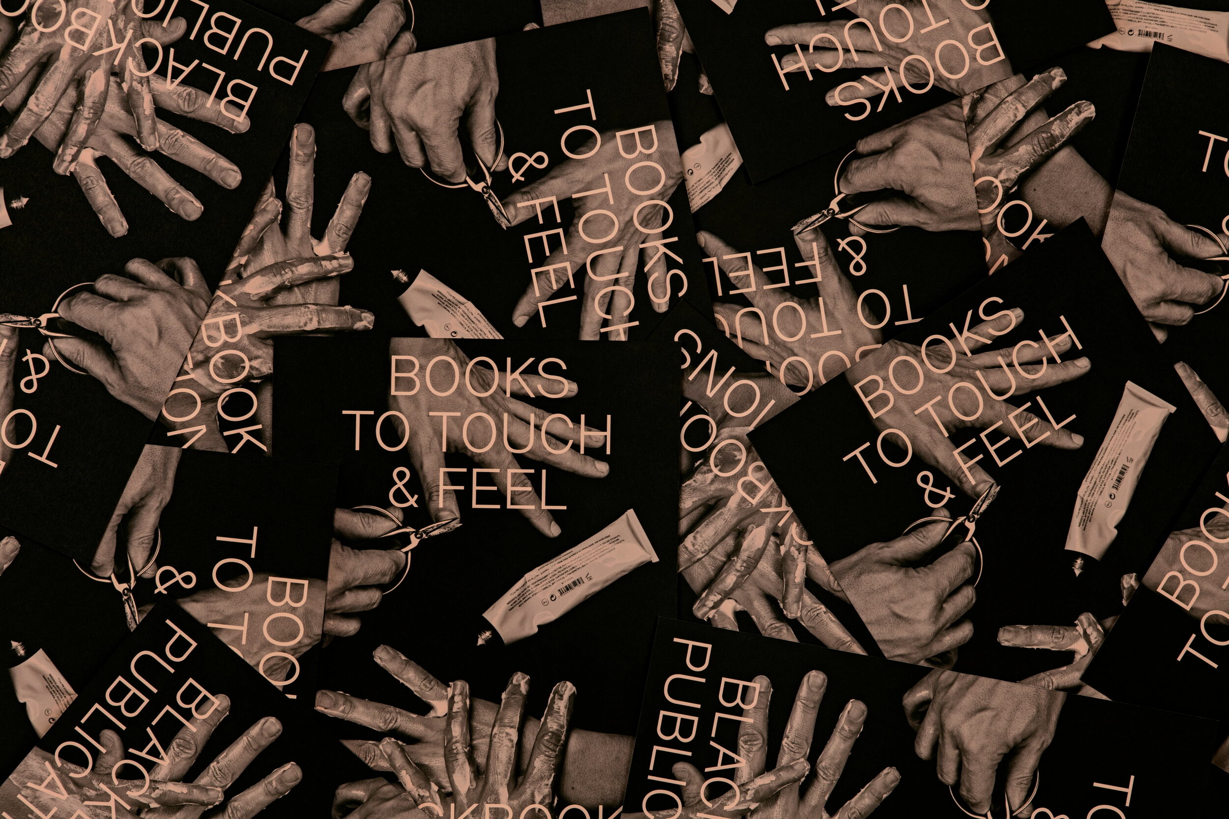
For the images of the books, we provided Blackbook with a guideline for how these were to be shot. The most prominent aspect of this is the fact that there are always hands in the images, except for in images of the covers. The main reason behind this choice, apart from differentiating the images from the usual static way of depicting the books employed by most online bookshops, was to place emphasis upon the fact that these are books that are meant to be touched and felt. With the collective treating the books very much as objects representing a natural extension of their artistic œuvres, the fact that the books need to be seen and handled in their physical form to be fully appreciated was something that we wanted to make evident.
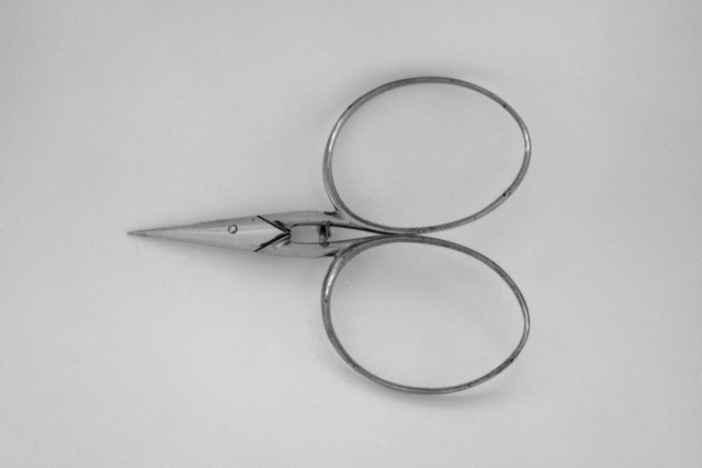
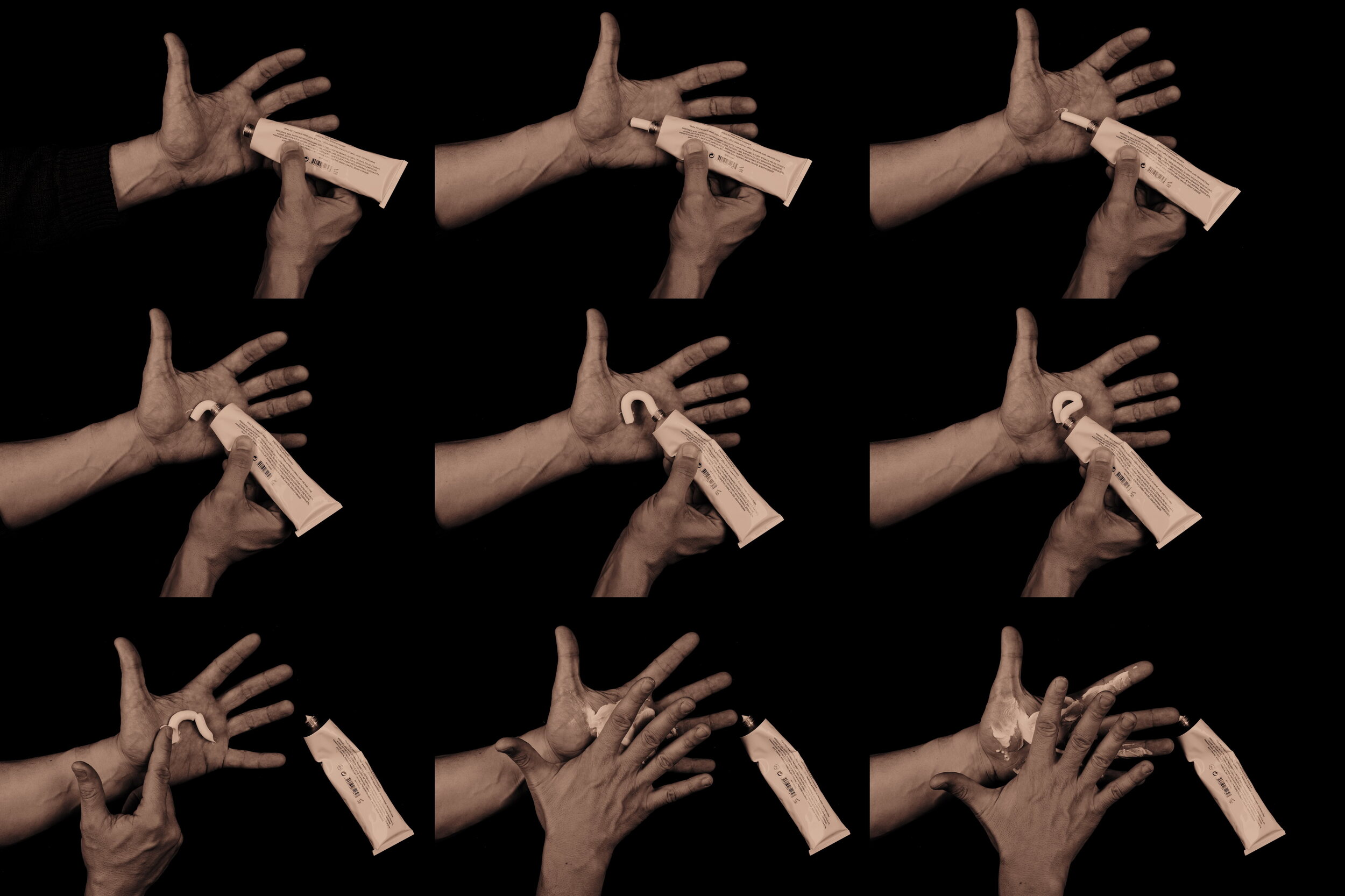
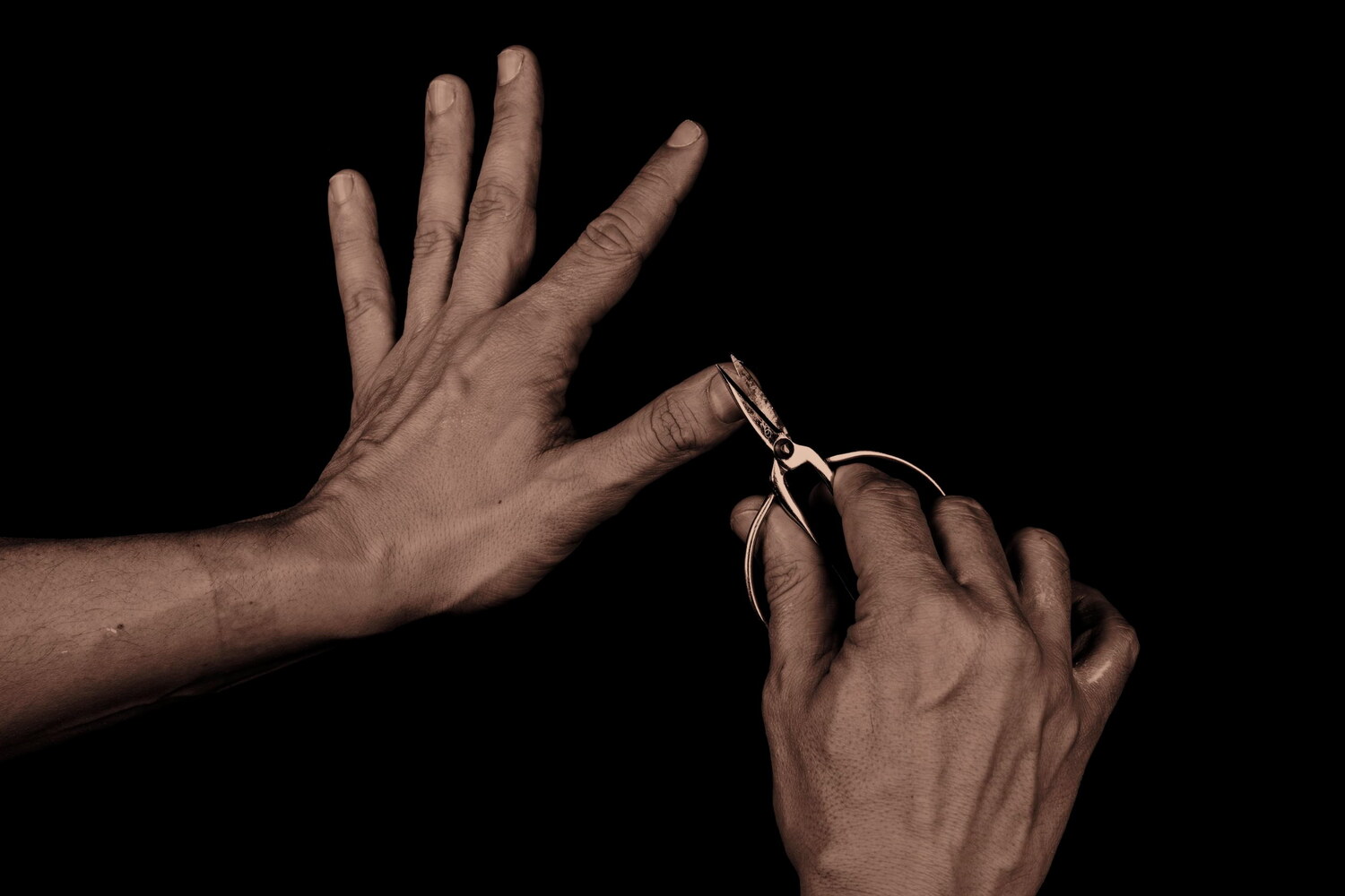
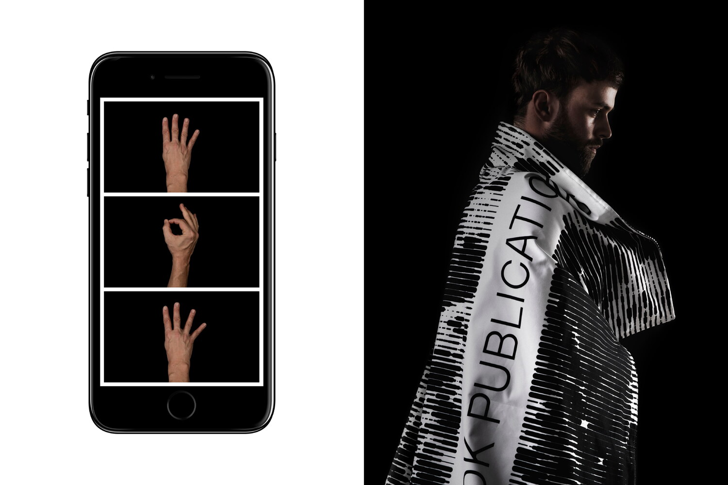
In some images, we allowed the top of the model’s head to obscure parts of the pictured book. We also made a sequence of humorous images depicting various stages of hand care, infusing the faceless model with a personality. These images act as small breathers spread out across the site. For the often overlooked 404 page, we made three images with the hands displaying 4-0-4 in sign language.
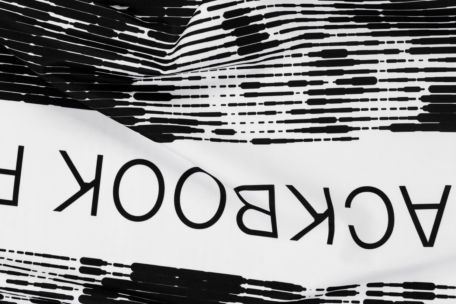
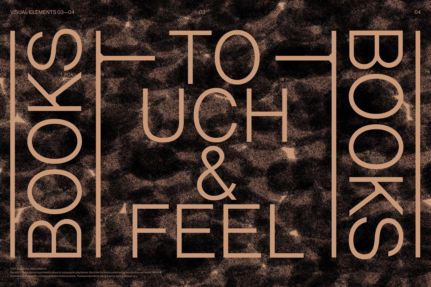
As a complement to the webshop, we also designed a series of three posters around the theme ‘Books to Touch and Feel’ and a flag, featuring a rasterised, abstract image of wood pulp1, which is also used as the loading screen on the site.