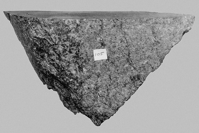
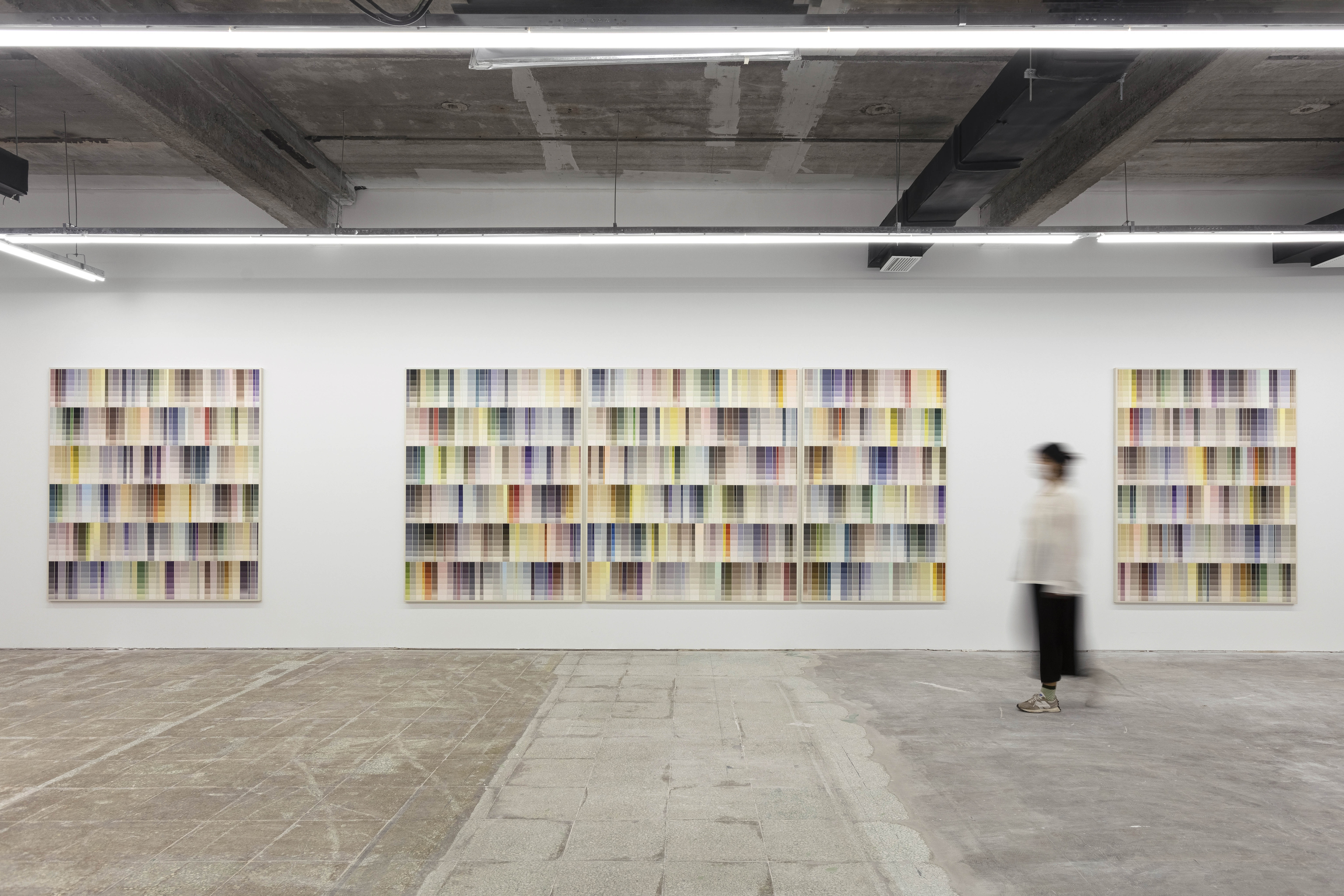
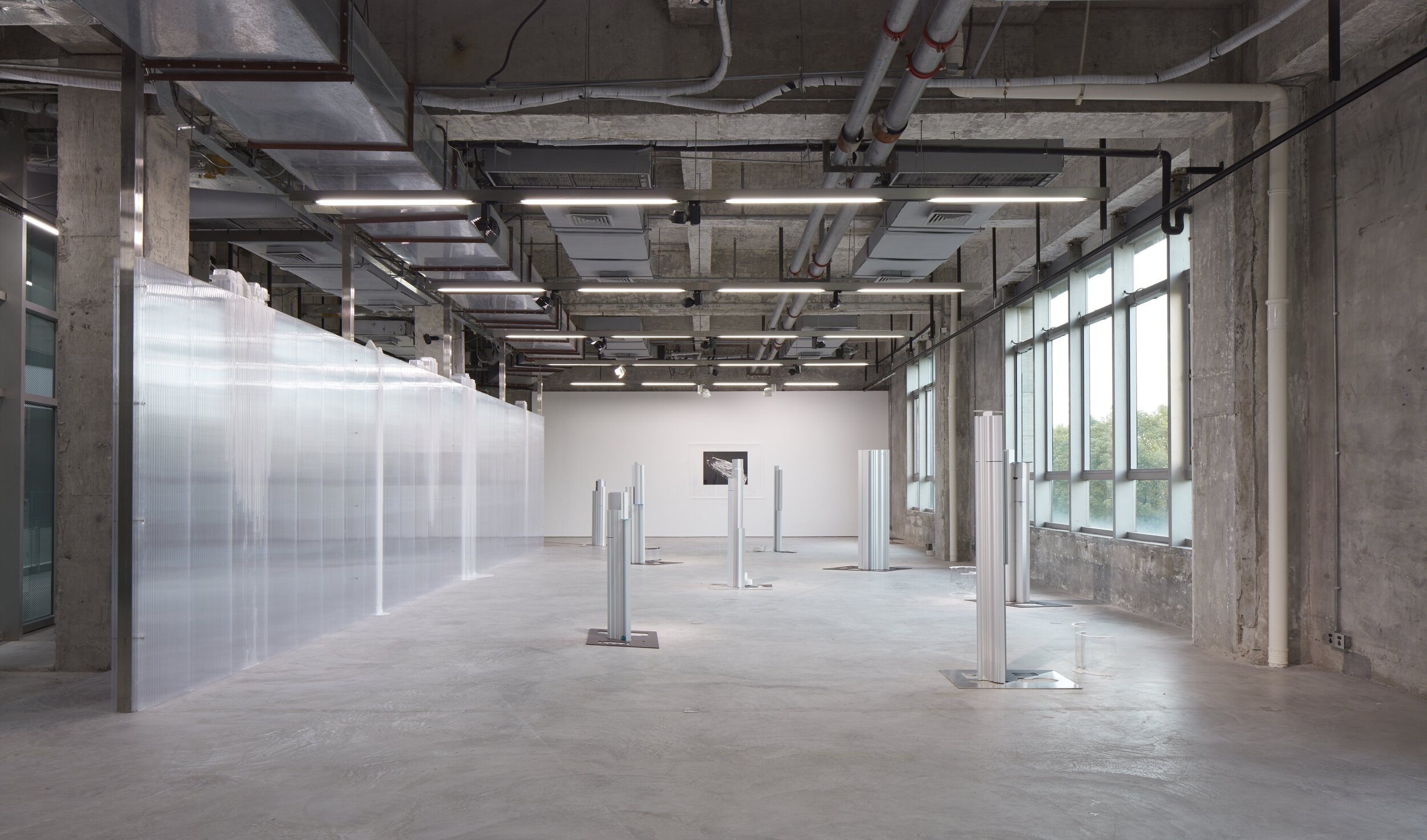
'Sedimentary Gradient', exhibition by Chou Yu-Cheng. Courtesy of the artist and Kiang Malingue Gallery.
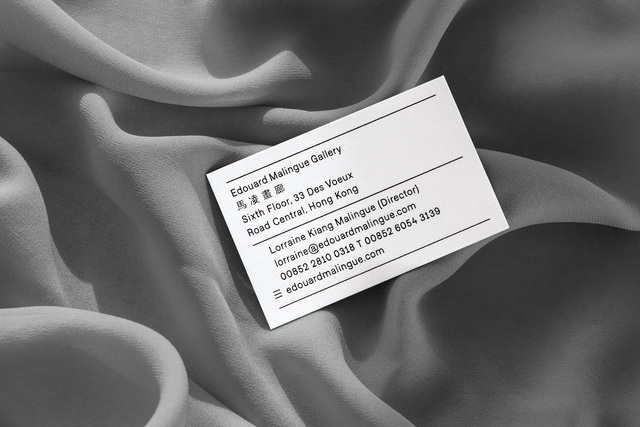
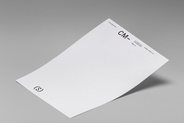
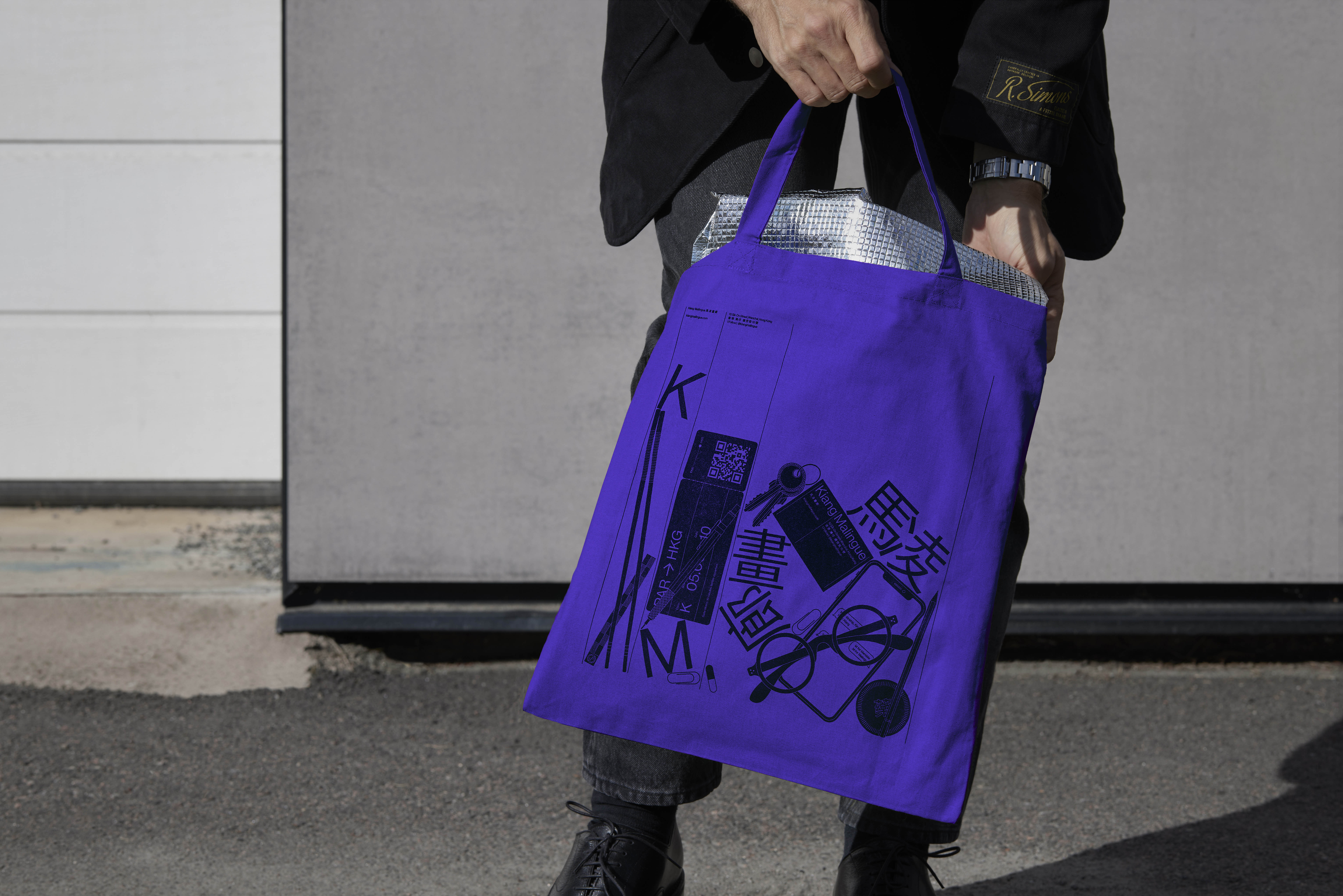
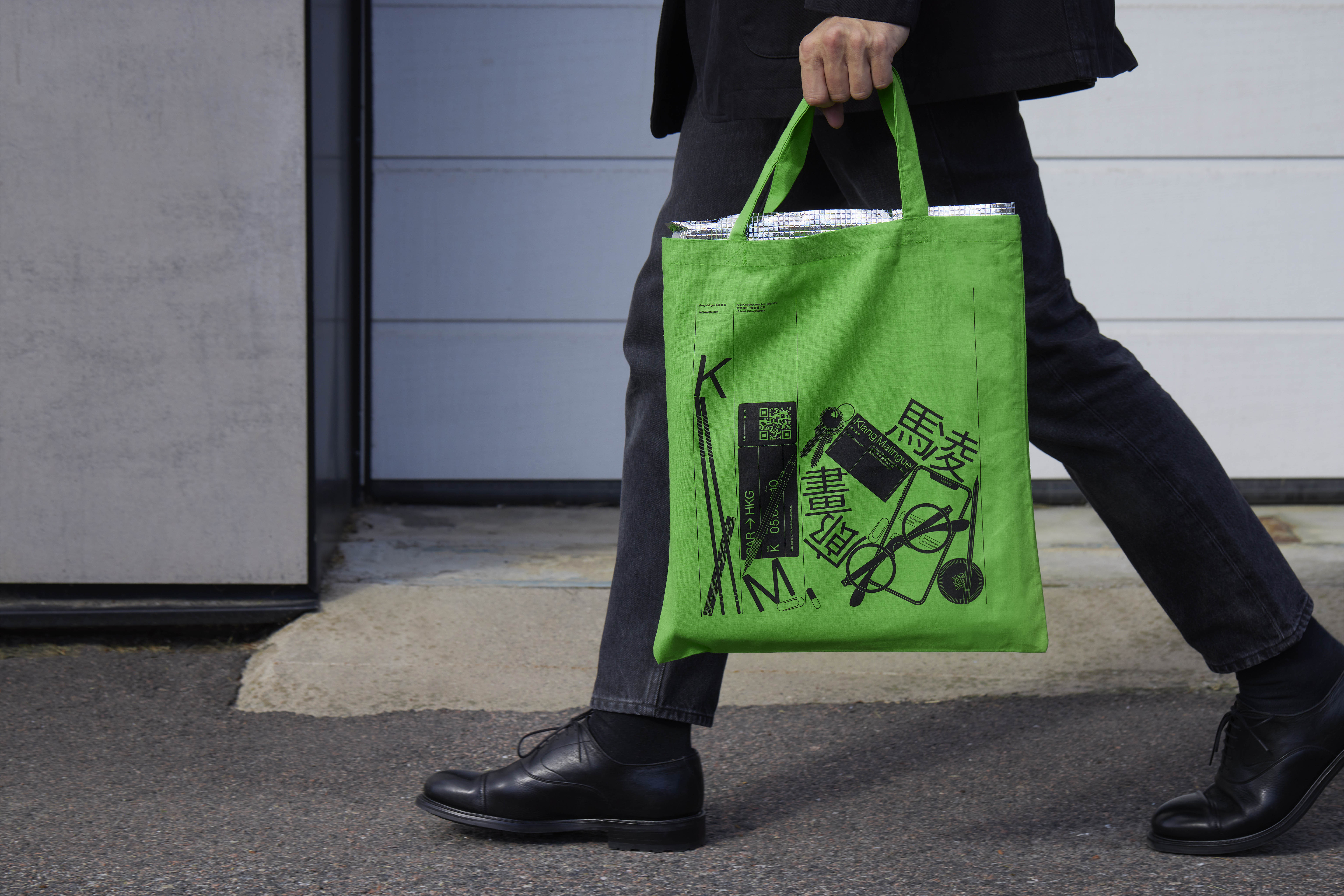
(Archive) Examples of stationery applications from the gallery's previous visual identity, designed by Lundgren+Lindqvist in 2015.
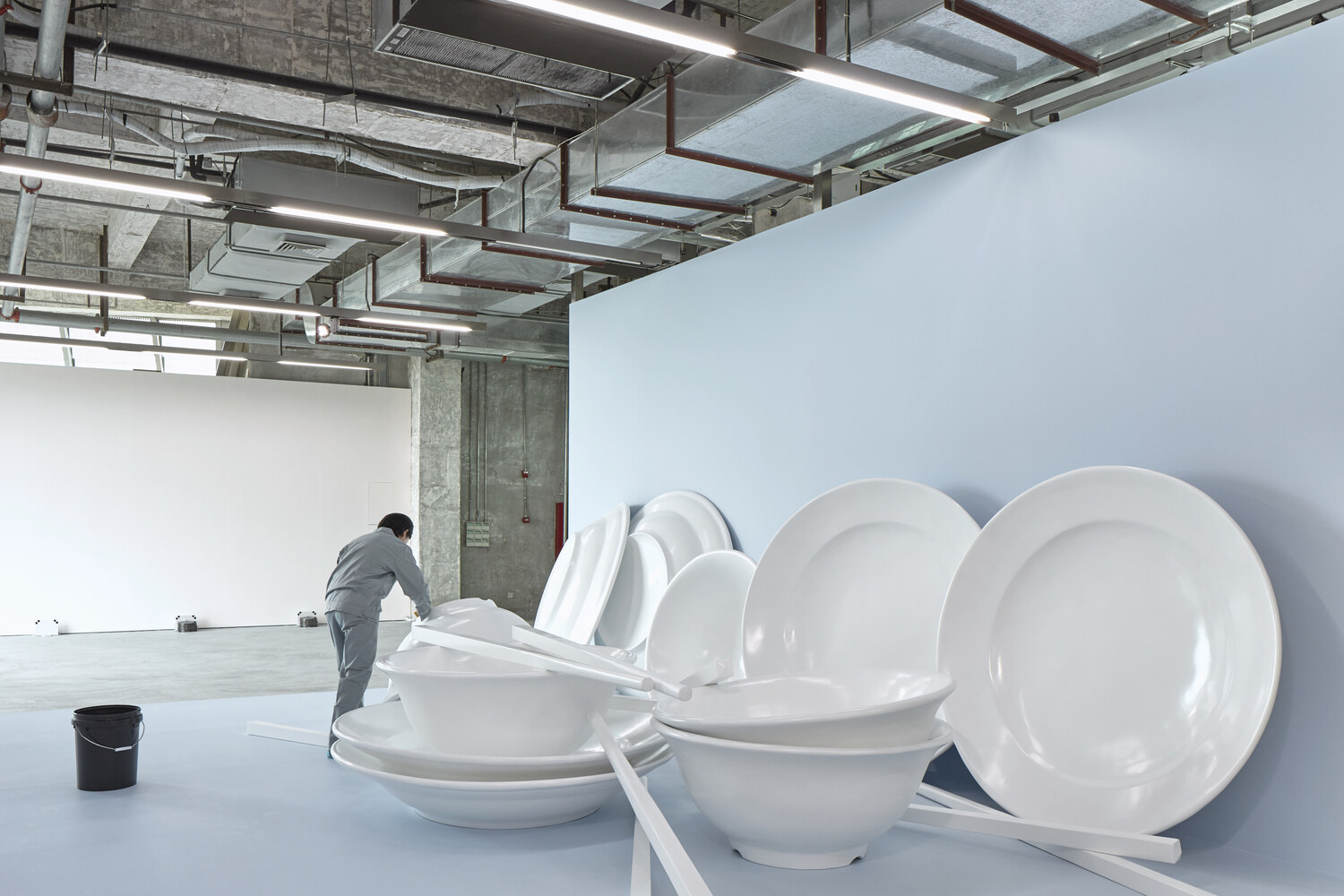
'Refresh, Sacrifice, New Hygiene, Home, Washing' by Chou Yu-Cheng. Courtesy of the artist and Kiang Malingue Gallery.
'Dwells in the Solid Shadow of the Unreachable', exhibition by He Yida. Courtesy of the artist and Kiang Malingue Gallery.
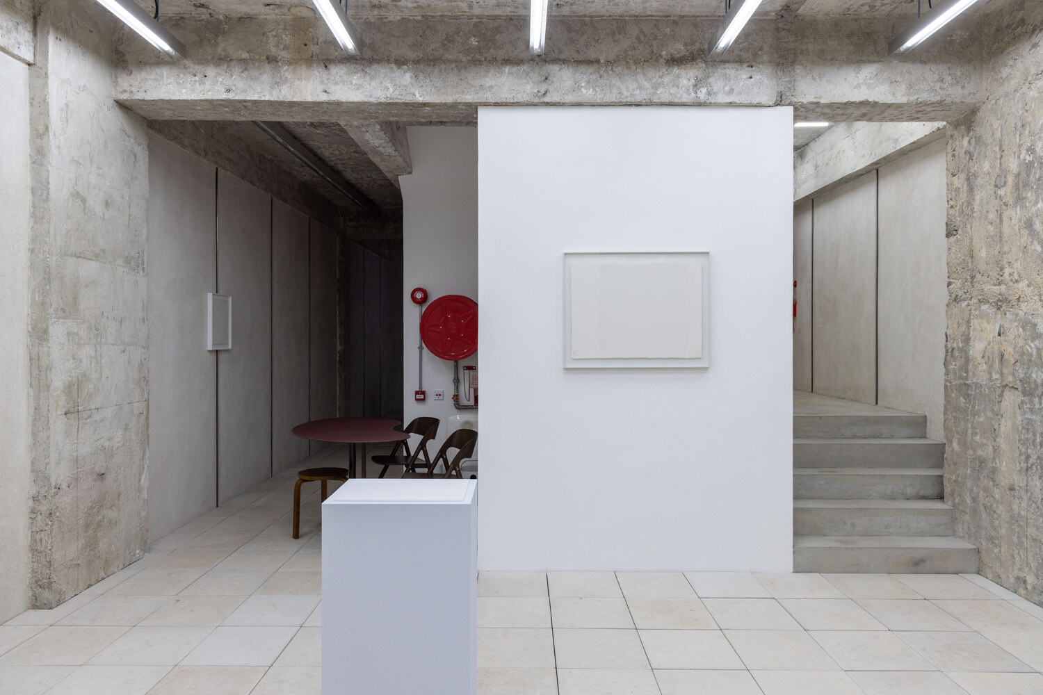
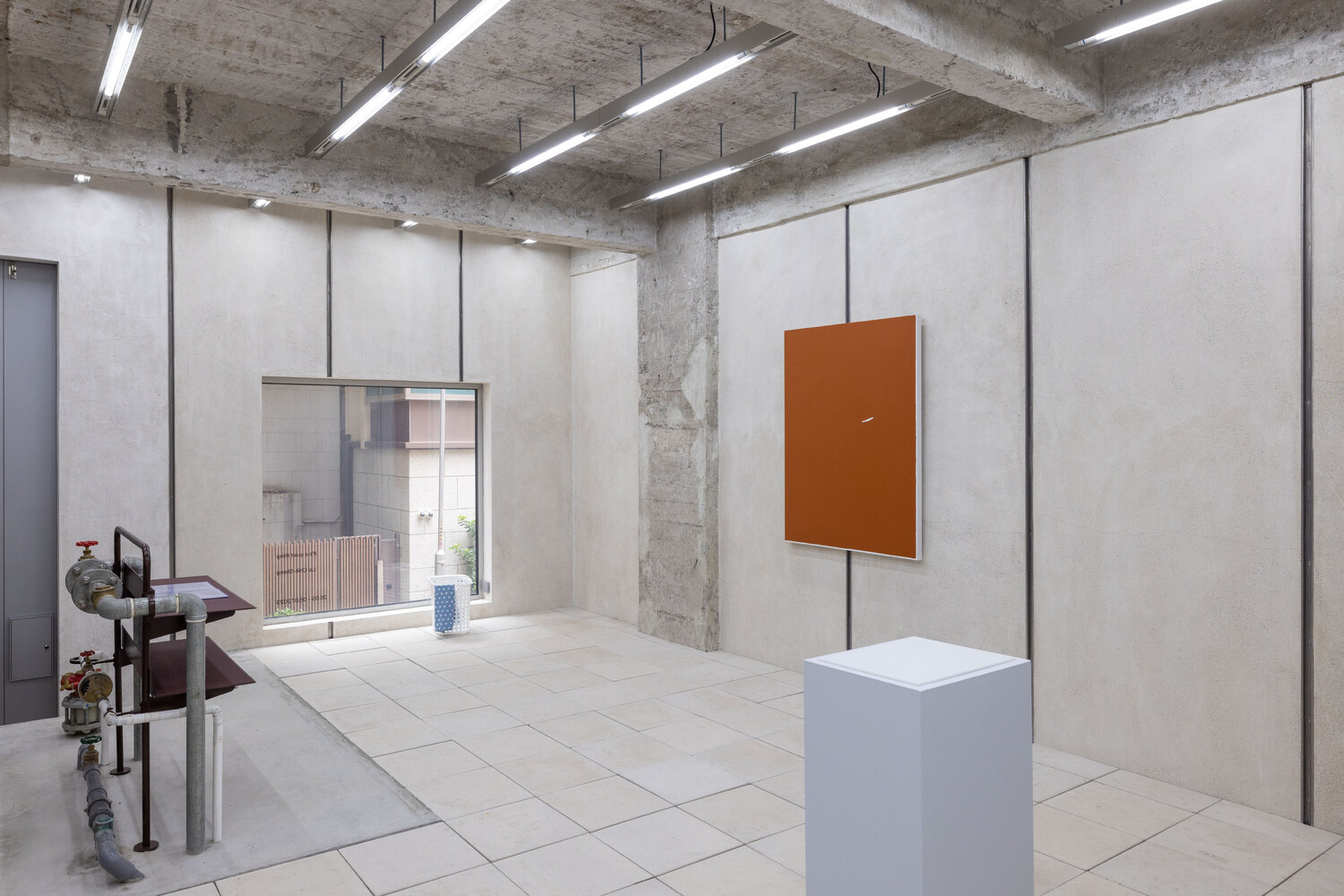
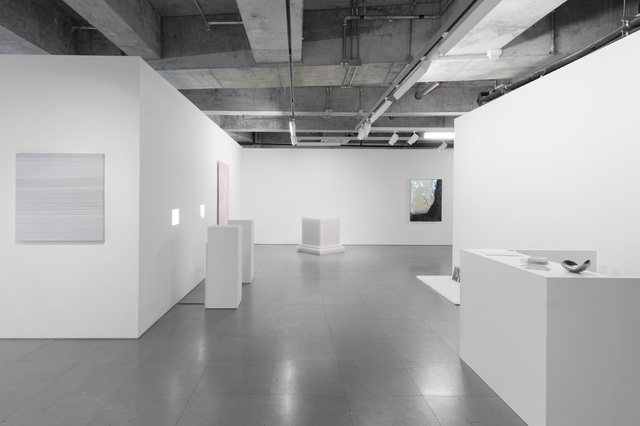
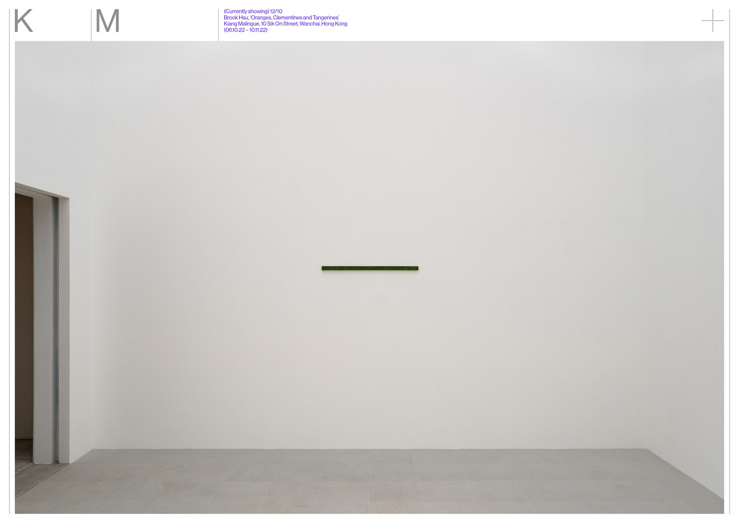
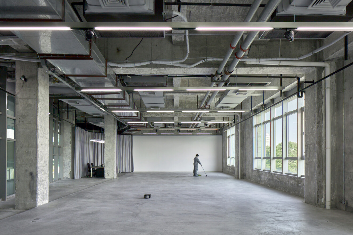
'It's a quiet thing', exhibition by Lai Chih-Sheng. Courtesy of the artist and Kiang Malingue Gallery.

'It's a quiet thing', exhibition by Lai Chih-Sheng. Courtesy of the artist and Kiang Malingue Gallery.
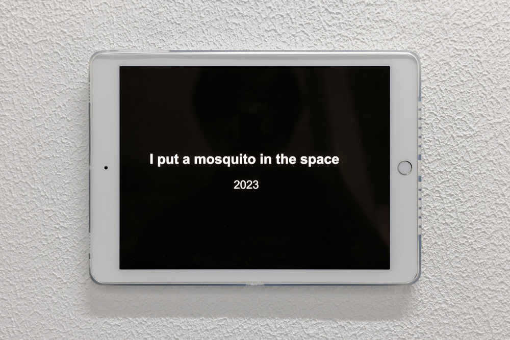
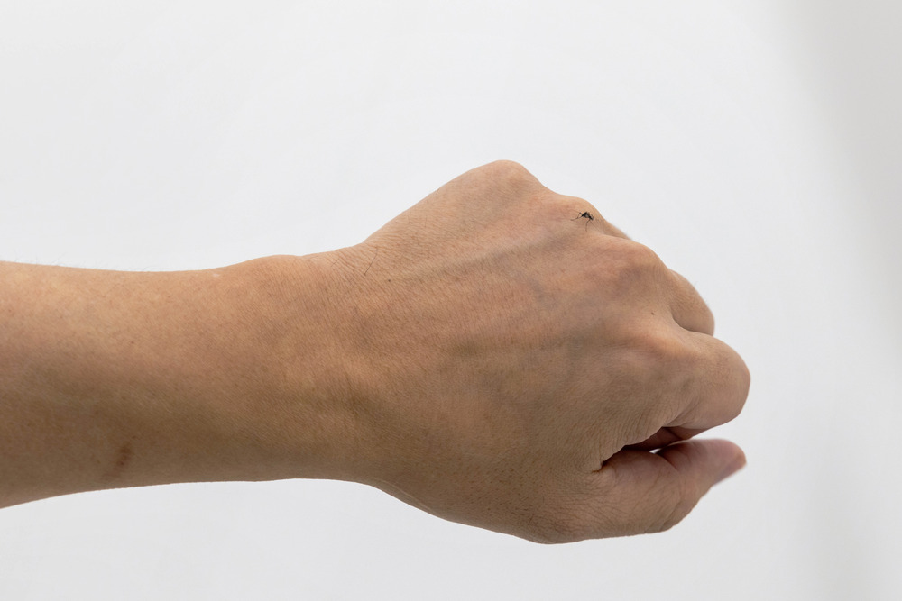
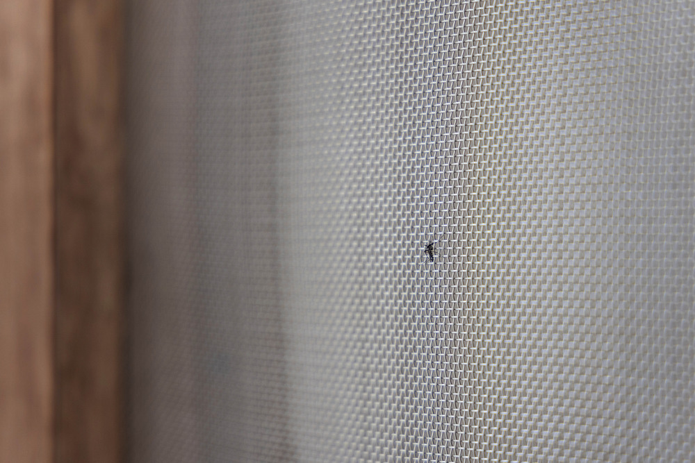
'I put a Mosquito in the Space', 2023, intervention by Lai Chih-Sheng. Courtesy of the artist and Kiang Malingue Gallery.
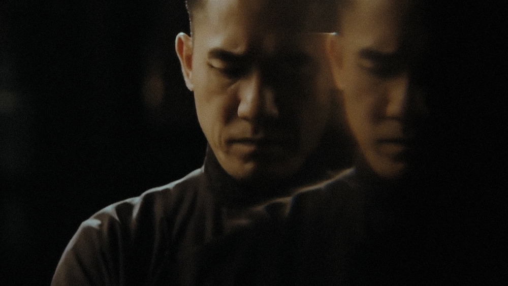
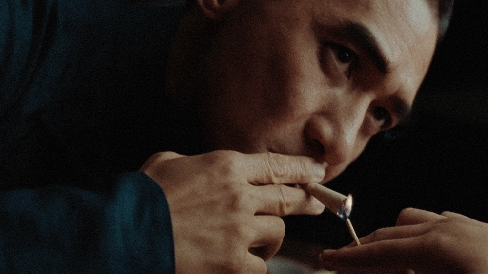
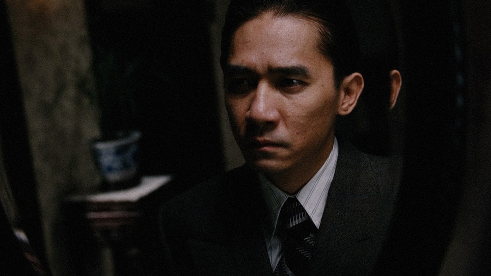
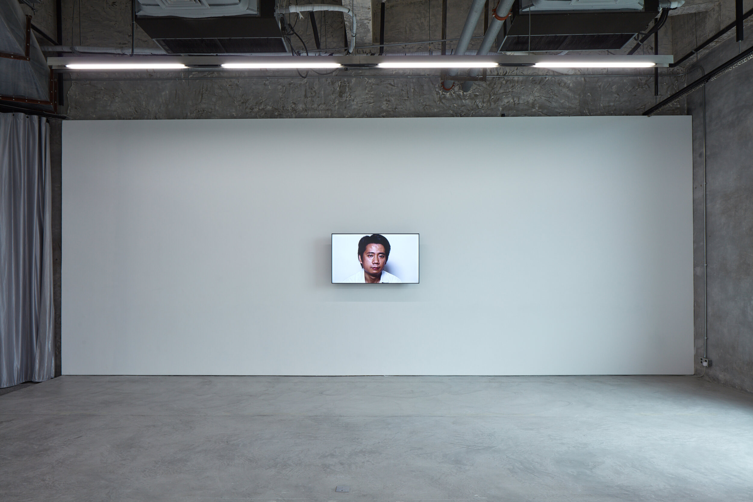
Stills from 'The Nameless', 2015, by Ho Tzu Nyen. Courtesy of the artist and Kiang Malingue Gallery.
'Healthier, Simpler, Wiser', group show by Hu Xiangqian, Lai Chih-Sheng and Kwan Sheung Chi. Courtesy of the artist and Kiang Malingue Gallery.
'Refresh, Sacrifice, New Hygiene, Infection, Clean, Robot, Air, Housekeeping...', exhibition by Chou Yu-Cheng. Courtesy of the artist and Kiang Malingue Gallery.
'Refresh, Sacrifice, New Hygiene, Infection, Clean, Robot, Air, Housekeeping...', exhibition by Chou Yu-Cheng. Courtesy of the artist and Kiang Malingue Gallery.