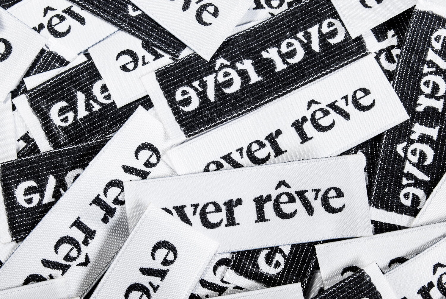
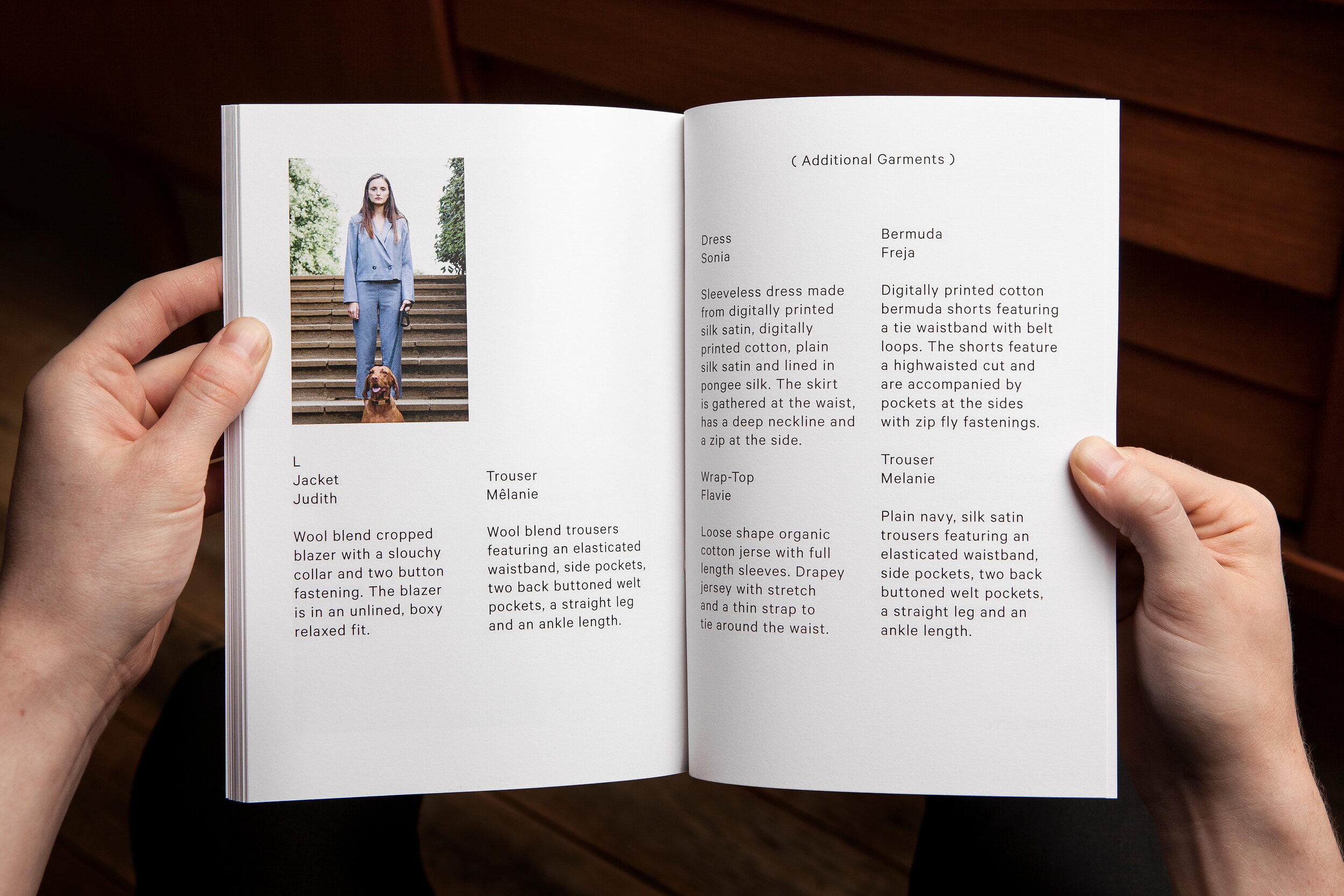
Lundgren+Lindqvist was commissoned to design Ever Rêve’s visual identity, including all digital and physical applications, such as lookbooks, labels, swingtags, stationery and the brand’s webshop.
For Autumn/Winter 2013, each of the lookbooks were made unique through manually dripping watercolour onto them. Each chapter of the storyline, an ever present element in Ever Rêve’s process, was split up into three parts which were printed on separate transparent paper sheets, creating a fade-out - corresponding to the dreamlike story - when overlaid. The lookbook was packaged in an embossed, satin black box.
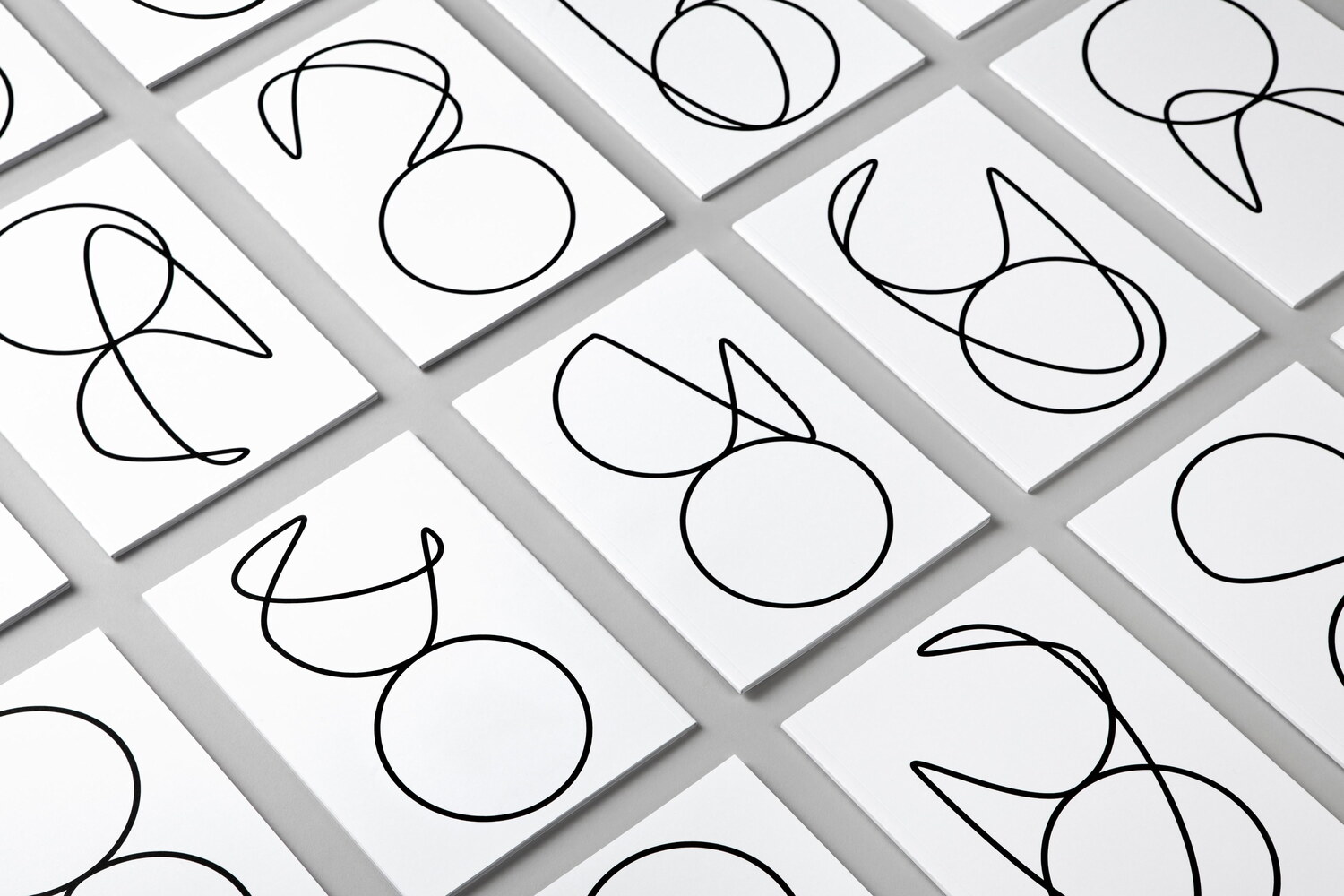
For the Spring/Summer 2014 lookbook (above), hundreds of varied eternity symbols (hinting at the brand’s name) were drawn giving each of the lookbooks its own, unique cover.
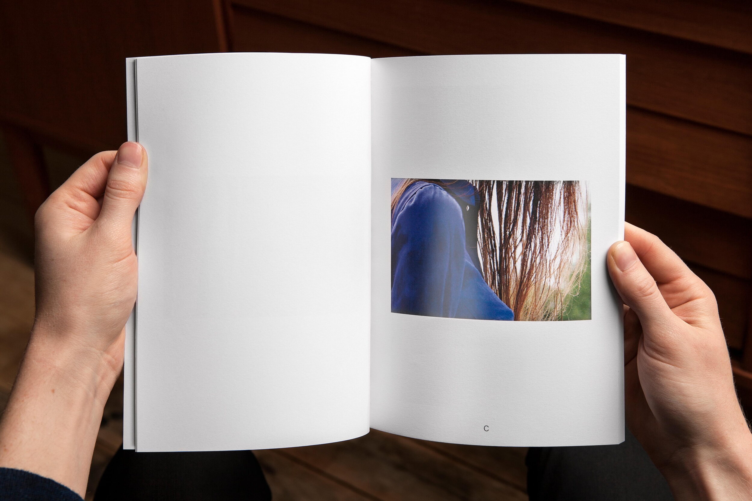
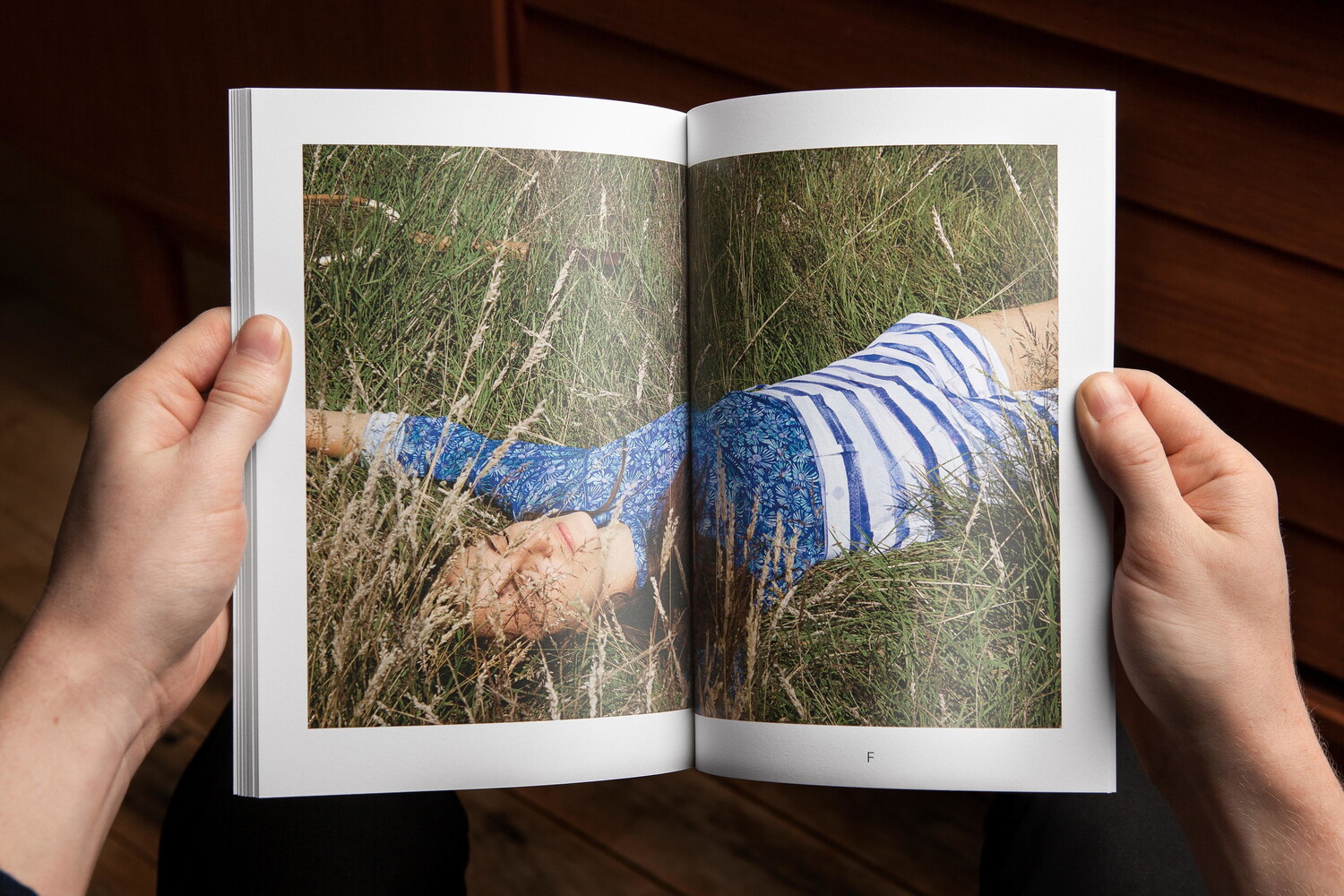
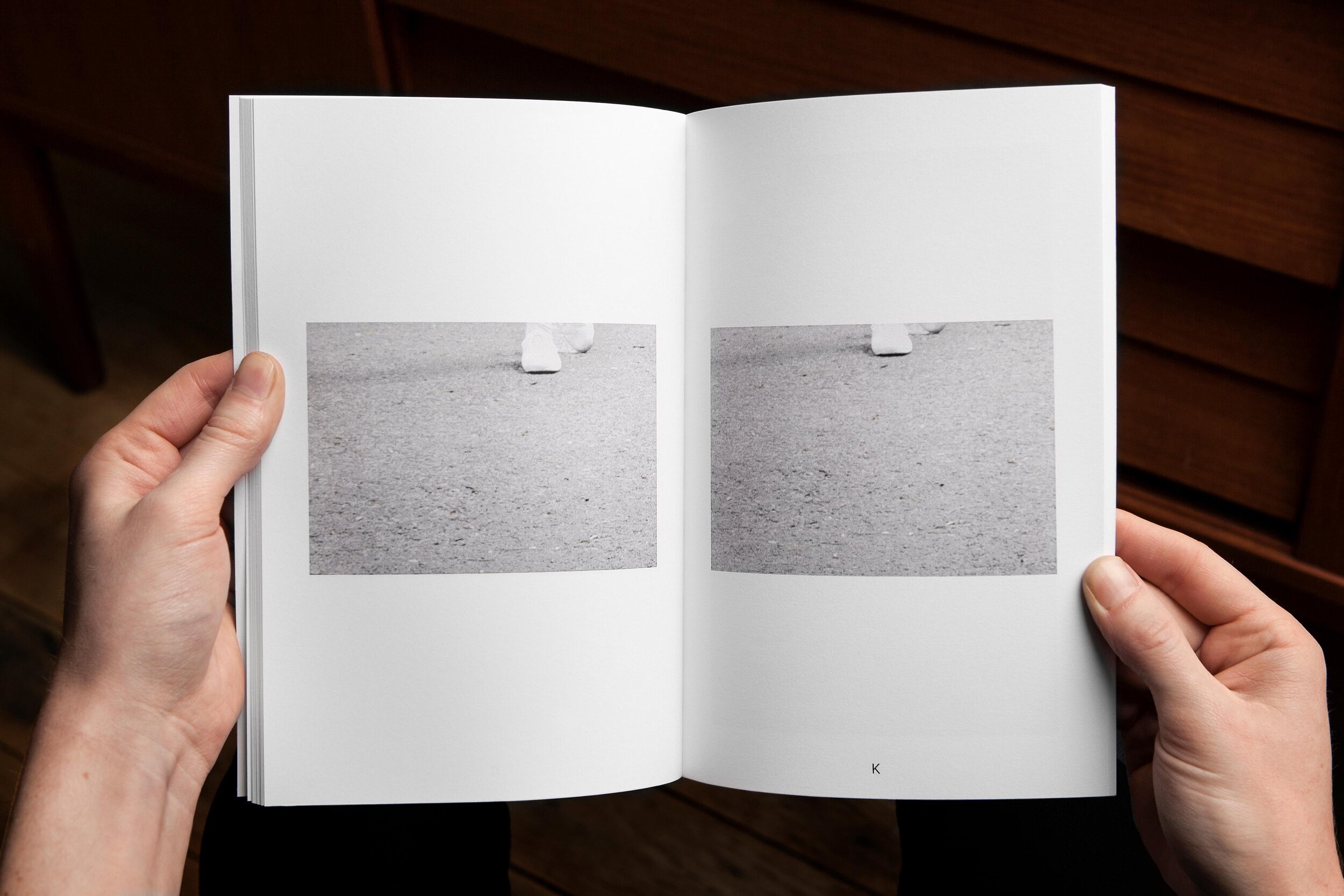
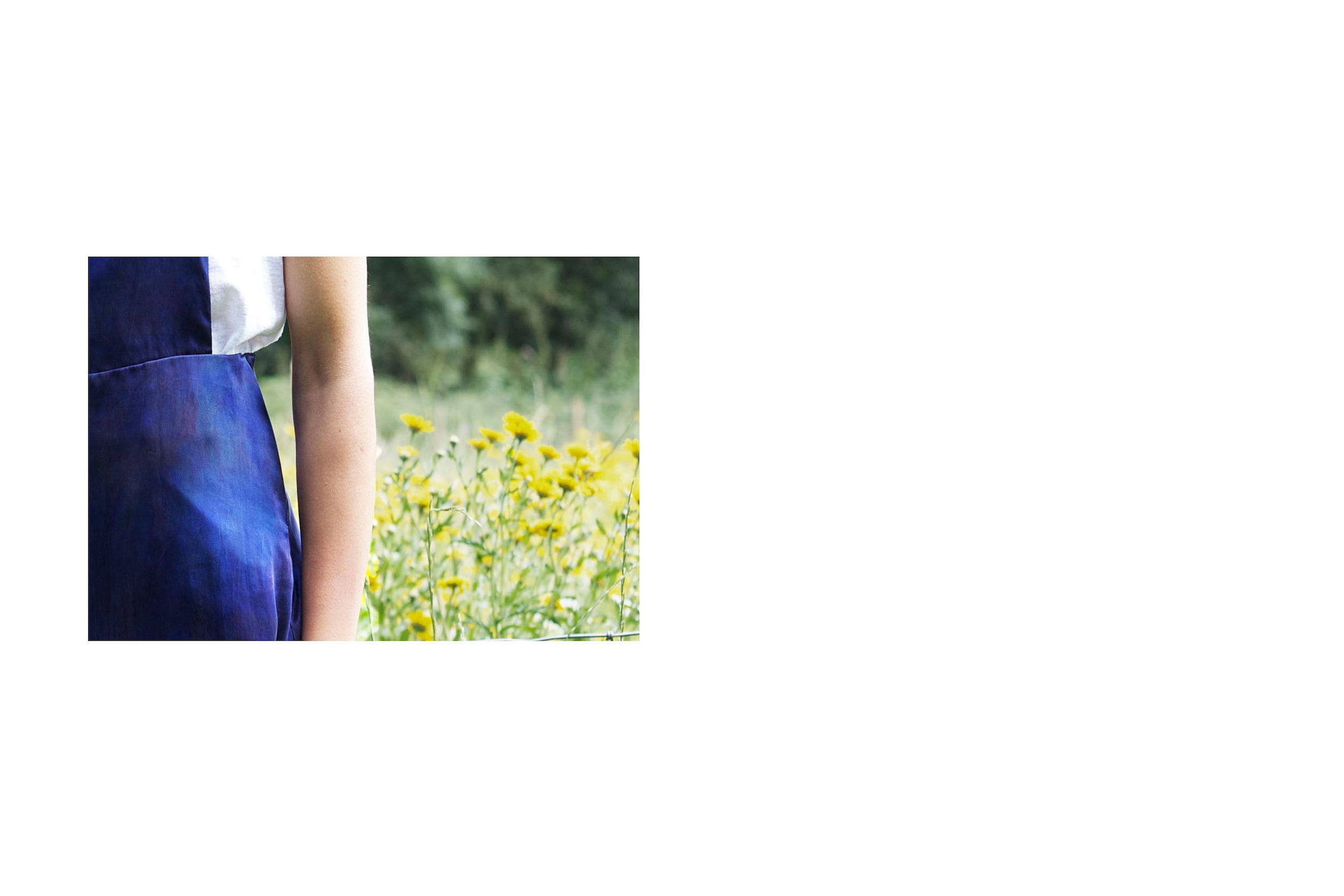
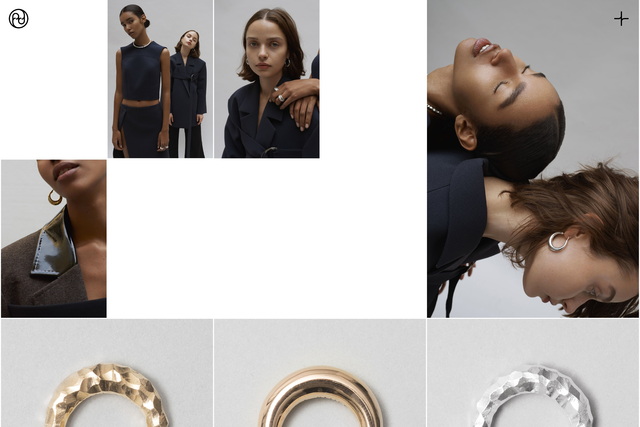
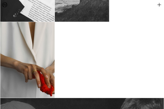
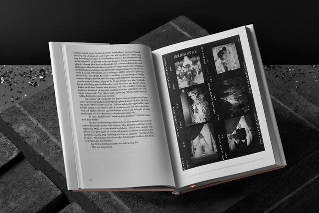
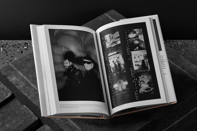
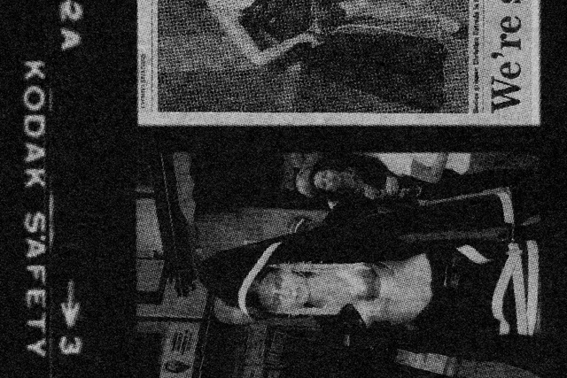
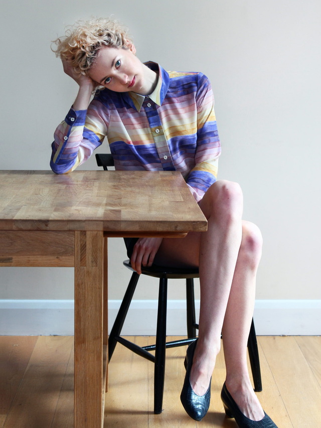
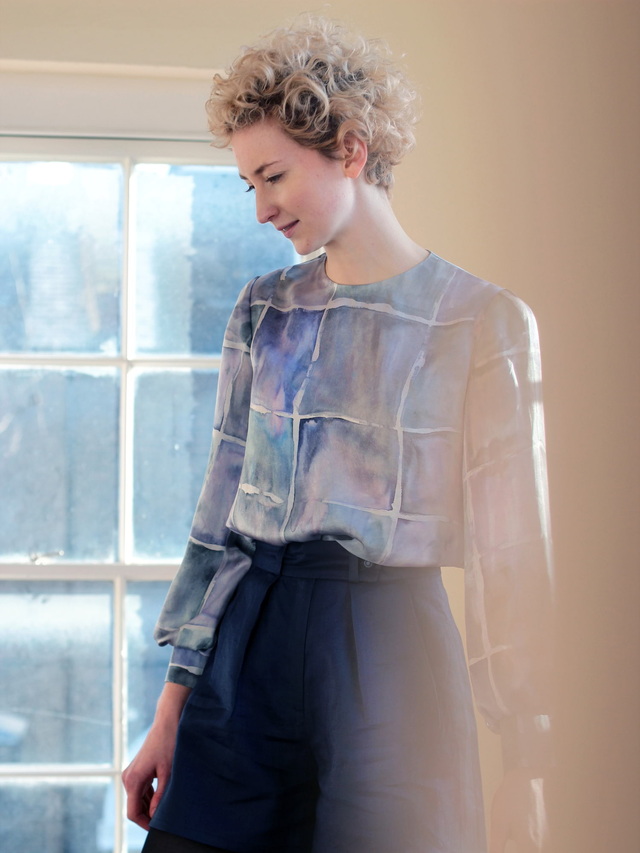
Every season, long before any drawings or toiles are made, a short story is written with a fictional persona at its centre. The ambience of the story and the study of that persona is utilised as an inspiration for the garments, as manifested throughout the collection. For the Spring/Summer 2015 collection, the story, which had previously been based on short essays by a range of authors, took on the form of a more vague, visual presence, establishing an atmosphere for the imagery. To create a cinematic feel, Lundgren+Lindqvist made abstract crops of the images which were then carefully sequenced and juxtaposed in a story section of the lookbook.
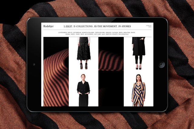
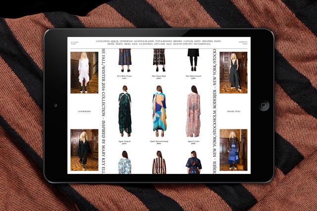
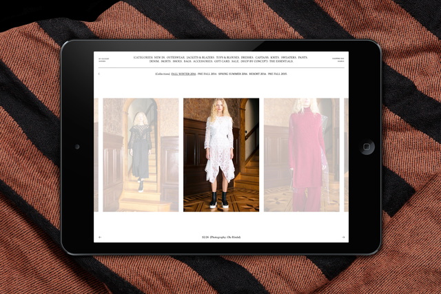
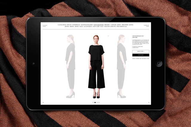
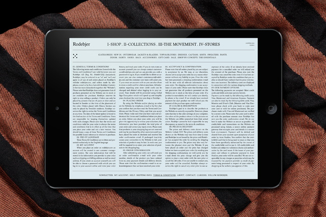
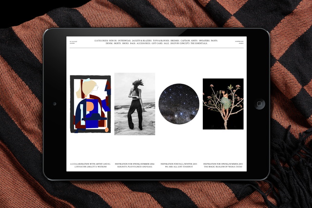
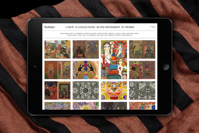
For the 2015 Spring Summer collection, we also redesigned Ever Rêve’s website and webshop. The new site featured a number of dynamic start sections, which allowed Ever Rêve to easily vary the look and content, giving the impression of a website in constant flux.
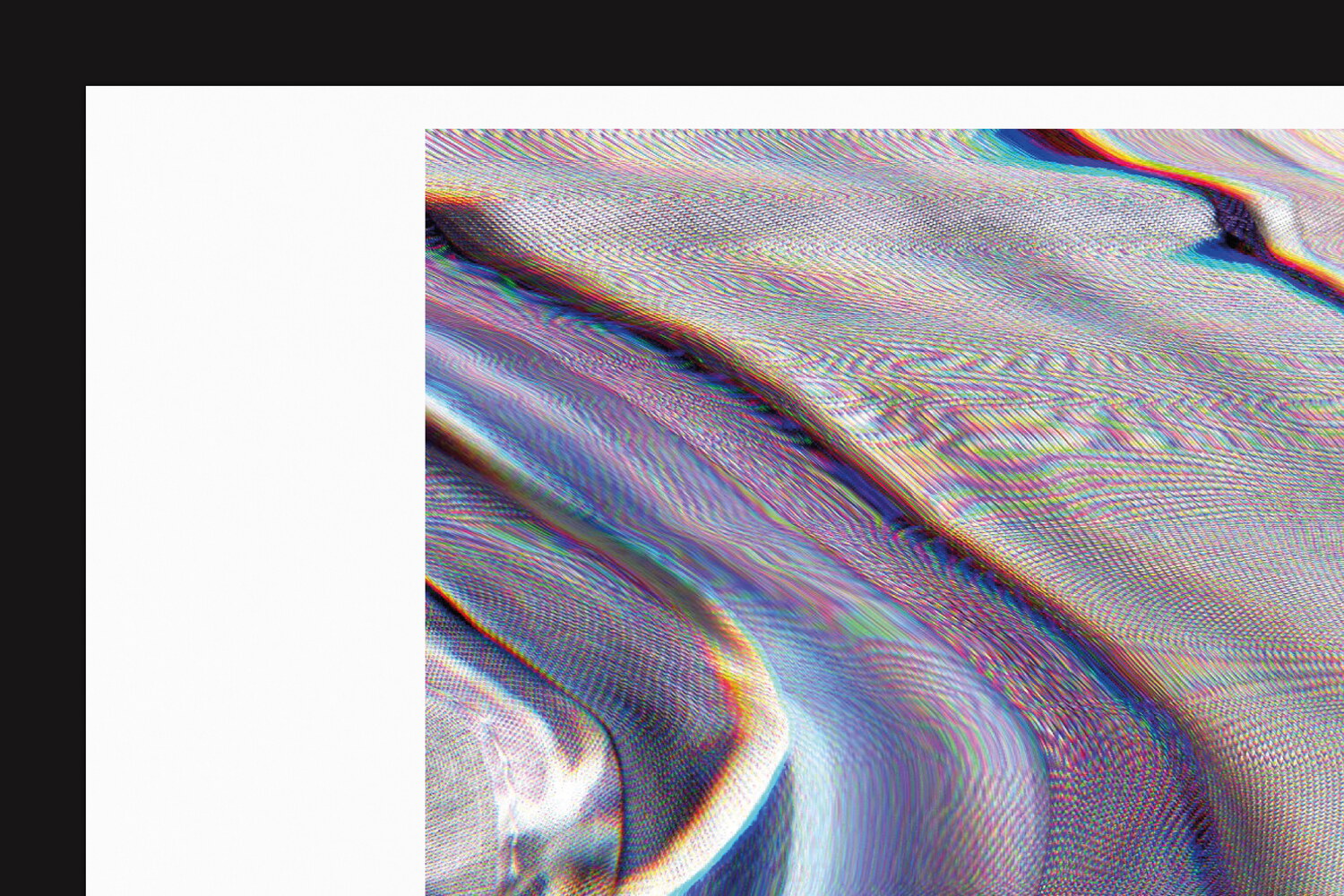
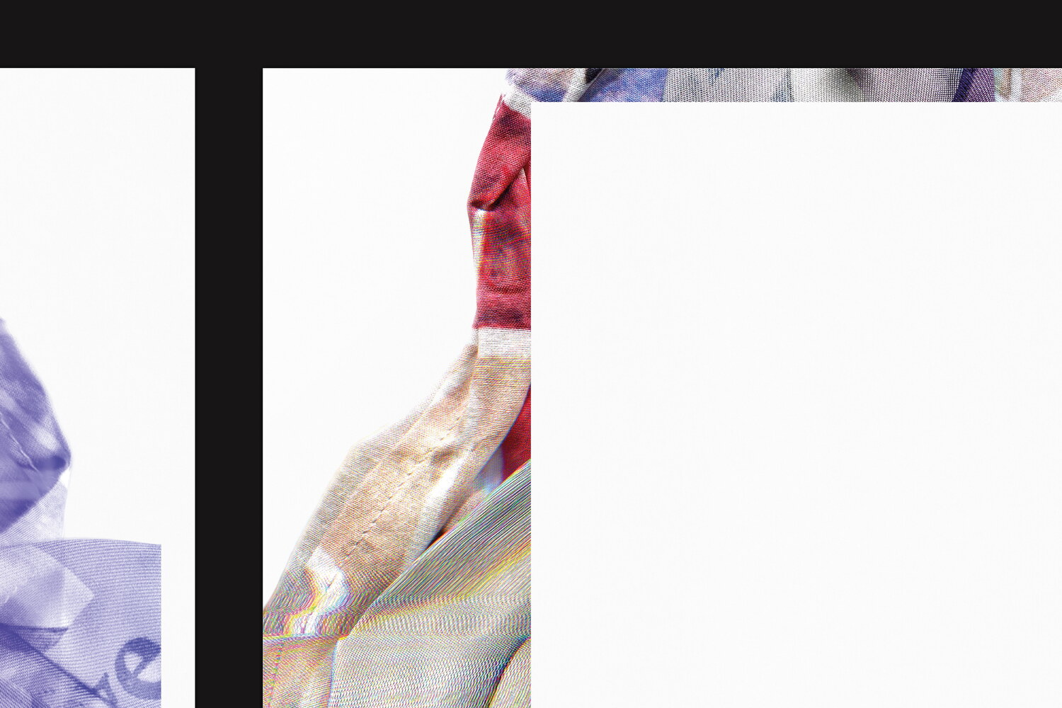
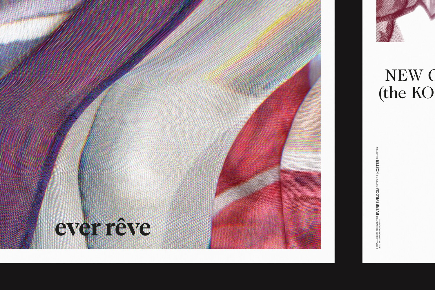
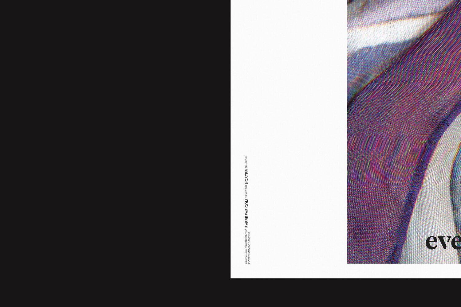
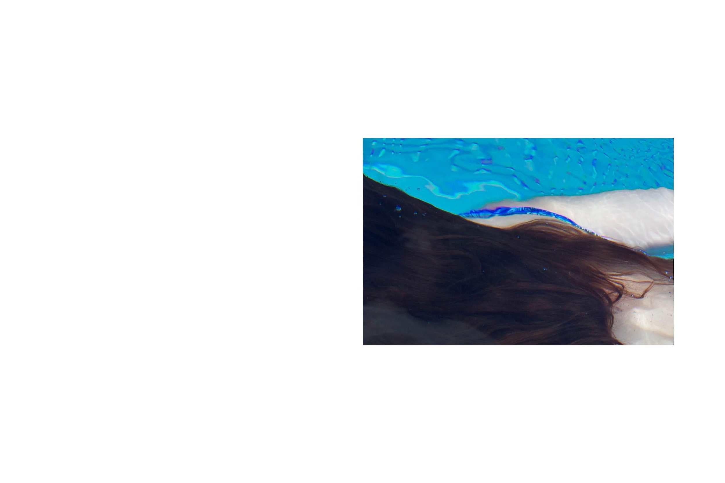
For Ever Rêve’s 2017 collection (below), a poster campaign was made in the streets of London. Each poster featured abstract compositions made by manually manipulating the printed fabrics from the collection while scanning them.