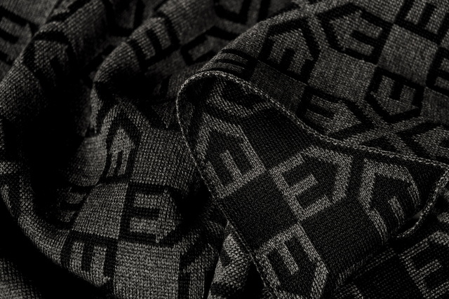
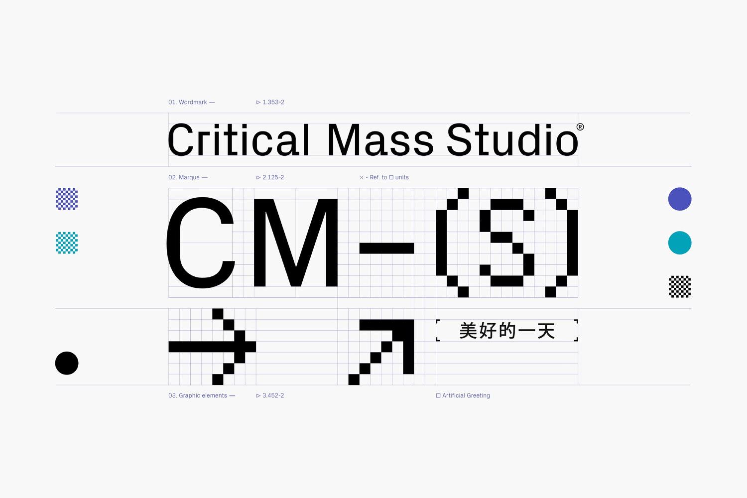
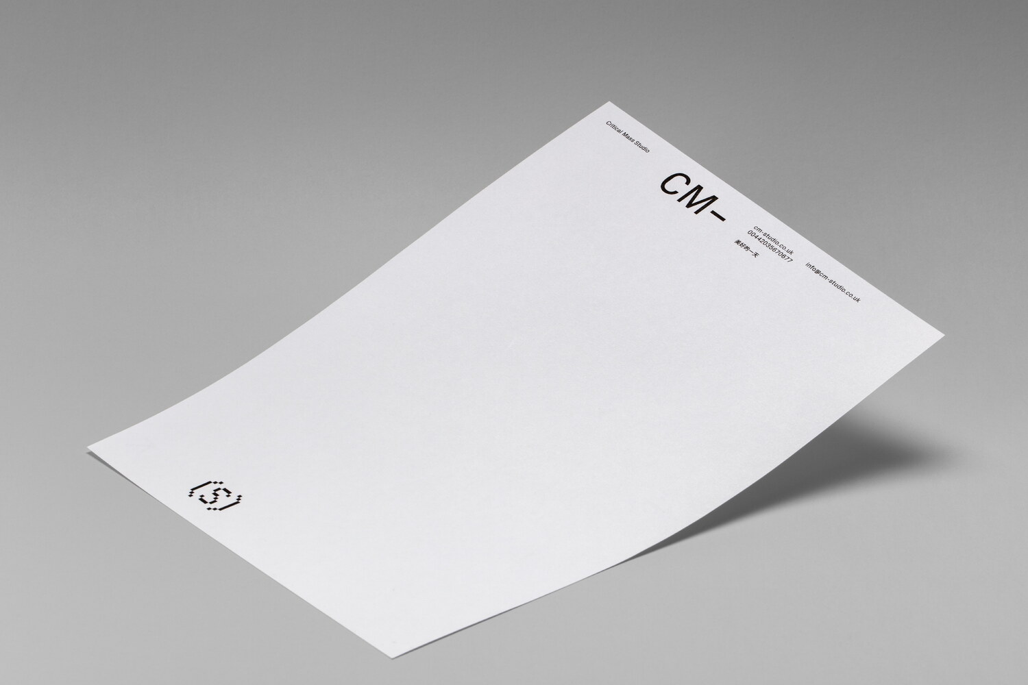
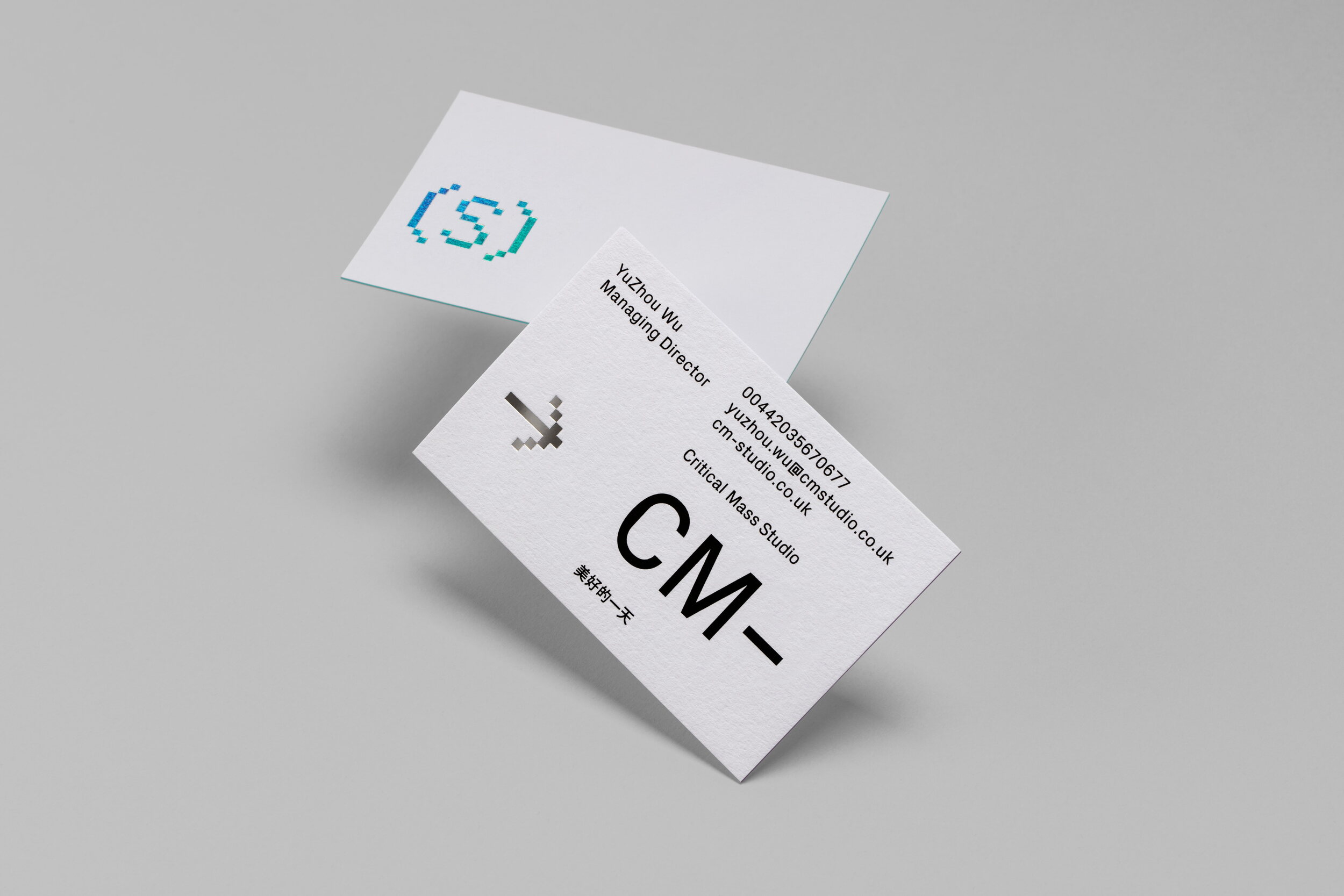
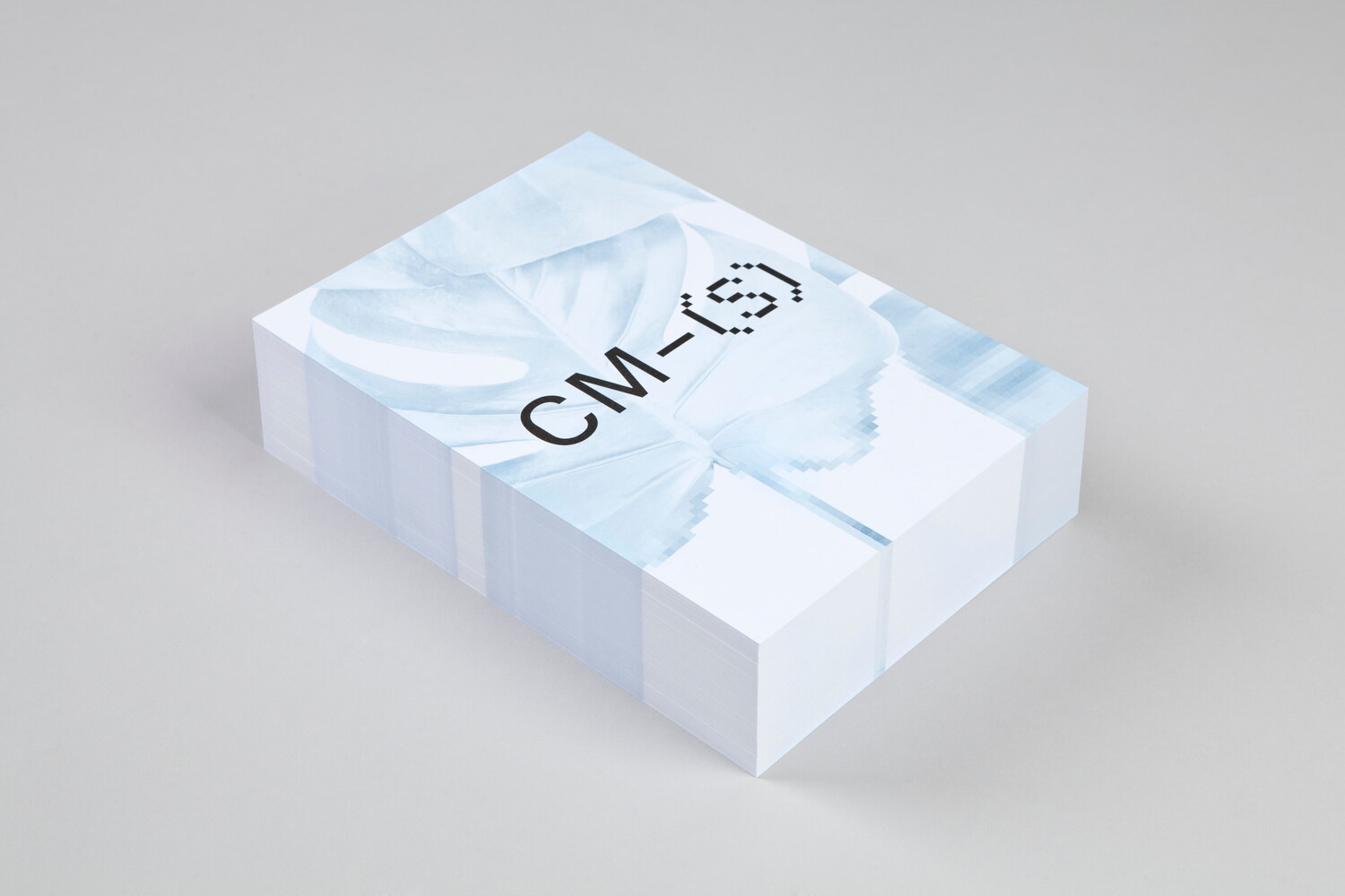
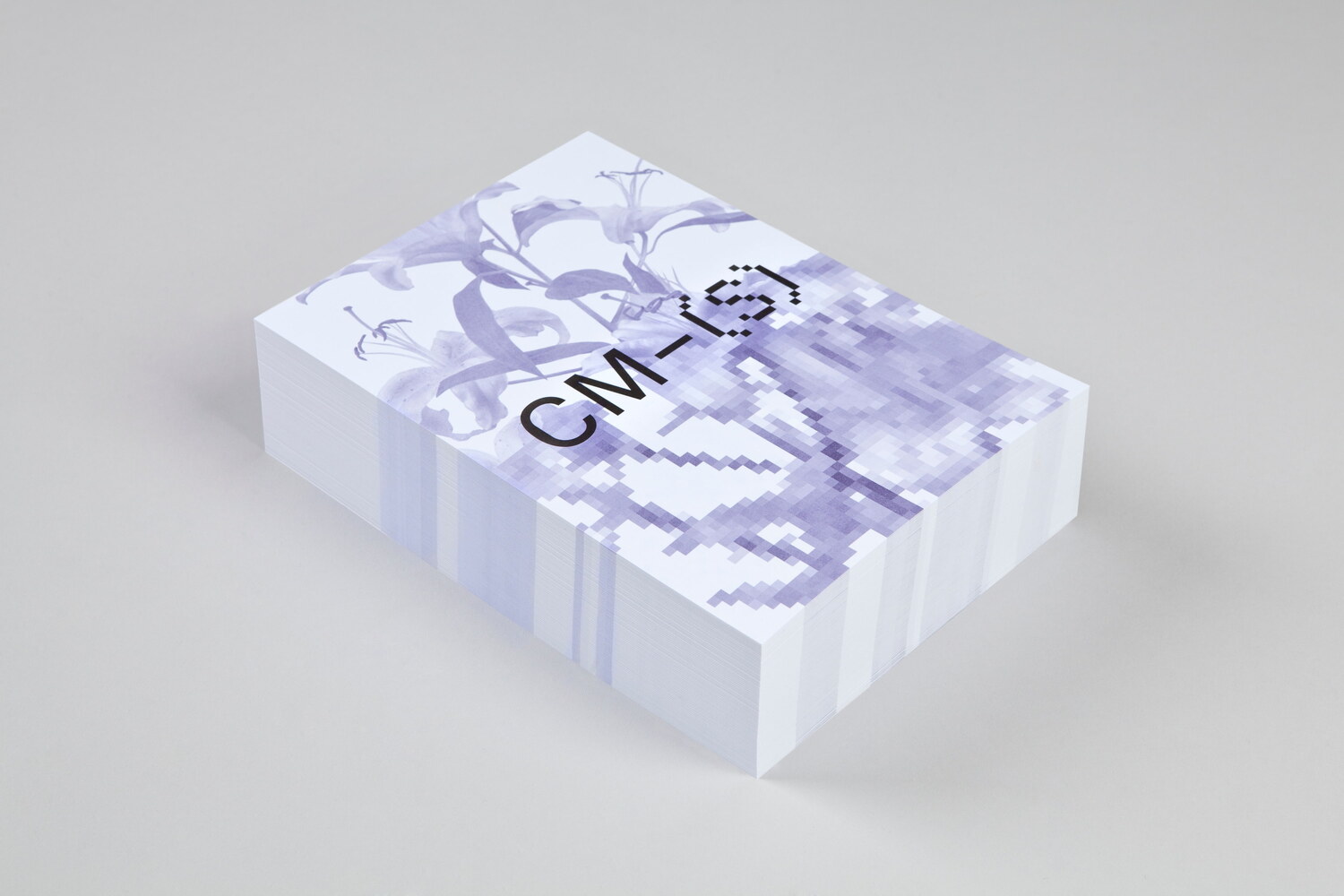
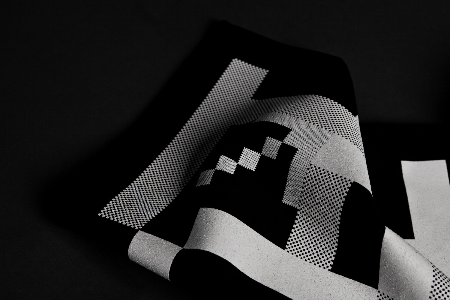
For the design of the marque, we divided the name into two entities, one being the primary ‘Critical Mass’, followed by the defining ‘Studio’. Securing the shorter domain, cm-studio.co.uk, also helped inform the design of the marque. Aiming to illustrate the studio’s way of building experiences by combining architecture and digital technology, we combined traditionally rendered latin characters and their pixelated counterparts.
“For more than two decades, typography and screen technology have not been dissociated. While the impact of the screen on the design has remained an ongoing issue for designers, Nicolas Eigenheer capitalized on the limitation of the pixel to research how technological parameters could create new forms in typography.” — An excerpt of Optimo’s description of the typeface PX Grotesk, which was used in the visual identity.
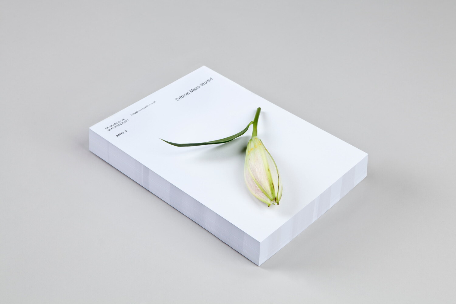
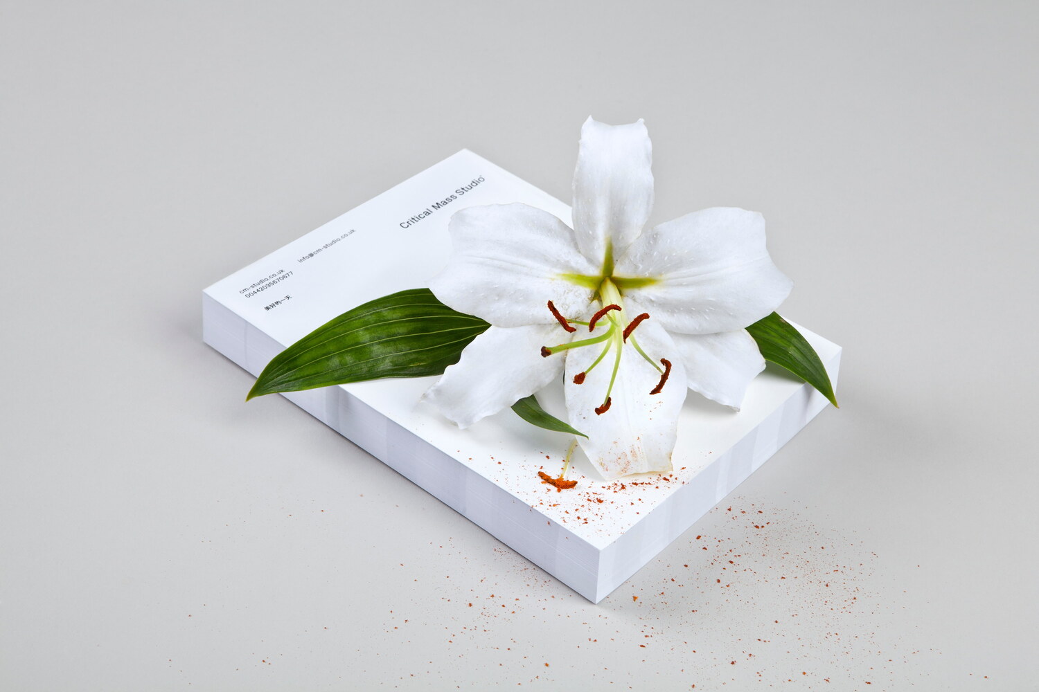
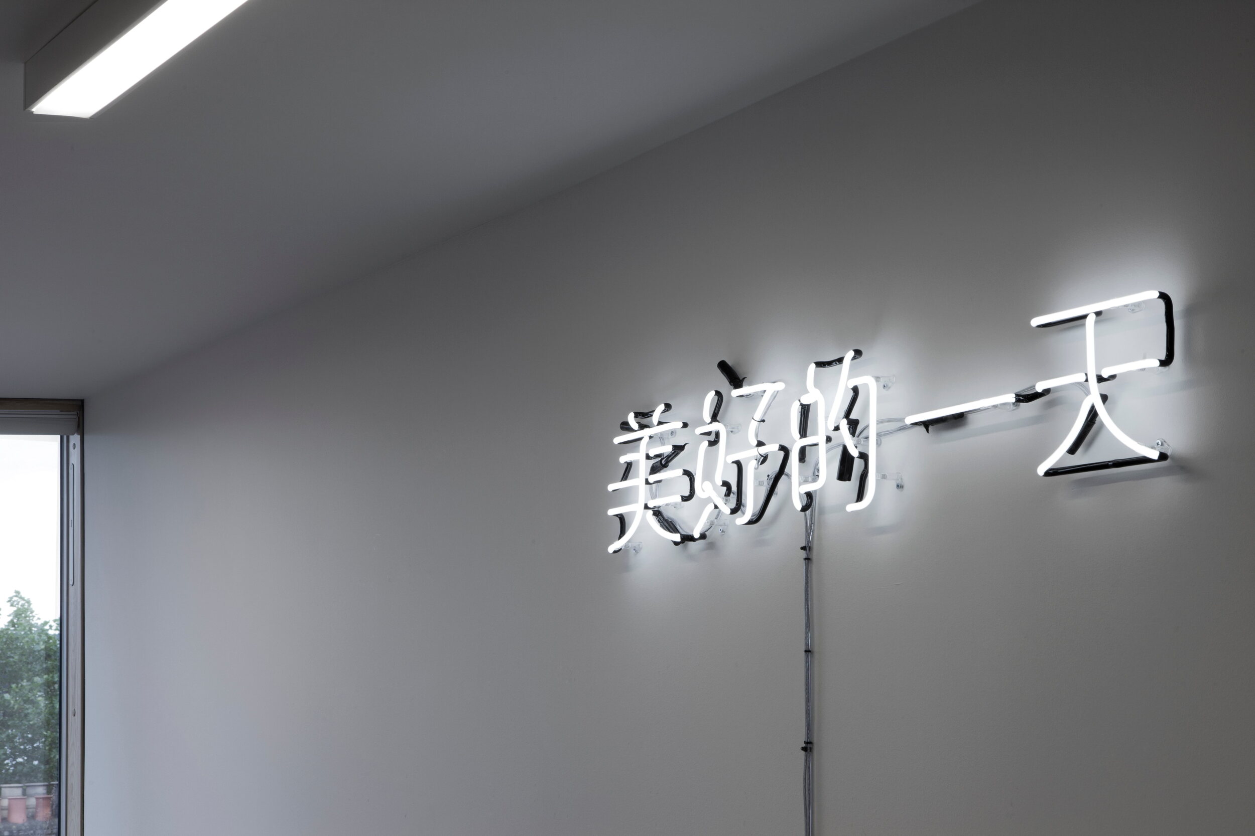
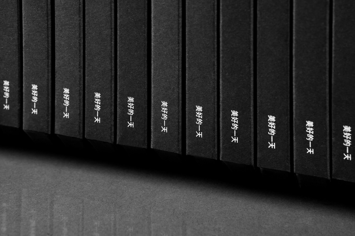
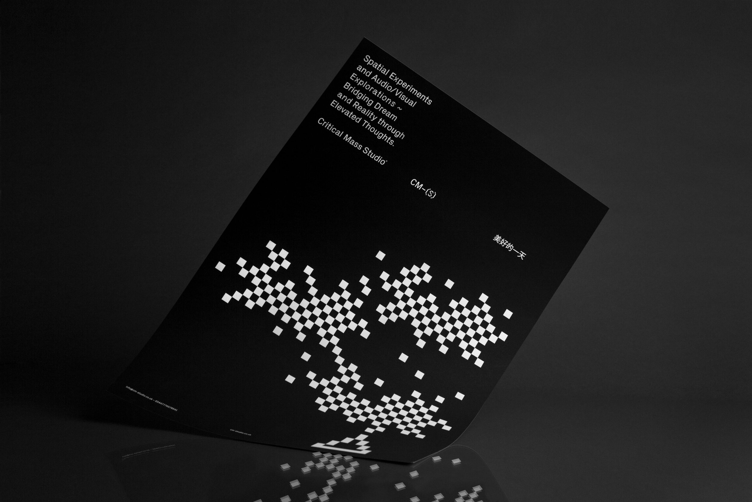
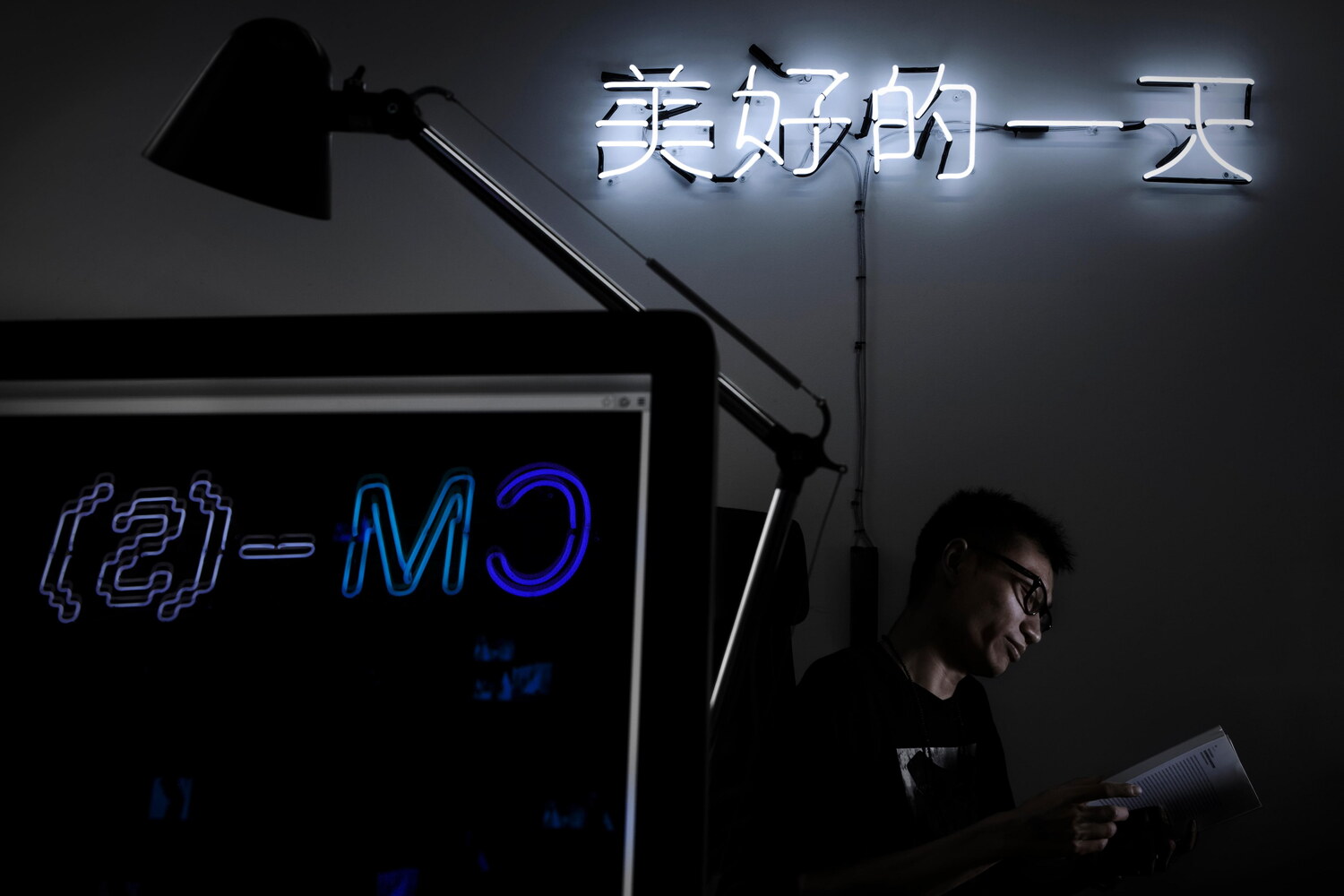
A greeting – ‘have a wonderful day’, was translated into Chinese using Google Translate, resulting in a somewhat boxy sounding 美好的一天, verbally reminiscent of the voice of an artificial intelligence trying to communicate with a human being. This greeting was used throughout the identity to further emphasize the meeting of physical and digital and to tie the identity to the Chinese heritage of the studio’s members.
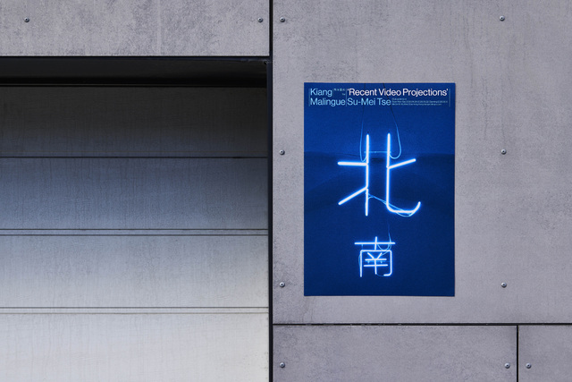
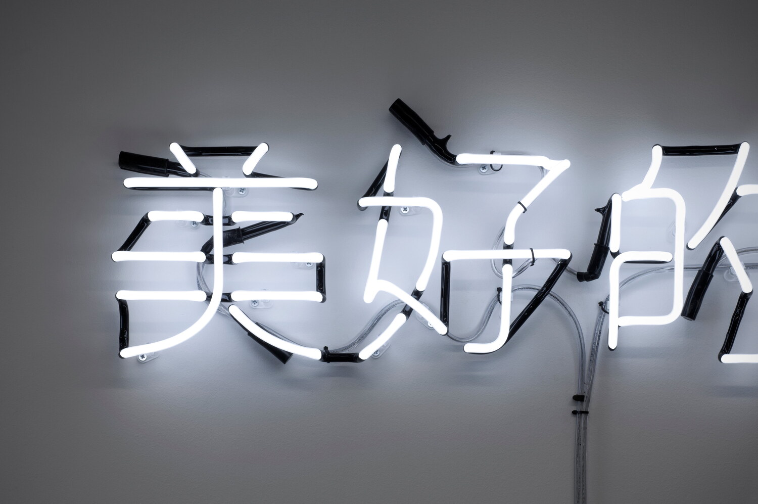
For the colour scheme, we were inspired by the peripheral pale reflections of distant neon lights in the urban landscape. As a part of the project, we also designed two neon signs for CM-S’ London office (photographed on site by Shaun Bloodworth).
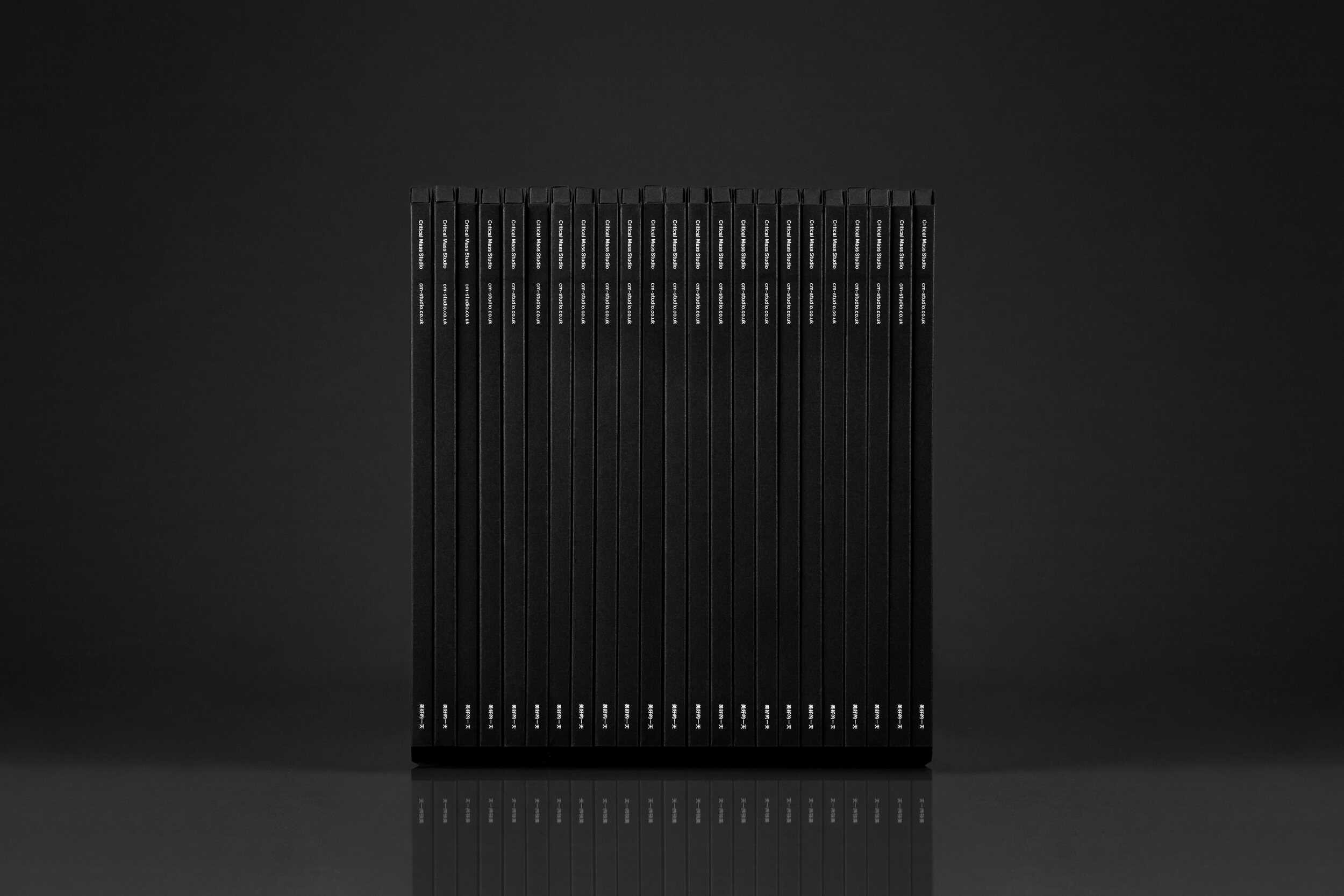
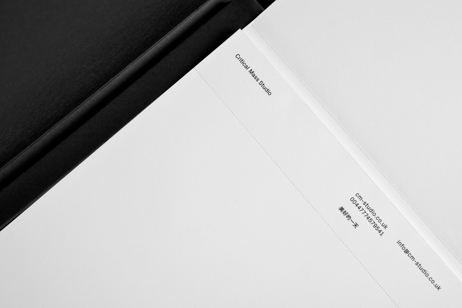
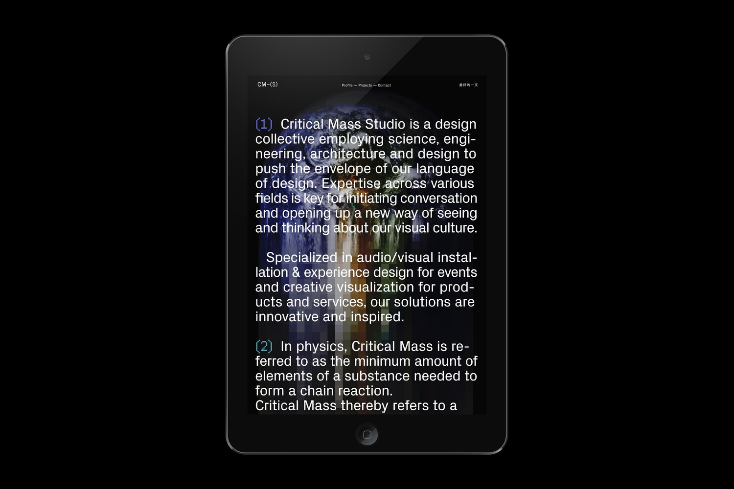
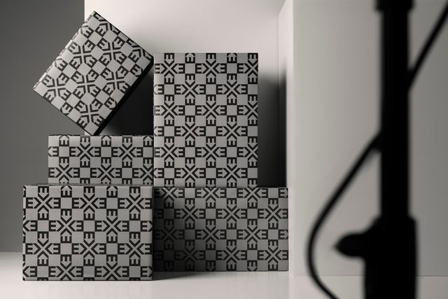
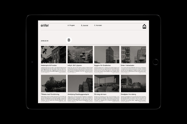
Following the design of the visual identity, we were commissioned to design and develop a simple website, along with a range of branded collateral. For the collateral, we wanted to complement the lightness of the studio’s stationery with a darker counterpart. In a way, this can be seen as an illustration of the studio’s weekly routines with long days at the office followed by the nightly events they produce for their clients.
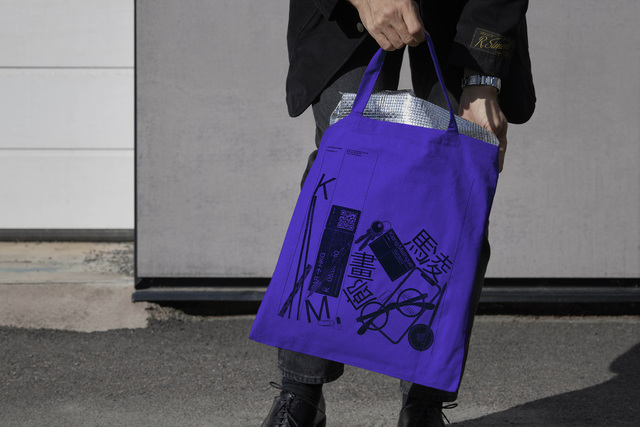
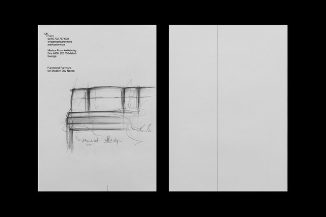
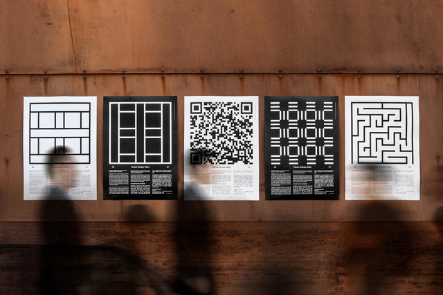
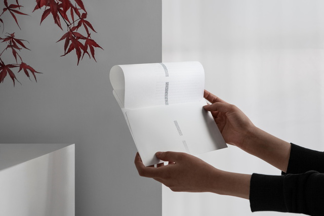
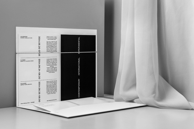
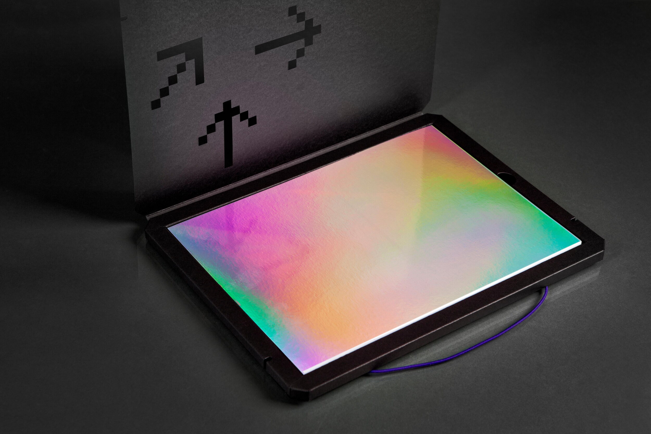
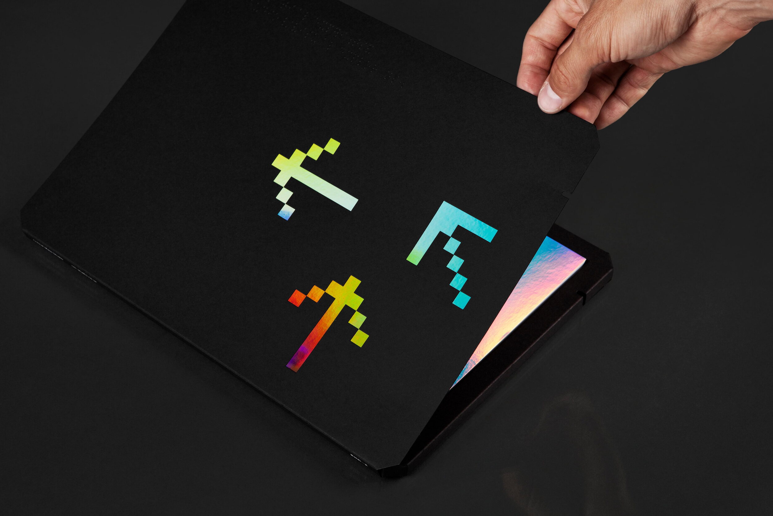
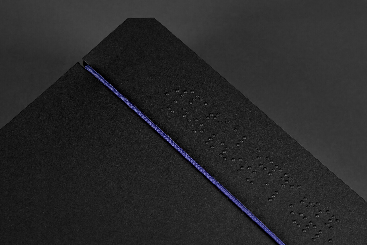
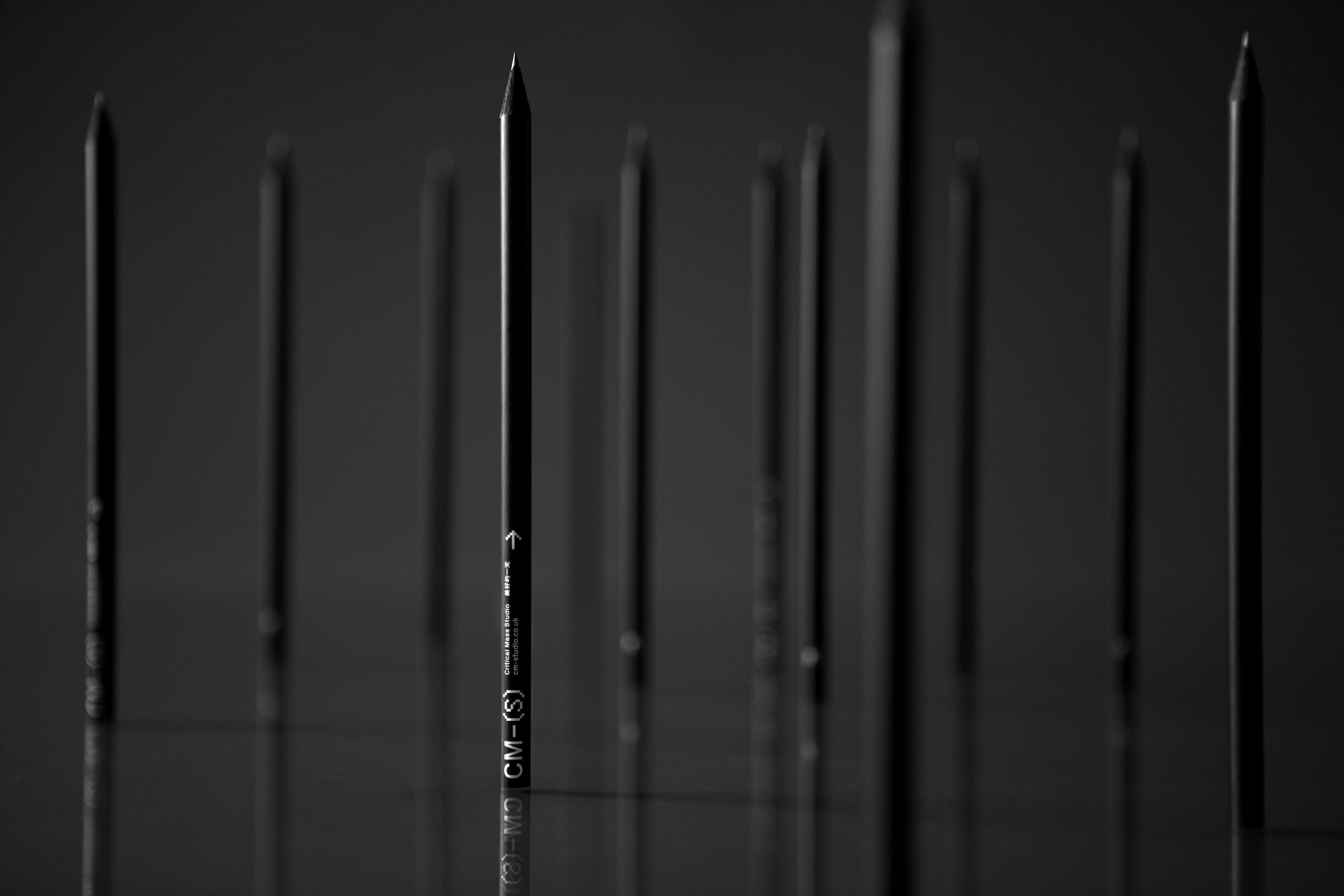
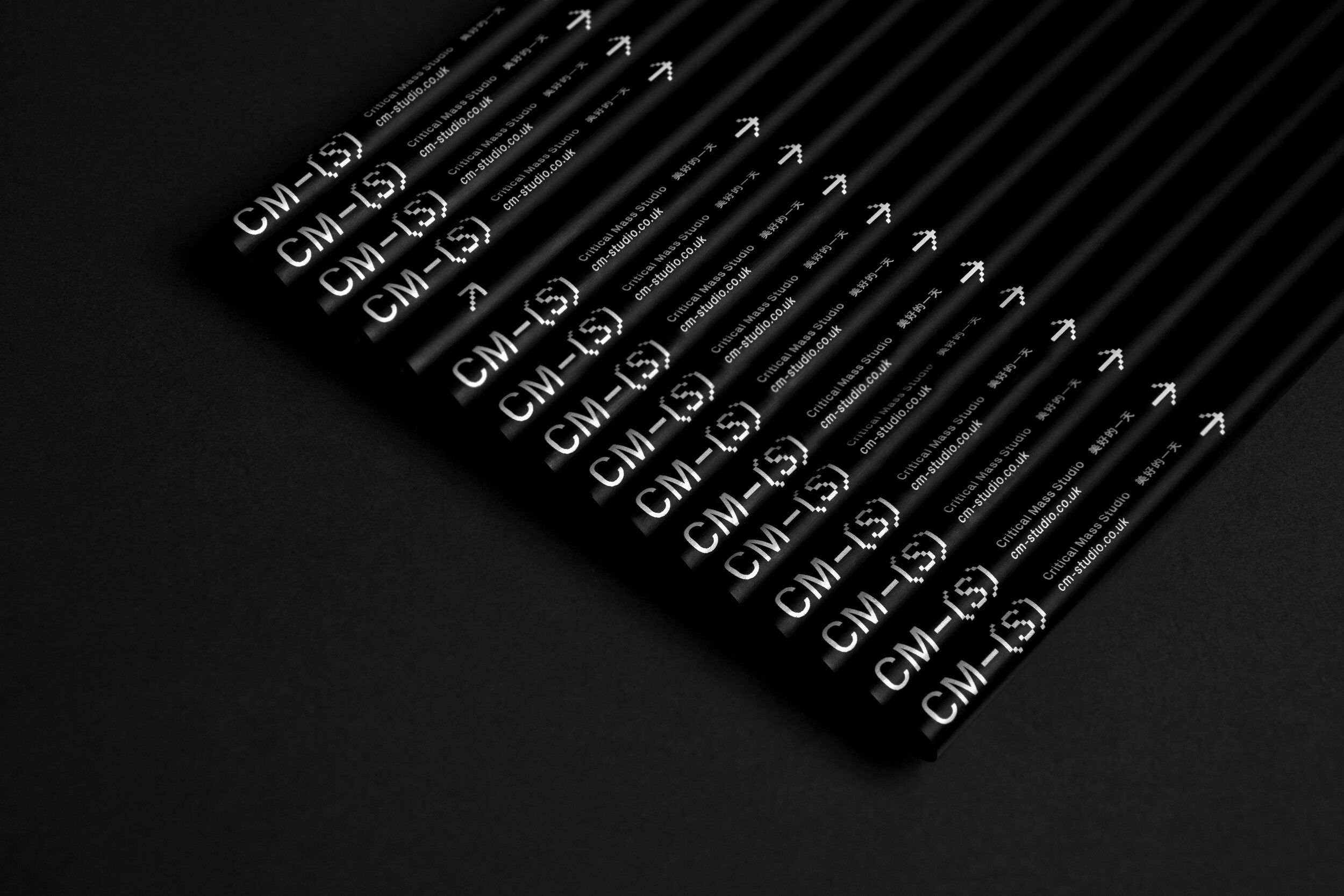
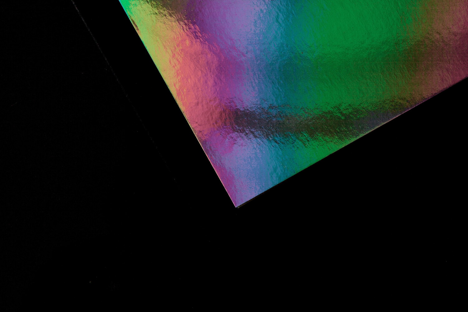
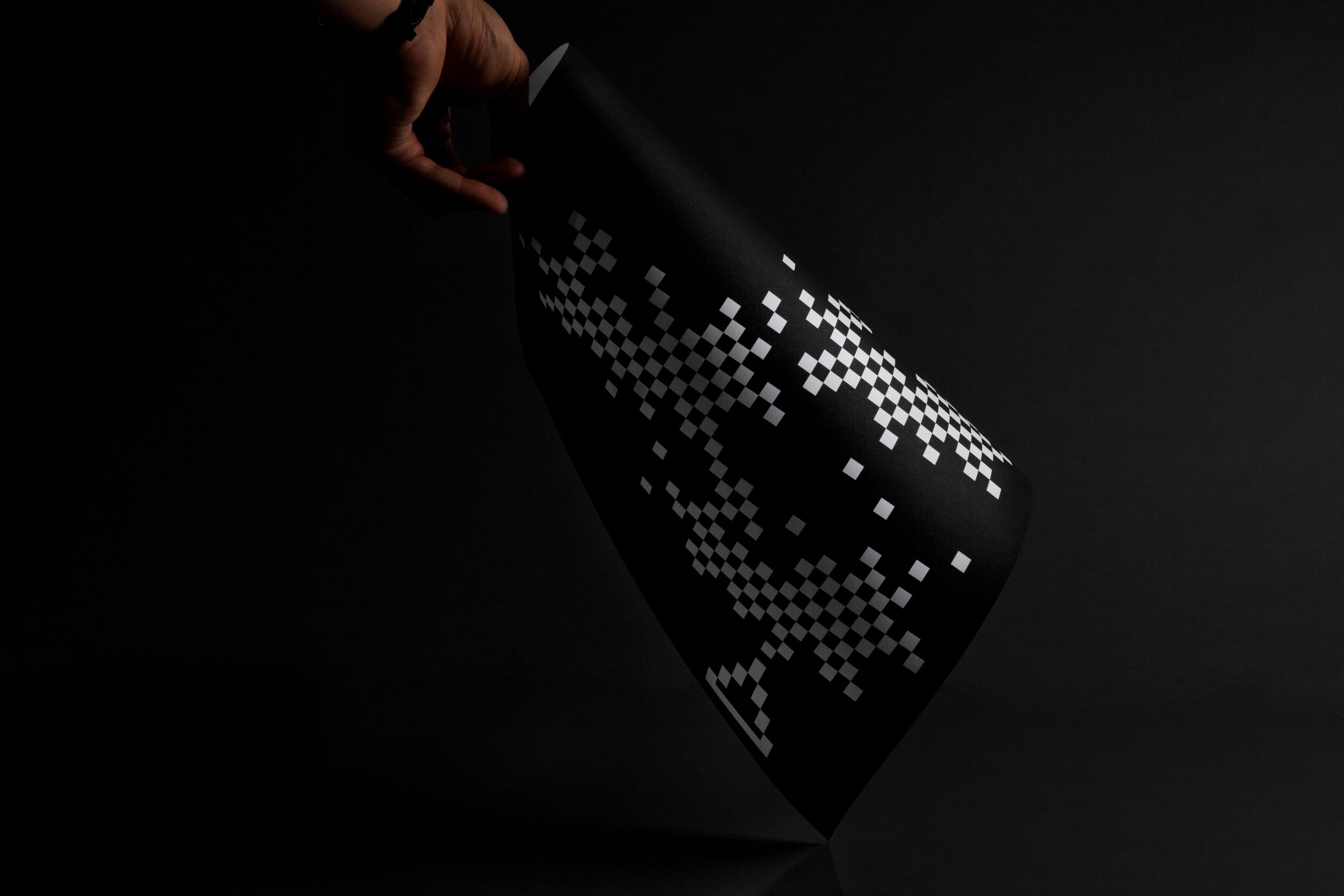
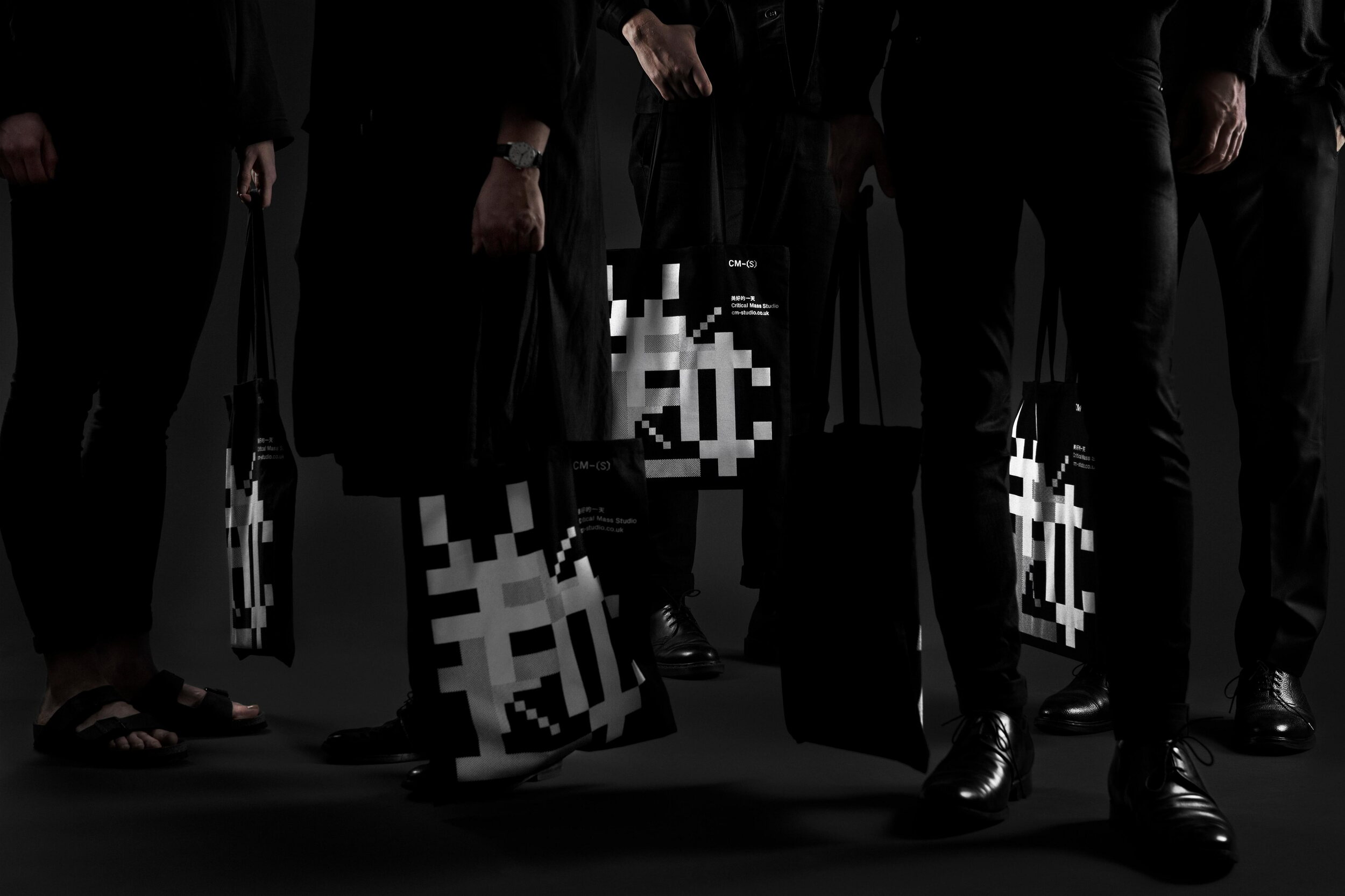
The full range of items includes a tote bag - titled ‘The Money Bag’ – which combines different sized pixels to depict the symbols for a number of different currencies, black bespoke pencils, a give-away poster and a document holder with sketch pad. The document holder, quite complex in its construction and finishing featuring die-cuts, a screen printed spine and braille embossing, holds a sketchblock with a holographic Mirri Board cover and perforated paper sheets.