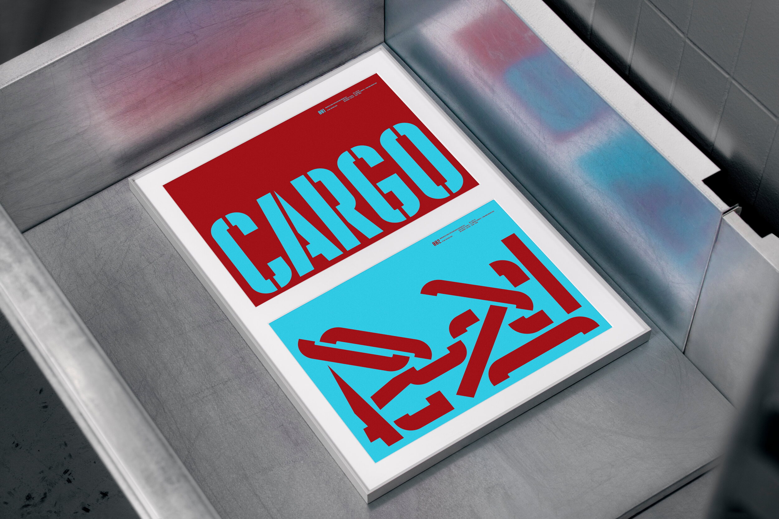
The Italian type foundry Think Work Observe (now Formula Type) invited Lundgren+Lindqvist to design a promotional poster for their typeface Kane Display.
Whereas the typeface was originally inspired by woodblock posters of Citizen Kane by Orson Welles, and, in the case of the stencil version, by the work of conceptual artists Christopher Wool and Lawrence Weiner, it immediately brought other associations to our minds. The Lundgren+Lindqvist studio faces Gothenburg’s harbour front, and every day we watch giant ships come in to unload their cargo.
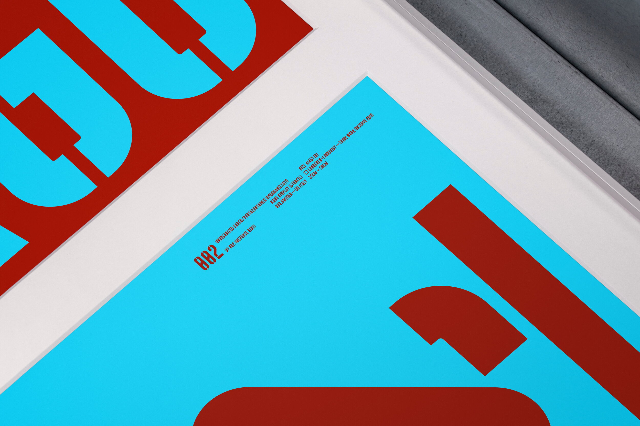
We only see the containers, and never what they hold, which invites to constant speculation on their contents. Some of them likely contain food, electronics and cars, while others may hold drugs or weapons. The ships and their cargo always feature bold colours and graphics, making use of typefaces not very different from Kane Display. Consequently, for the design of the poster, we chose to set the word CARGO on the front, using Kane Display Stencil. En verso, we scrambled the parts making up the letterforms – much like how the once ordered insides of a cargo container might look after a rough journey across the ocean.
The fine print is also stylistically attuned to the type of industrial signage that you see on cargo containers and the colours are set to match those of one of the world’s largest cargo ships from Maersk, which docks in the Gothenburg harbour a few times each month.