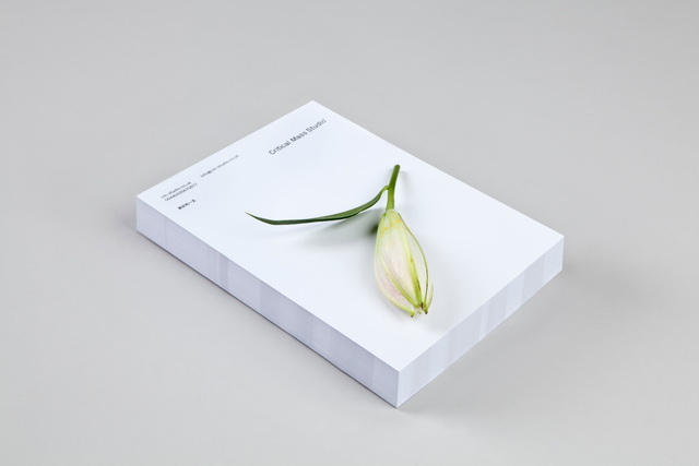
Roger Burkhard is a creative web development studio based in Bern, Switzerland’s de facto capital, or Bundesstadt. With a roster of clients in the creative industries, the studio turned to Lundgren+Lindqvist for a complete redesign of their visual identity, stationery and website.
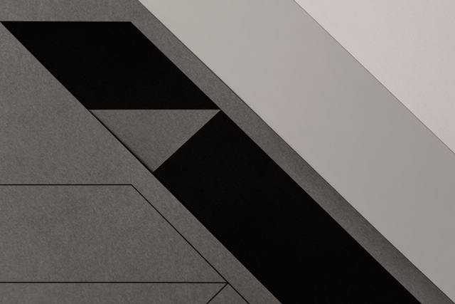
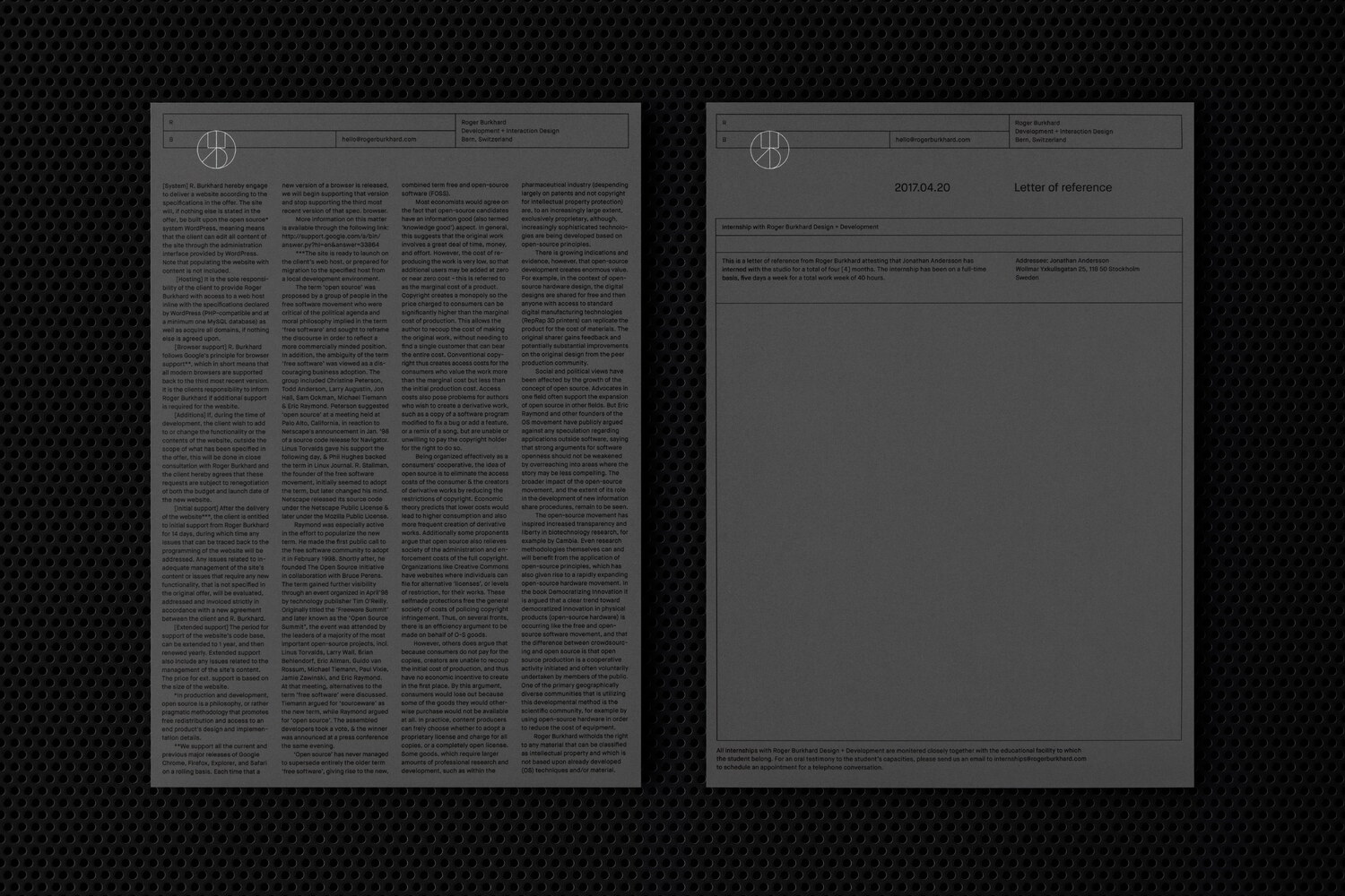
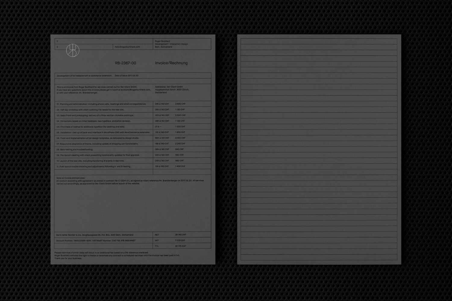
The new visual identity is built around a modular system with a baseline grid constituting its smallest visual component. In addition to providing the underlying structure applied to documents and pages on the website, the grid is also visualised in a modular header that is used throughout the identity. The header holds key contact details and can be seen as an extension of the brand marque. Alluding to the lines of code constituting the precise systems that are characteristic of the studio’s builds, the visual identity aims to marry form with function. The dynamic system is highly flexible and extends horizontally to fit any format, with a set height for each module allowing for a coherence throughout the identity.
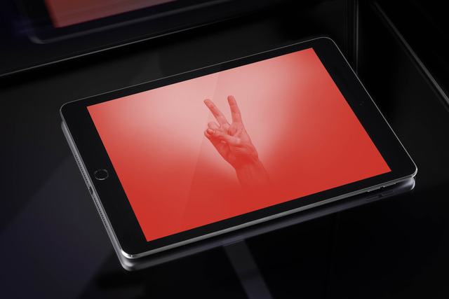
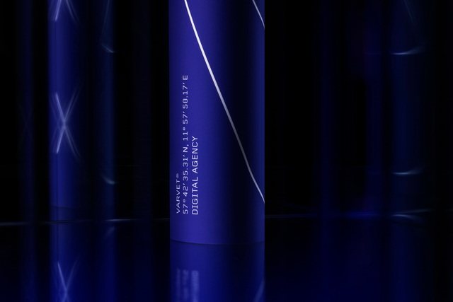
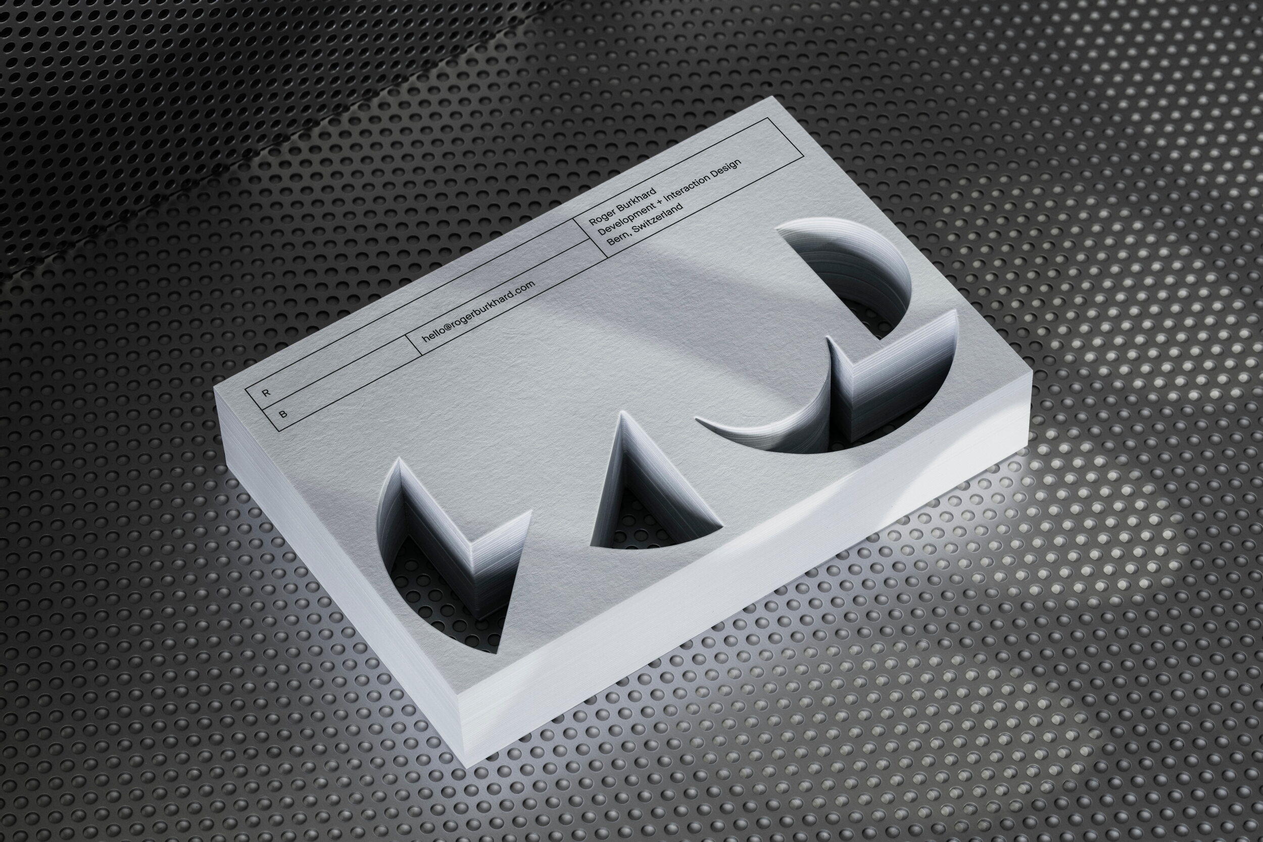
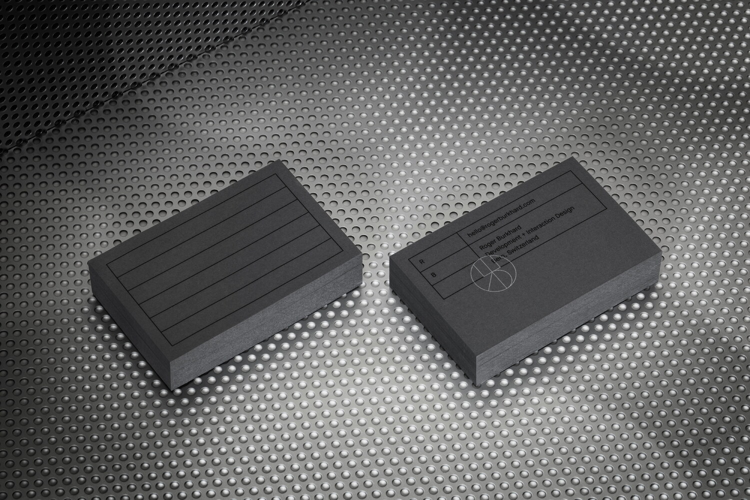
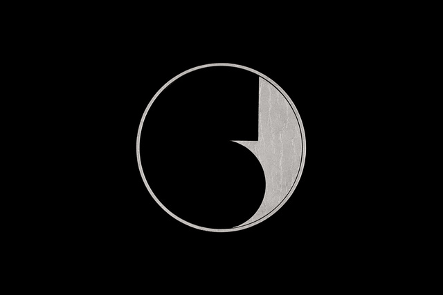
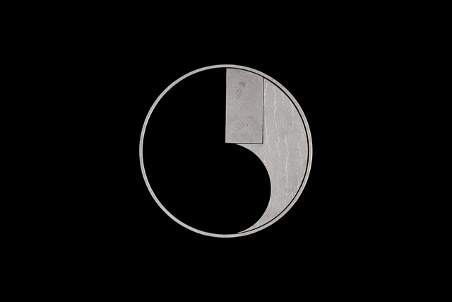
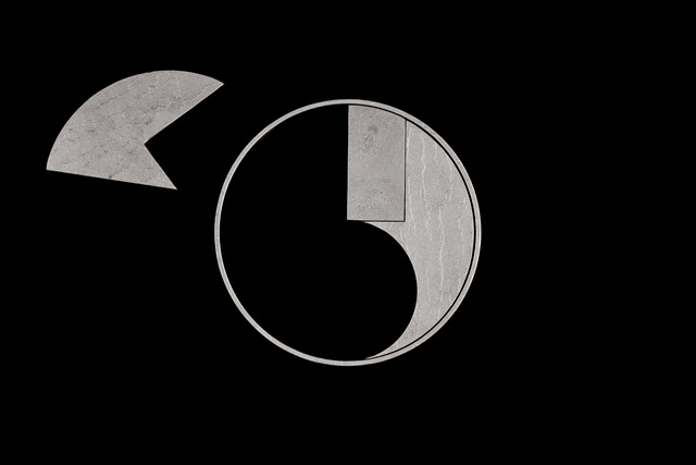
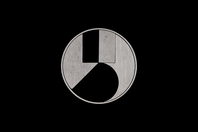
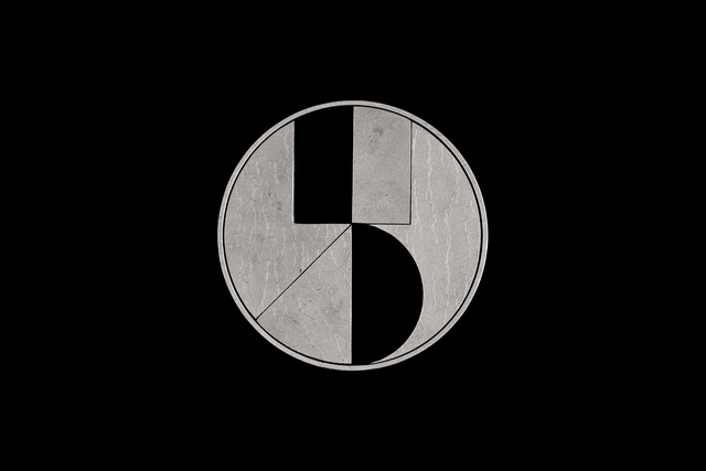
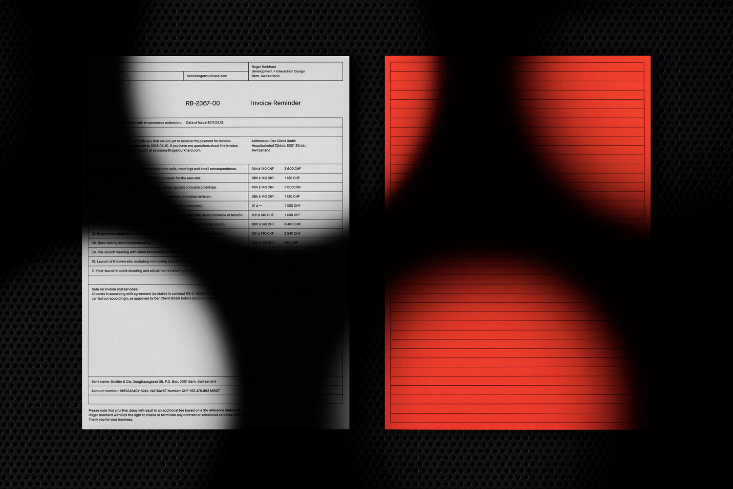
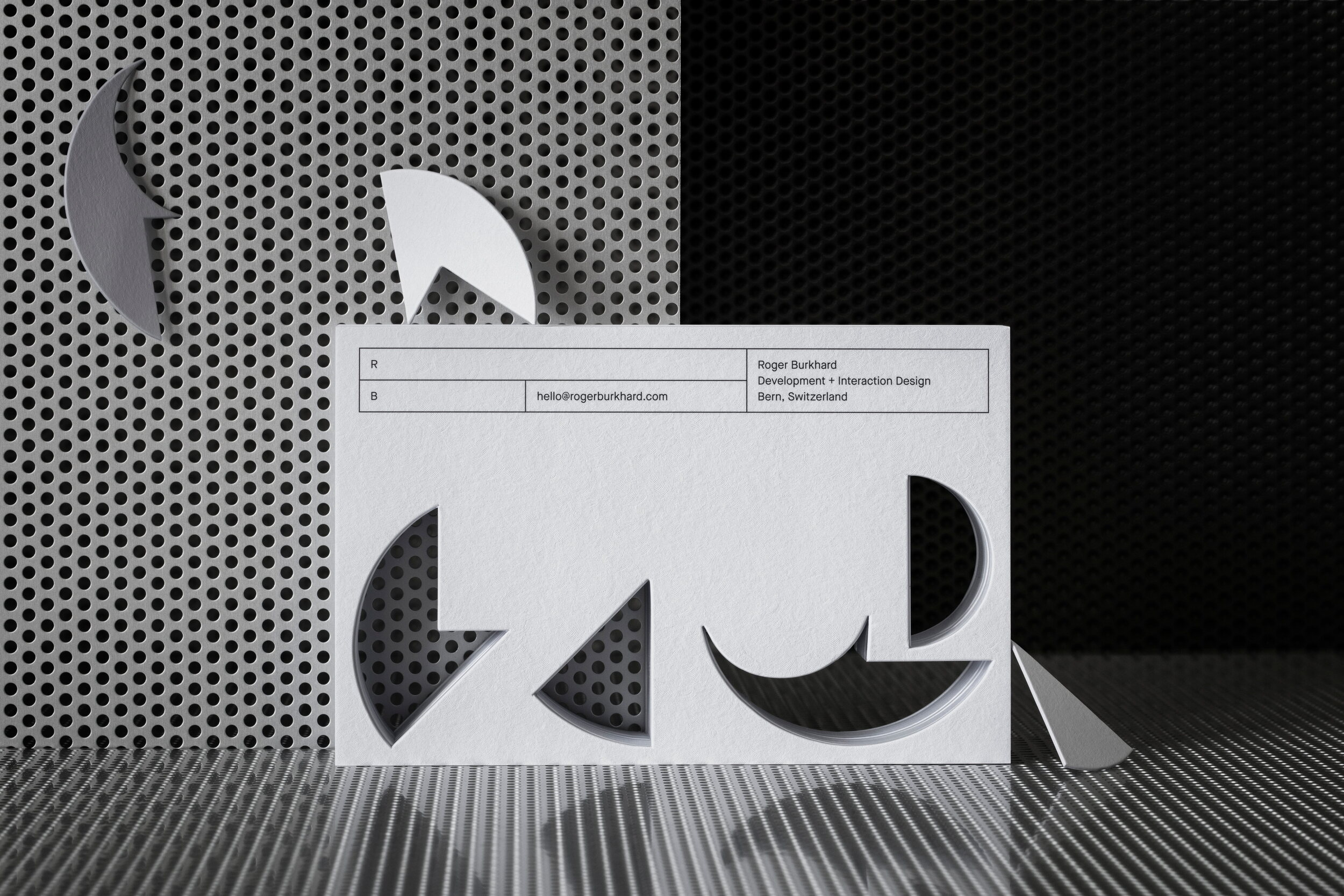
A monogram, featuring a reversed capital ‘R’ (for Roger), conjoined with a capital ‘B’ (for Burkhard), was designed. The monogram’s thin lines are accentuated by a silver spot colour on the dark grey paper used for the stationery. The paper, titled Graphite and made by the Italian paper manufacturer Favini, has a very special texture and its surface reacts to light in a curious way, obscuring the print when the light hits it from a certain angle. The main paper stock is complemented by a lighter shade from the same paper series, titled Chalk. This is used for the Invoice Reminders, which were printed with a fluorescent orange spot colour for a tongue-in-cheek shock effect. For the die-cut promotional cards, Damask textured Frost White Colorplan from GFSmith was used. The card, with its visual puzzle of four windows (deriving from the negative spaces of the brand marque), aims to illustrate the multilayered nature of the studio’s work. While a visitor of one of the studio’s builds will only see the front-end, there is always a hidden, rich layer of code making everything look and function the way it’s supposed to. This rationale also influenced the documentation of the project. It also alludes to the fact that a developer’s job is often about connecting the dots, using equal portions of logic and creativity.
With clients mainly within the creative industries, more specifically graphic designers and design studios, the overall identity and stationery was designed to appeal to the refined taste of said group. By consciously avoiding the standard praxis among developers of communicating and sending documents mainly by digital means, Roger Burkhard show that they are a design driven development studio who are not only capable of comprehending the full extent of a visual identity, but who also approach their builds with the same focus on craft that many of their clients employ when working on printed pieces. For many designers, this 360° perspective is key when choosing a development partner. All the printed pieces were produced by Göteborgstryckeriet.
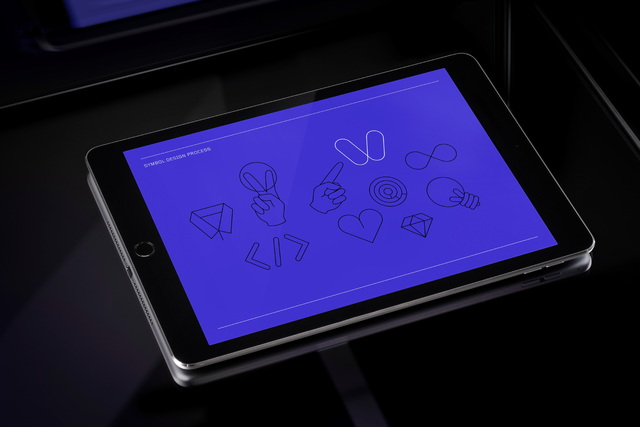
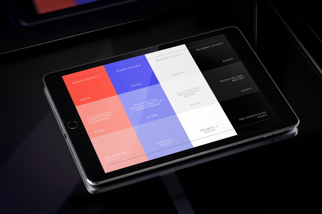
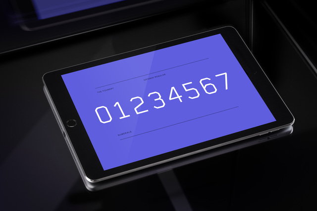
The visual identity is presented in a comprehensive identity guidelines manual, making it easy for the studio to expand it with additional printed or digital items.
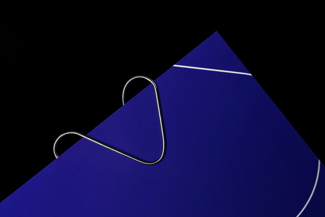
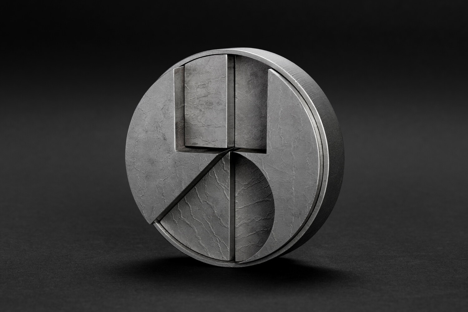
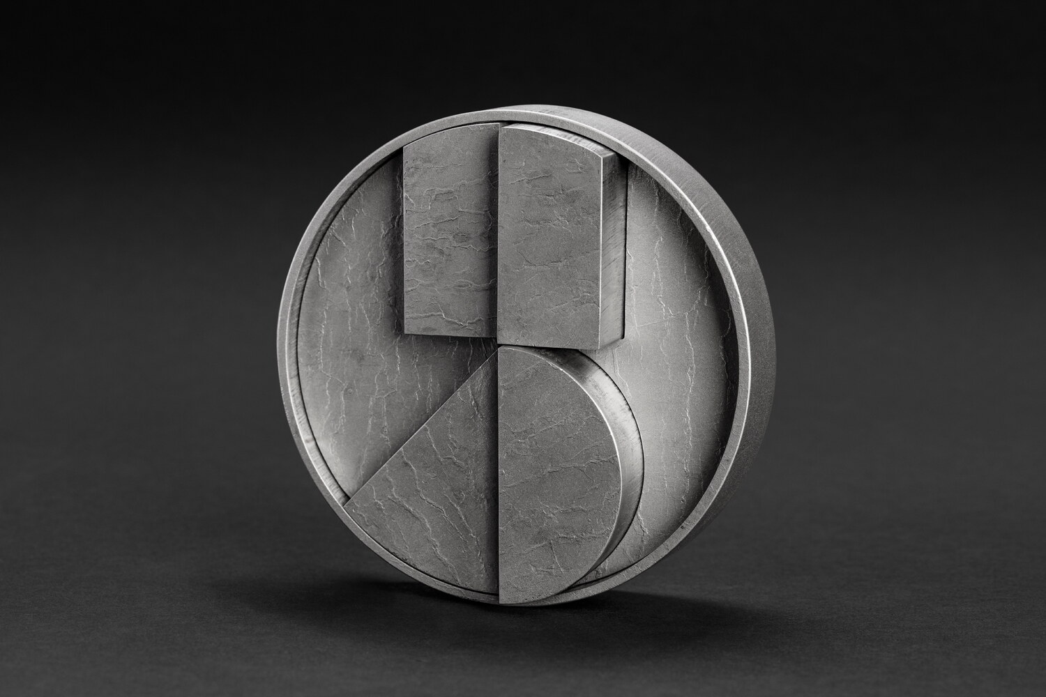
In addition to the printed pieces, we also designed a one-off table sculpture in water-cut and treated steel. The sculpture, which sides as a paperweight, features seven parts held together by friction and is based on the RB Monogram.
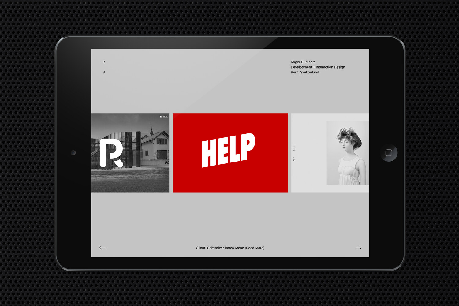
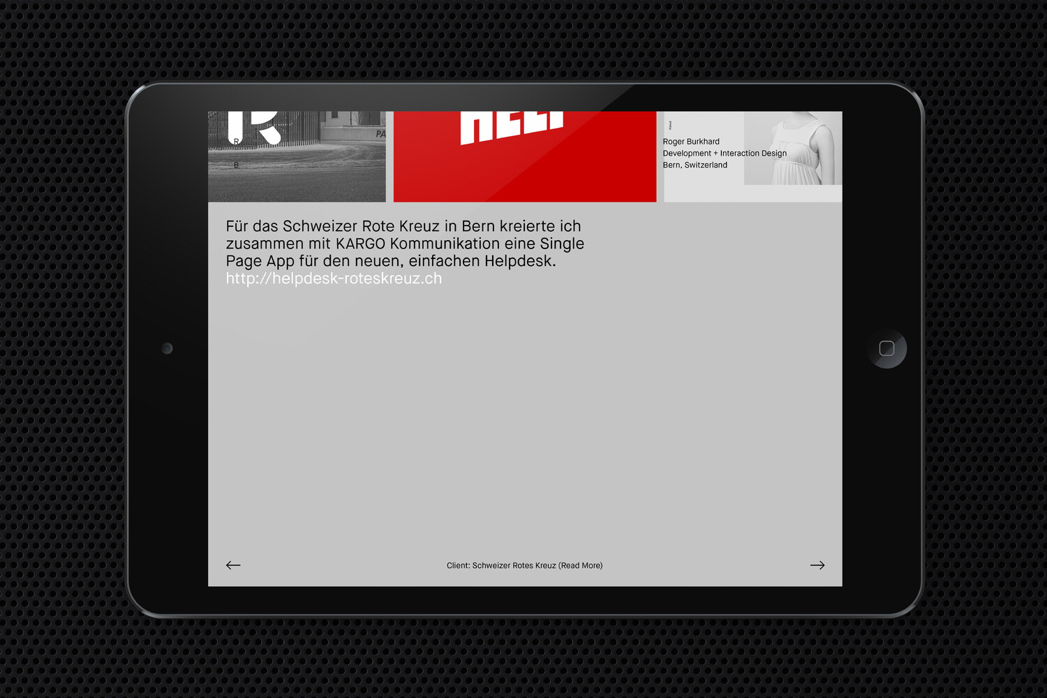
For the website, showcasing the development studio’s work, we worked in close collaboration with the studio’s founder and designed a simple yet effective site.