Next to the Ocean is the title of an exhibition with the students from the Valand Academy’s Photography Programmes. The exhibition, which was held at Röda Sten Konsthall in Gothenburg, was the first to feature both the BFA, MFA and research programmes, including a total of 23 students. The photographic education at Valand Academy is Sweden’s only complete milieu, ranging from undergraduate and postgraduate education to artistic research.
“The exhibition gives an overview of what is happening in young contemporary photography in Sweden. Using different modes of expressions, the width of the exhibition reflects concerns and interests of photographers today.” (Excerpt from Röda Sten Konsthall’s text about the exhibition)
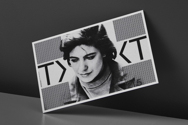
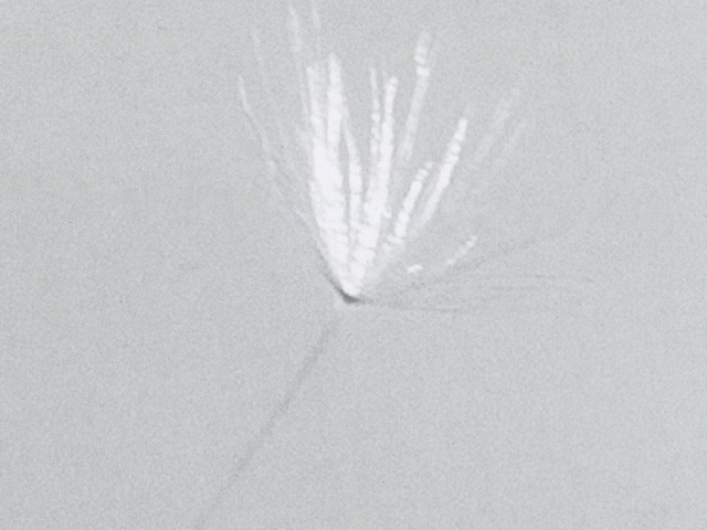
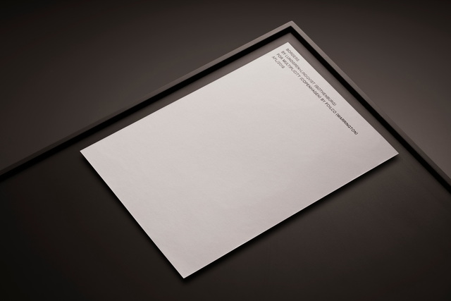
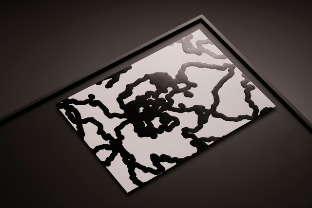
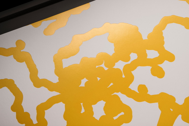
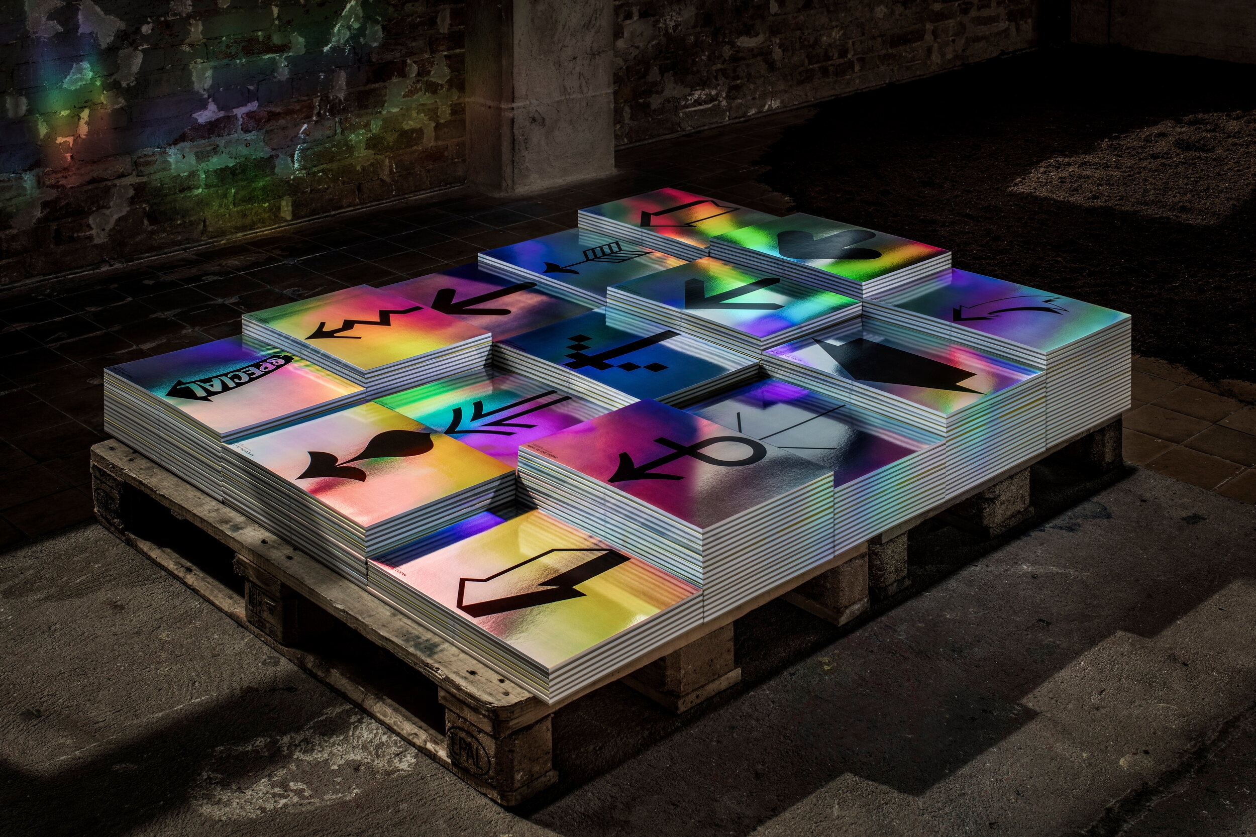
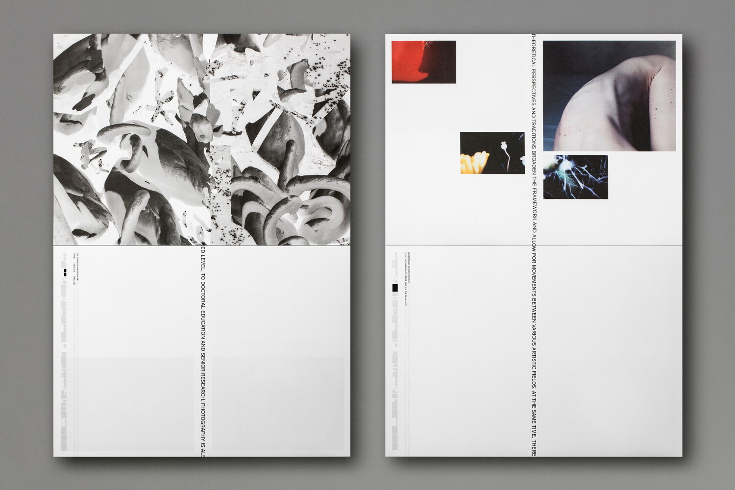
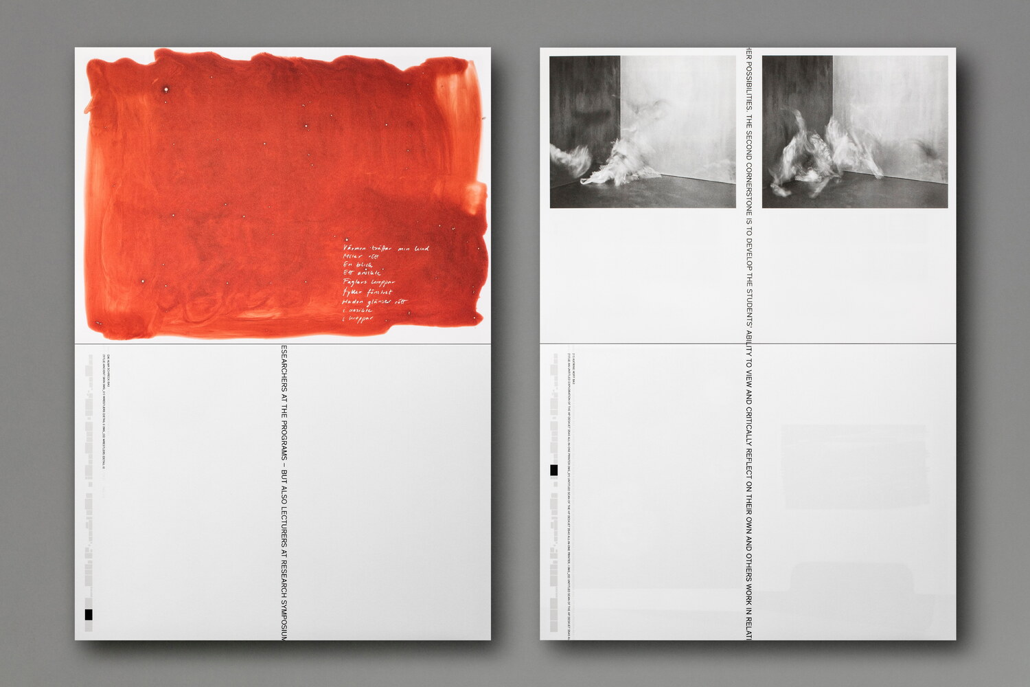
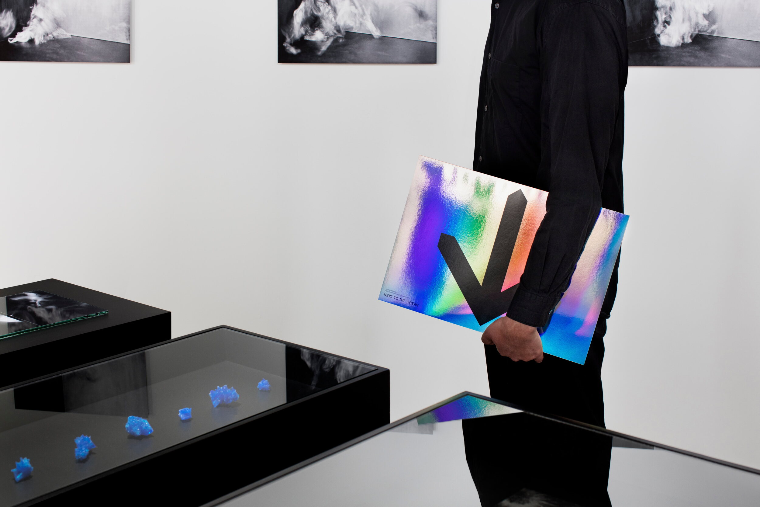
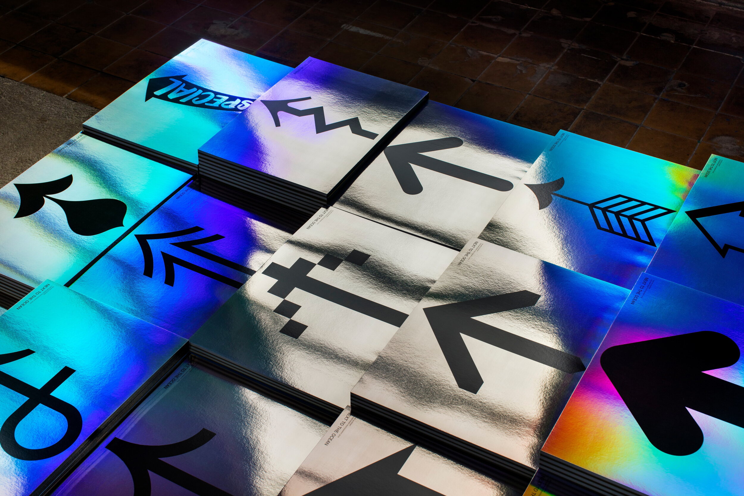
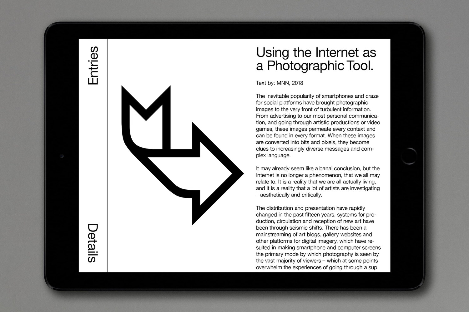
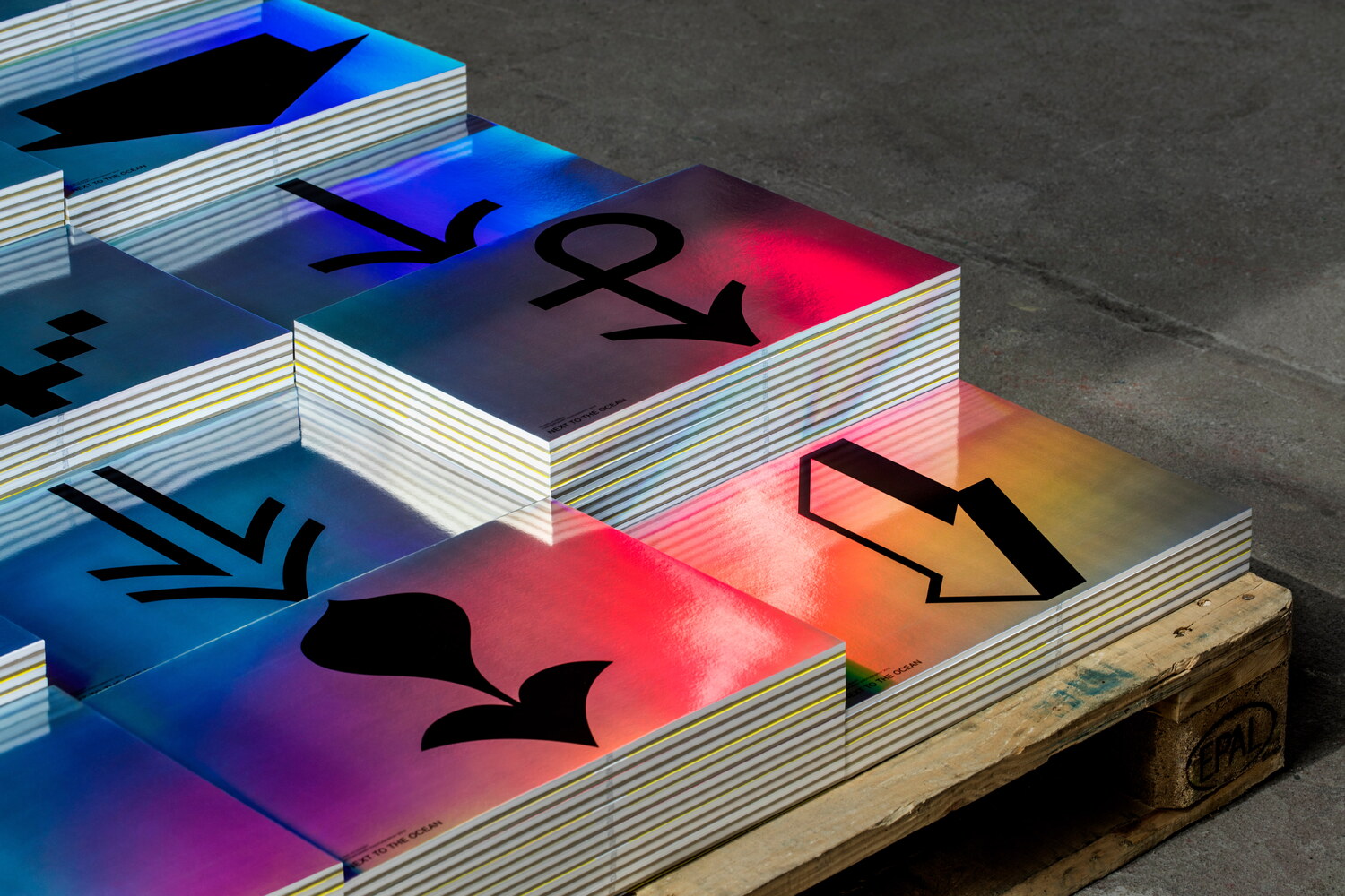
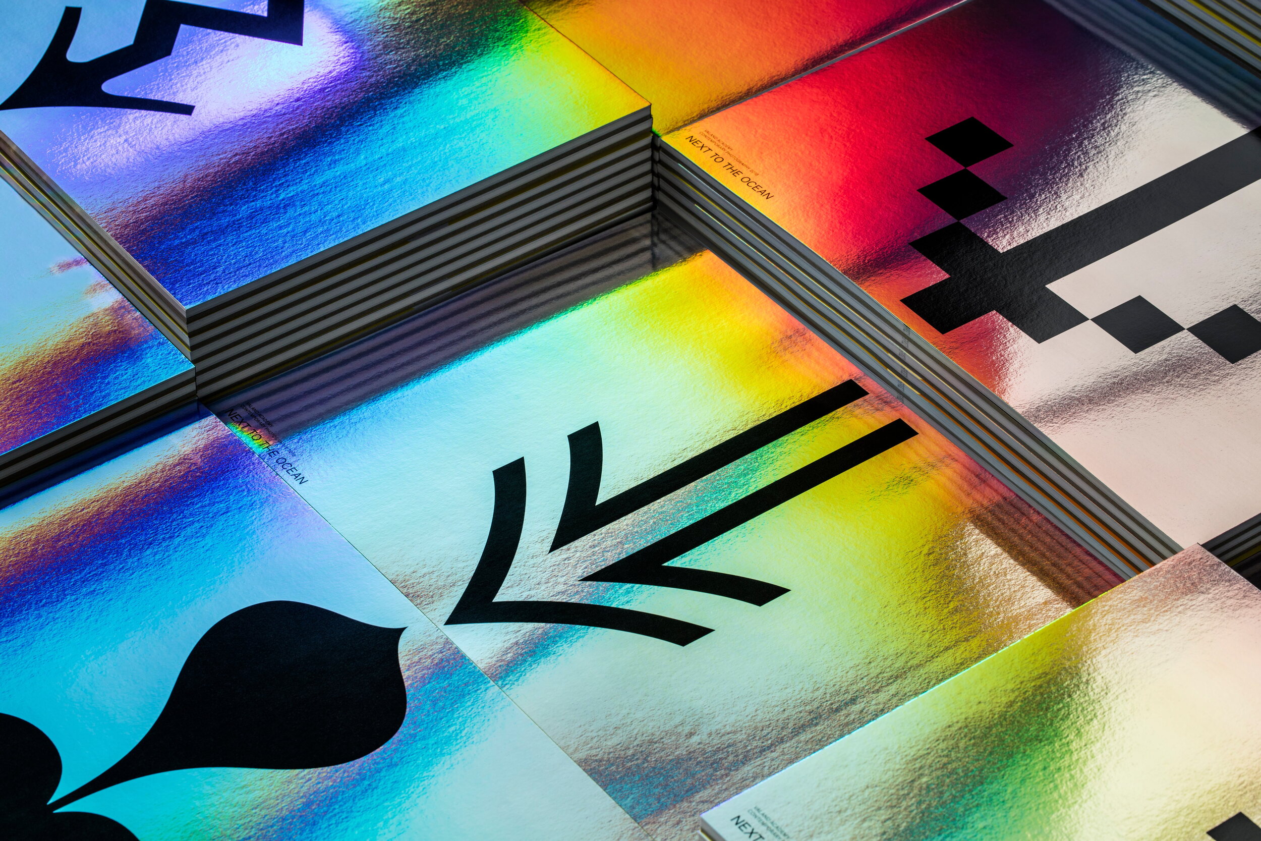
The Valand Academy approached Lundgren+Lindqvist to design the catalogue and visual identity of the exhibition. The catalogue is built around the students’ projects, and an essay by writer and curator Niclas Östlind. The design of the catalogue was based around the idea of direction, building on to the title of the exhibition, which points out the location of the exhibition venue. Rather than focusing on the physical space, we focused on the notion of the exhibition and catalogue functioning as vehicles for communicating ideas about new directions in the field of contemporary photography. The arrow was used as a concrete illustration of an abstract idea. By utilising a unique arrow for each cover of the publication (resulting in a total of 350 unique publications), we propose that contemporary photography is practiced in stereo rather than mono, with a diverse and ever growing number of practitioners of different backgrounds all contributing to the richness of the field. While each student has a unique point of view and their own objective, they are both consciously and subconsciously informed by tendencies and movements in the field at large. Whereas the students’ works propose various directions in contemporary photography, the arrow also stubbornly proclaims: Look at this! Come here!
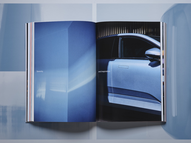
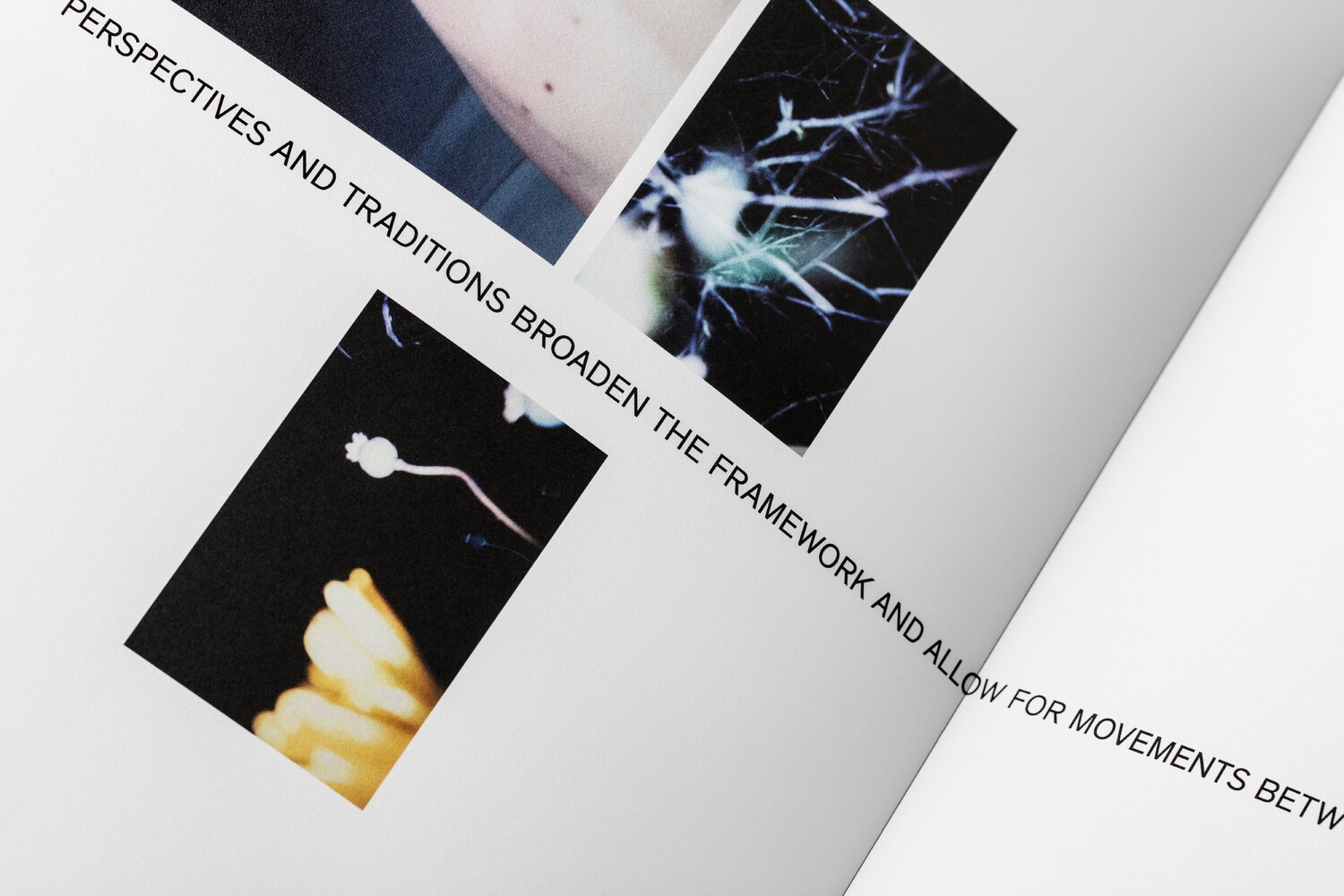
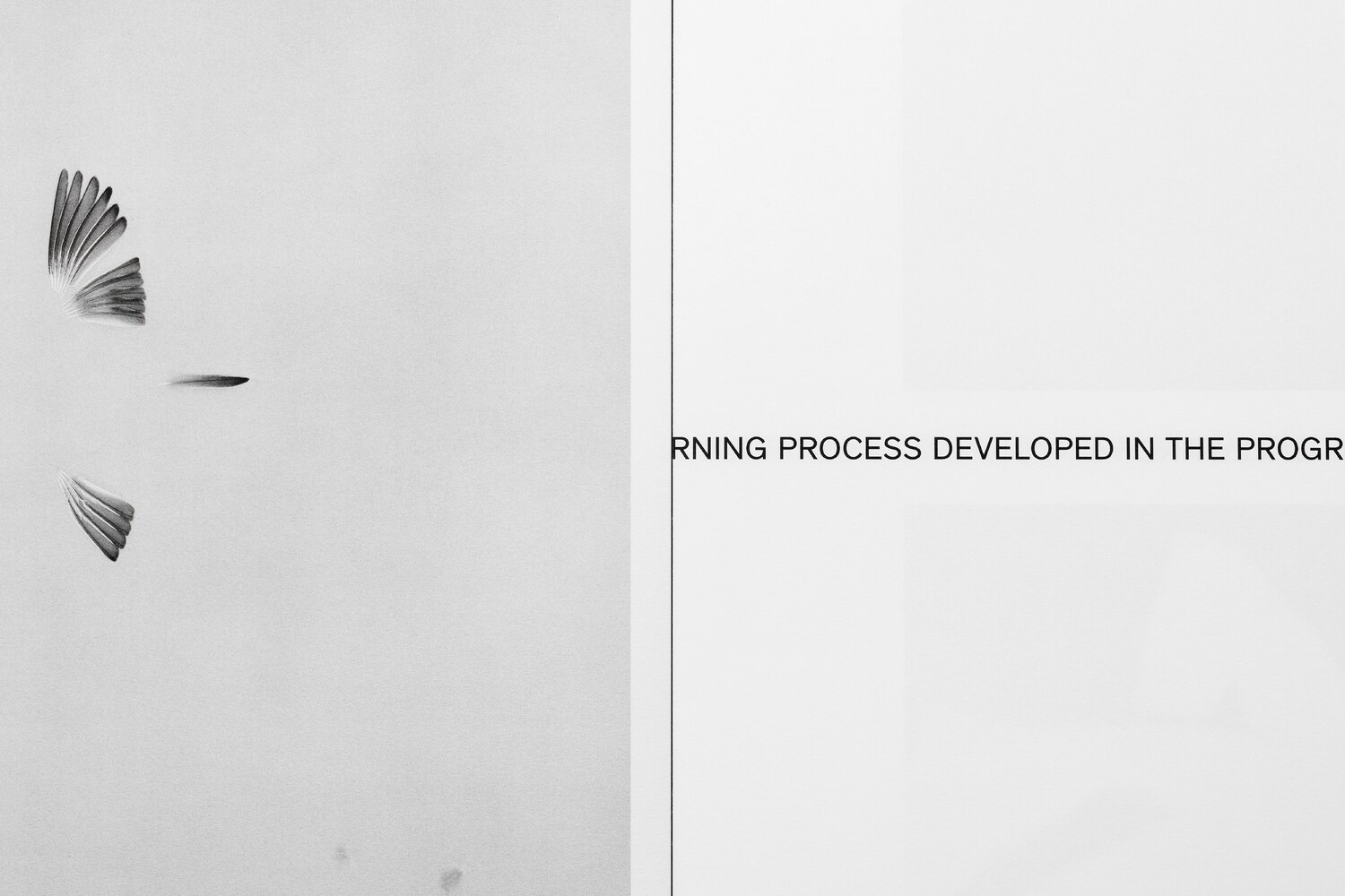
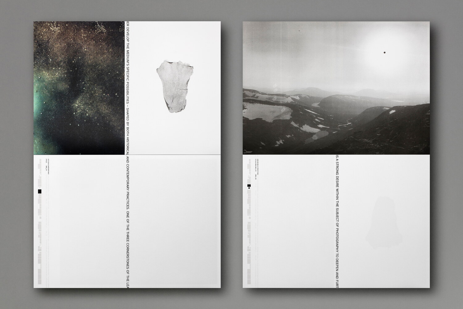
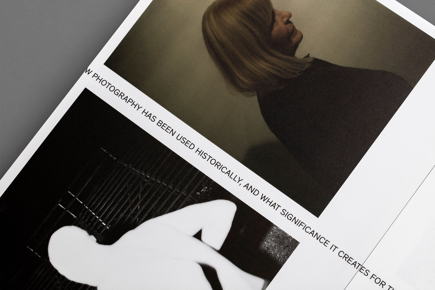
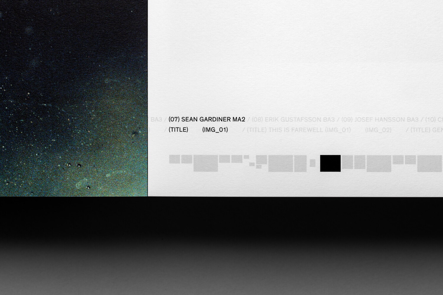
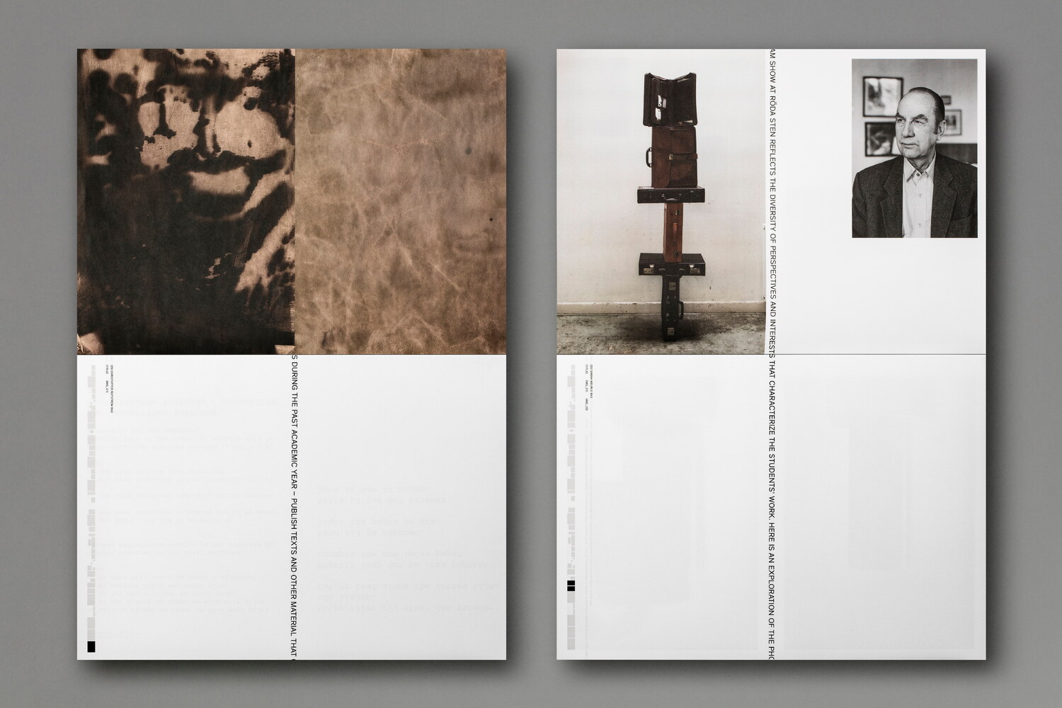
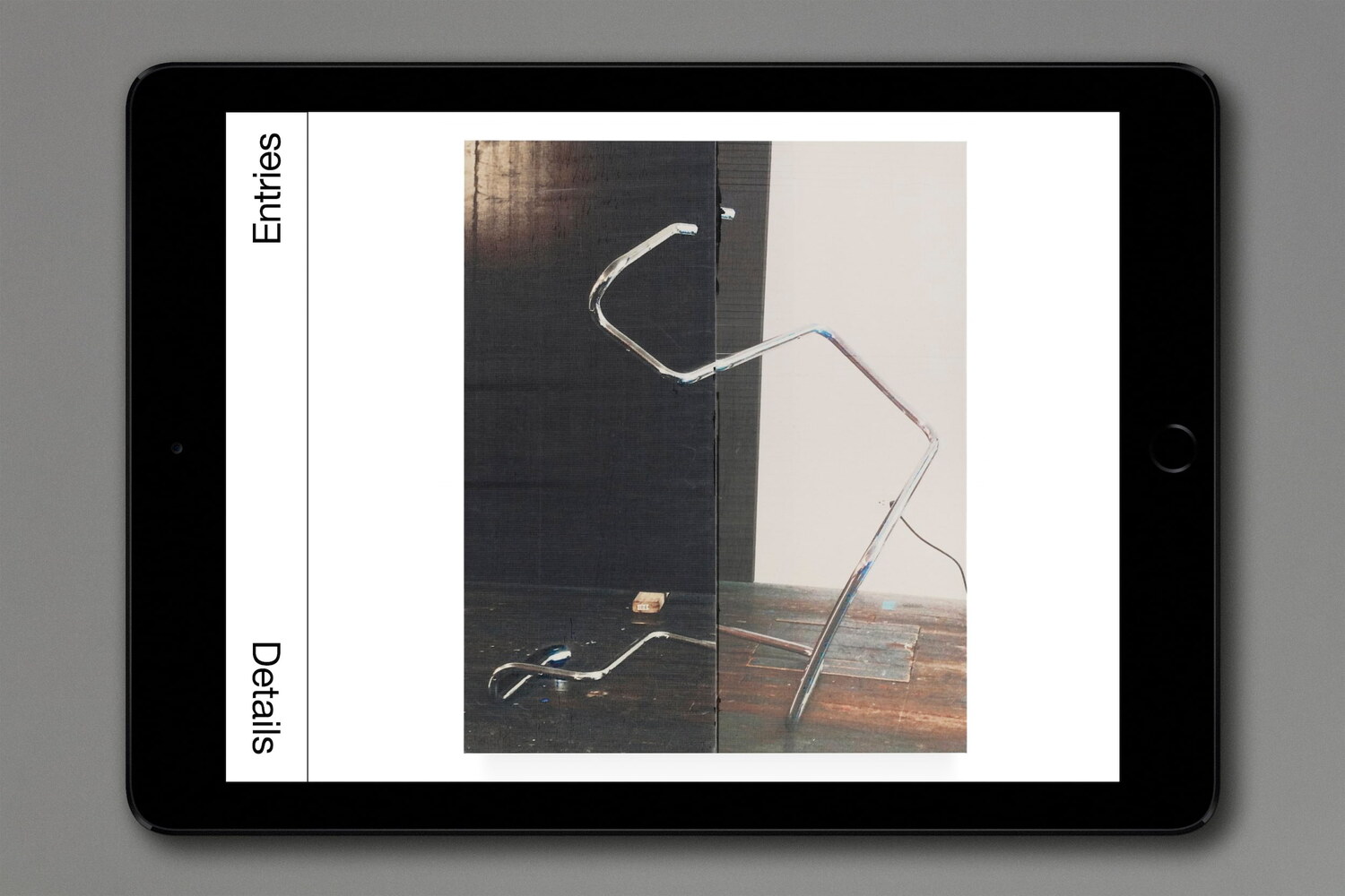
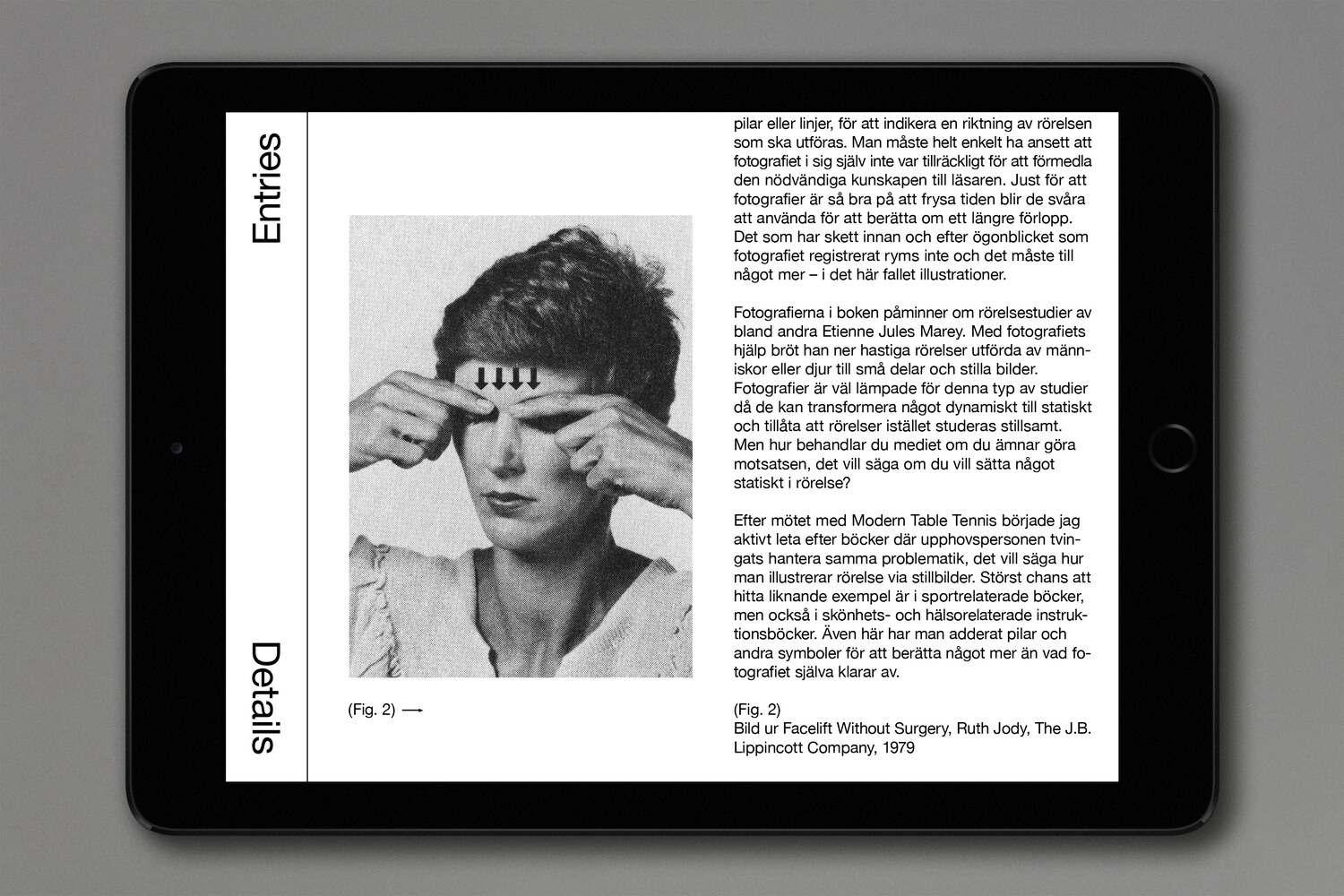
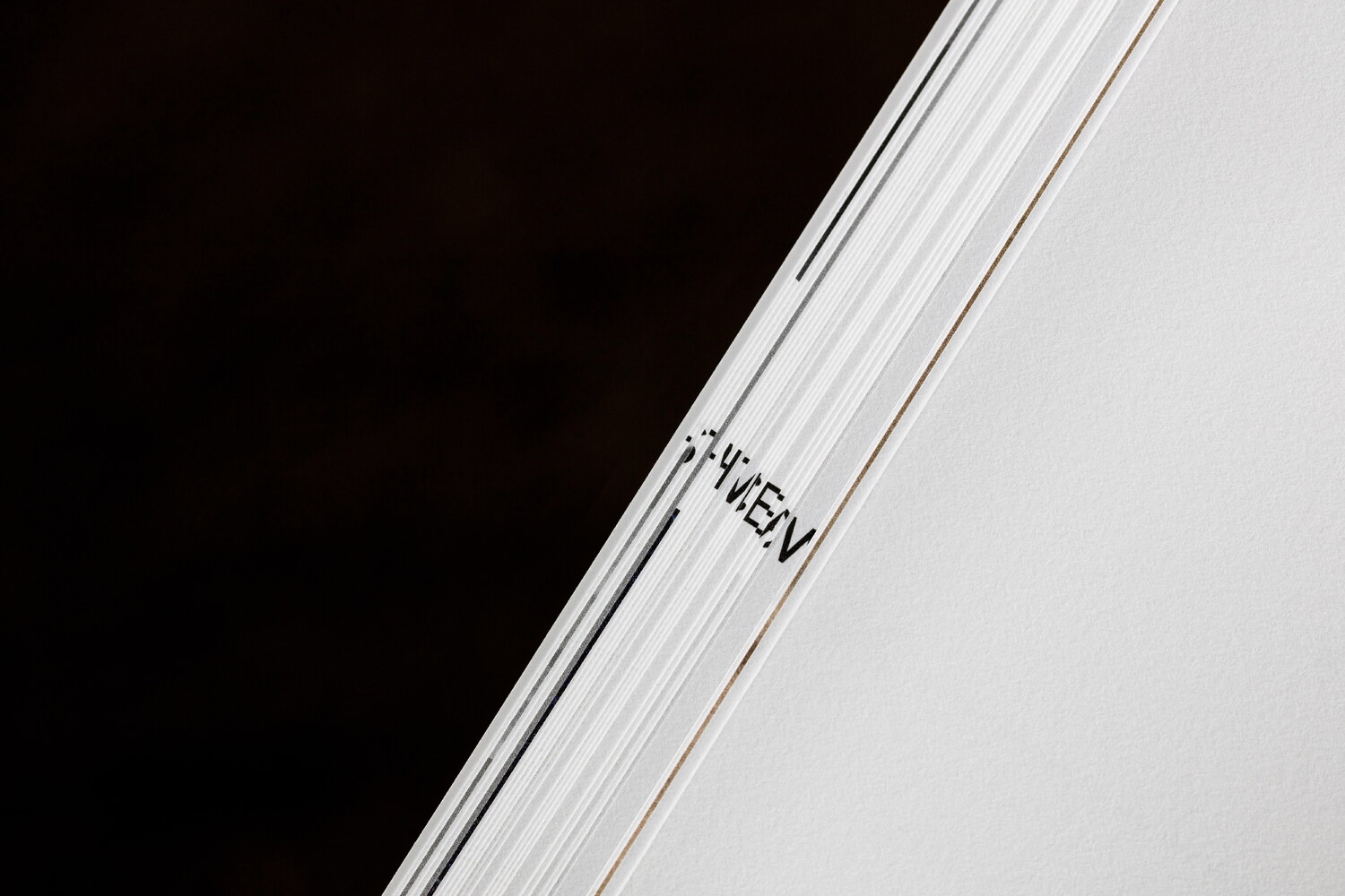
The large scale catalogue of unfolded sheets, which are bound with black glue at the top, can be read in two directions. Östlind’s essay runs through the publication in a single line, creating a fictional gutter, allowing us to display the students’ works as if the images were more traditionally dispositioned on a spread in a book. The images are displayed in the opposite orientation to the text, allowing both text and image to coexist without competing for the reader’s attention. An index, subtly hinting at photography’s more technical side, guides the reader through the publication, tying the works to their titles and, more importantly, to their creators.
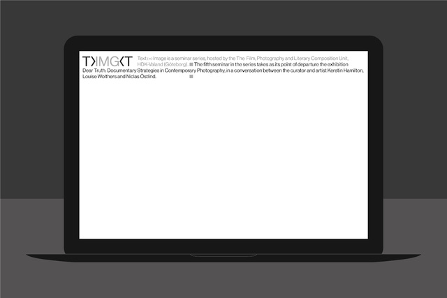
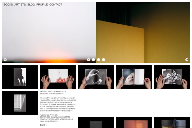
Lundgren+Lindqvist was also commissioned to design and develop an online portal, established to house a growing archive of critical essays on photography. The essays are both written by students and tutors at the university, as well as by researchers and artists working within the field of photography. The portal, named UGOTPhotography (a play on the words University of Gothenburg Photography), is built around an index of articles, appearing in an order randomised for each visit. The portal, which at its launch contained around 30 articles, will continue to grow over time.