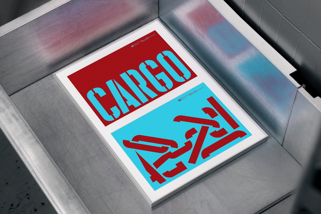
For the launch of their type foundry, Stockholm based design agency Söderhavet, asked a group of international designers and studios to design a black and white poster using one of their typefaces.
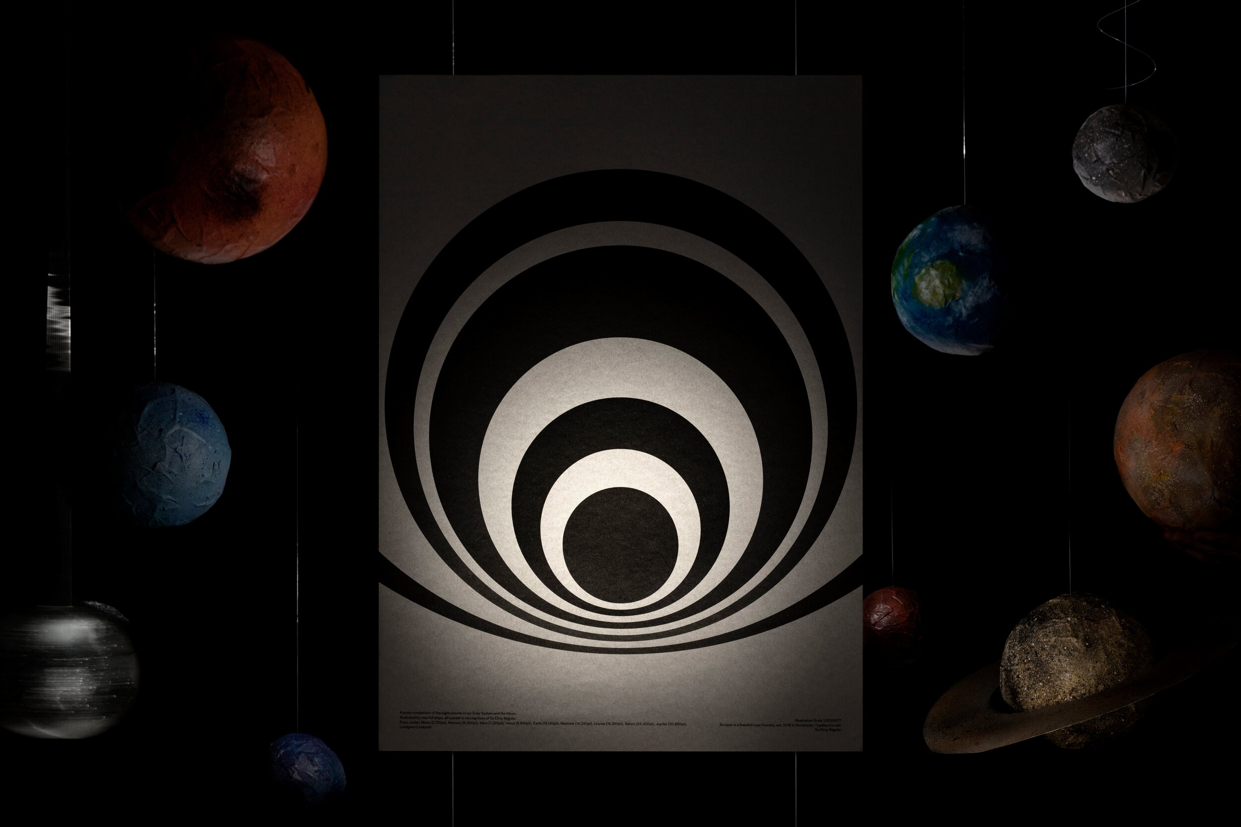
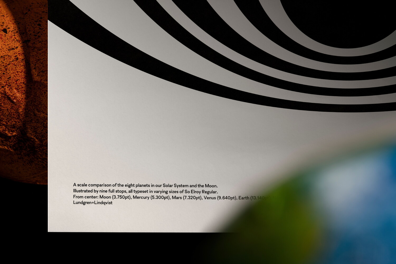
Having previously designed Söderhavet’s own visual identity, centred around a dot (or rather the lack of one)* and the associations it evokes, we chose to focus on a small yet highly significant part of any typeface; namely the full stop.
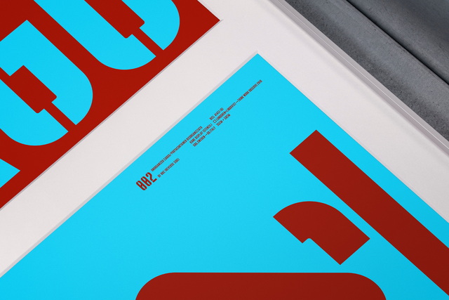
In typography, scale and contrast are critical considerations, whether you design the actual typefaces or design something using someone else’s fonts. To emphasise this, we designed a scale comparison between the eight planets in our solar system and the moon, all set as full stops of the sans serif So Elroy. The planets were rendered in a scale of 1:32300177, giving the Moon a size of 3.750pt while Jupiter, the biggest of the planets, an impressive size of 30.880pt.
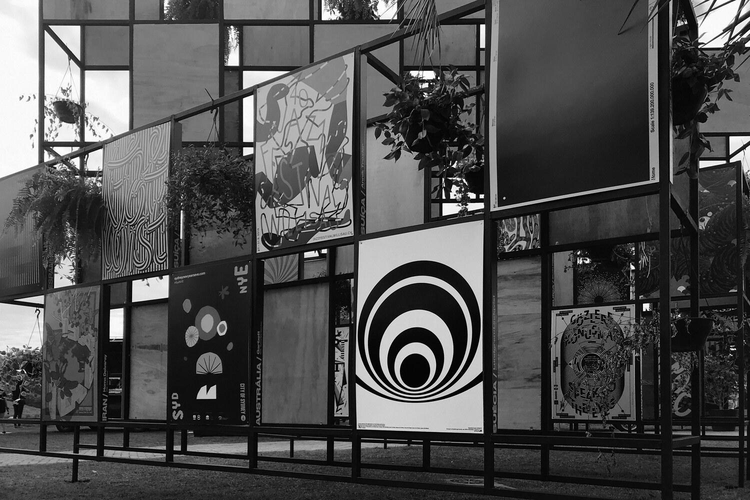
The posters were exhibited during the type foundry’s launch event in Stockholm. Our contribution has later also been shown in an exhibition curated by Typographic Posters, at the Ame Laroc Festival in São Paulo, Brazil.