


The book was released at Institut suédois in Paris, in connection with the opening of Maja Daniels' exhibition 'On the Silence of Myth'. Documentation: Ricardo Sousa
The book was released at Institut suédois in Paris, in connection with the opening of Maja Daniels' exhibition 'On the Silence of Myth'. Documentation: Ricardo Sousa
(Resources)
Want to work with us?
Editors: Kristyna Müller, Magnus af Petersens
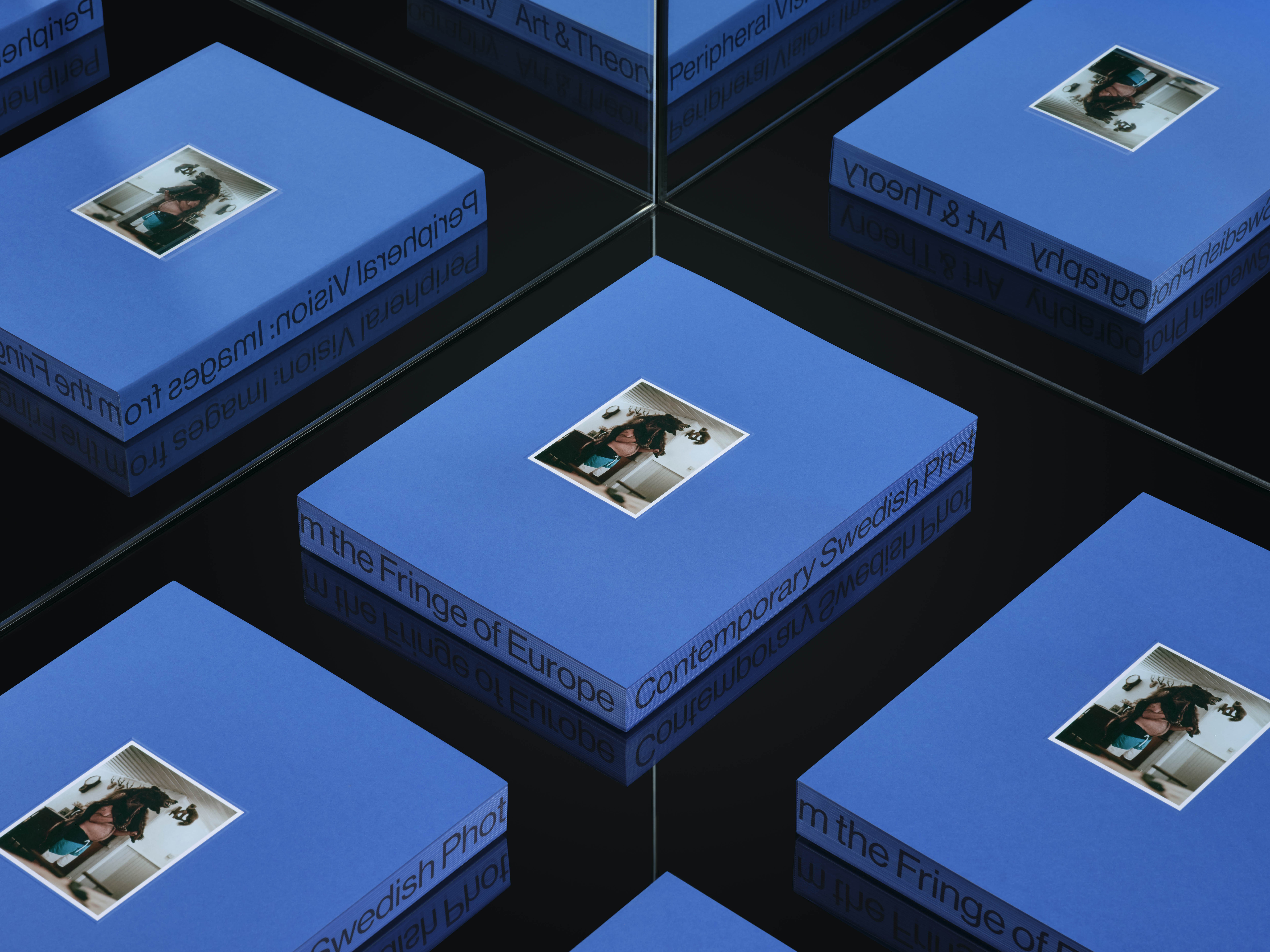
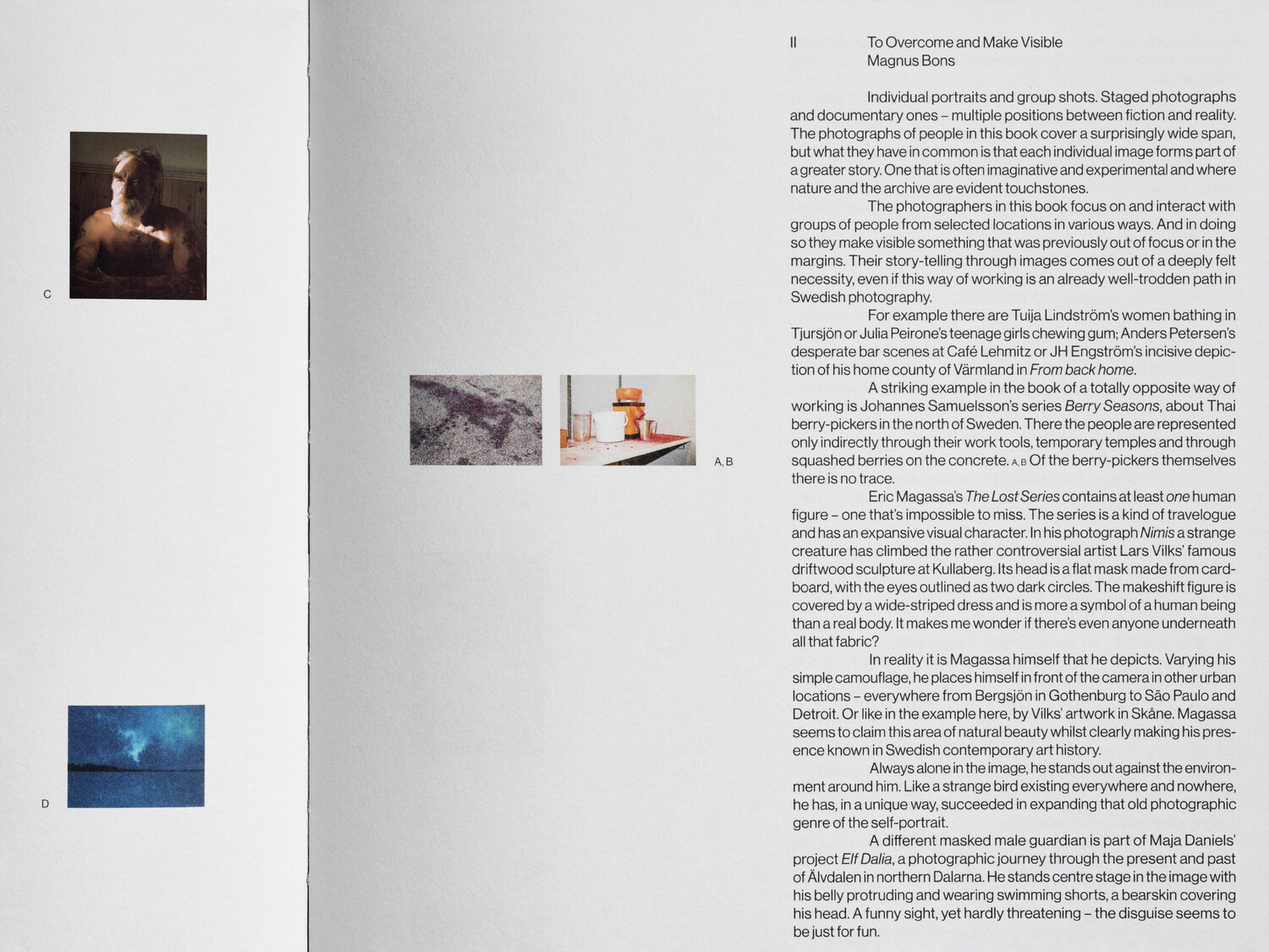
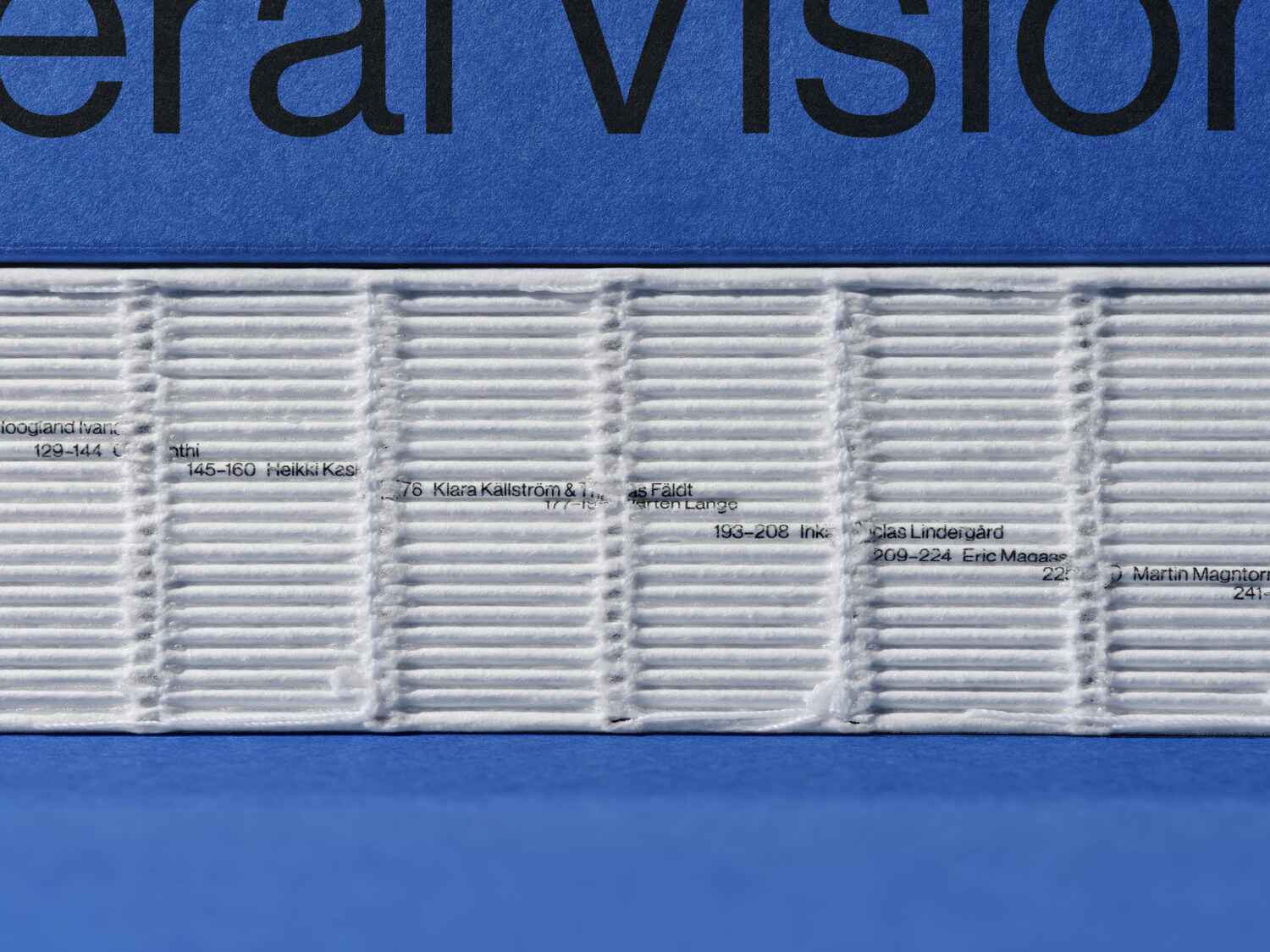
Texts: Magnus Bons, Onkar Kular, Olga Krzeszowiec Malmsten, Elisa Medde, Kristyna Müller, Magnus af Petersens, Ieva Ruadsepa, Dragana Vujanović Östlind
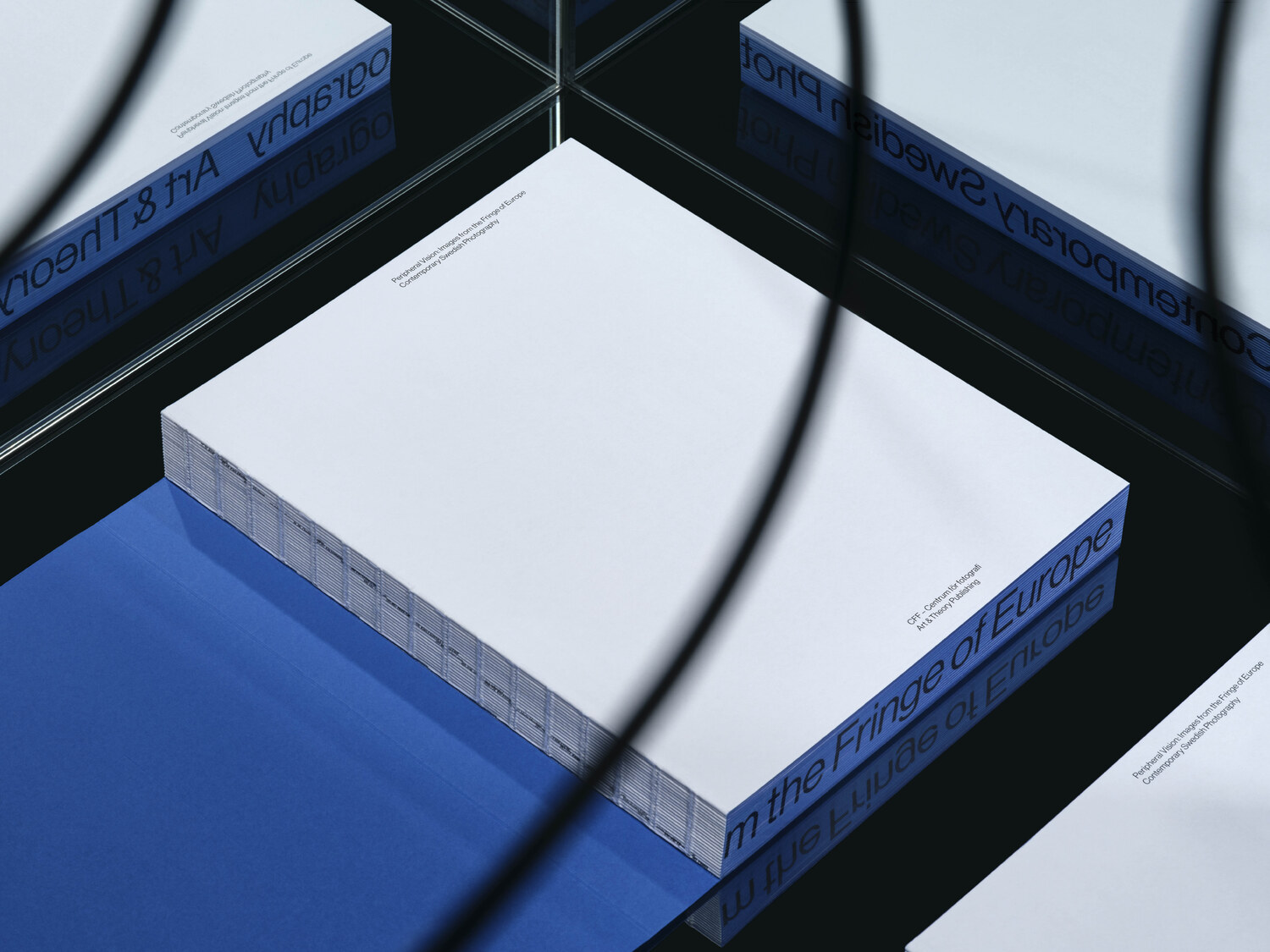
Design: Lundgren+Lindqvist
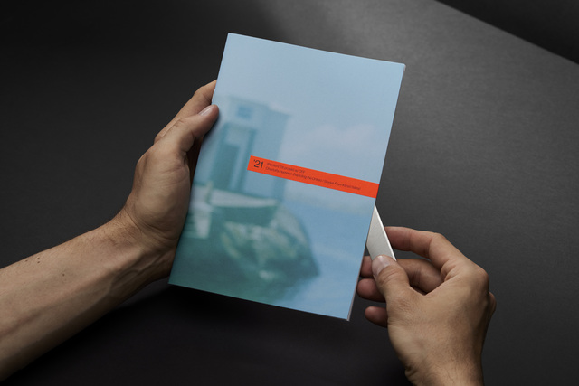
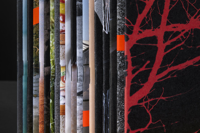
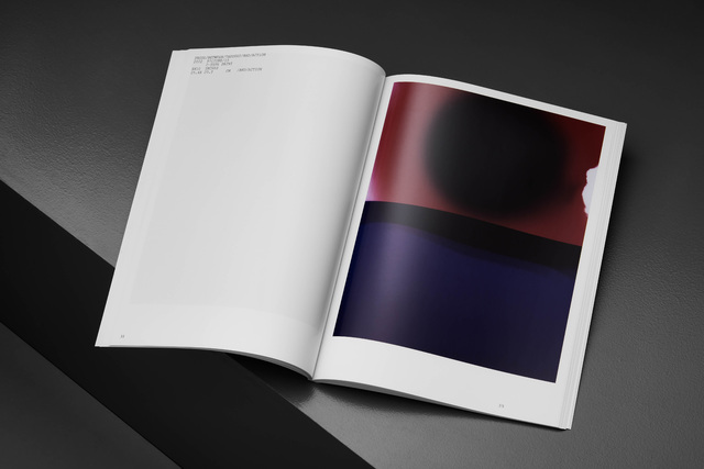
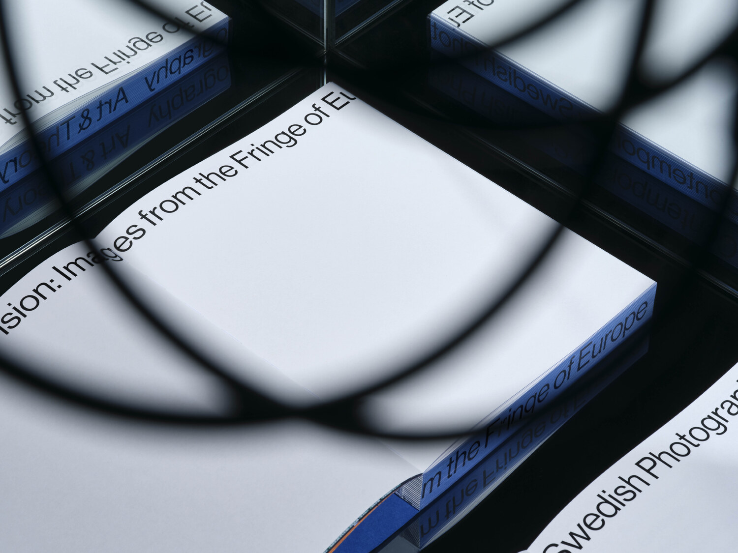
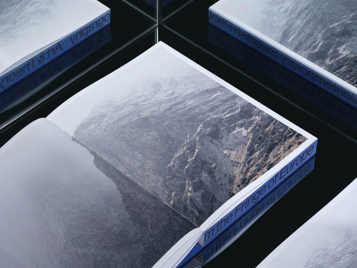
2023, English, softcover
352 pages, 21,6 x 27,6 cm
ISBN: 9789198672145
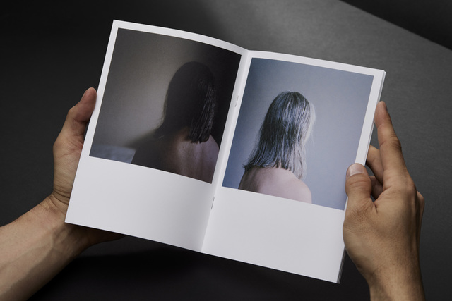
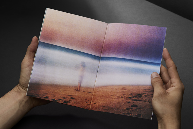
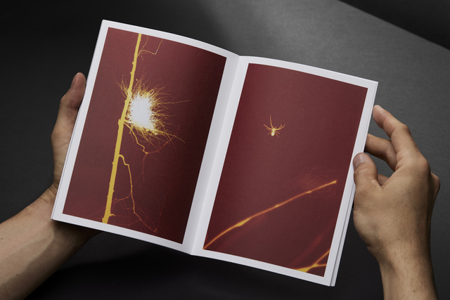
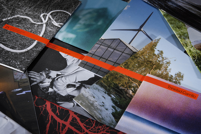
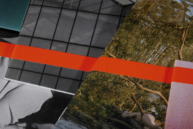
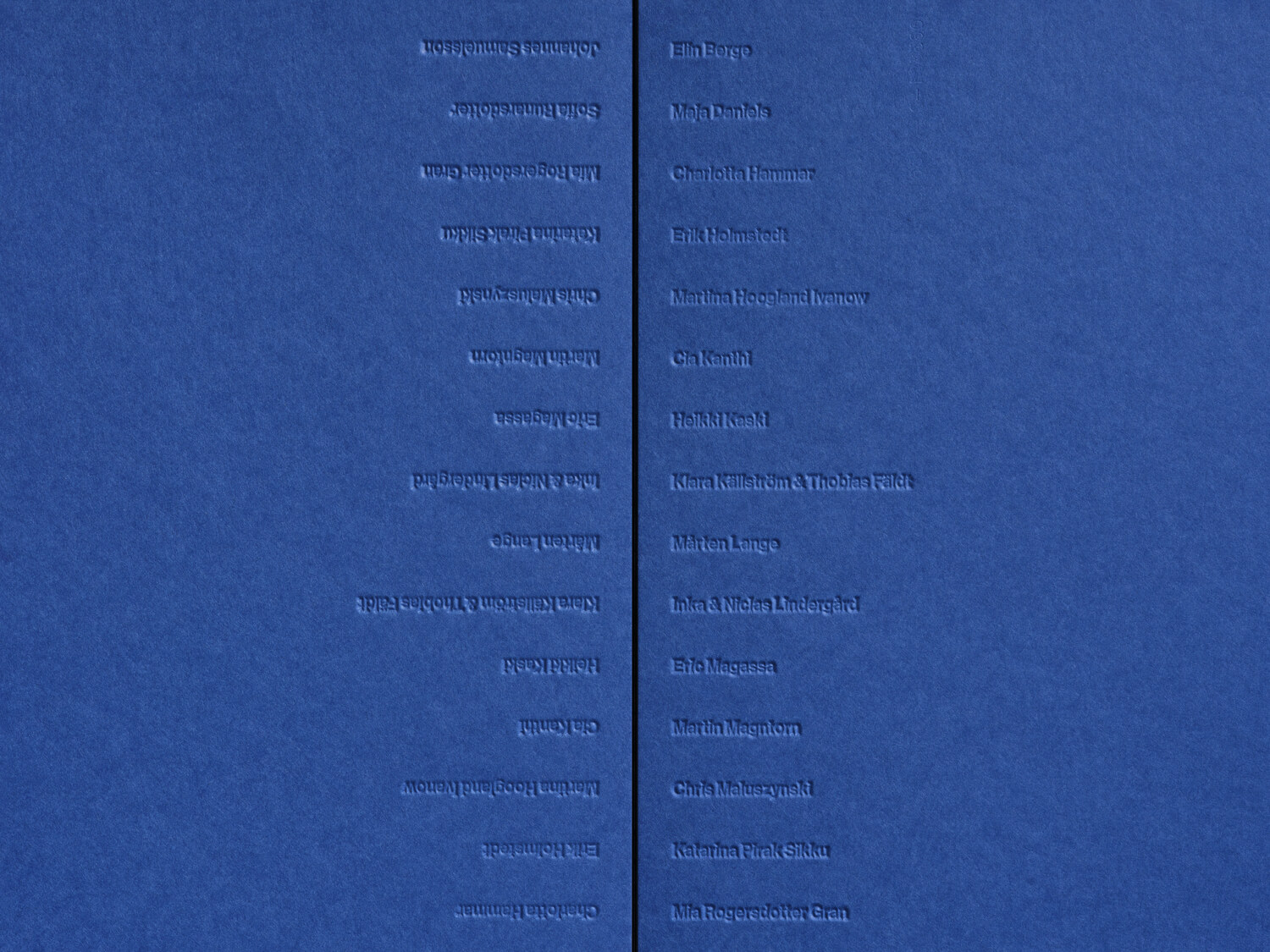
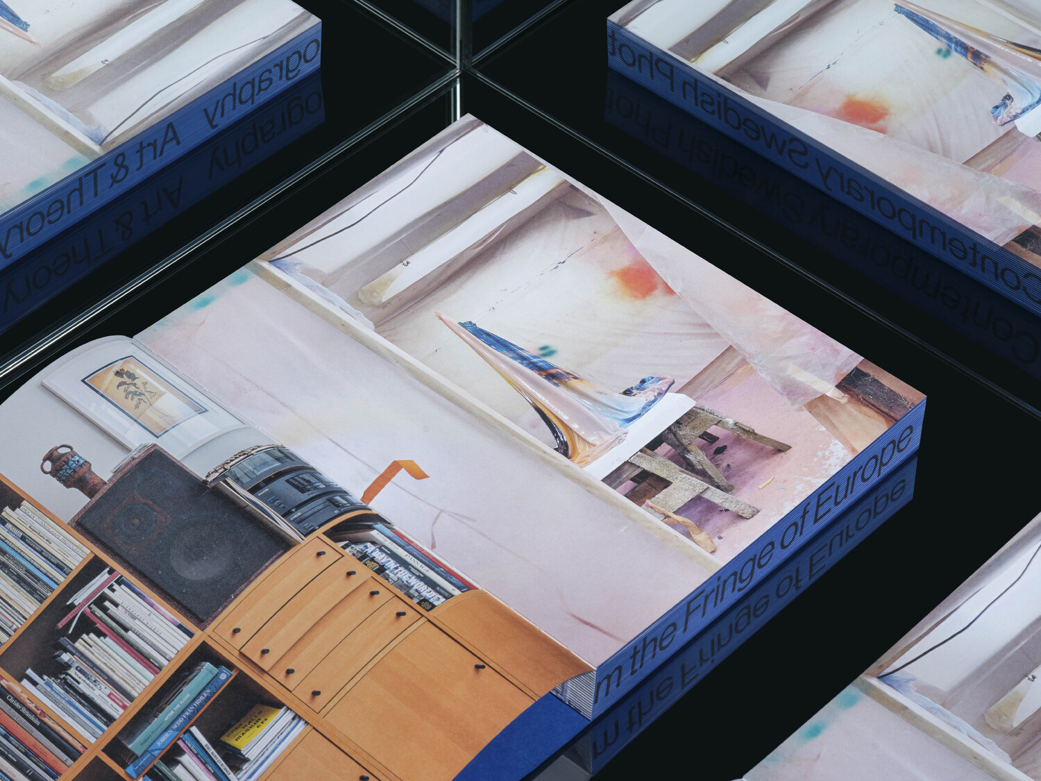
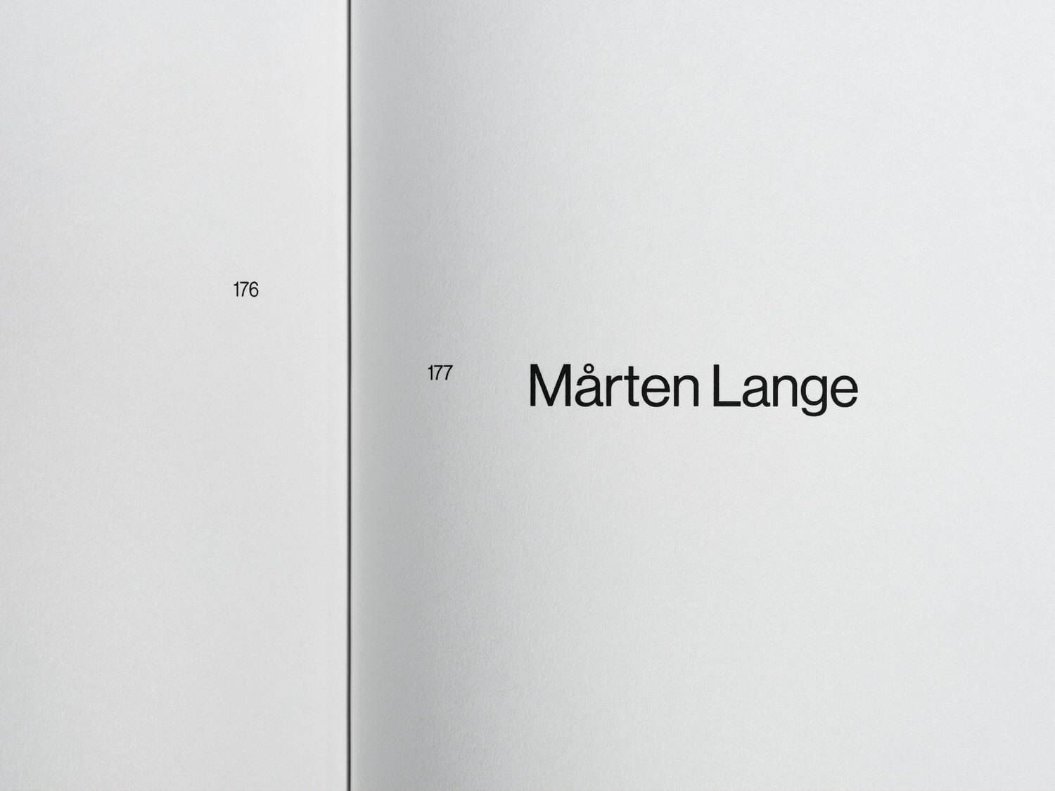
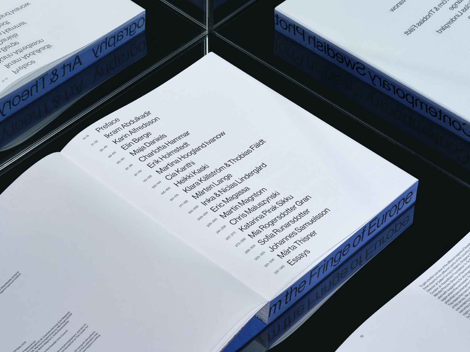
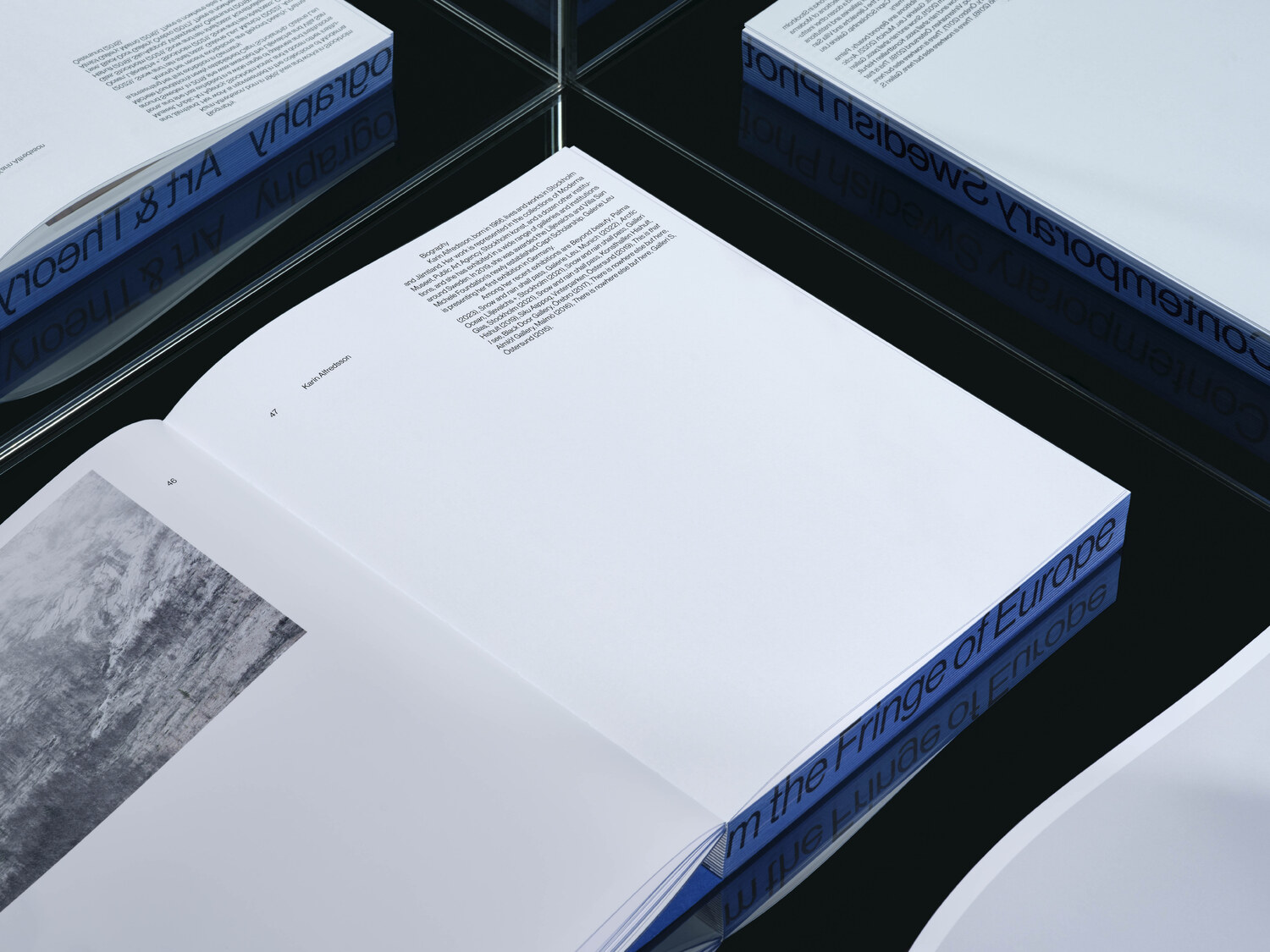
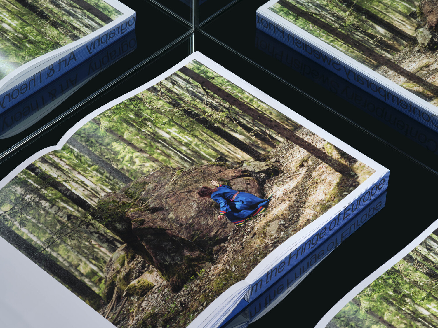
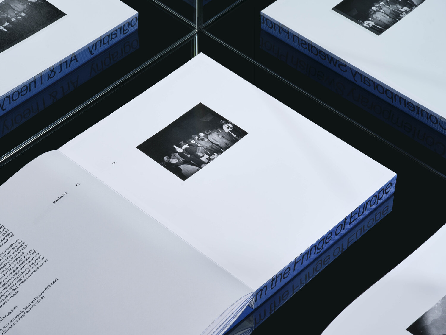
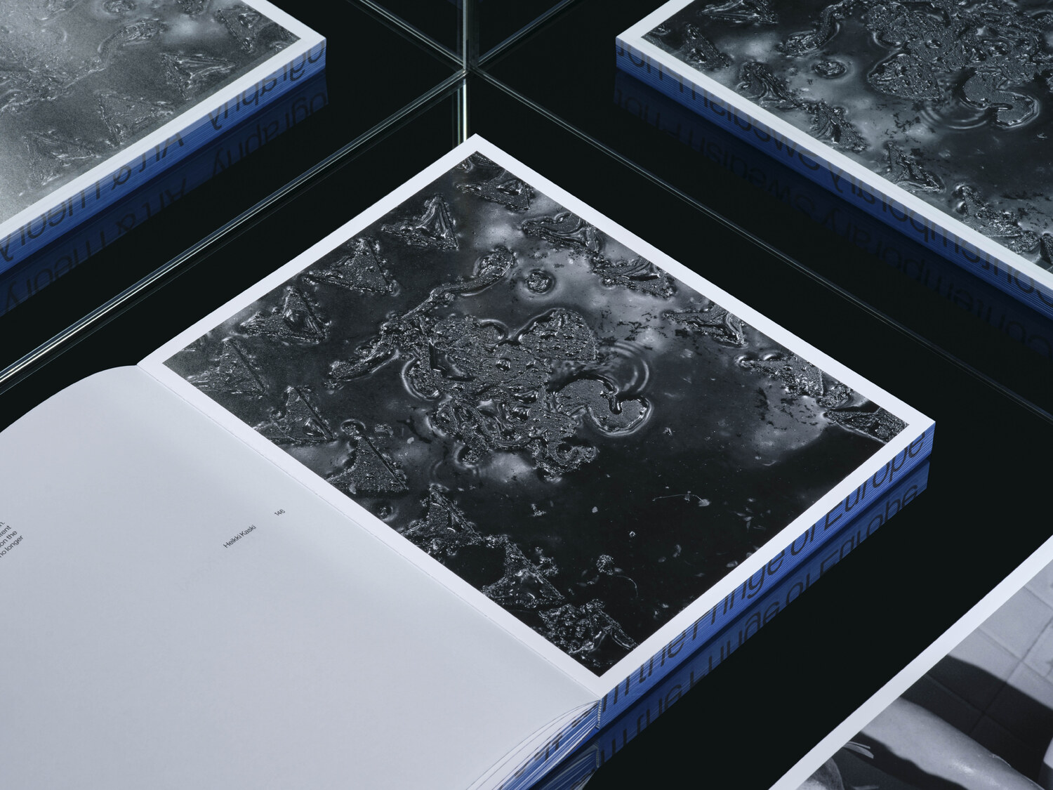
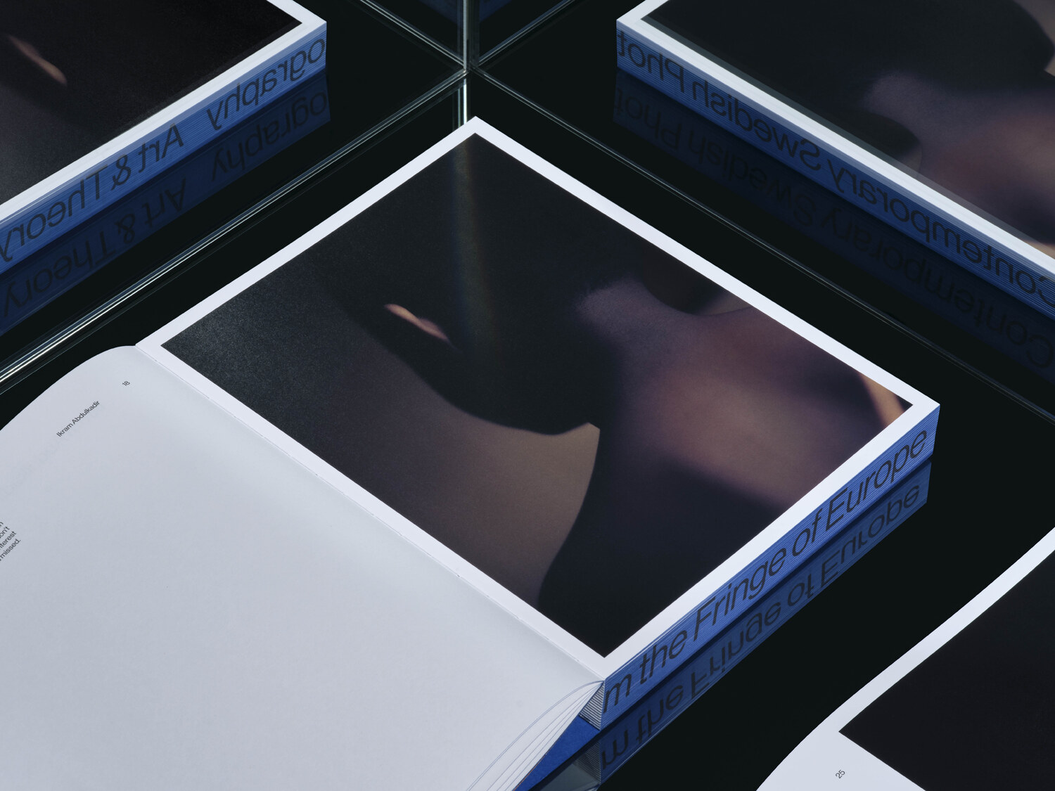
Participating artists: Ikram Abdulkadir, Karin Alfredsson, Elin Berge, Maja Daniels, Charlotta Hammar, Erik Holmstedt, Martina Hoogland Ivanow, Cia Kanthi, Heikki Kaski, Klara Källström & Thobias Fäldt, Mårten Lange, Inka & Niclas Lindergård, Eric Magassa, Martin Magntorn, Chris Maluszynski, Katarina Pirak Sikku, Mia Rogersdotter Gran, Sofia Runarsdotter, Johannes Samuelsson and Märta Thisner.