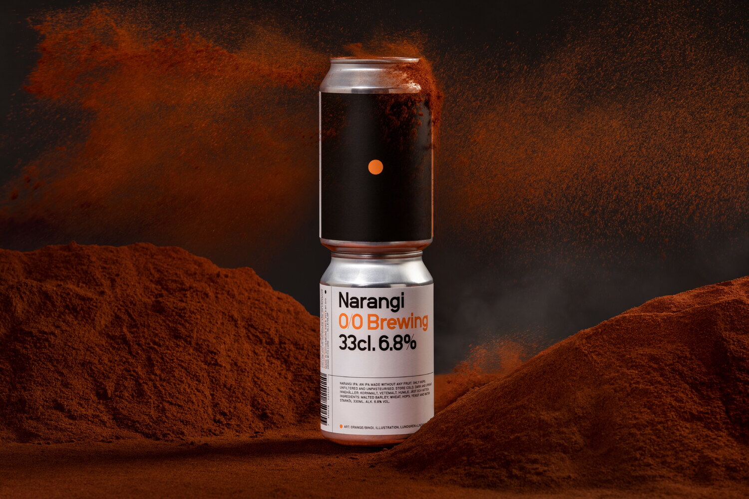
One of the first beers in O/O Brewing’s core range to make the transition from bottle to can is the popular Narangi. Narangi is a fruity IPA, with a distinct taste of oranges. The beer was named after a village in the city of Virar in India, and it also means ‘orange’. Some claim that the orange, which is not a wild fruit, but a cultivated hybrid of mandarin and pomelo originate from Narangi.
With the link to India being clearly established through the beer’s name, we looked at visual links between the fruit flavoured beer and Indian [visual] culture. The link between an orange, in its most abstract form, and a bindi* was too obvious for us to avoid.
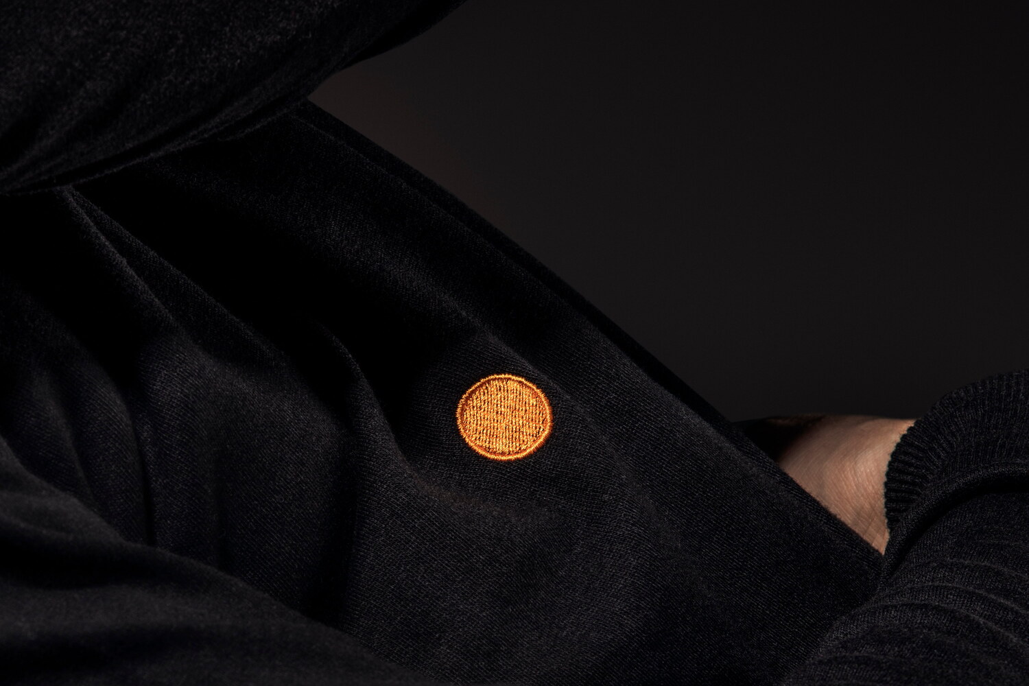
For the can release, a special spot colour was used when printing the label to give the orange dot an extra glow. To celebrate the release of the can edition, we designed a black sweatshirt with an orange dot embroidered dead center on its front. The sweatshirt is available to buy from O/O Brewing.
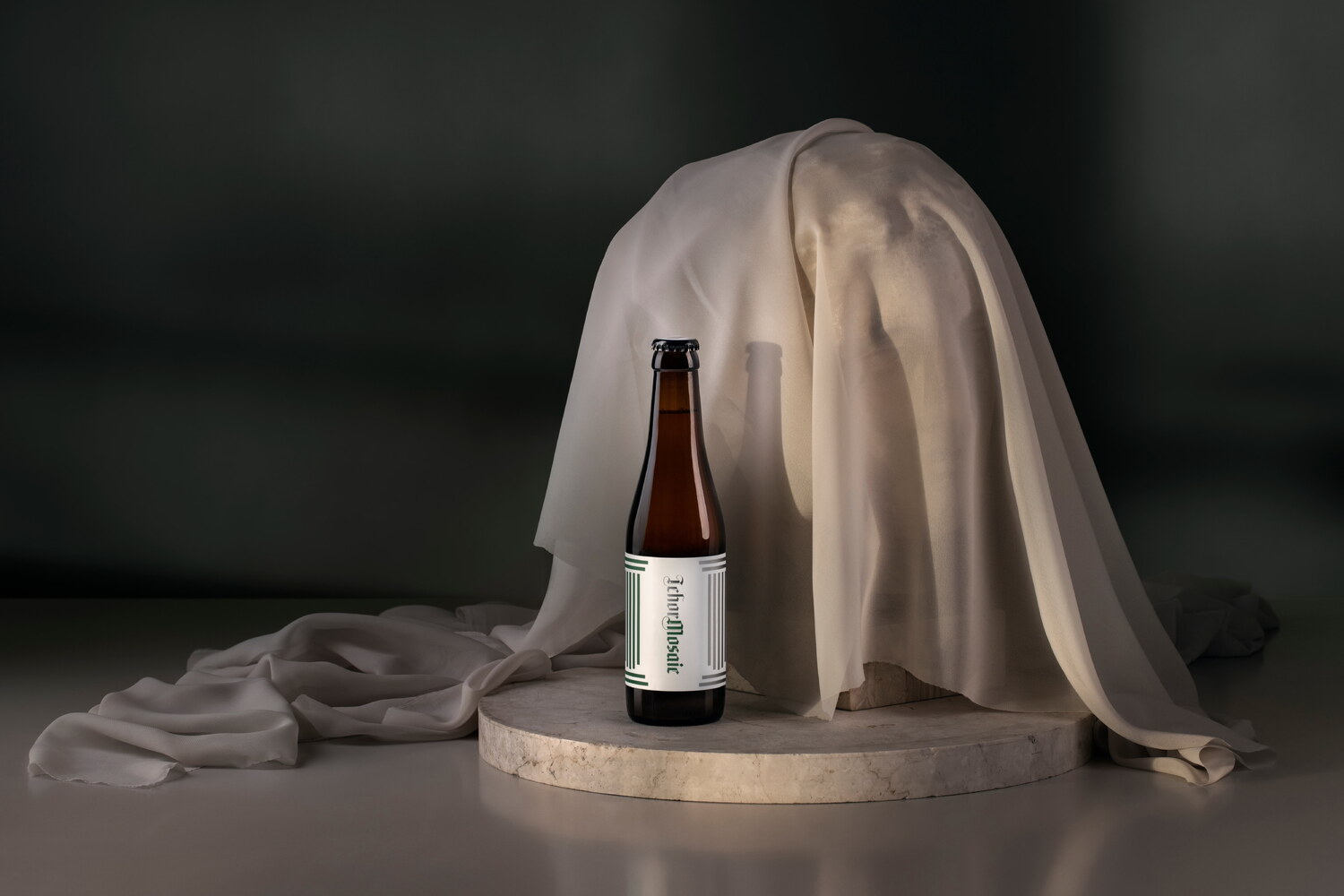

IchorMosaic is a recent addition to O/O Brewing’s steadily growing product range. The name derives from Greek mythology, where Ichor is the ethereal fluid that is the blood of gods and immortals. It marks the first in a micro series of beers where new editions will retain the main recipe, with exception for the hops, which will be replaced from one edition to the other. This first edition features Mosaic hops.
Like the name, the design of the packaging takes inspiration from ancient Greece and its monumental temples. One such temple is the Parthenon (or Temple of Athena) in Athens, with proportions that continue to inspire architects to this day. Much like the front of the Parthenon, the label sees a repetition of columns, or capital I:s (for Ichor). The name of the hops – Mosaic – further adds to the architectural association. The green colour follows the logic of O/O Brewing’s colour system for their popular 50/50 series, where each type of hops has been assigned a specific colour.
The beer sold out within hours of its release. A new edition is currently in the works.
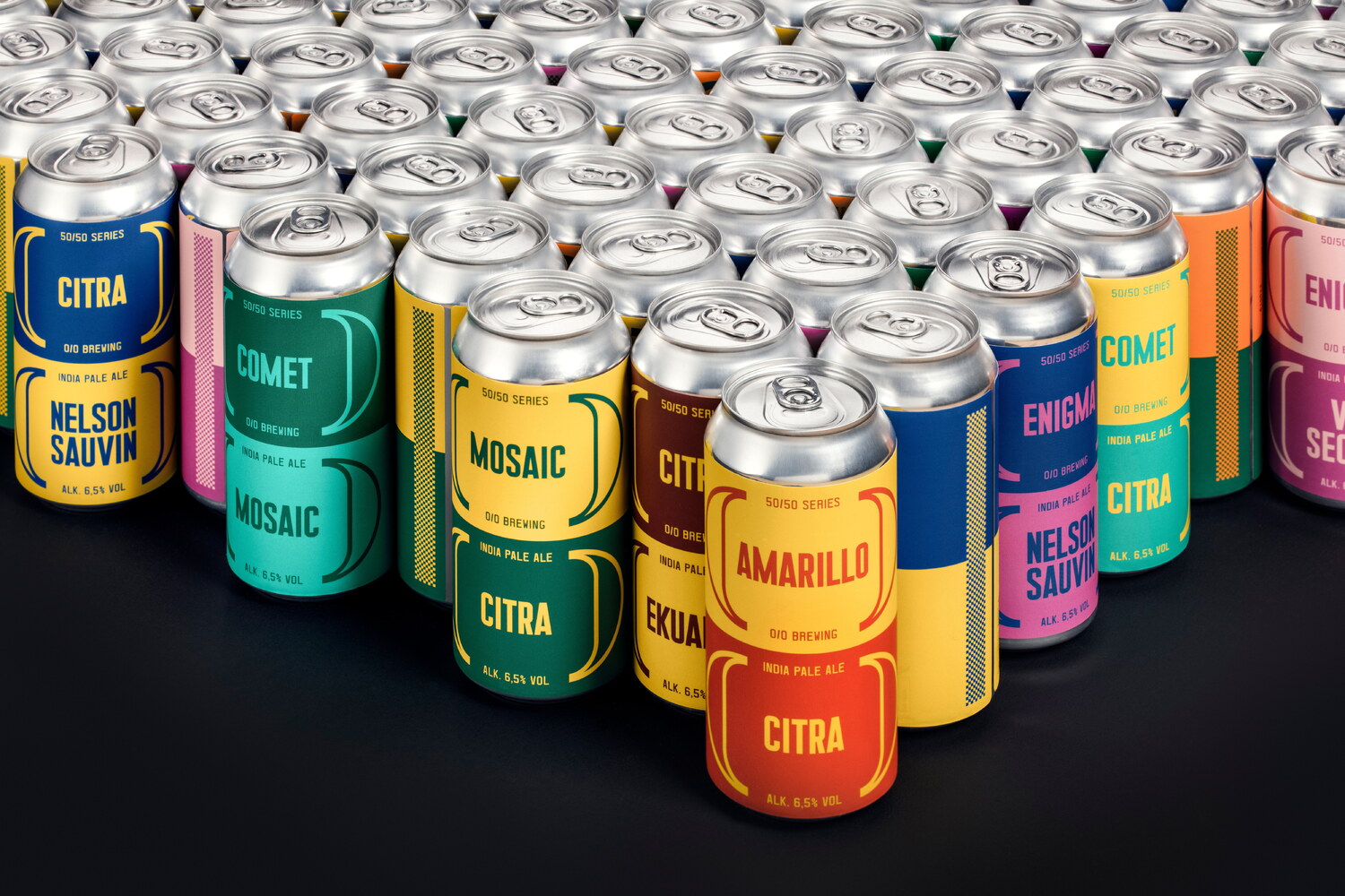
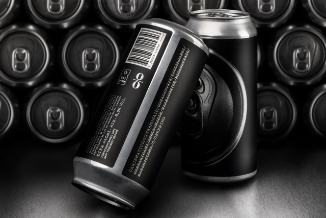
The 50/50 series is just what the name suggests, a series of beers based on a half and half mix of two different types of hops. Each beer in the series is based on the same core recipe, with only the types of hops from one beer to another. The rapidly growing series now counts 12 iterations, with more on the way. It has provided O/O Brewing a platform to experiment with new flavour combinations. Some of the pairings are made in several batches, while others are released only once.
The design of the packaging aims to illustrate that this series is not a part of O/O Brewing’s core range by employing a freer interpretation of the brewery’s visual identity. Each type of hops is assigned a specific colour, which is related to its flavour and character. For each beer, the label is split in half, with one hop type occupying the top and the other the bottom.
After publishing this project, Lundgren+Lindqvist has undertaken a comprehensive redesign of O/O Brewing's packaging system, including their signature 50/50 series. Please see the more recent case studies for the updated look.