
(Resources)
Want to work with us?
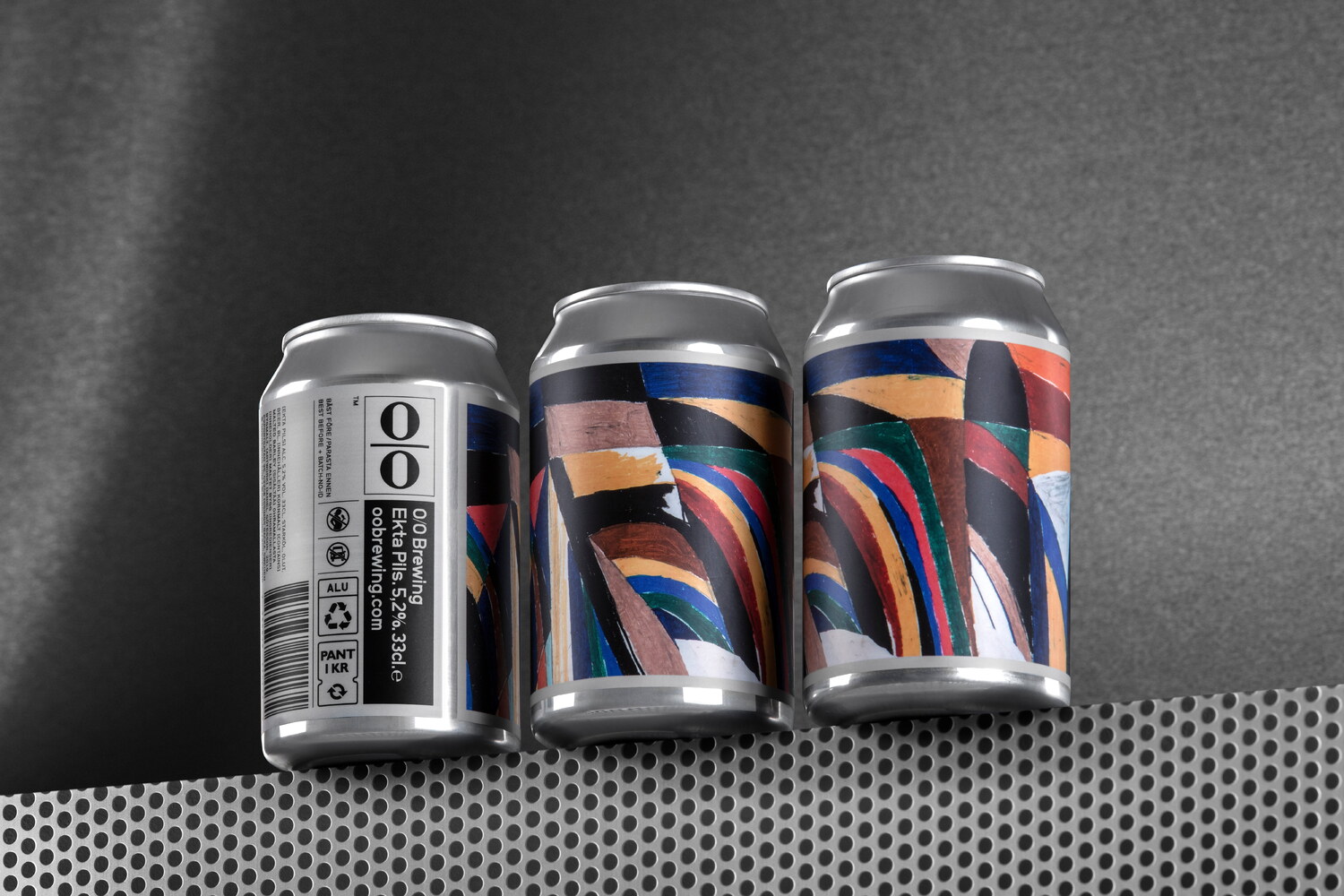
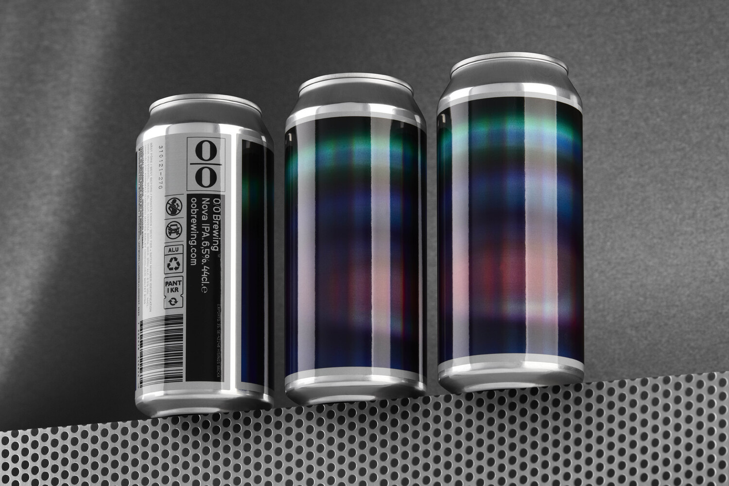
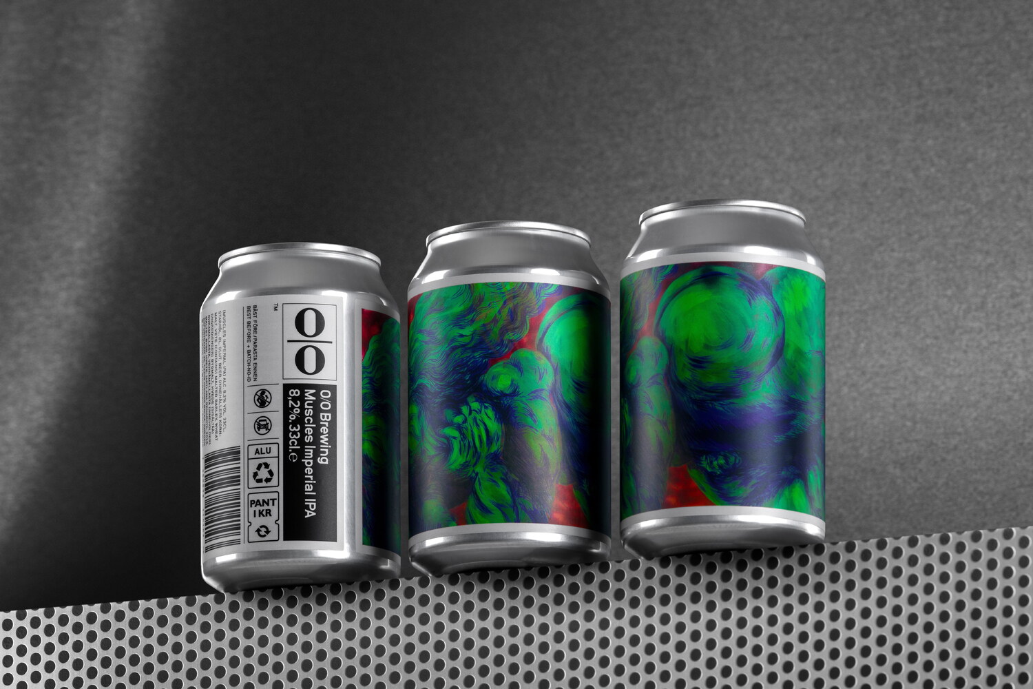
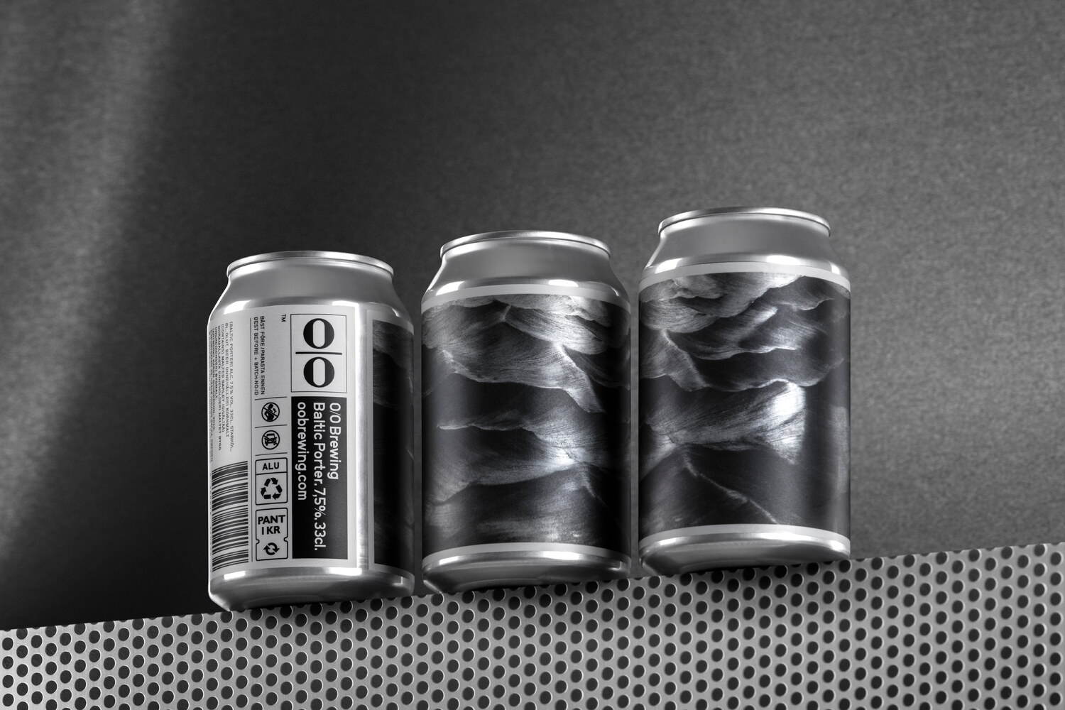
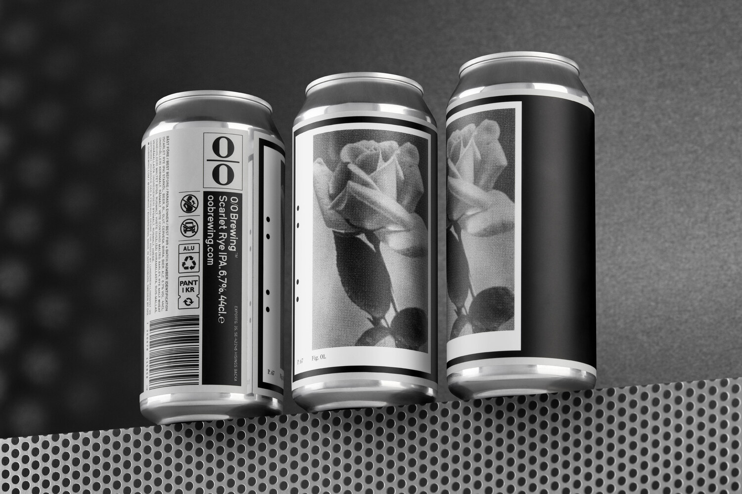
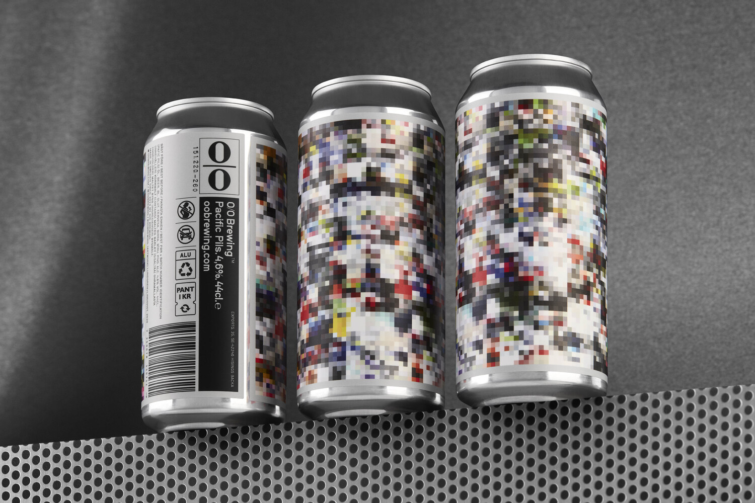
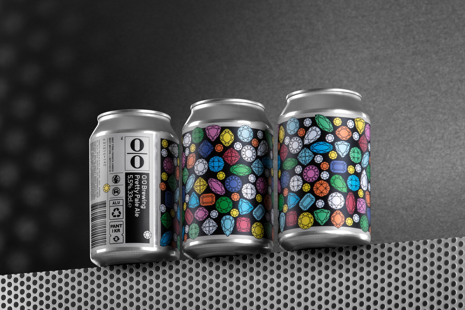
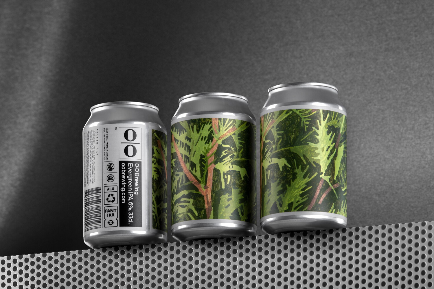
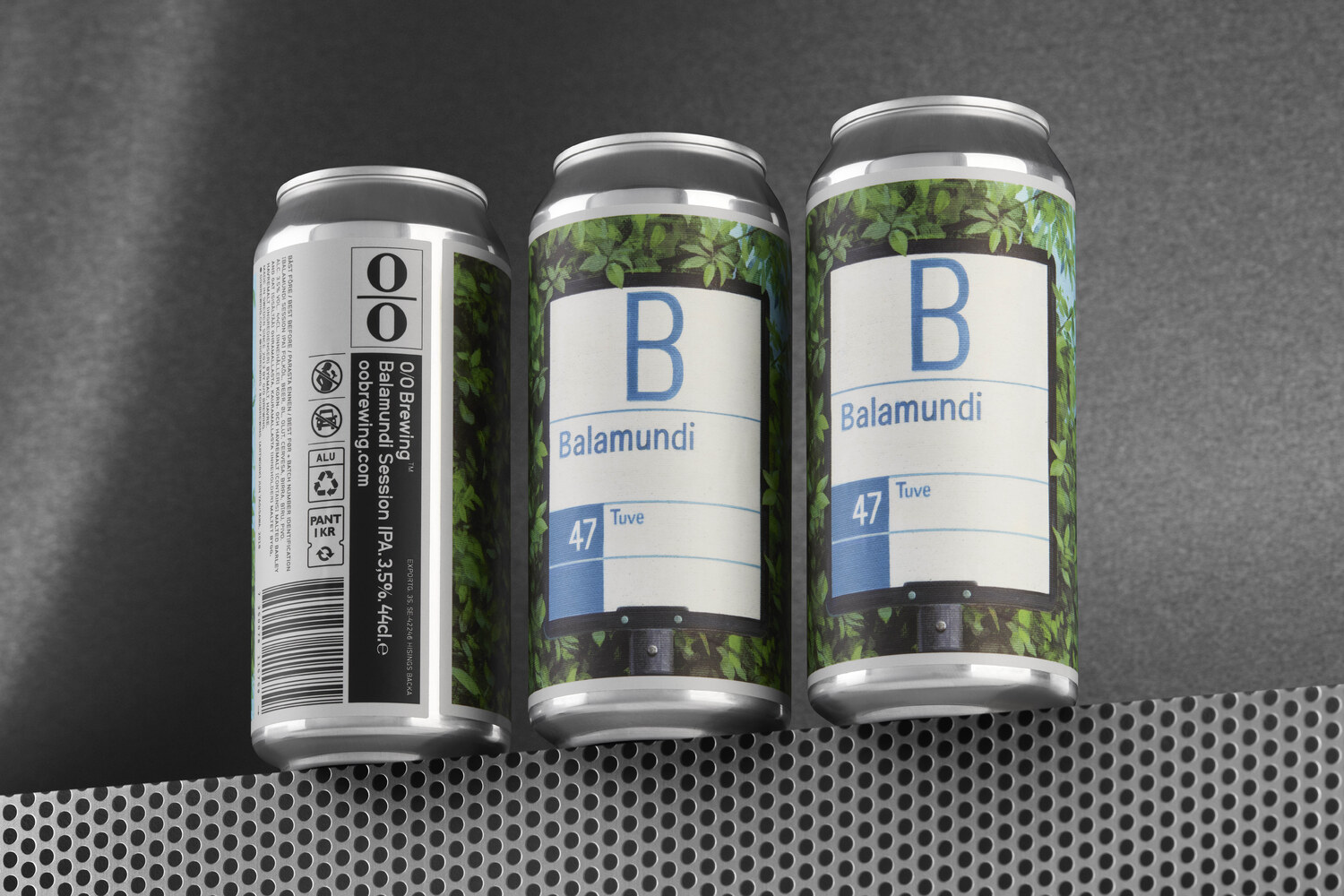
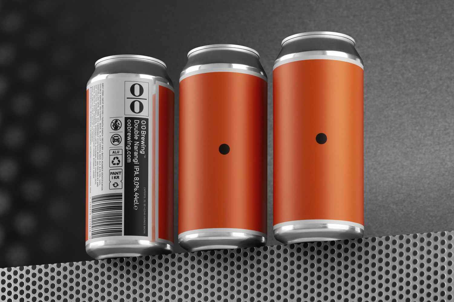
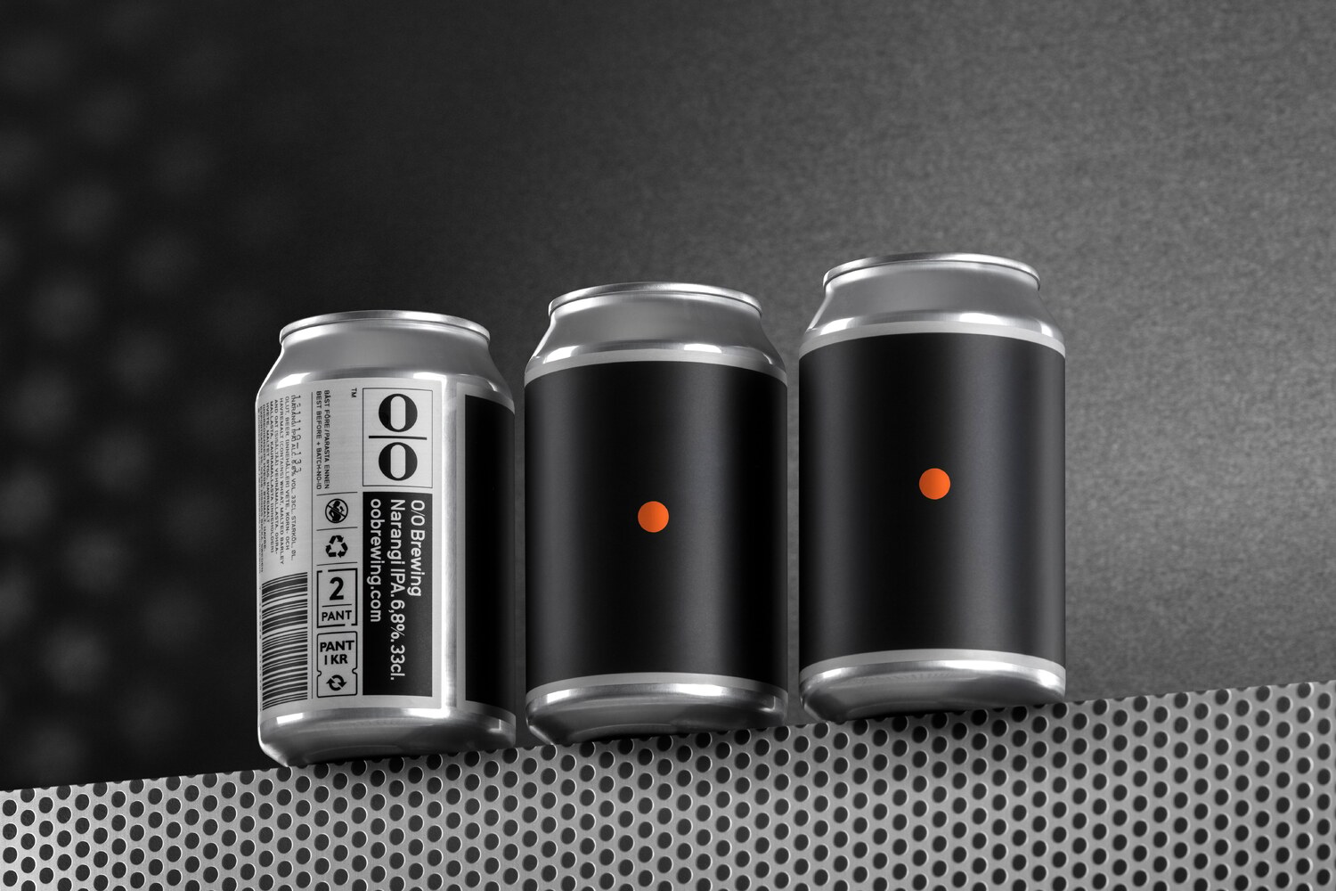
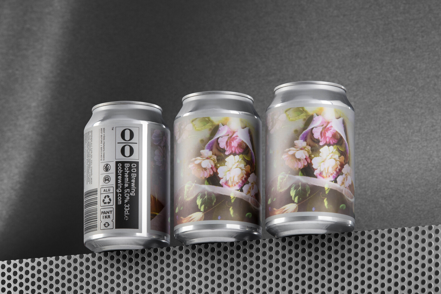
To date, Lundgren+Lindqvist and O/O Brewing have invited the following artists to make artwork for the packaging series: Karen Gunderson (US), Daniel EKTA Götesson (SE), Ana Benaroya (US), Fredrik Åkum (SE), Carl Ander (SE), Alexander Palmestål (SE), Yun Yagisawa (JP), Tim Lahan (US).