
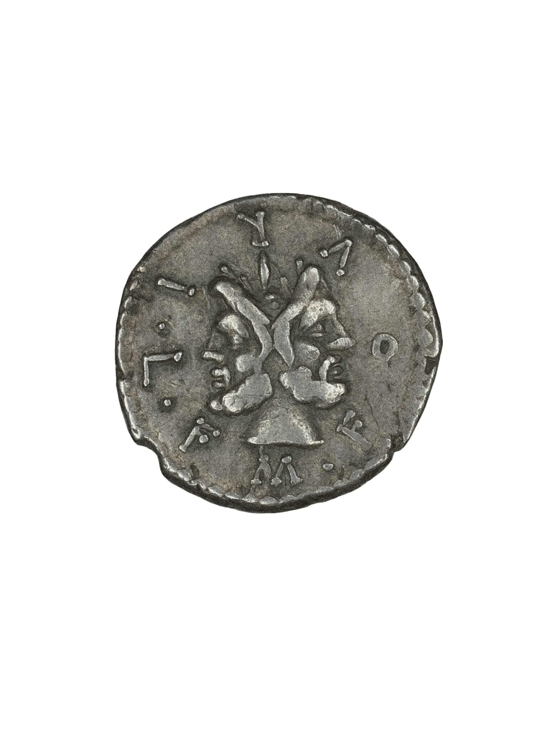


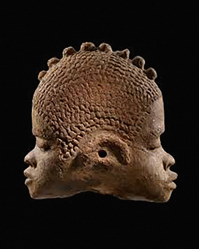
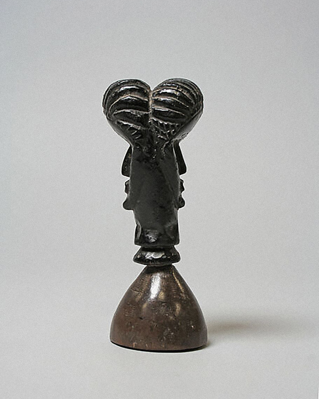
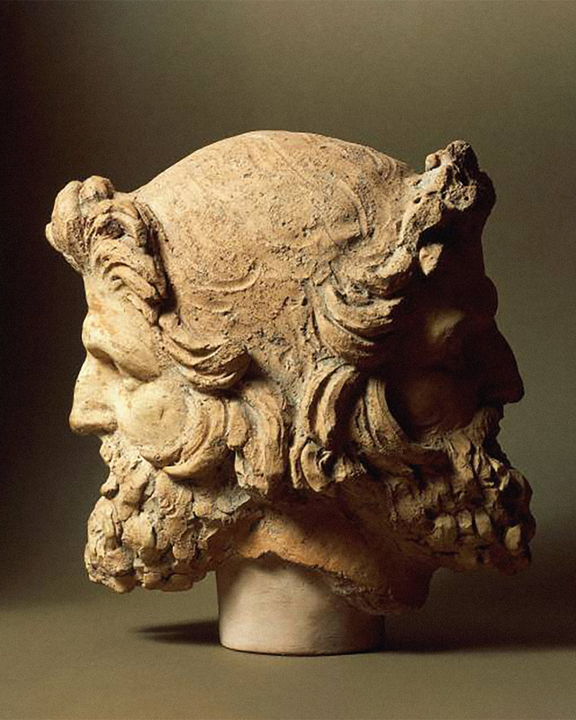
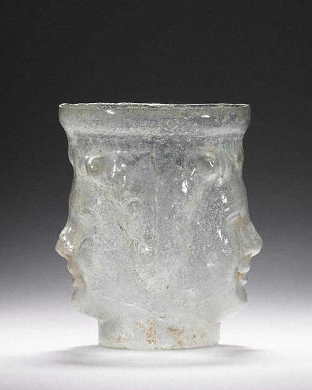
Historical references of Janus as part of the research for Inflection’s visual identity.
Historical references of Janus as part of the research for Inflection’s visual identity.
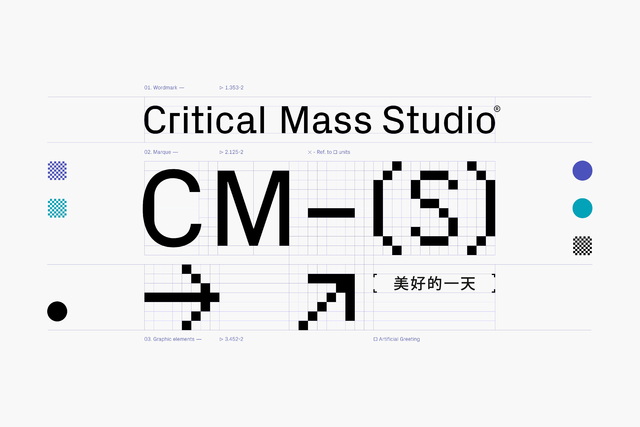
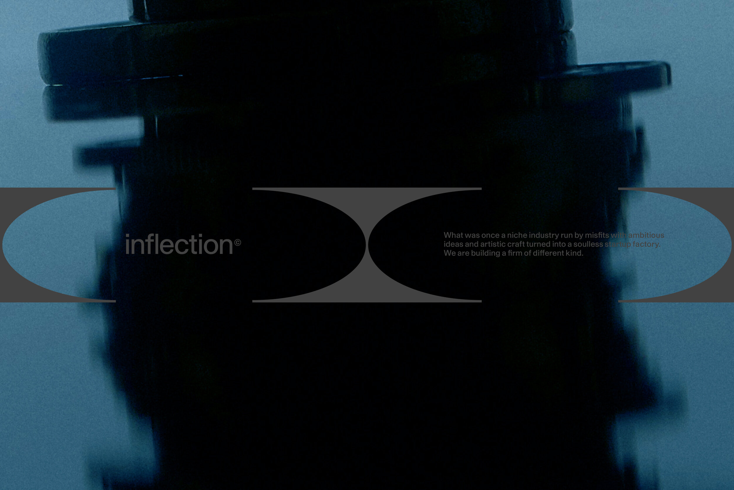
Inflection is a high-touch boutique venture capital fund with a tightly knit team backing non-consensus engineering moonshots at the idea stage. Its mission is to unlock meaningful progress through technology by identifying early signals of change, shifts in technology, society, or geopolitics, and supporting the people working at those frontiers. Beyond capital, Inflection provides access to trusted networks, thoughtful guidance, and practical infrastructure designed to help ideas grow into enduring companies.
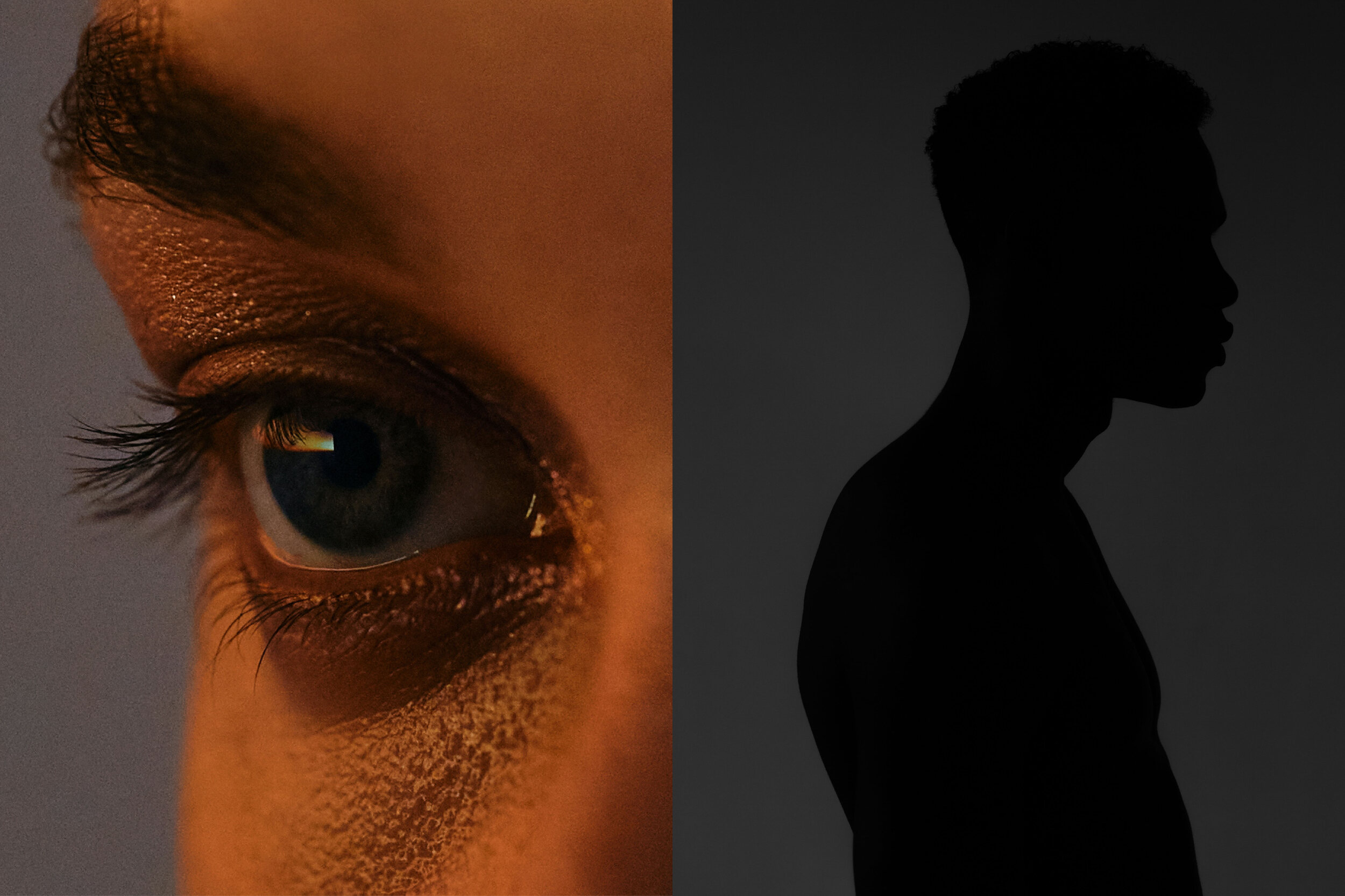
Designed by Lundgren+Lindqvist, Inflection’s visual identity draws on the dual gaze of Janus, the Roman god of transitions, who simultaneously looks to the past and the future. This metaphor captures the essence of venture capital: the ability to recognise patterns and lessons from what has come before, while anticipating the opportunities and risks that lie ahead.
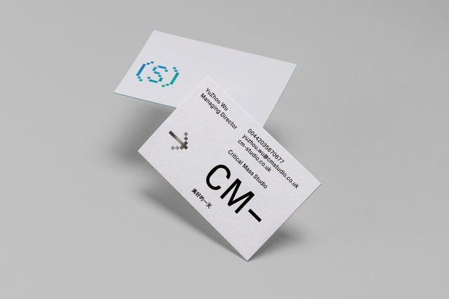
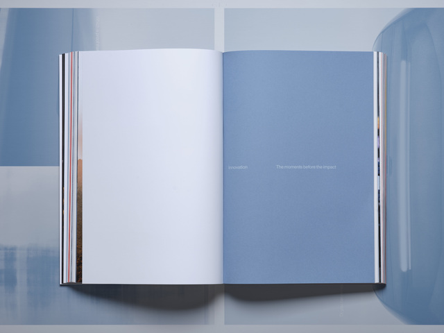
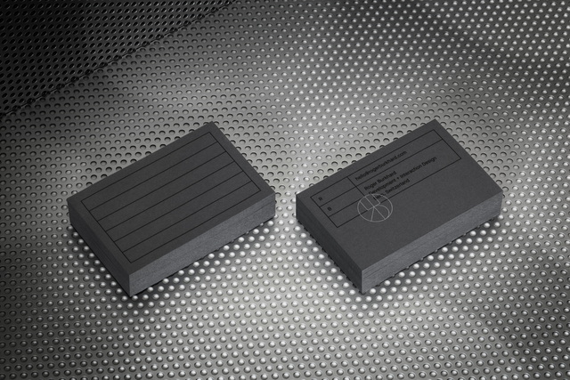
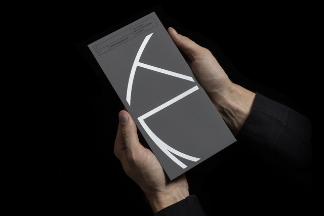
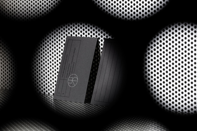
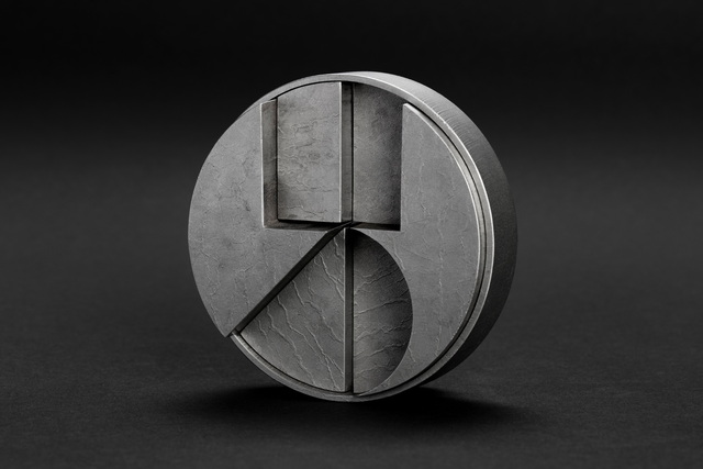
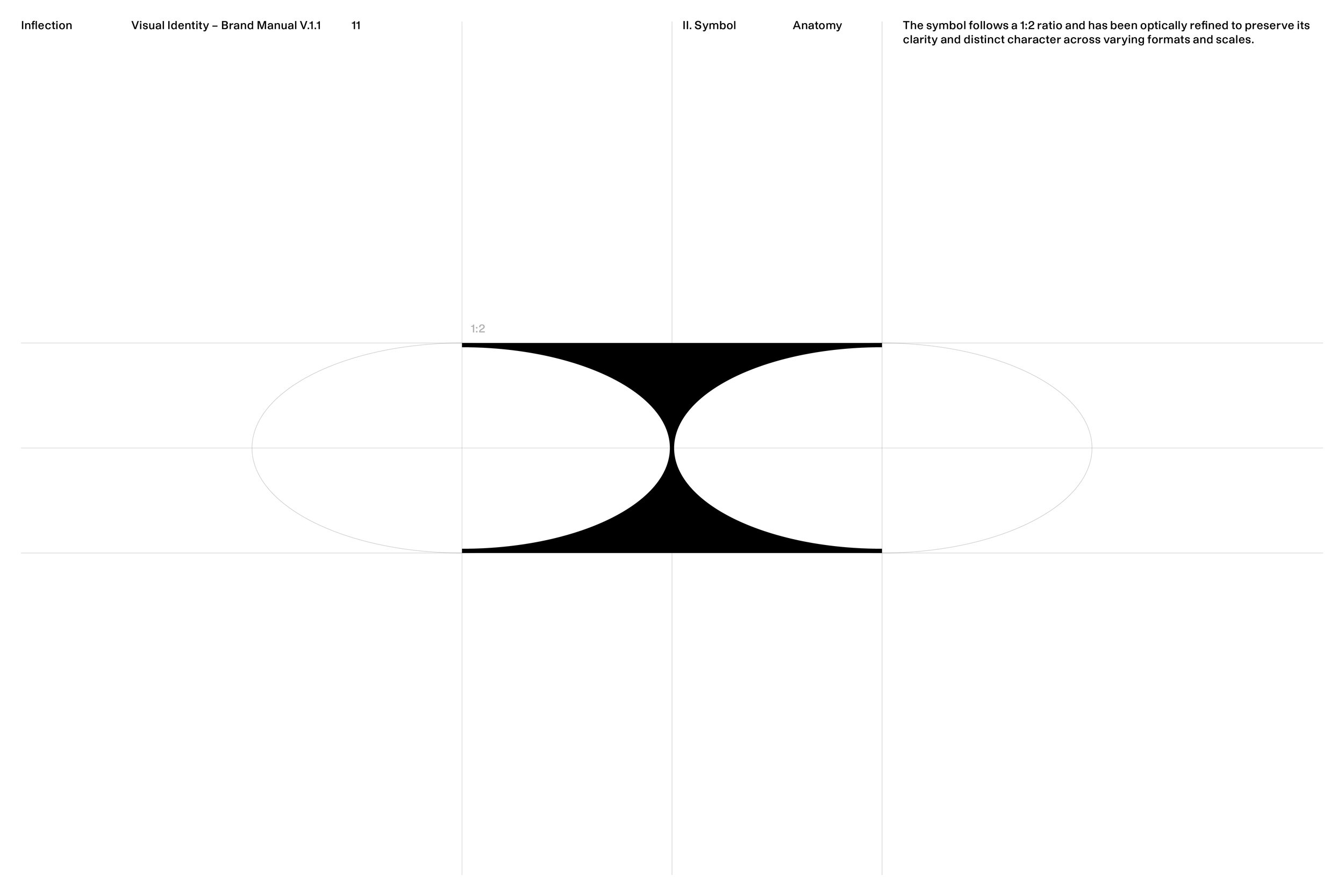
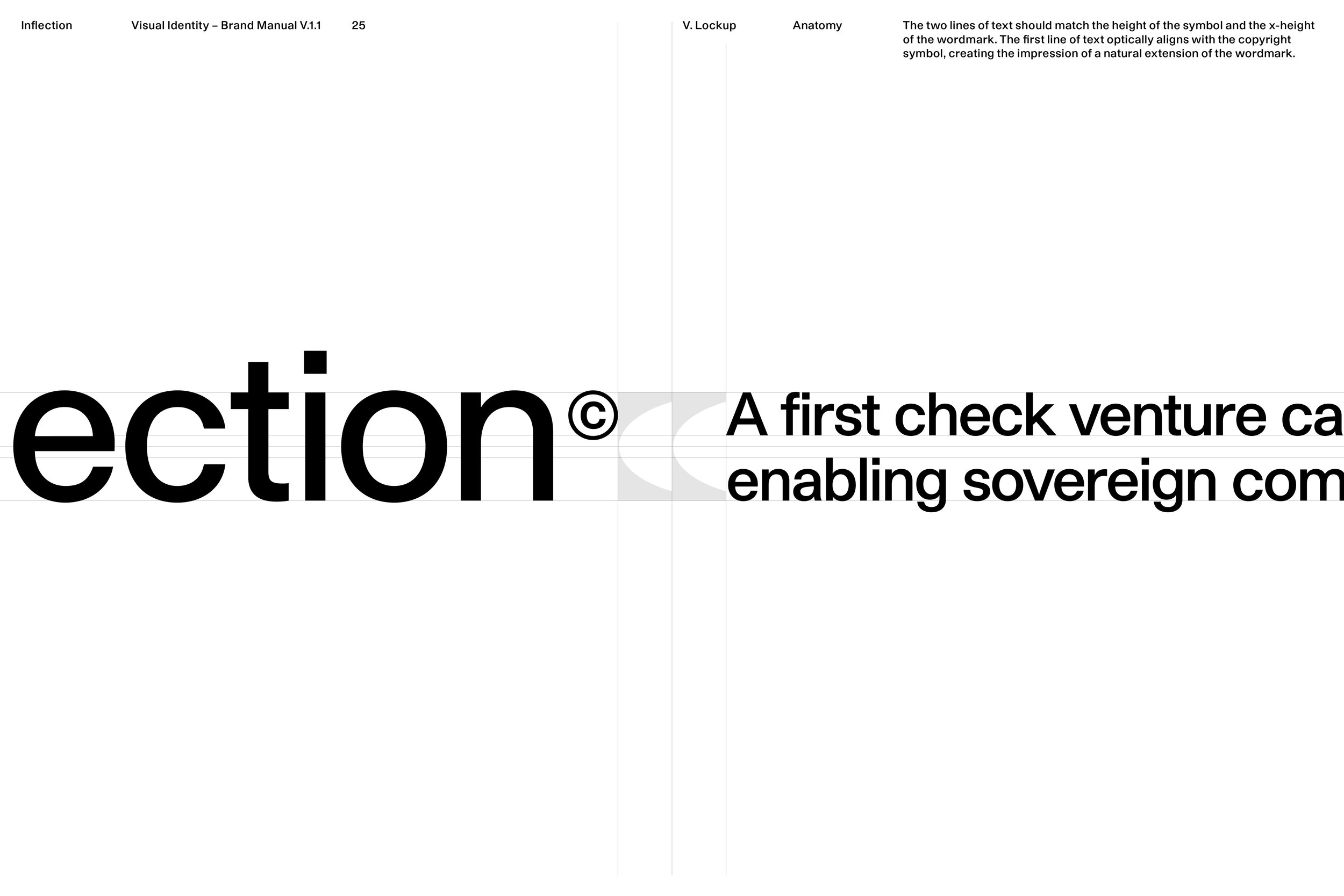
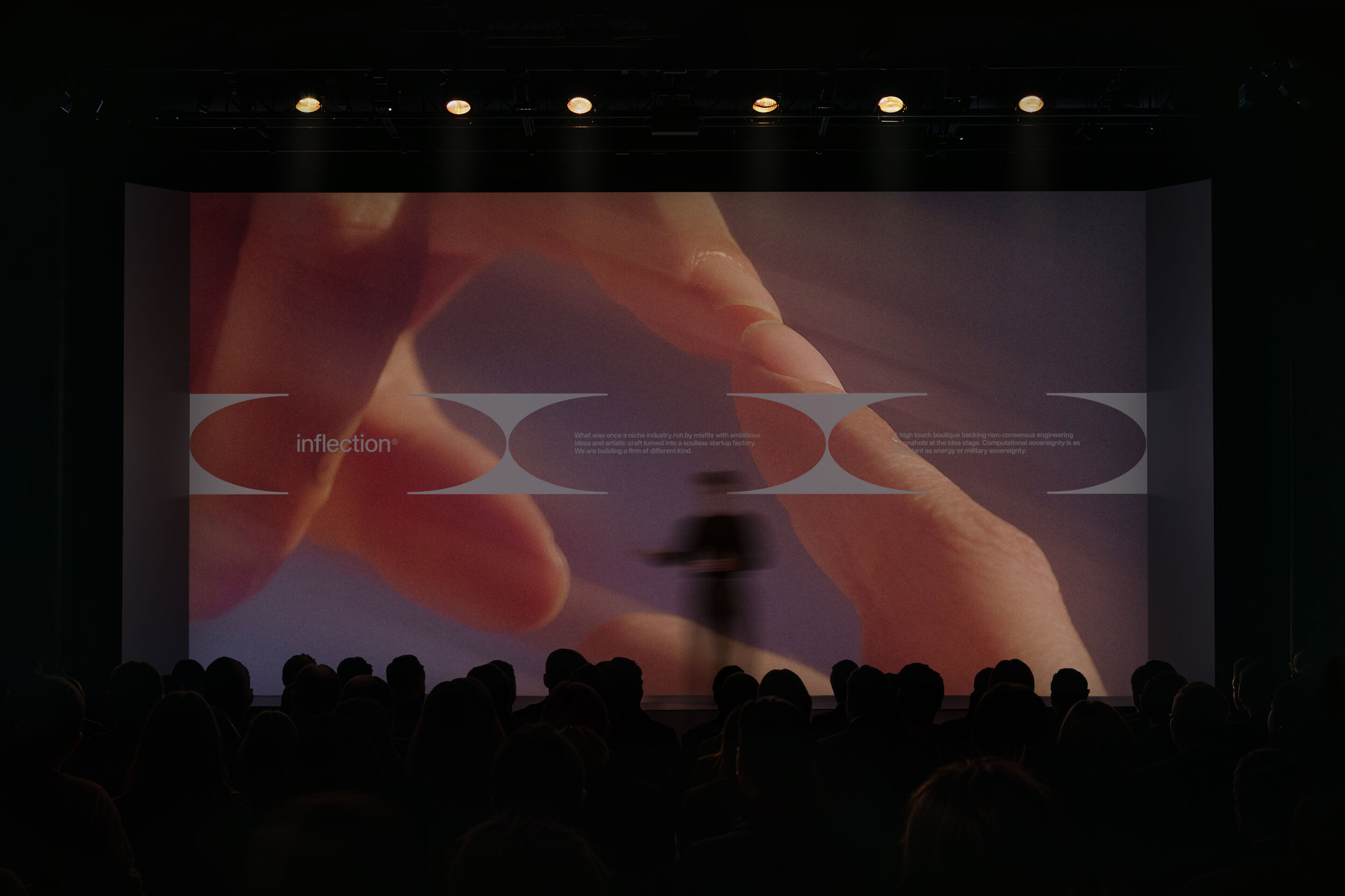
At the centre of this idea is the inflection point, the moment where direction changes and new trajectories begin. The logomark embodies this tension. A rectangular form is interrupted by two elliptical cuts, evoking a pair of eyes; one turned to the past, the other to the future. The resulting shape reveals the letter ‘I’, a direct reference to the firm’s name.
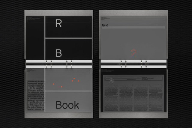
A contemporary sans-serif typeface, Studio Pro, underscores Inflection’s forward-looking ethos while remaining rooted in the heritage of Swiss modernism. This balance between timeless rationality and modern adaptability mirrors the twofold perspective that is integral to the identity.
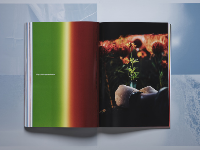
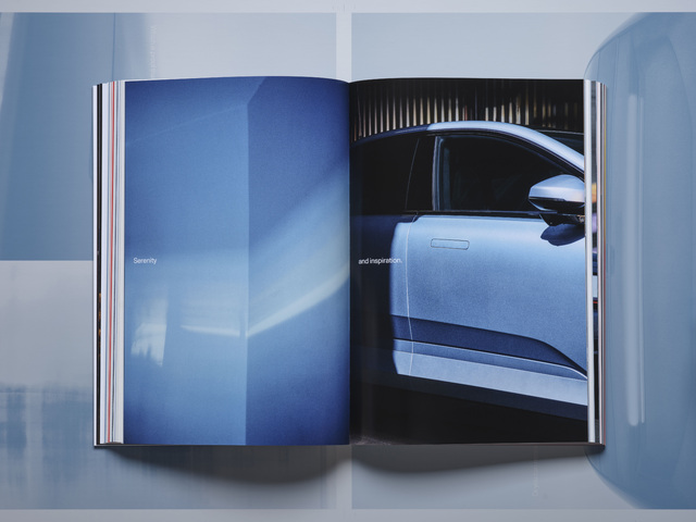
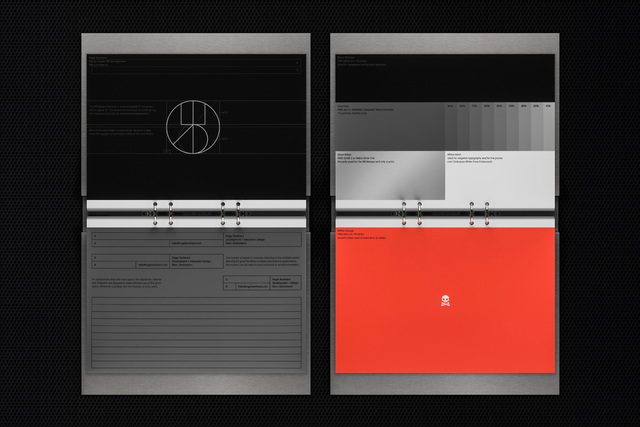
The primary colour palette—black, white, and the transitional grey between them—visualises the idea of the inflection point. This chromatic continuum embodies change, the movement from one state to another. The green tone, used as an accent colour, conveys renewal, growth, and foresight. These are all qualities that reflect Inflection’s progressive outlook and long-term perspective.
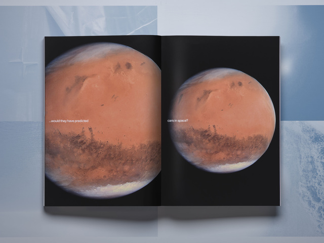
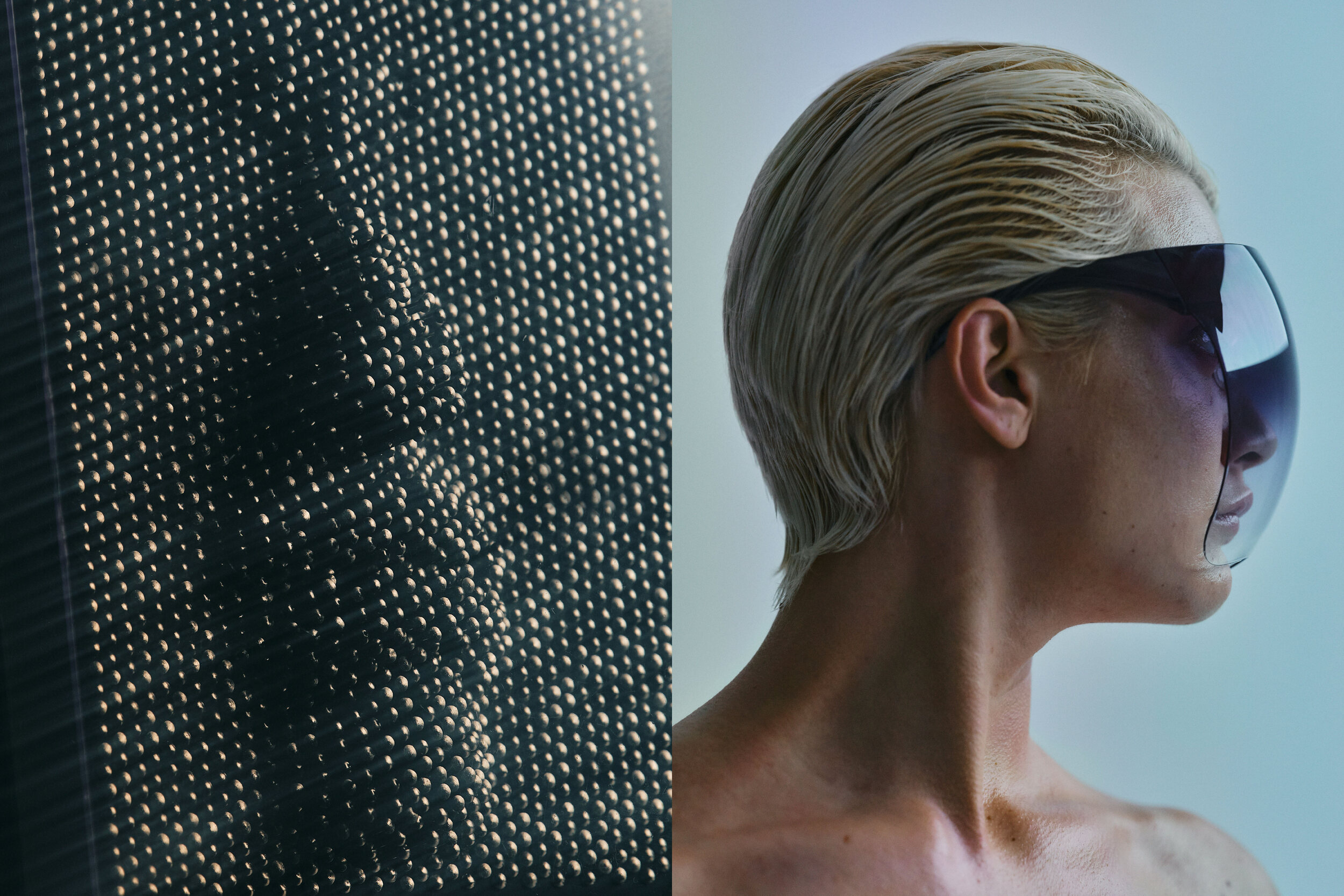
Two-part compositions reinforce the Janus concept through structure, mirroring its underlying duality. When combined with imagery of people facing left and right, the system acquires a human dimension, reminding us that every investment is ultimately rooted in people, culture, and lived environments.
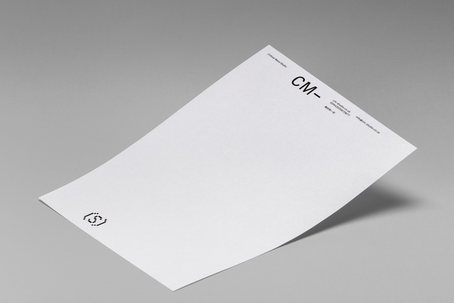
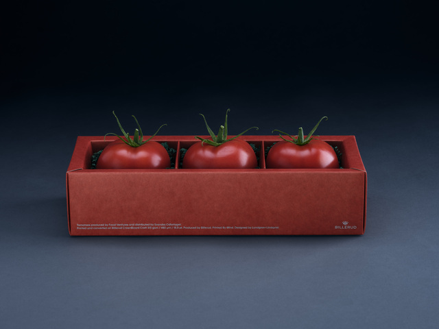
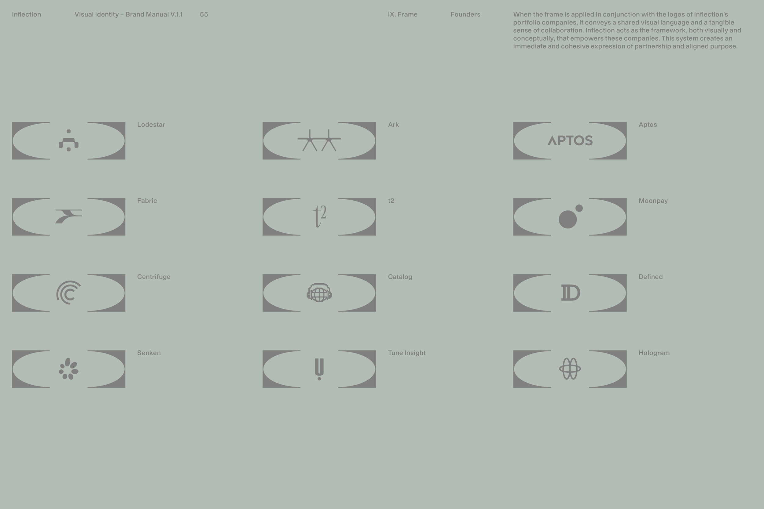
Another layer of the visual identity emerges through the deconstruction of the symbol to create a frame, an element that serves both visual and functional purposes. When applied in conjunction with the logos of Inflection’s portfolio companies, it establishes a shared visual language and a tangible sense of collaboration. Inflection acts as the framework, both visually and conceptually, that empowers these companies, creating a cohesive expression of partnership and aligned purpose.
The identity extends to the website as a continuous system, where the dialogue between past and future is sustained. The frame is reinterpreted as interactive components, while split compositions and the pairing of historical and futuristic imagery articulate the inflection point as the space where these two worlds converge.
Together, these elements frame Inflection as a firm that bridges opposing forces—retrospection and anticipation—while remaining deeply attuned to the individuals behind every venture.