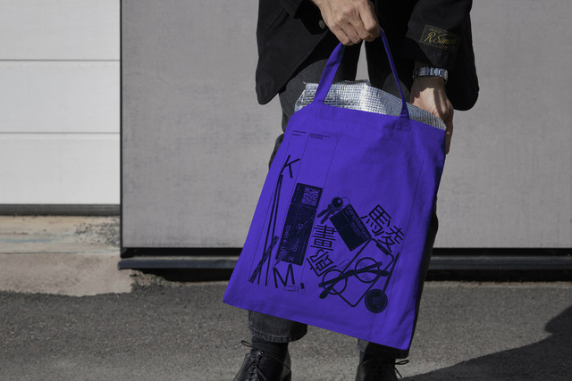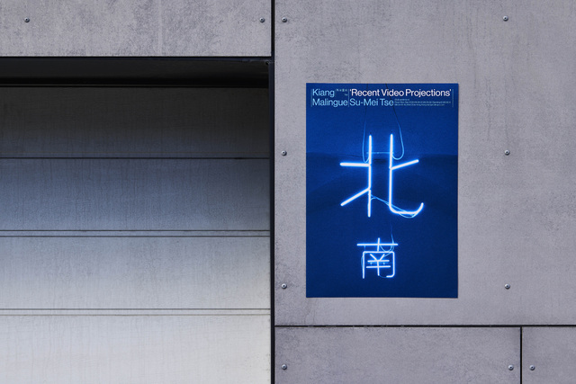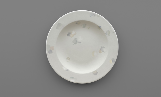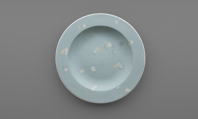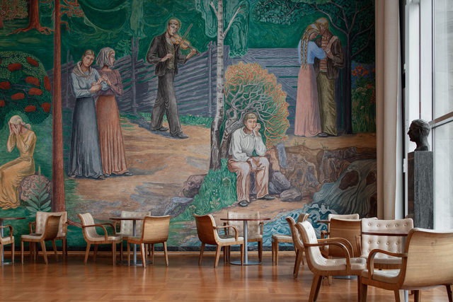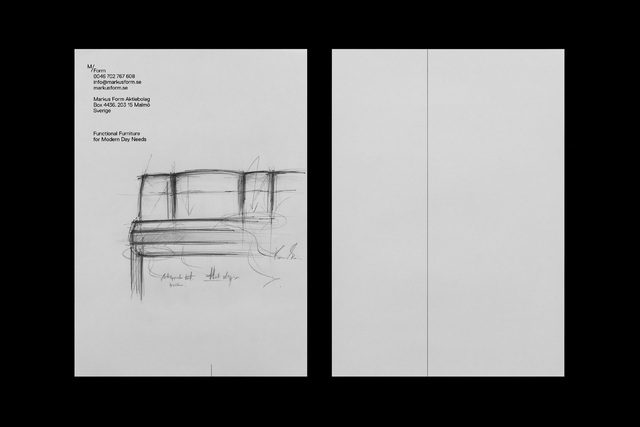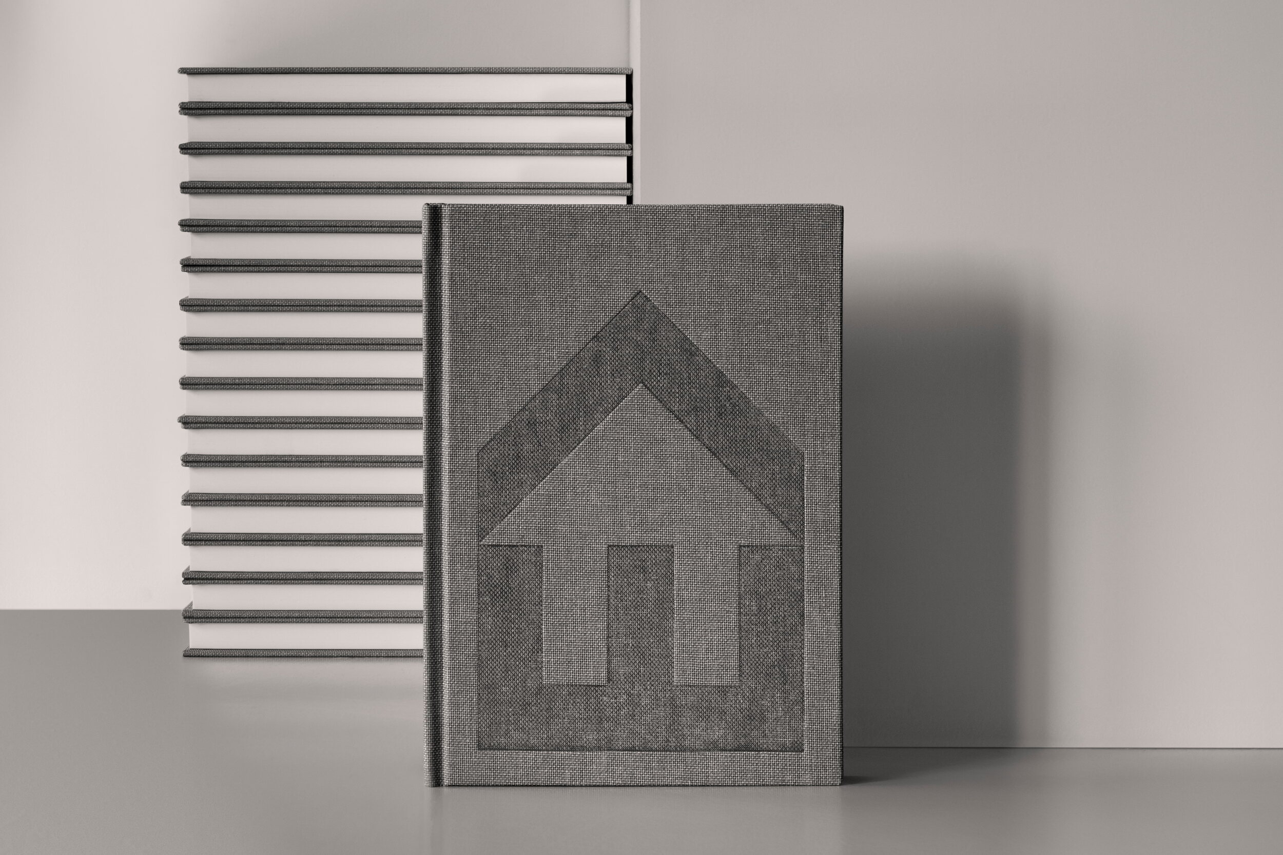
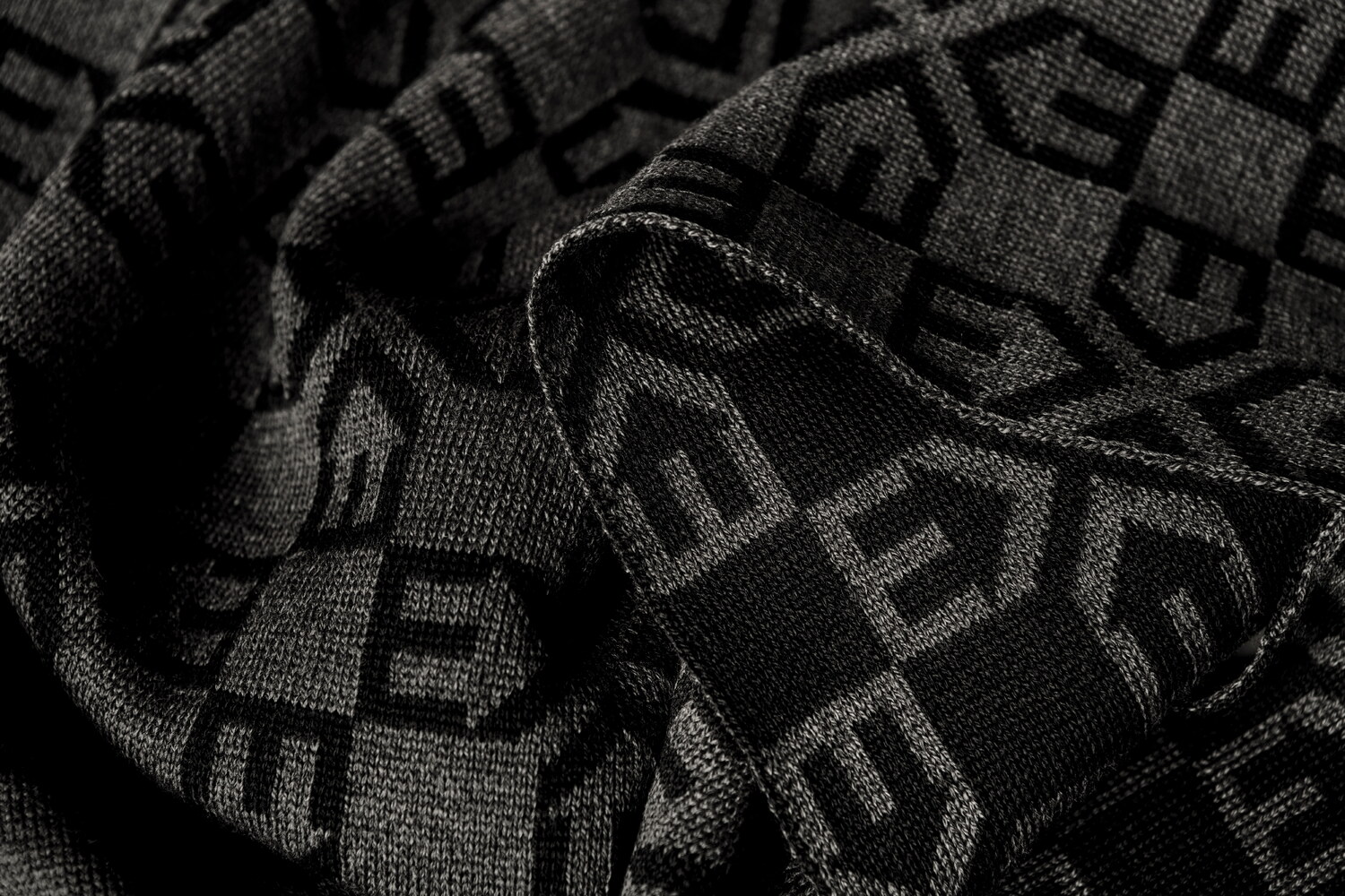
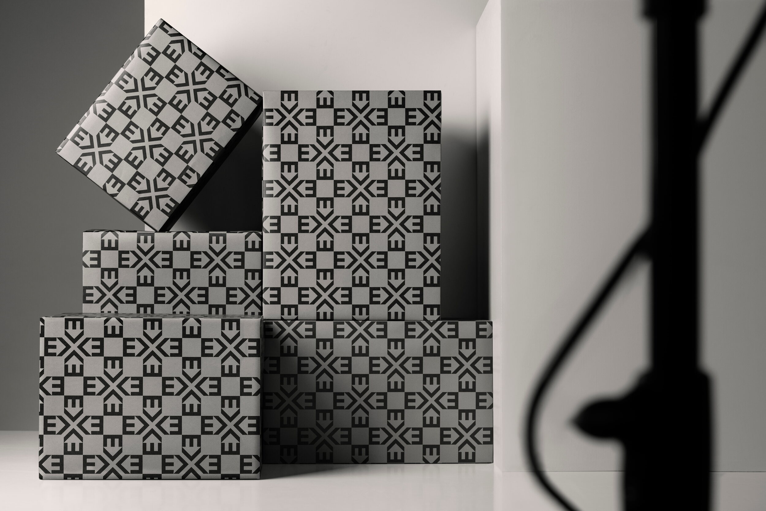
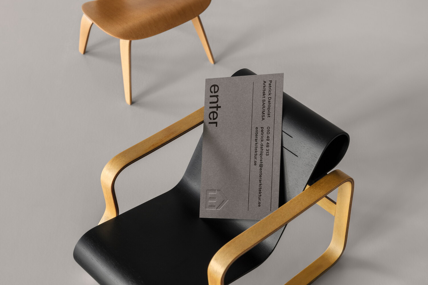
In addition to the visual identity, Lundgren+Lindqvist designed a range of give-aways that were given to guests who attended the launch event for the new visual identity. This range included bespoke knitted scarves, patterned wrapping paper (with the launch coinciding with Christmas), silkscreened tote bags and a series of hand-bound notebooks. For the notebooks, we experimented with the heat and pressure settings of the embossing machine in order to achieve the speckled surface which, when embossed onto the grey book cloth of the covers, resembles concrete. The level of variation which came as a result of this very manual process also made sure that each of the 200 books had a unique look. The books were handmade by Flodstrands Bokbinderi in Gothenburg.
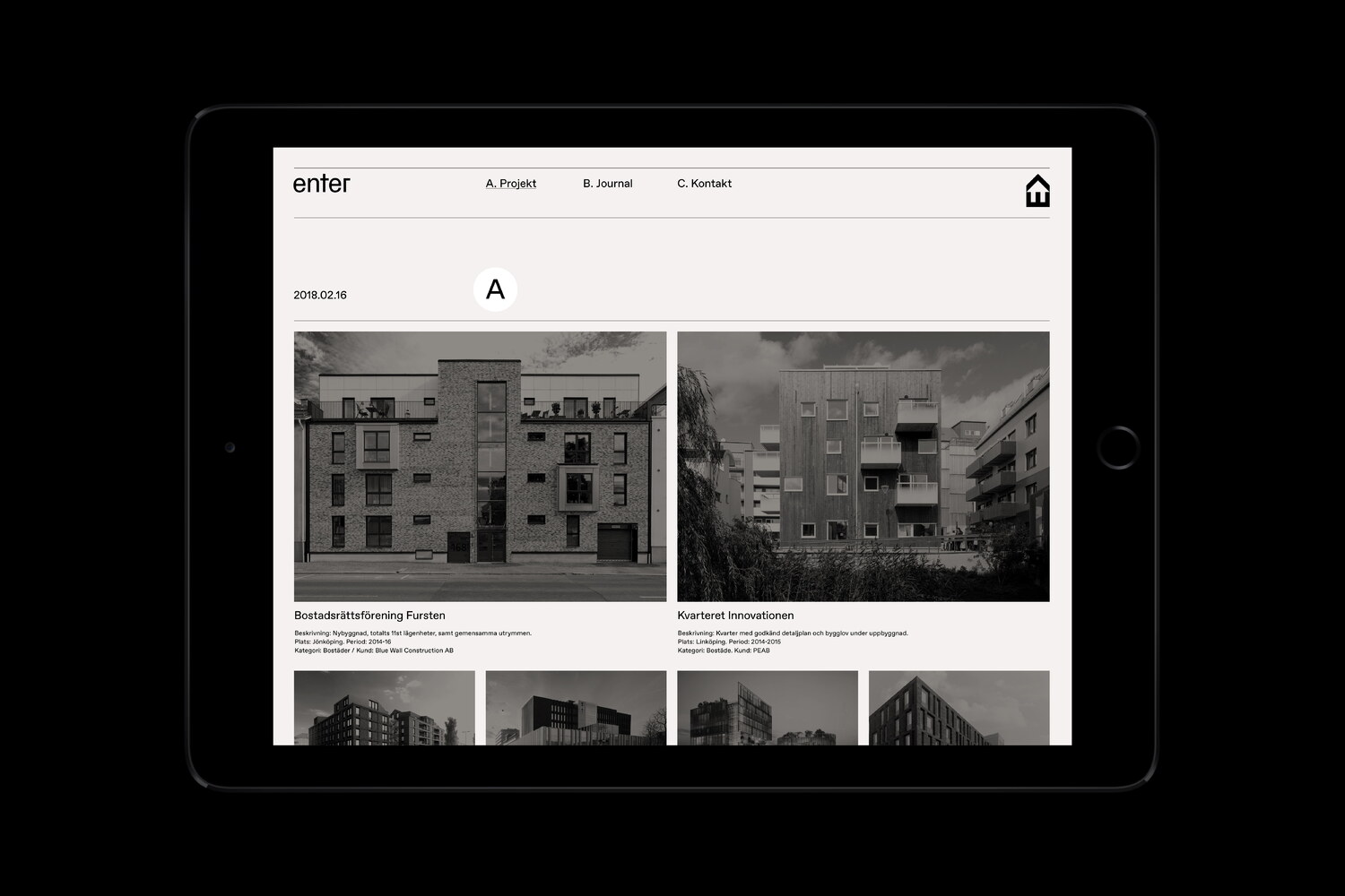
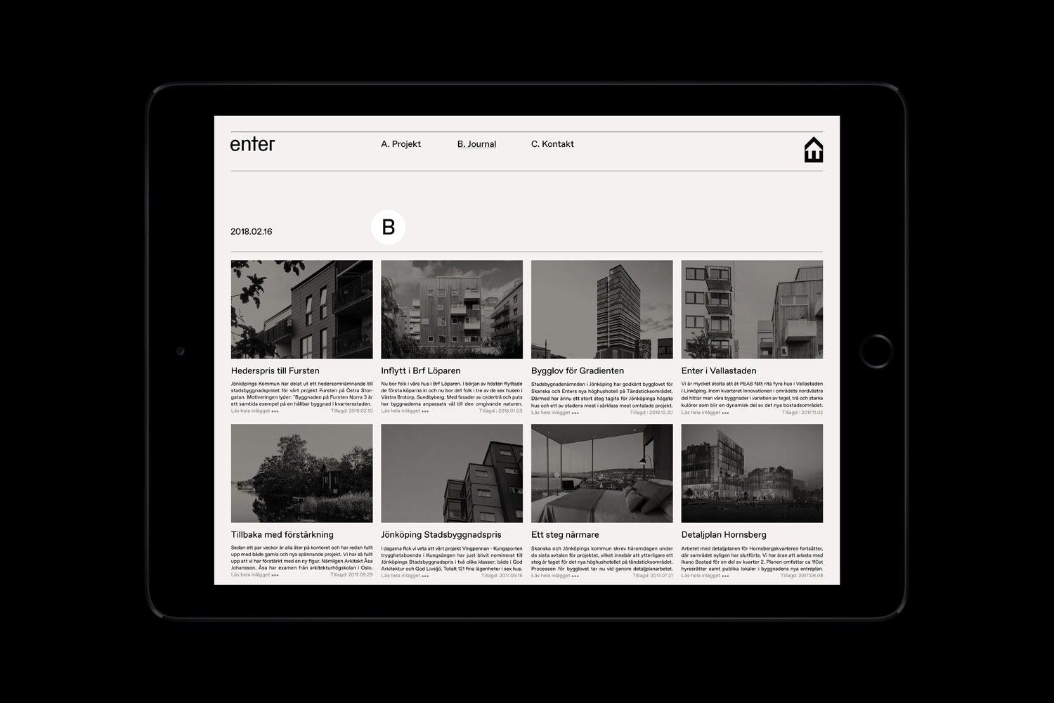
As part of the project, we also designed a range of digital presentation templates and designed and developed a new website. The website offers a straightforward manifestation of the new visual identity, in which the practice’s projects are the main attraction. Displayed in an organised grid, built with the new CSS Grid standard, the projects are presented in levels. The two latest ones are in primary focus, followed by three rows of projects presented with smaller images. At the bottom of the page, a complete archive of the practice’s work unfolds. In the Journal, the news posts are displayed in a similarly precise yet more comprehensive grid, and will grow to display the post’s full texts upon hover, or click on touch-devices.