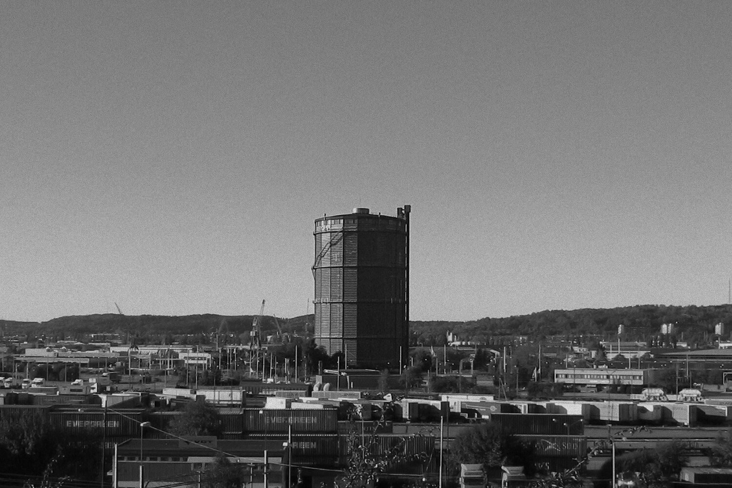
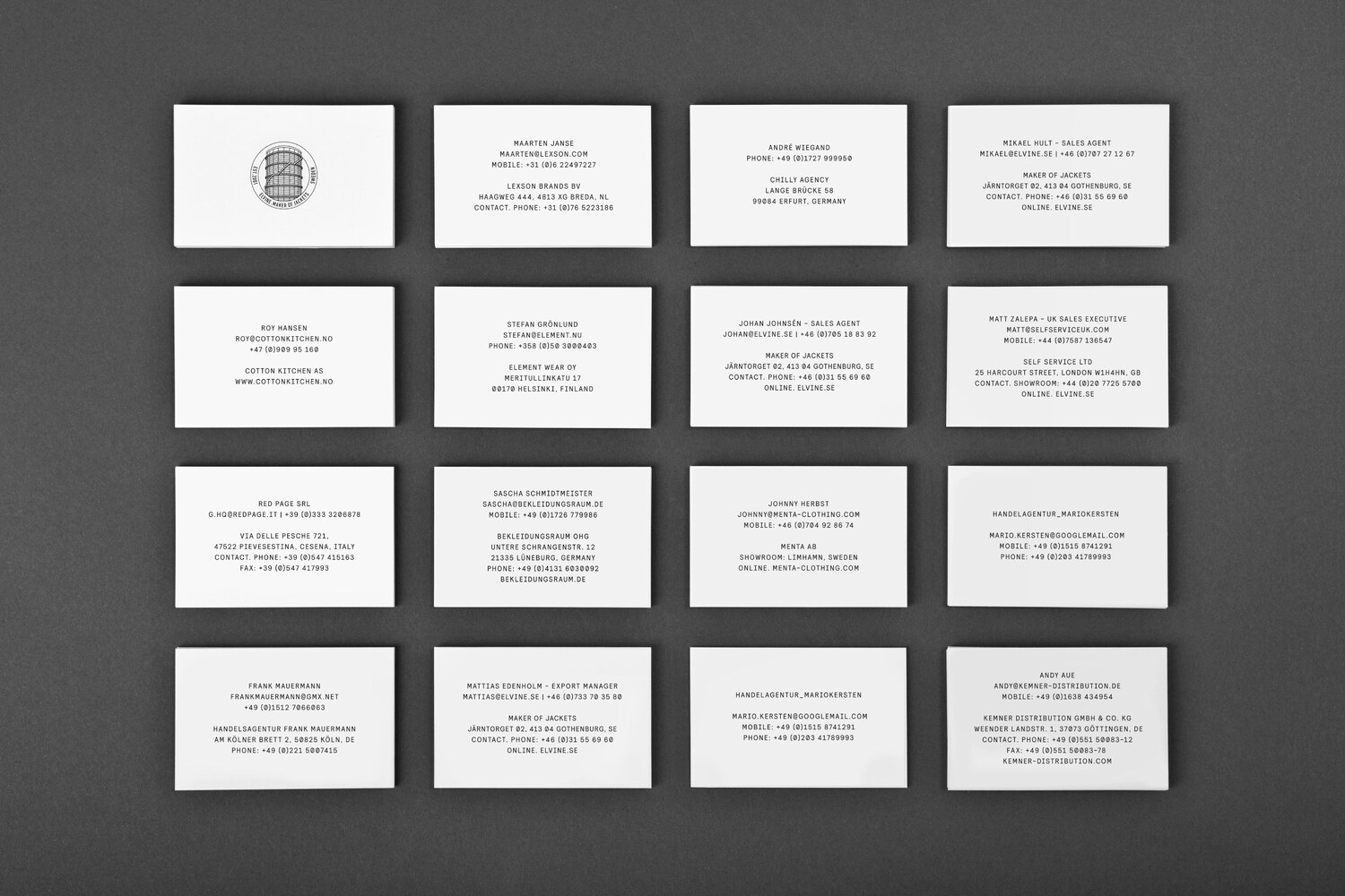
The Elvine emblem depicts an illustration of the iconic Gothenburg gas holder; ‘Gasklockan’. The building holds a lot of history, and has been a symbol for Gothenburg’s refusal of bending to commercial forces ever since Coca-Cola was forced by public demand to withdraw a request to repaint the whole building as a giant soda can. Gas holders, in one shape or another, can be found in most larger metropolitan areas in the world, representing urbanity and progression. In a way, these structures have become icons of the industrialised landscape, as manifested in the work of Bernd and Hilla Becher.
After many years of legal battles, the iconic gas holder in Gothenburg was finally demolished in 2017. Perhaps, the Elvine emblem was then indeed transformed into more of a symbol of heritage than what was initially intended?
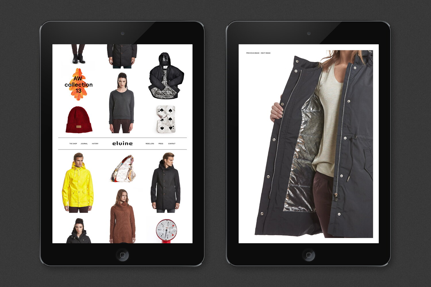

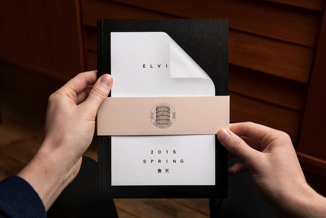
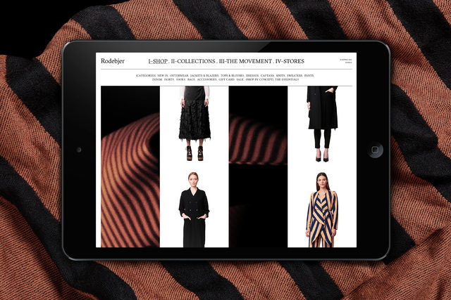
For the redesign of Elvine’s website, the intention was to create a simple and impactful way for Elvine to quickly share new garments, along with updates from their showroom, regular travels and more long-form editorial pieces. The landing page of the website featured a juxtaposed mix of objects found and collected during journeys abroad, garments and other updates. It was designed to be in a state of constant flux, with randomized material from an archive being posted automatically at regular intervals.
The website was built on WordPress and included a number of highly bespoke features, such as a custom-built solution for easily creating new layouts for the front-page and the story sections. Using these tools, the editor could swiftly customise the start page by using and combining a number of available modules, as well as build bespoke stories, with different options for laying out images and text.


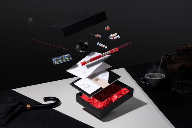
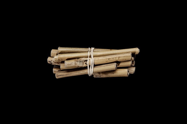
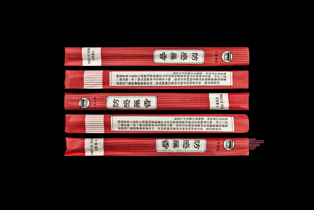
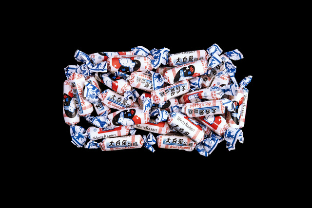
COLLECTION OF URBAN ARTEFACTS.
COLLECTED WORLDWIDE. CURATED BY LUNDGREN+LINDQVIST. DOCUMENTED BY CARL ANDER. PART OF CLOTHING BRAND ELVINE’S STEADILY GROWING INVENTORY.
ITEMS B55 - B91. SEASON 3, 2013.
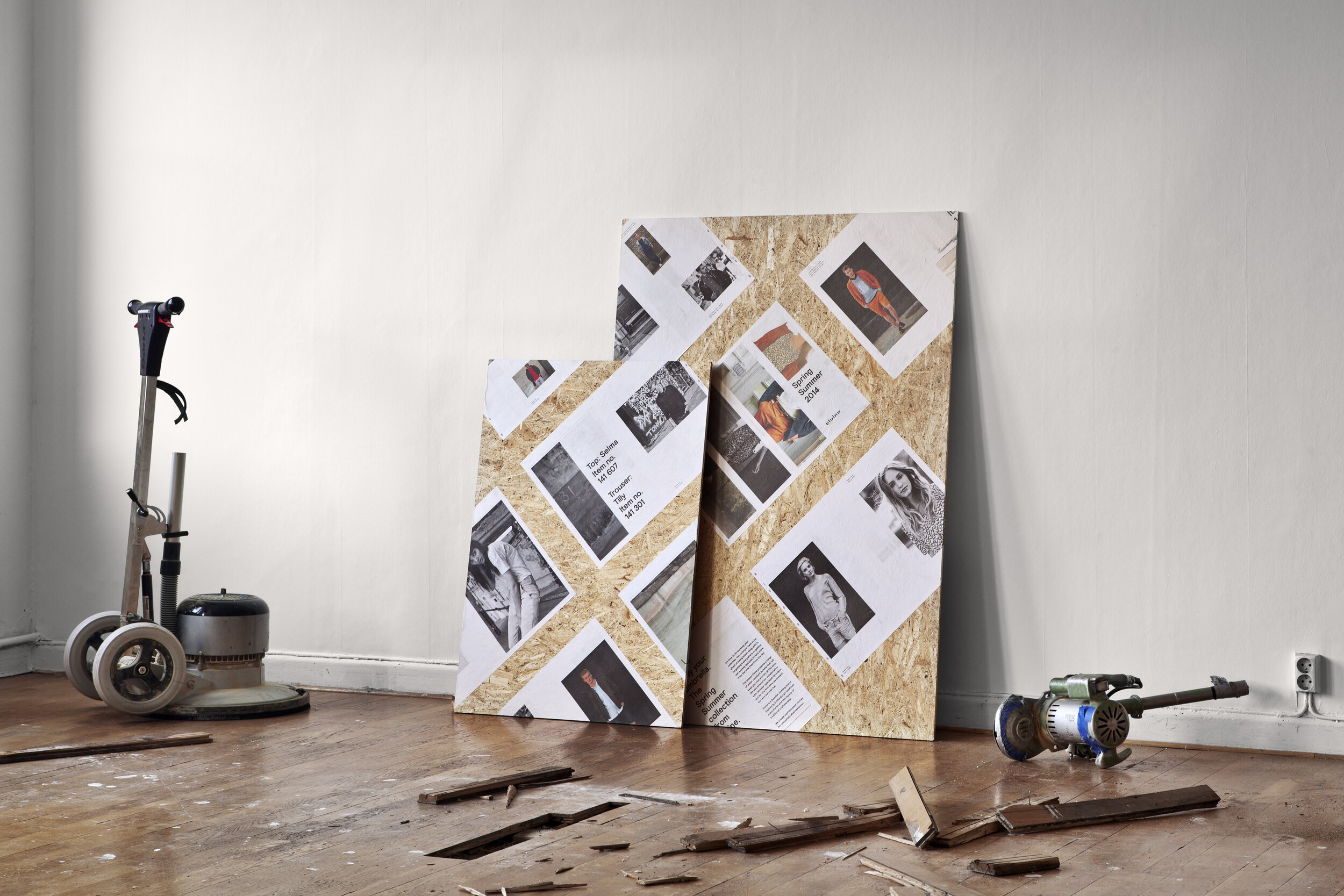
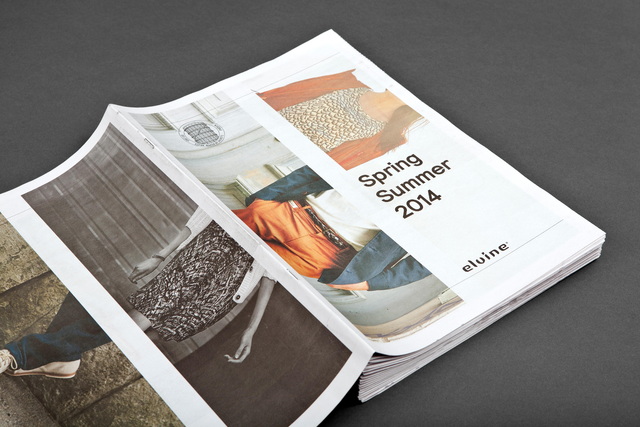
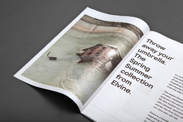
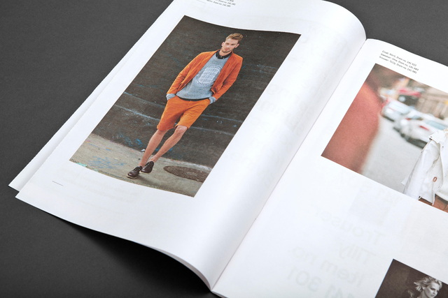
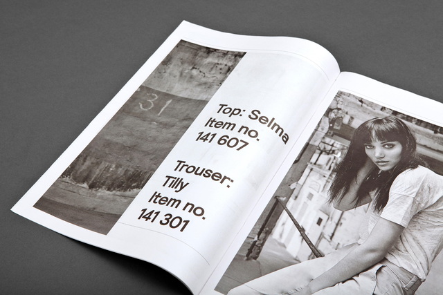
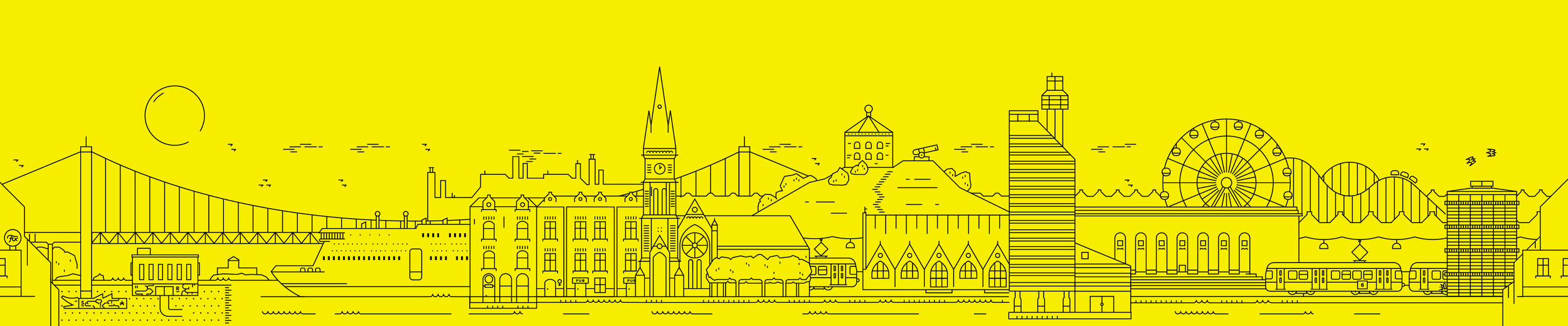
The Elvine Spring Summer 2014 lookbook was, much along the lines of the process for the redesign of the visual identity, inspired by the urban landscape. From the posters hastily pasted on construction site hoardings to the sliding views between the high-rises, the temporal state of the cityscape is constantly inspiring us to find new ways to communicate, commute and collaborate.
For the cover of the lookbook, we juxtaposed images in both colour and greyscale creating a distorted rhythm. For the inlay, we devised a dynamic grid allowing for considered variation throughout the publication. The typography was set in stark black against the white background, mimicking newspaper headlines and urban signage. The idea behind the type’s rough treatment and the paper and printing method was to give the publication an undesigned look and feel.
The lookbook was printed in tabloid format, on newsprint and distributed to Elvine retailers worldwide. Spreads from the lookbook were also pasted on the walls of Elvine’s exhibition stands in trade shows such as Bread & Butter in Berlin.
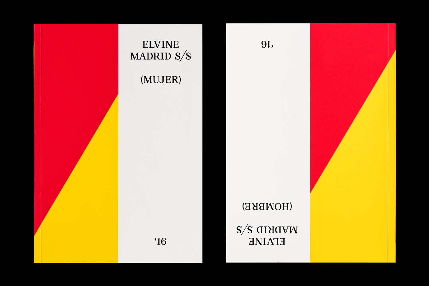

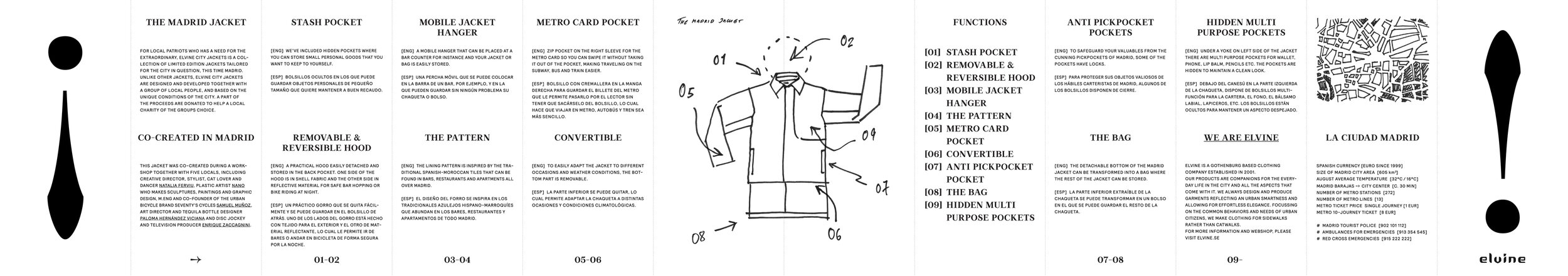
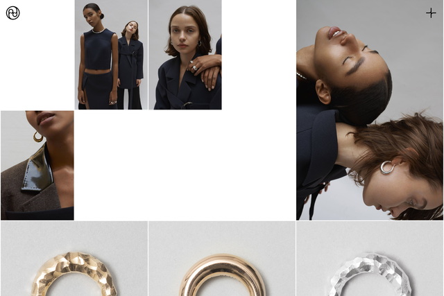
For the Spring/Summer 2016 collection, fashion brand Elvine traveled to Madrid. As part of their City Jackets program, they gathered a group of local creatives to co-create the Madrid jacket - a garment tailored to the specific conditions of Spain’s bustling capital.
We designed both lookbooks and all other marketing material for the launch of the collection. The project included creating a collage, for which we collected and compiled thousands of images related to Madrid. The black and white images were arranged according to their density of black, creating a floor pattern landing its geometric arrangement from traditional Madridian tiles. This floor was used in Elvine’s showroom for various fashion trade fairs around the world.
The lookbook was designed to be read in two different orientations, with the women’s collection designed to be read from one side, and the men’s collection from the other. This allowed us to design two different covers and to avoid having to produce two separate lookbooks.
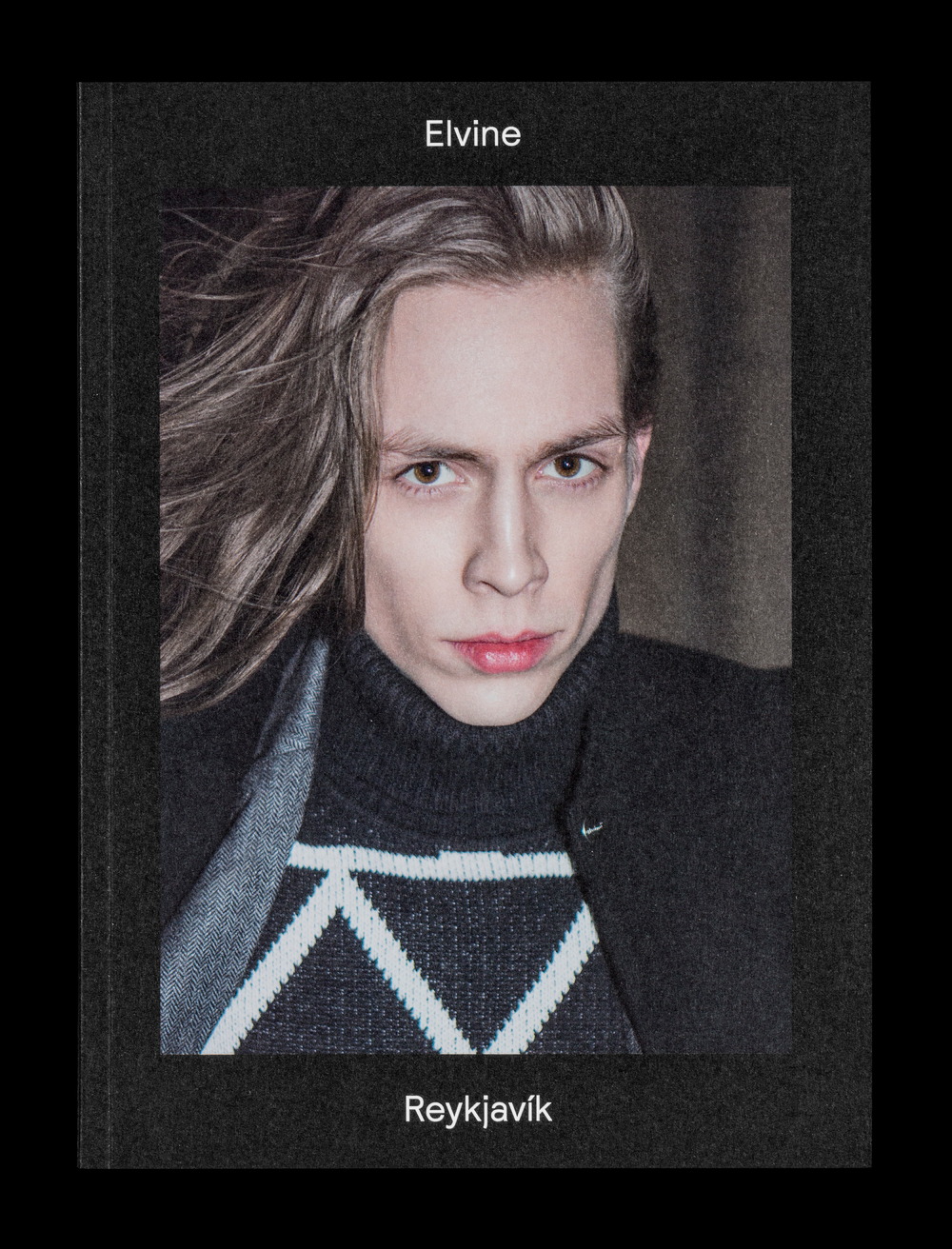
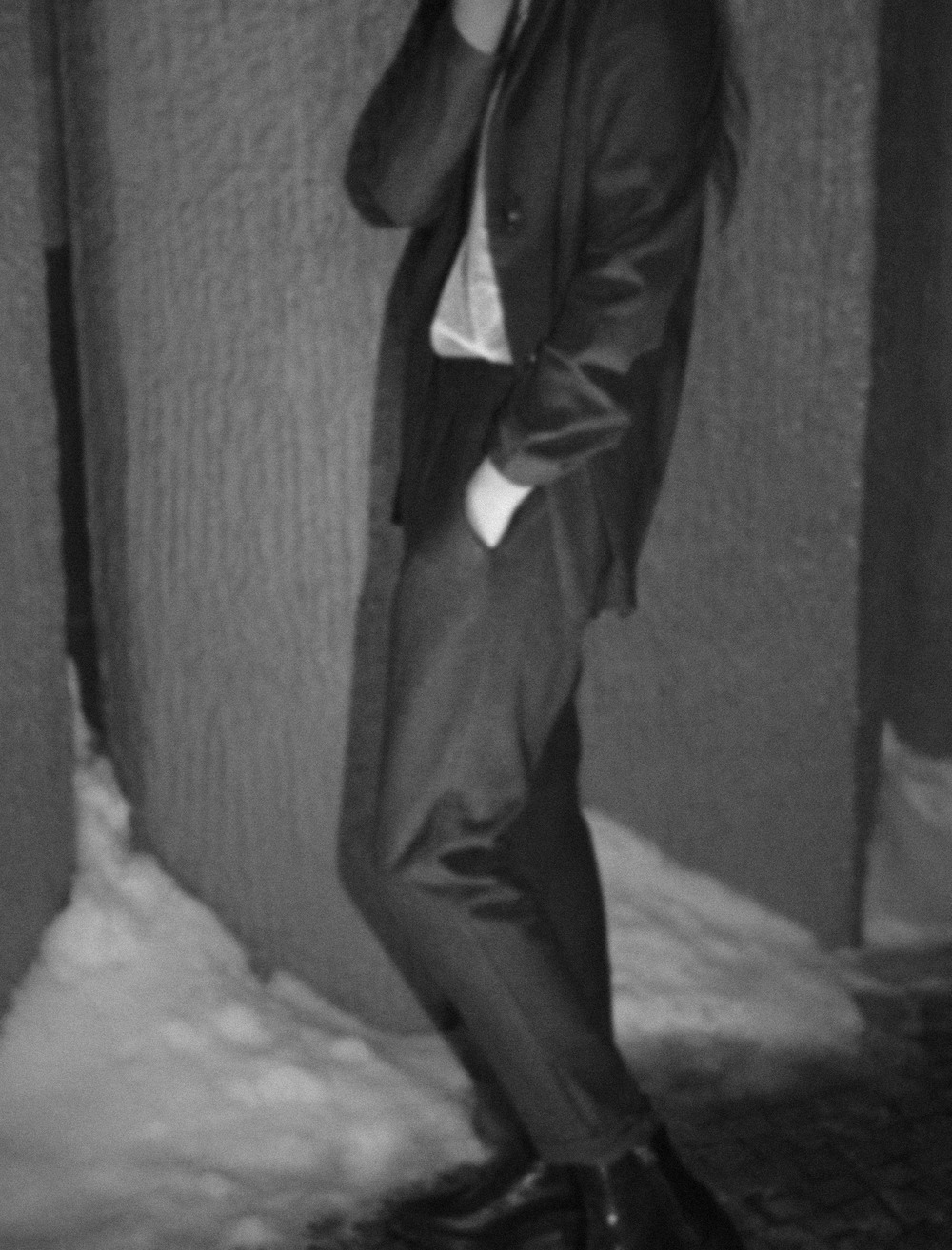
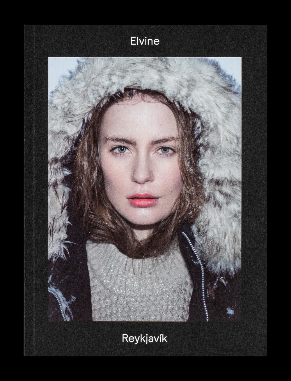


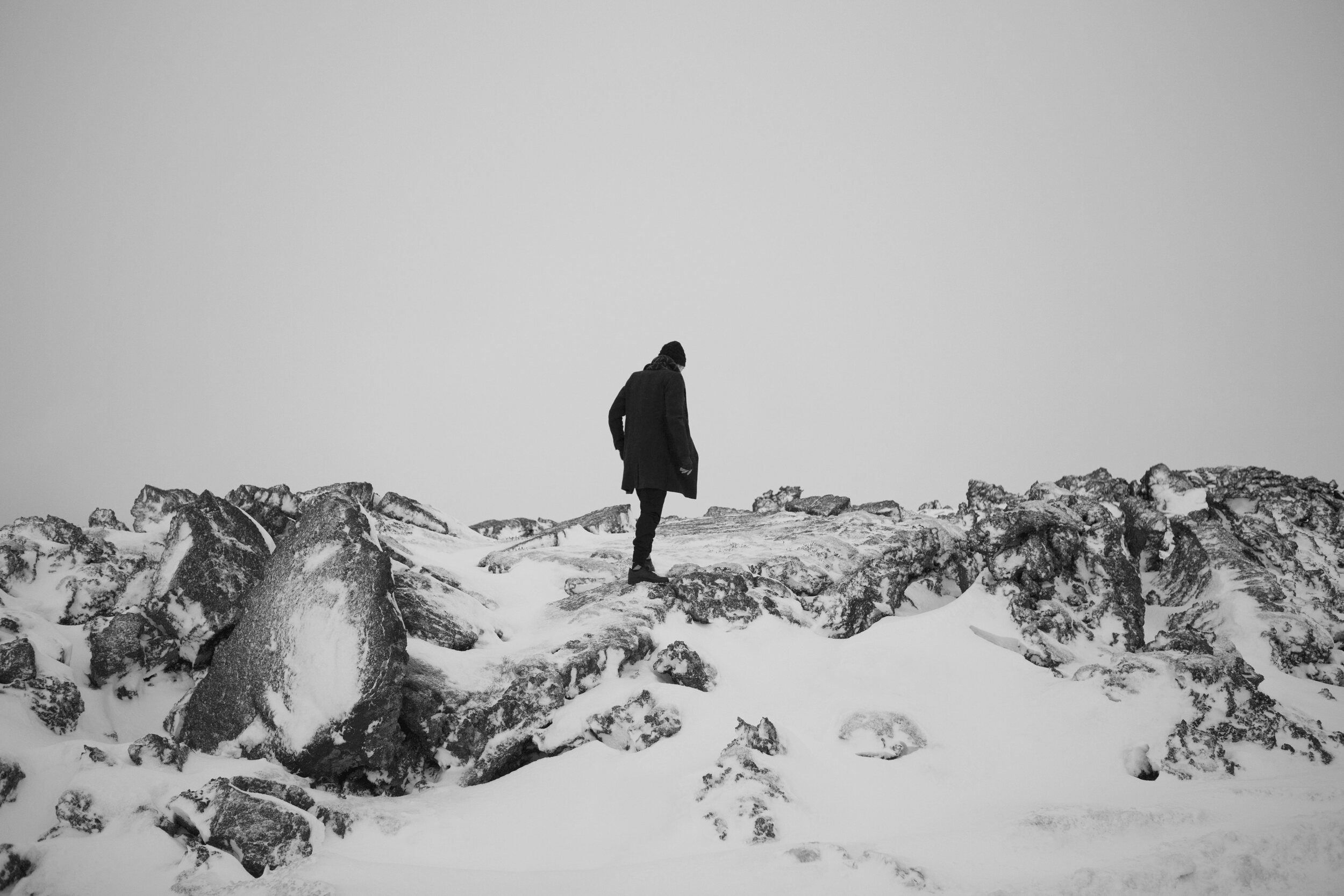

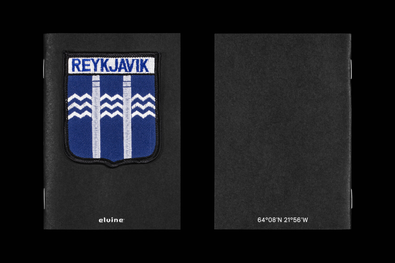
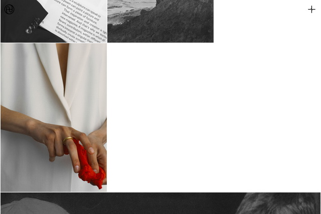
For the Autumn/Winter 2015 collection, fashion brand Elvine traveled to Reykjavik. As part of their City Jackets program, they gathered a group of local creatives to co-create the Reykjavik jacket - a garment tailored to the harsh conditions of Iceland’s capital.
We art directed the campaign and designed the lookbooks and all other marketing material, which included a special hangtag with an embroidered Iceland patch glued to its cover.
For the lookbook, we sourced and photographed stones and mineral samples, which were used to illustrate the Icelandic landscape; where the volcanic scenery meets the flowing lava of the island's active volcanos and the fierce waves of the North Atlantic Ocean.
(Resources)
Want to work with us?
(Credits)
Design & Art Direction: Lundgren+Lindqvist
Photography S/S 2014: Andreas Sundgren
Photography Reykjavik (on location): Kári Sverrisson
Case study photography: Ander,Sanner Fotografi
Print production: By Wind (Göteborgstryckeriet)