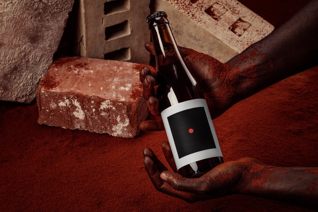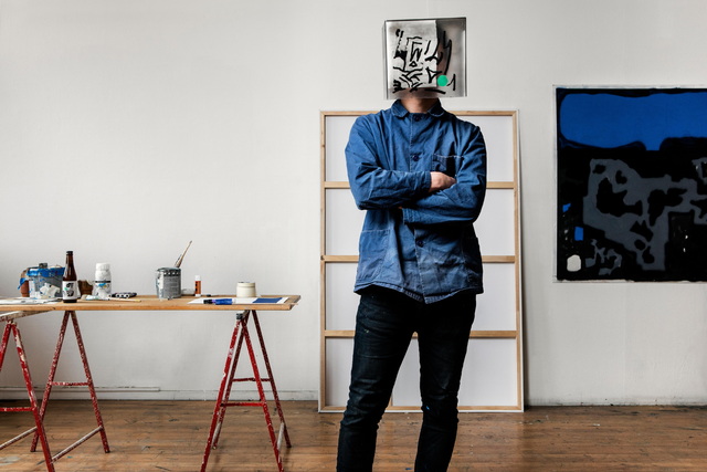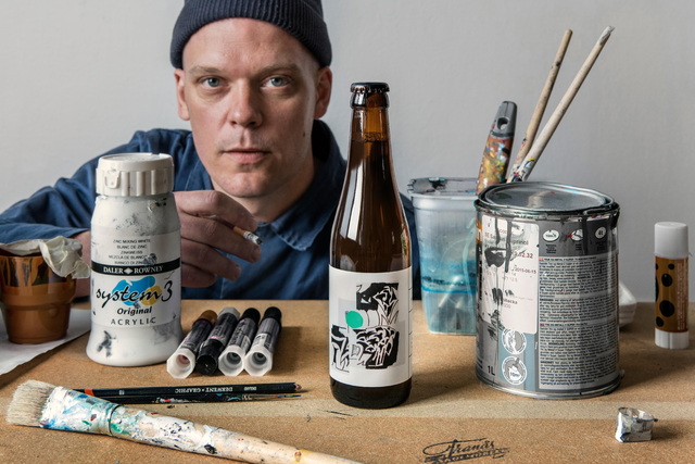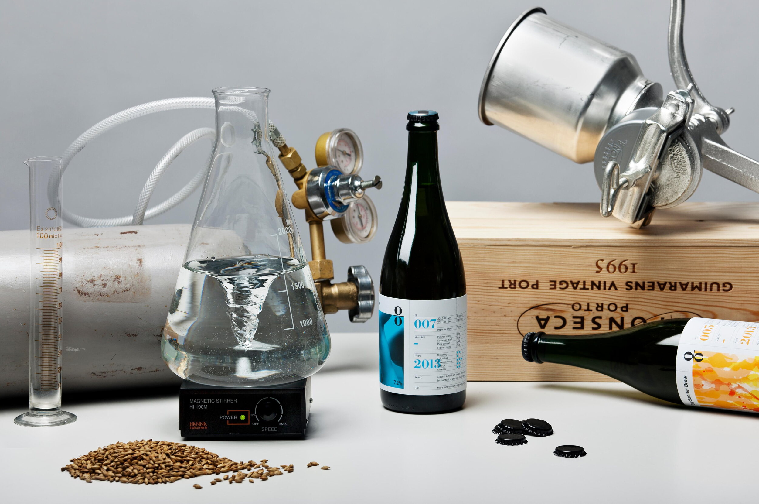
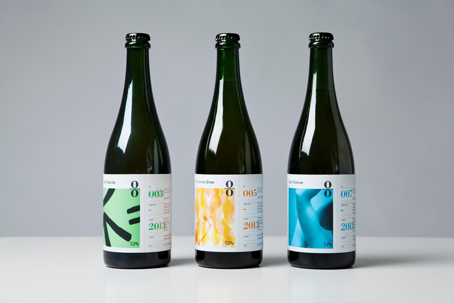
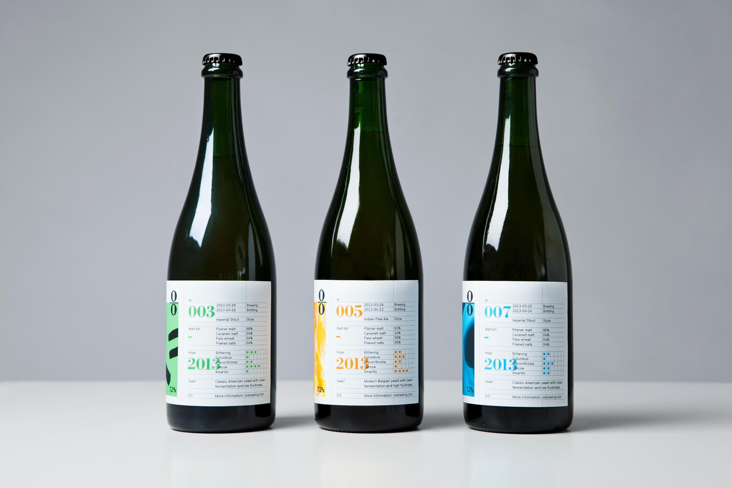
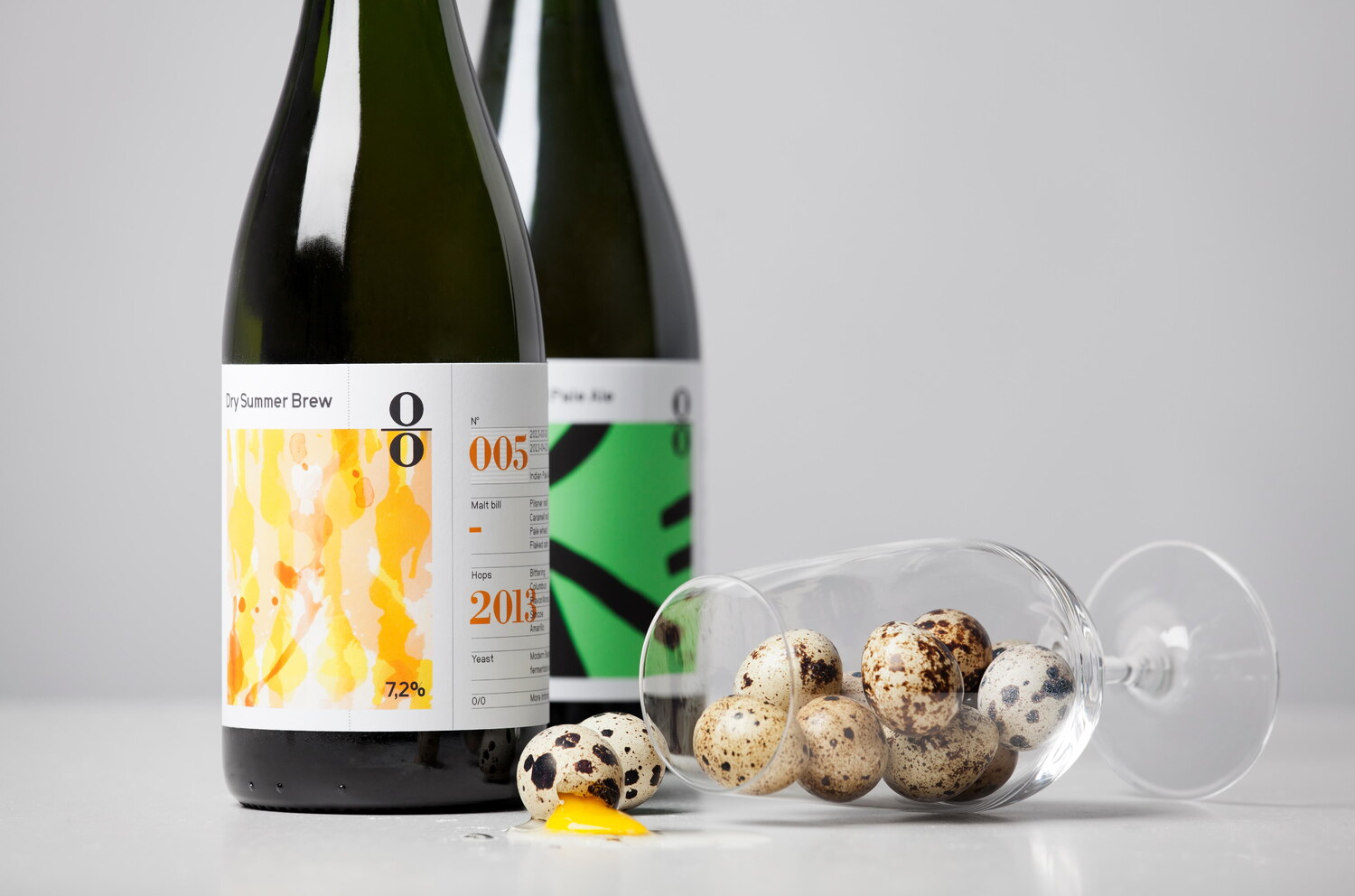


With many friends of the brewery being involved in creative disciplines - we designed the labels leaving a designated blank space serving as a canvas for artist collaborations. For each beer included in the ‘Standard Series’, Lundgren+Lindqvist and O/O Brewing have commissioned an artist to provide the artwork, with the labels growing over time to serve as a micro-gallery of sorts.
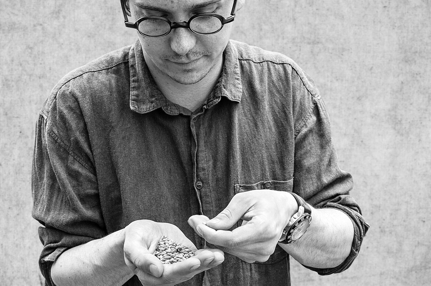
”This is a beer style that is very close at heart for me. Drinking Porter beers made me realize how complex and diverse beer could be and for a couple of years I was obsessed with everything that had to do with Porter beer. I was reading everything I could find about the history and origin and tasting as many different kinds of Porters as I could. This is when I stumbled across the Baltic Porter and it got my attention as it stood out from the rest with it's complex history and flavours. For me, it was one of the most mysterious beer styles that I had come in contact with. When I started brewing my own beer I was almost afraid of doing my own version of the Baltic Porter.
Being based in Gothenburg, we have a special relationship to the Baltic Porter. Sweden's oldest still active beer brand, Carnegie Porter, is brewing a weaker version of a Baltic Porter, which is still full of flavour. Or at least it was, until Carlsberg in 1976 moved the production from the harbour in Gothenburg to one of their big production facilities, which unfortunately resulted in a beer of much lower quality. Making our own version of Baltic Porter is in its own way a tribute to Gothenburg and its place in history as a city with one of the best beers of Scandinavia.”
(Brewmaster Olle Andersson’s own words on the Baltic Porter)
Baltic Porter is a beer style indigenous to northern Europe. It is similar to the English Porter, originating from the strong Porters and Stouts, which were shipped to the Russian empire throughout the 1800s. The Baltic Porters are usually very dark in colour with high notes of coffee and chocolate flavour.
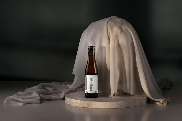
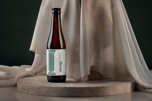
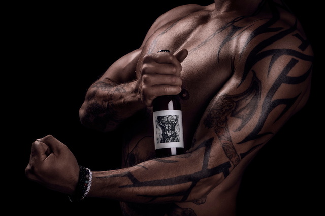
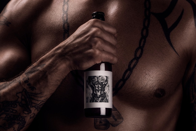
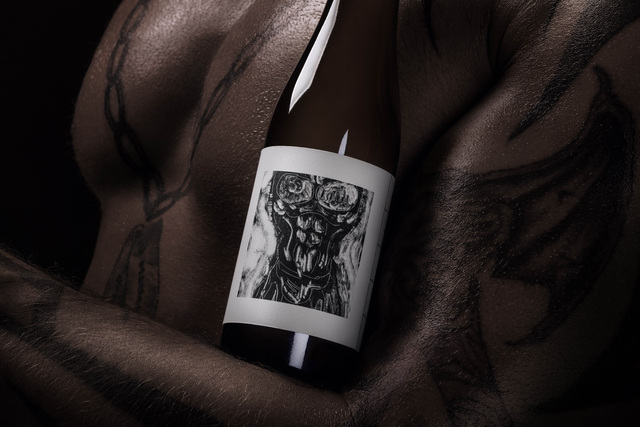
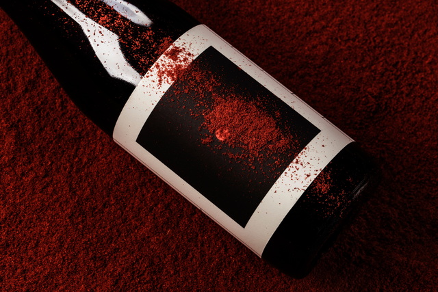
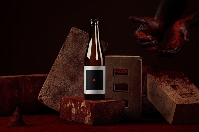
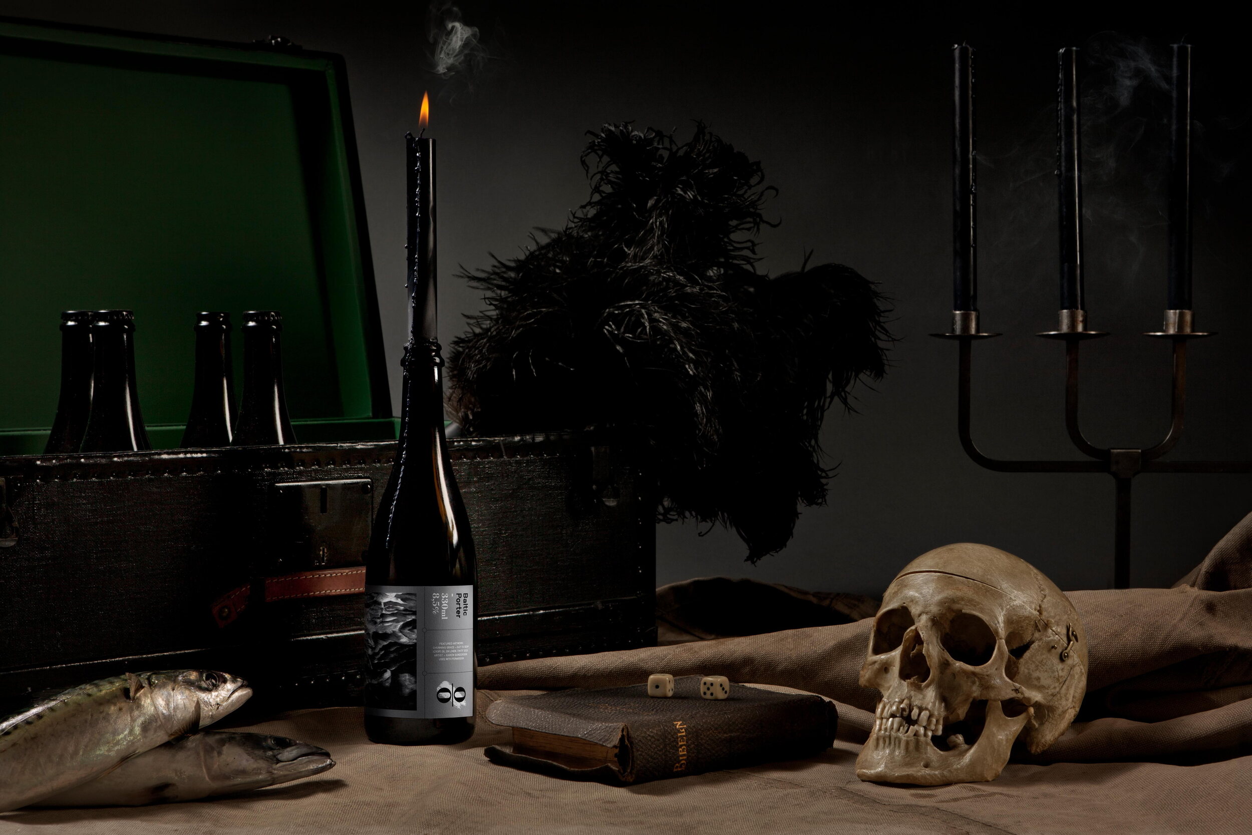
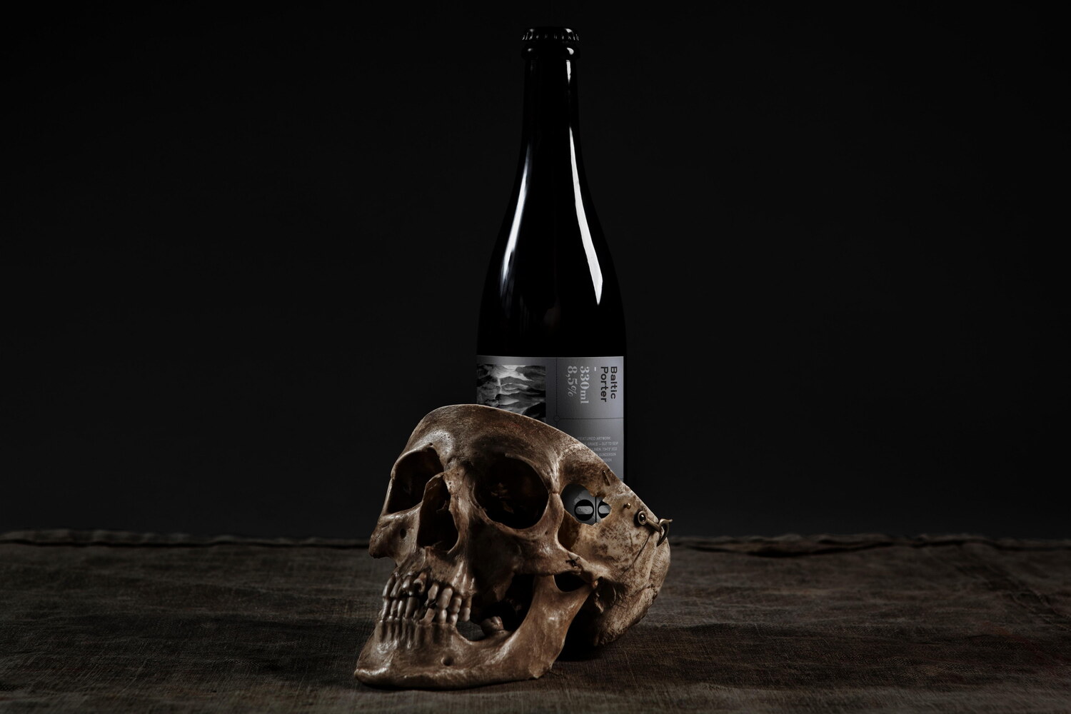
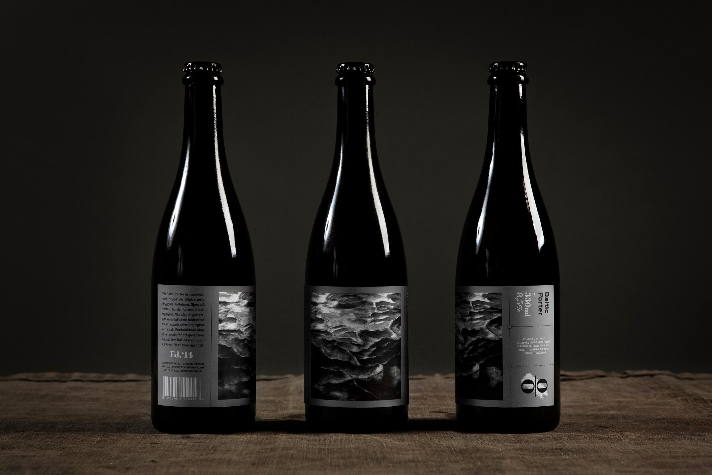
The pitch black beer with its Baltic provenance, with shores facing the Baltic Sea, led us to think about the work of American artist Karen Gunderson.
’Widely collected in Hollywood and New York, artist Karen Gunderson is perhaps best known for her work since the 1980s, when she transitioned from painting in color to working only in black. Over her forty-plus-year career, Gunderson has tackled subjects from clouds to royalty to the cosmos. Her long-developed, labor intensive technique, including rigorous brushwork and paint layering, employs a range of black shades that create a unique three-dimensional effect: The multiple textures from the paint catch light and make the paintings shimmer and appear to move, alternating with shadows and highlights that illuminate her subjects—historic royal figures, bodies of water, mountains, and constellations—depending on how the viewer moves in front of each artwork.’
(An excerpt from ’Karen Gunderson’, written by author and critic Elizabeth Frank)
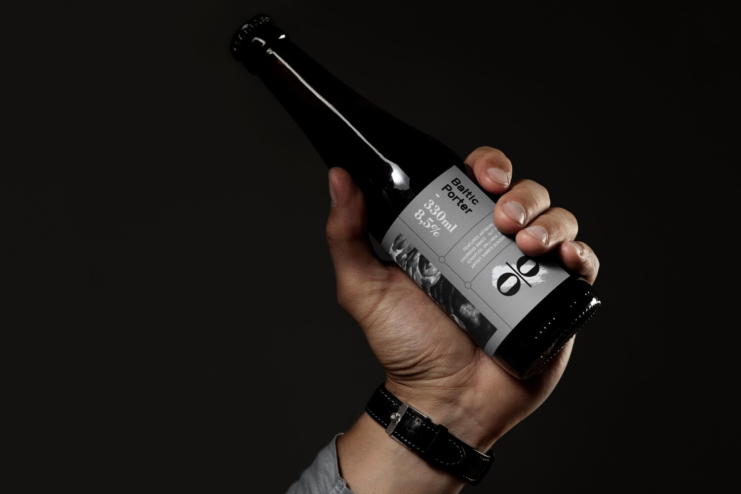
We have long admired Gunderson’s edge-to-edge paintings of black seas and when O/O started to plan the release of their pitch black Baltic Porter, she was the perfect match. Consequently, we approached Gunderson which led to a collaboration for the Baltic Porter labels, for which we used a reproduction of her painting 'Churning Grace - Out to Sea'.
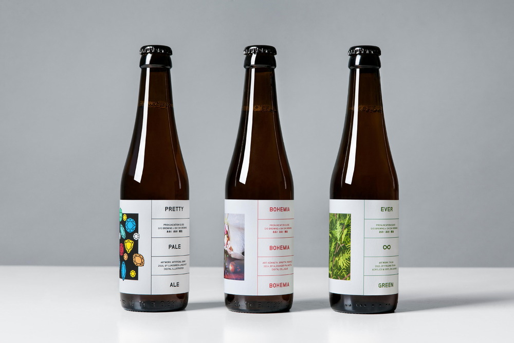
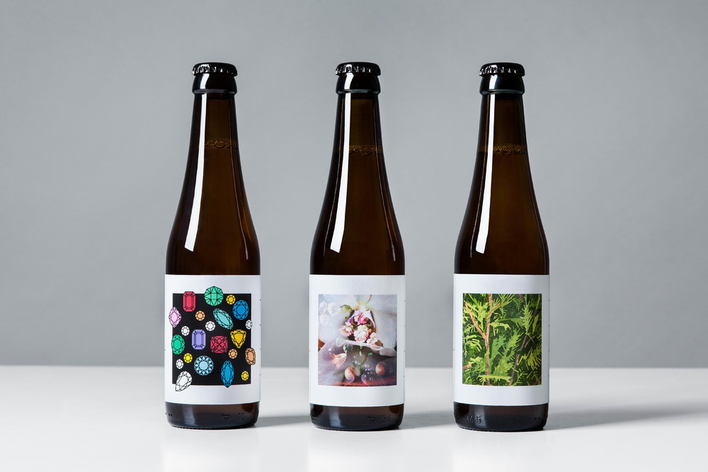
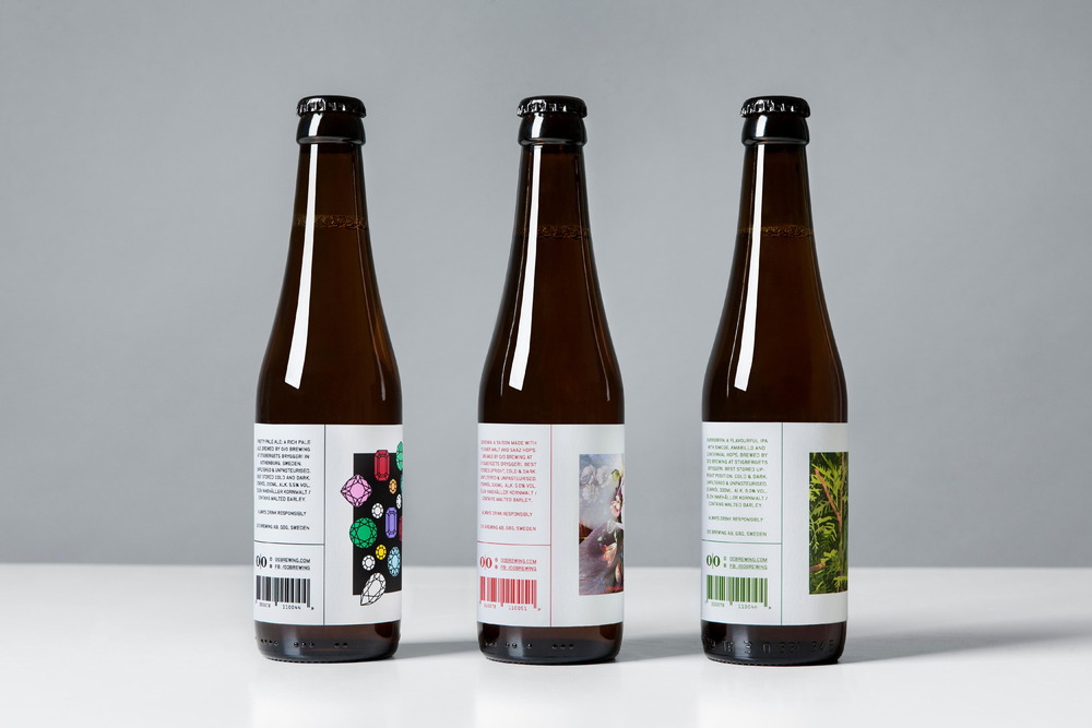
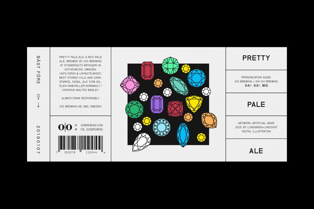
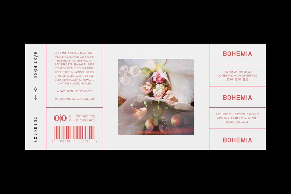
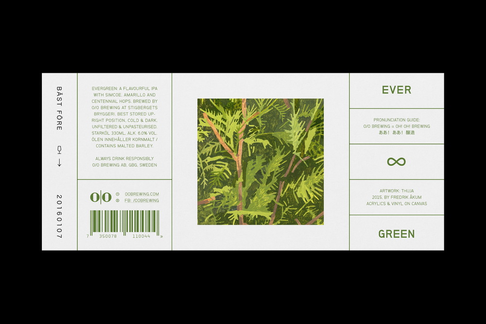
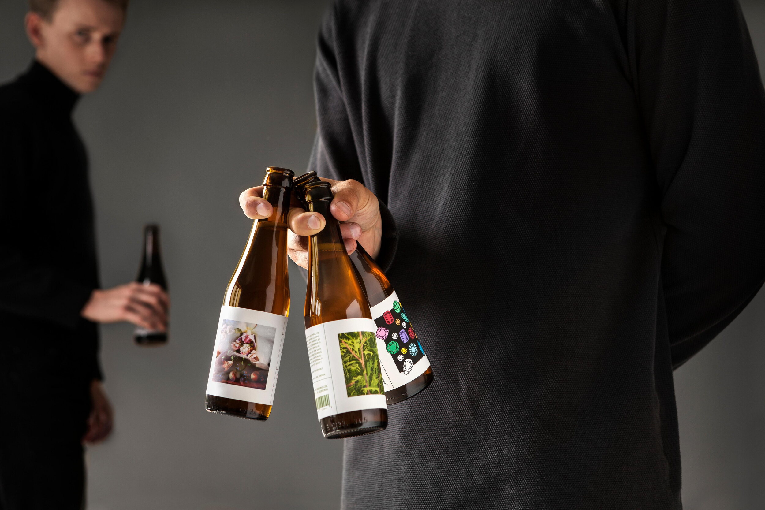
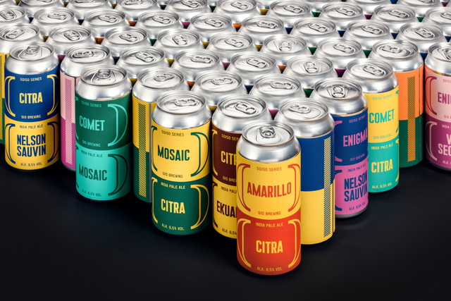
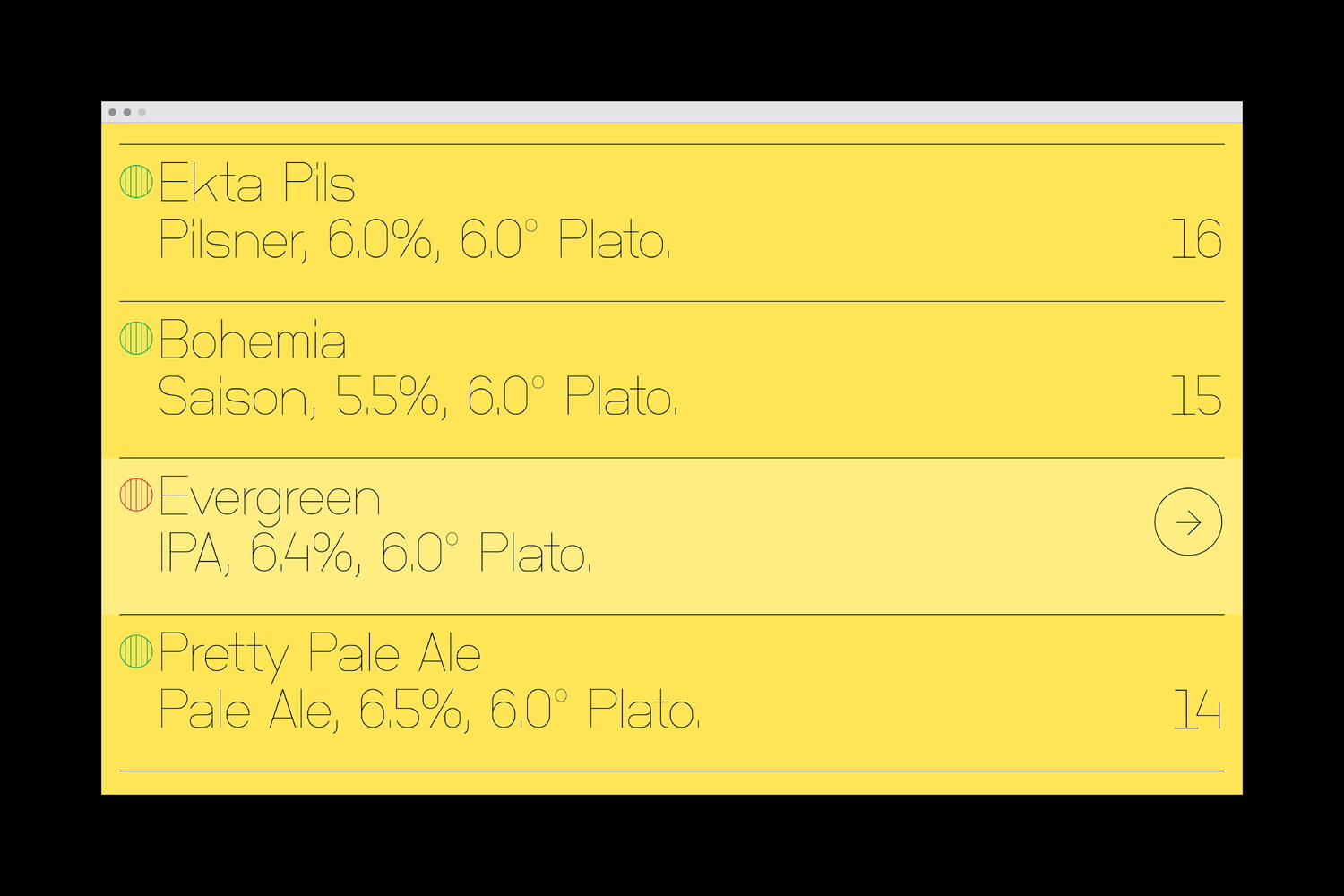
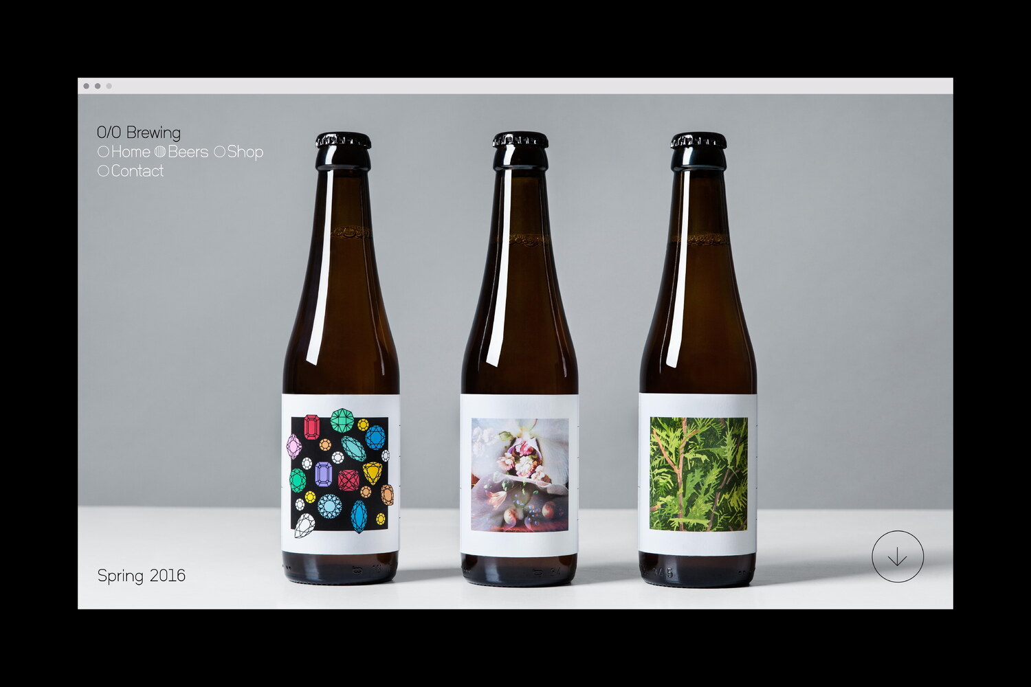
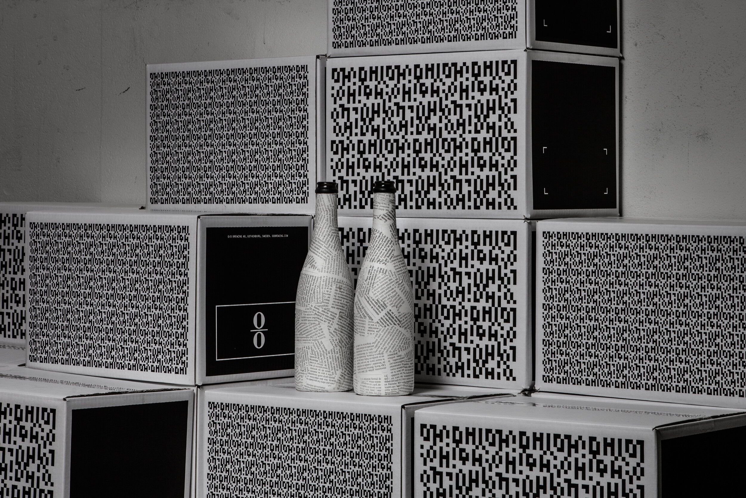
During the Spring of 2015, O/O Brewing released three new beers: A rich-in-flavor pale ale called Pretty Pale Ale, a saison made with Pilsner Malt and Saaz Hops called Bohemia and Evergreen - a flavorful IPA inspired by the taste and smell of conifer.
For the packaging of the new beers, Lundgren+Lindqvist revised and simplified the design system which had been used for previous labels, and incorporated a ’pronunciation guide’, to make the somewhat cryptic name easier to comprehend. We continued our collaboration with artists and designers, this time teaming up with Fredrik Åkum (for Evergreen) and Alexander Palmeståhl (for Bohemia), asking them to interpret each beer, featuring the resulting artwork on the labels.
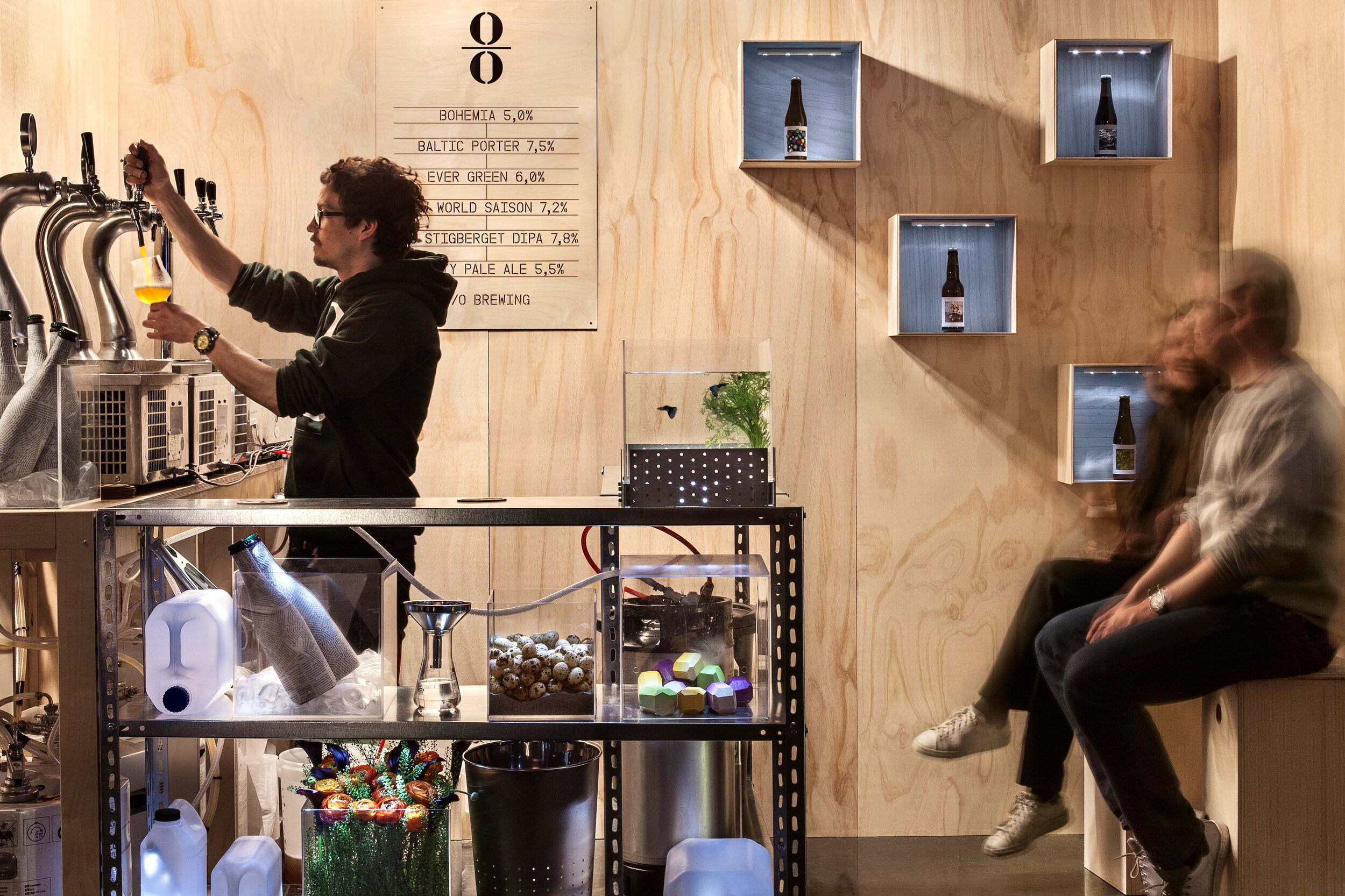
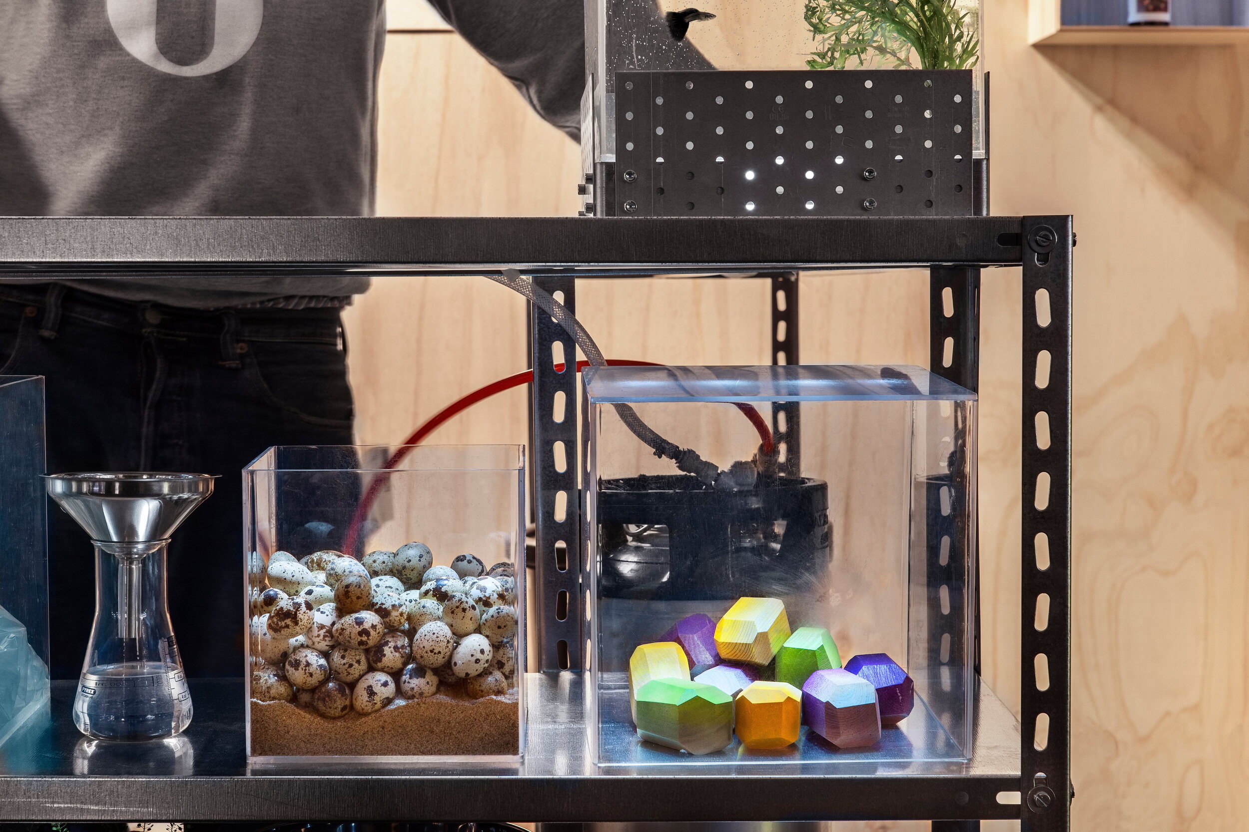
O/O’s modular pop-up bar at the Gothenburg Beer & Whiskey Fair of 2015 was designed by architects Emma Magnusson and Angelina Kjellén. Lundgren+Lindqvist designed the signage and a limited edition coaster in laser cut Poplar, which was the primary material used for the construction of the bar. The coasters were given out for free during the fair and have already become a hot commodity amongst collectors of beer ephemera.
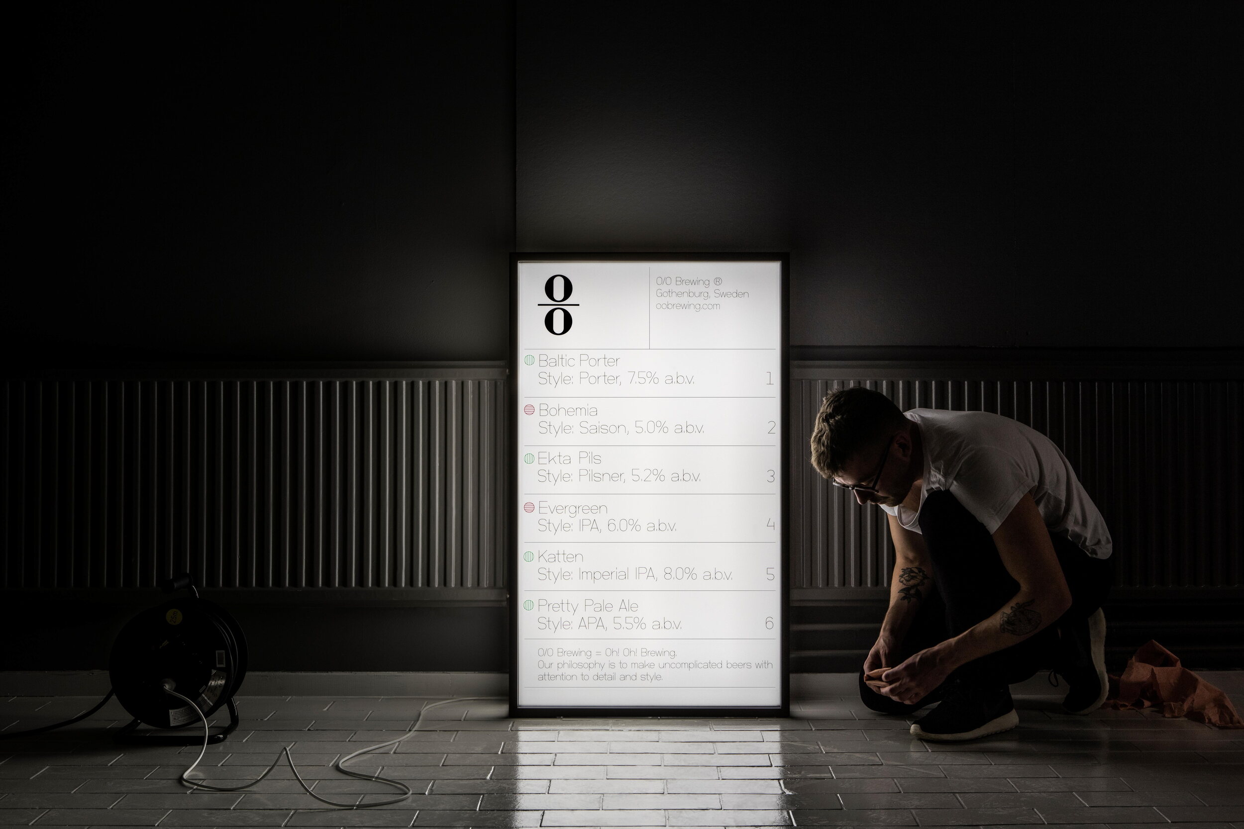
For O/O Brewing’s participation in the 2016 edition of En Öl och Whiskymässa (Gothenburg’s Beer and Whisky Fair) we designed a lightbox display sign, to complement the pop-up bar designed for the previous year’s fair.
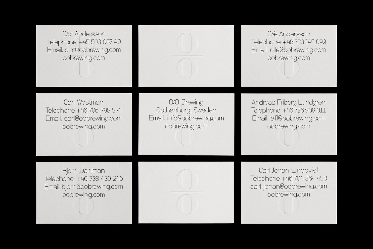
O/O Brewing’s business cards were printed by Göteborgstryckeriet, on delicate Conqueror Connoisseur 100% cotton paper, with the logotype blind embossed in the center of the card. The paper was selected primarily based on the fact that it is optimal for this type of embossing, but also because it represents a counterweight to the type of paper you are likely to find on the bottles of beer labels in general. Much like O/O Brewing aims to differentiate themselves from the competition by brewing beer of the best possible quality, we continually work on remodeling the image of what is expected from a craft brewery.
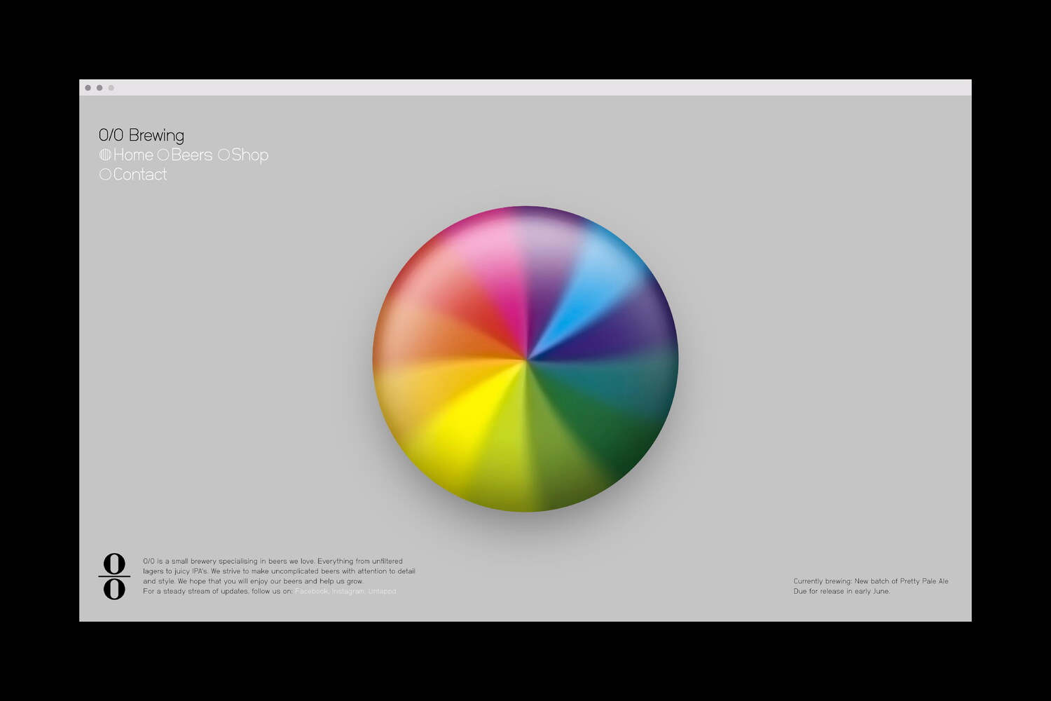
Simultaneously, we also redesigned O/O Brewing’s website, building it around an oversized typographic listing of the beer range. The thin weight of O/O’s primary typeface; Neubau Grotesk, gives the typography a delicate feel, echoing the precision employed in the brewing process. A set of icons were drawn to match the typeface.
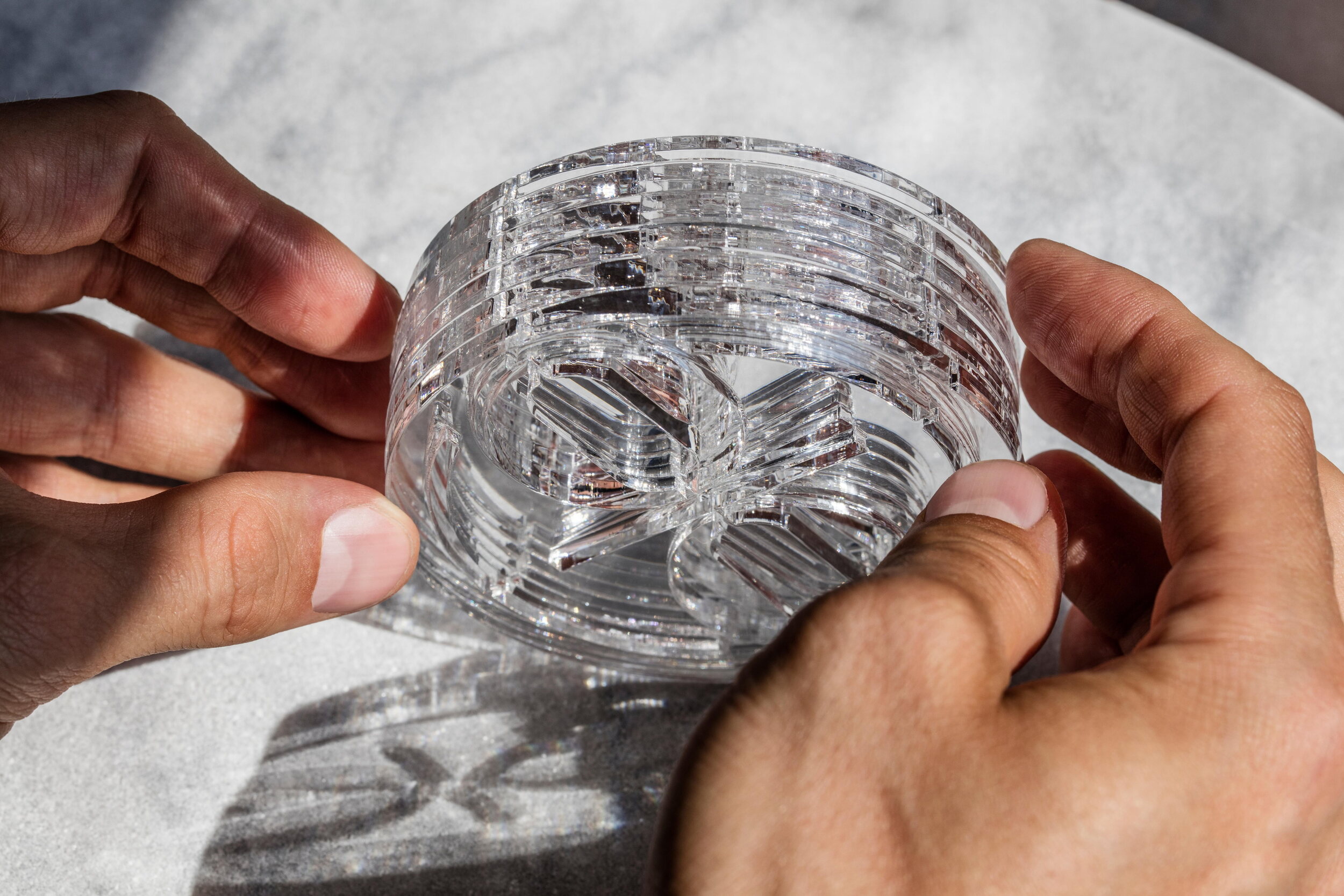
Following up the previous year’s much sought after laser cut wood coaster, we designed a new limited edition coaster, this time in transparent, CNC cut plexiglass.