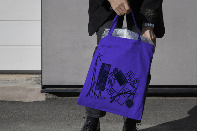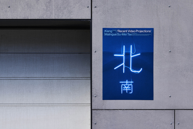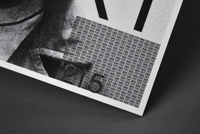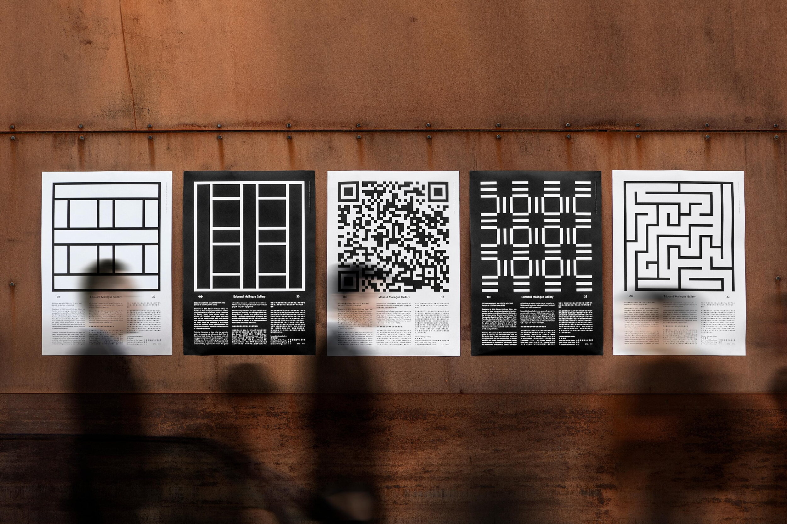
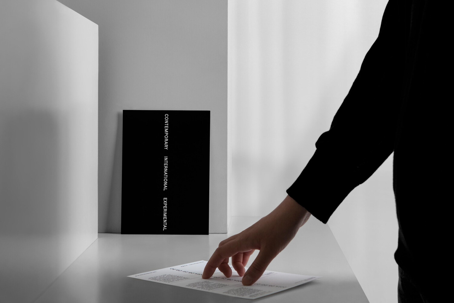
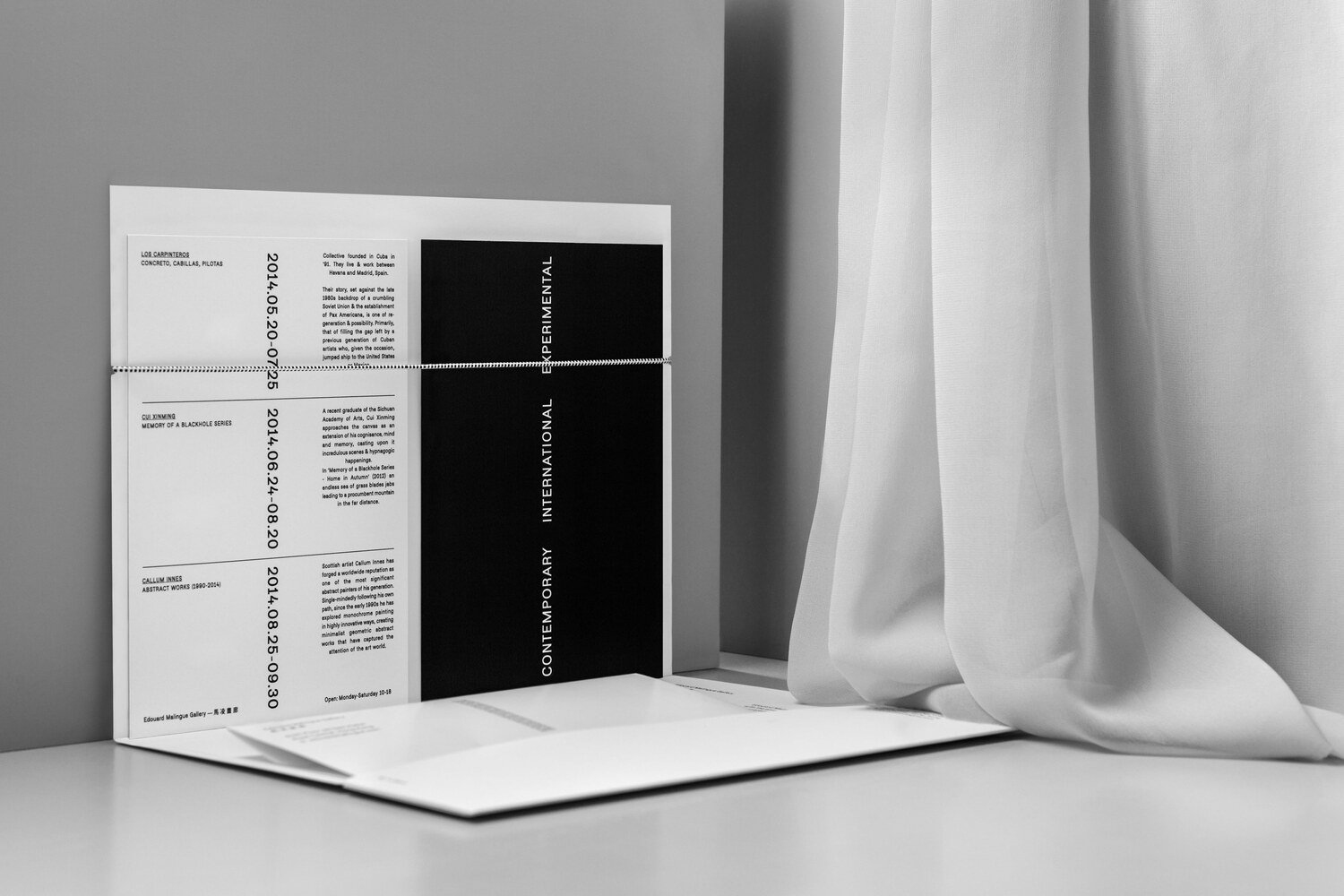

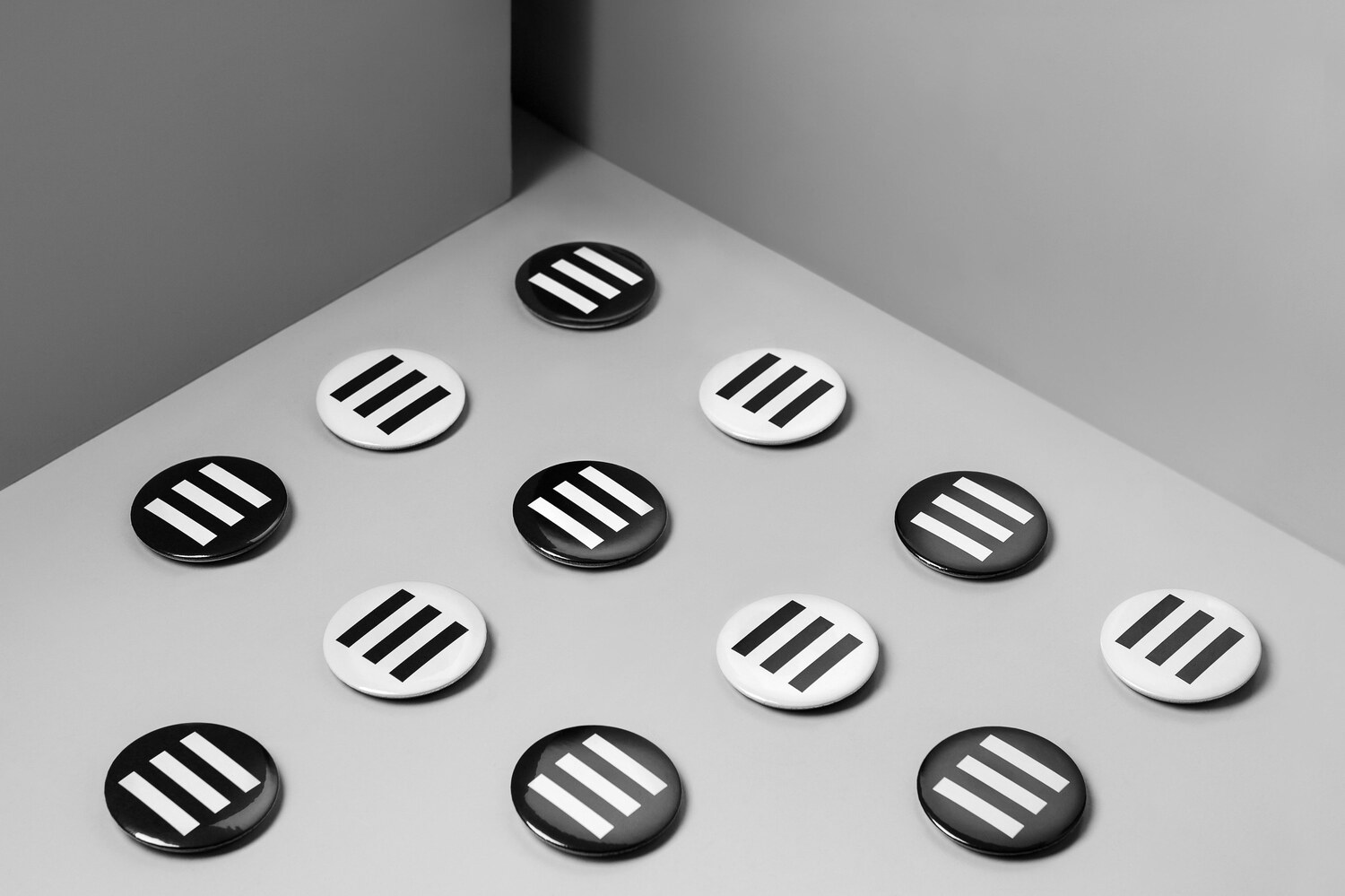
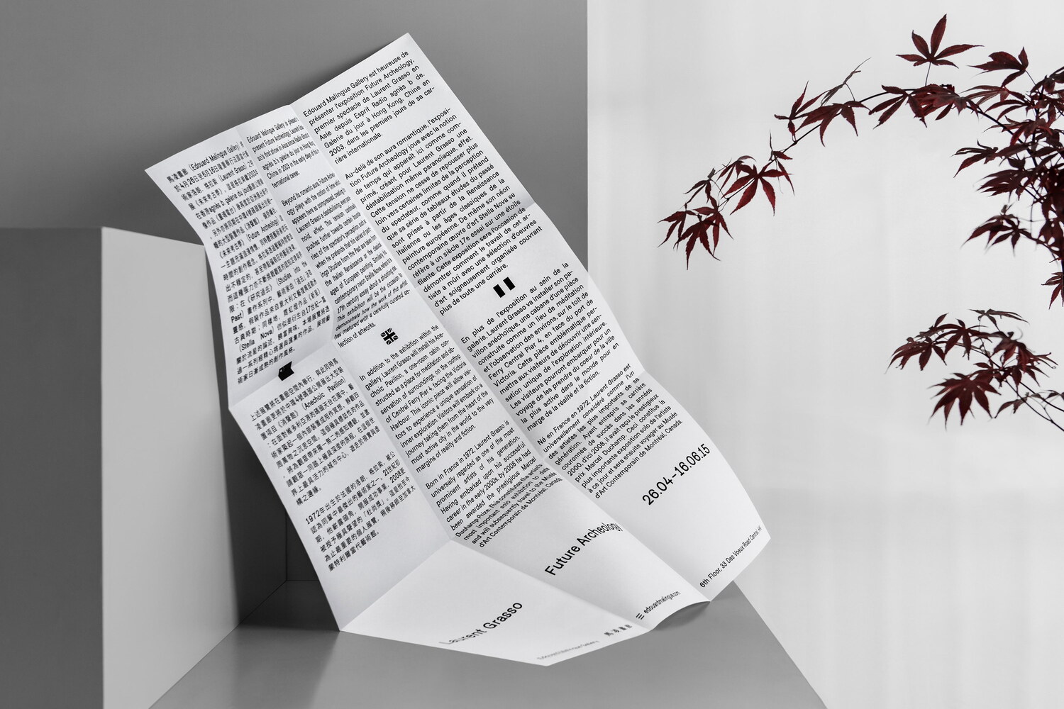
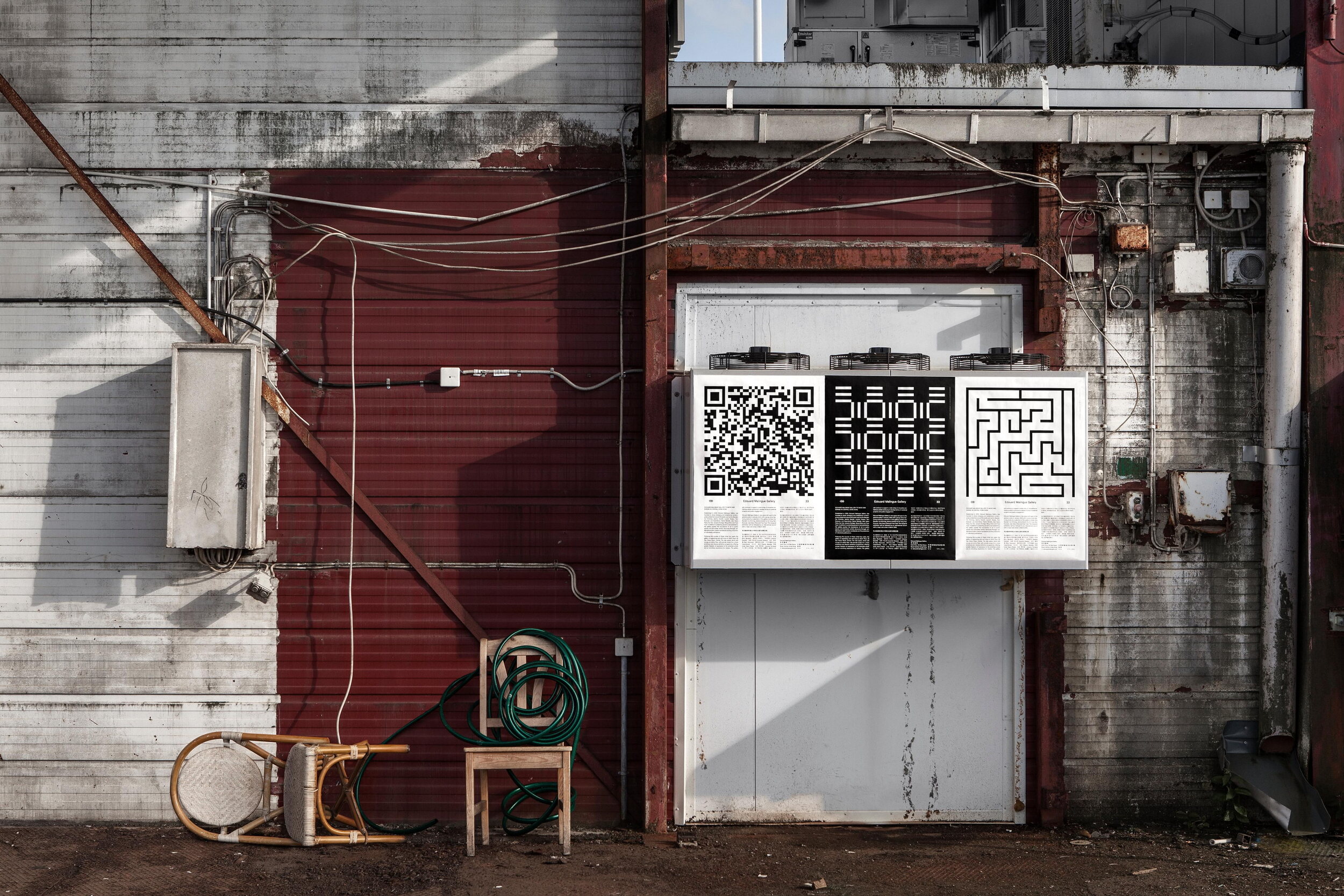
The new identity revolves around the number three, which is most visibly represented in the reoccurring stroke divided in three sections; titled ‘the Trisection’. The Trisection is an abstraction of the gallery name’s three words. It is also a representation of the three strokes needed to make a readable E (as in Edouard) or M (for Malingue). As it happens, there are also three letters that occur three times in the gallery name, and the new gallery is located on 33 Deux Veux Street.
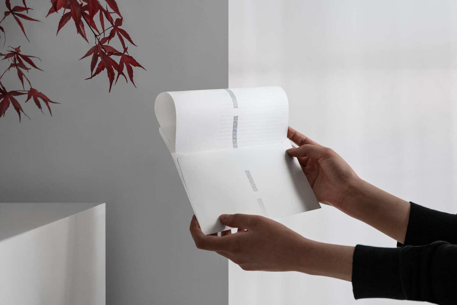
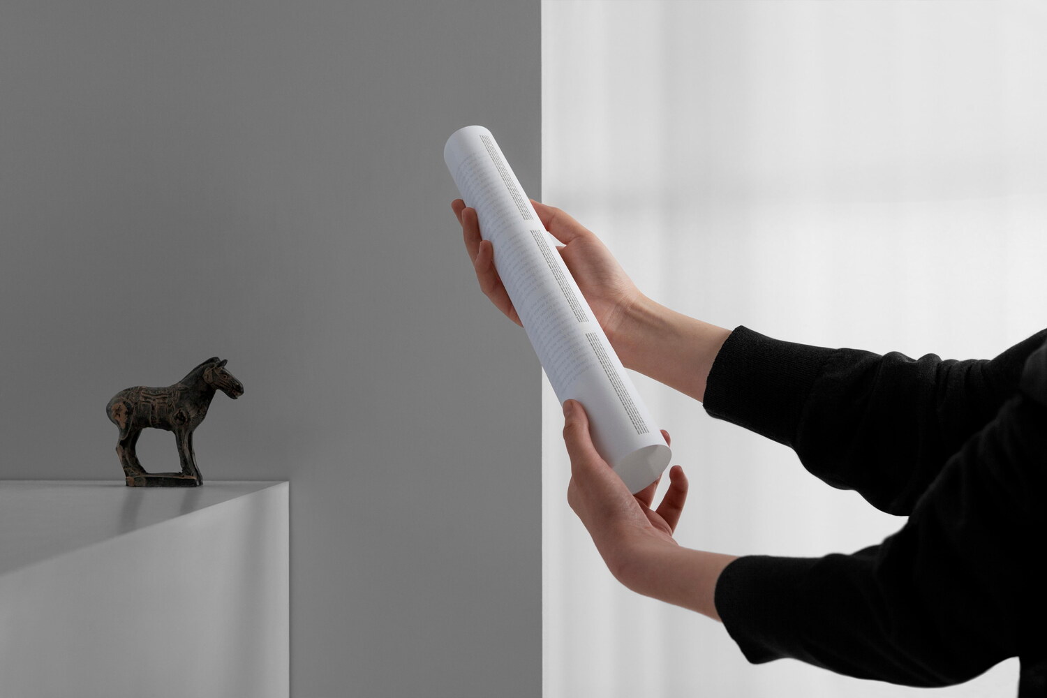
The Trisection is used extensively throughout the identity, not only to arrange sections of text and images, but also to dictate the overall grid used for a range of applications, or the number of folds for leaflets, letters and posters.
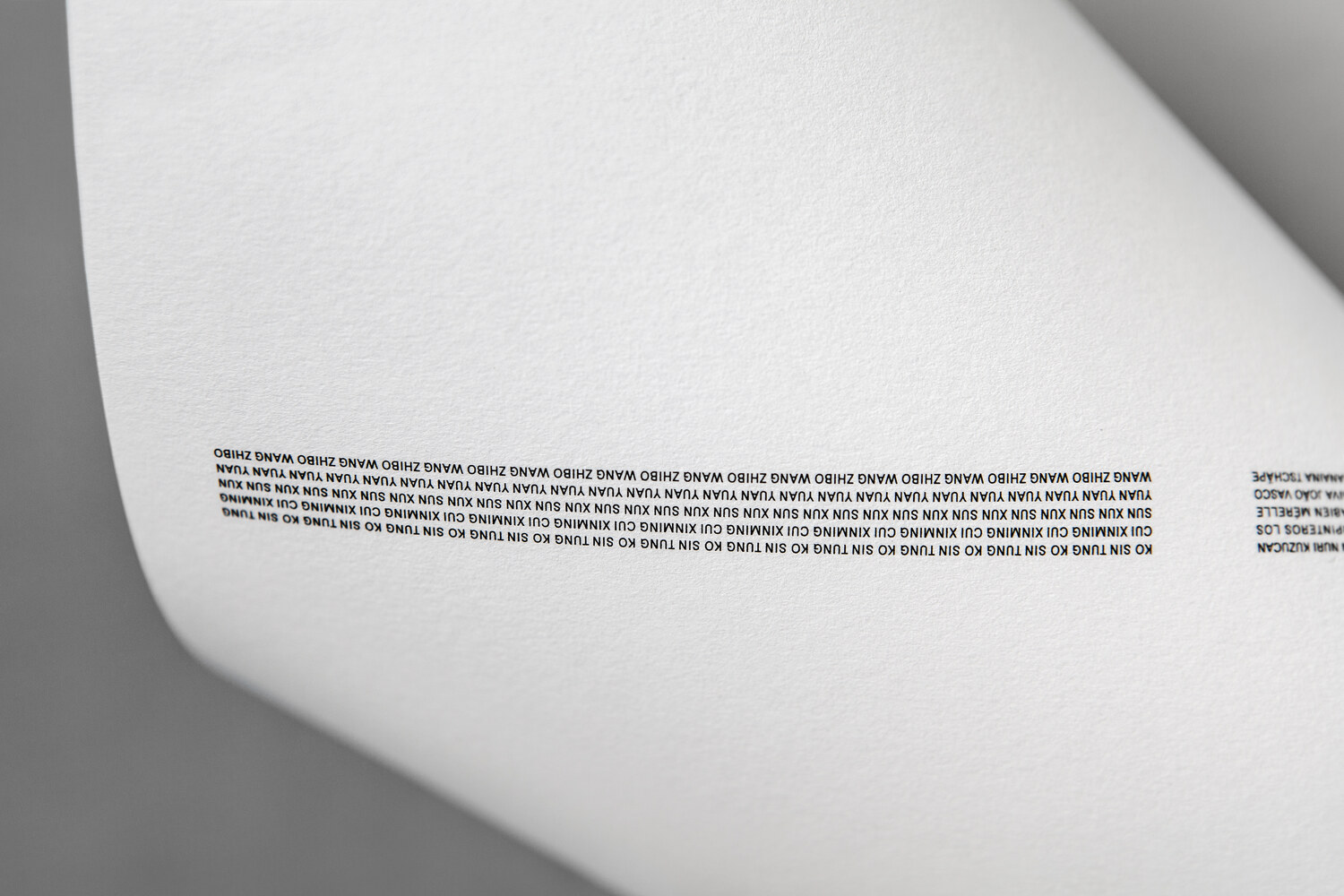
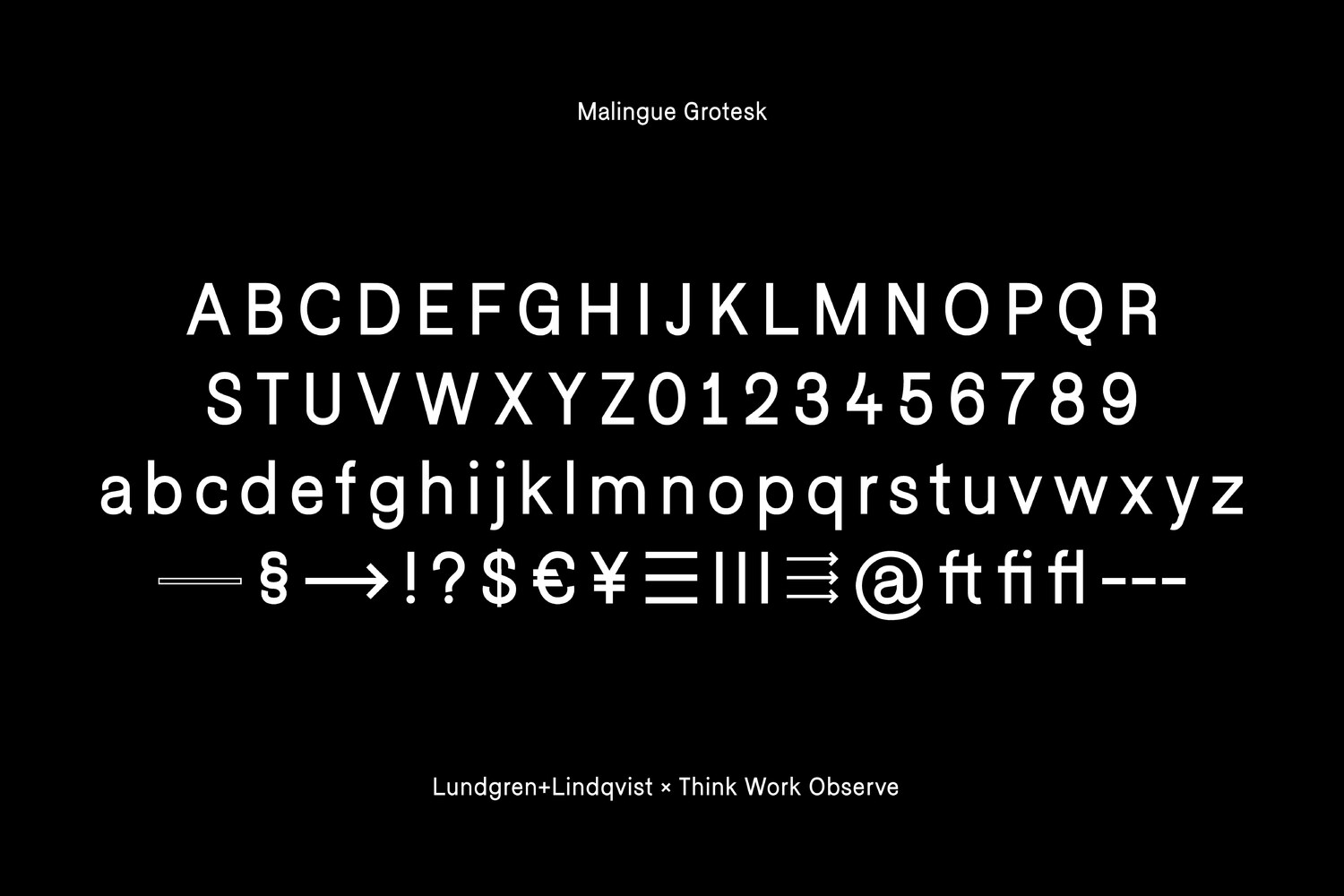
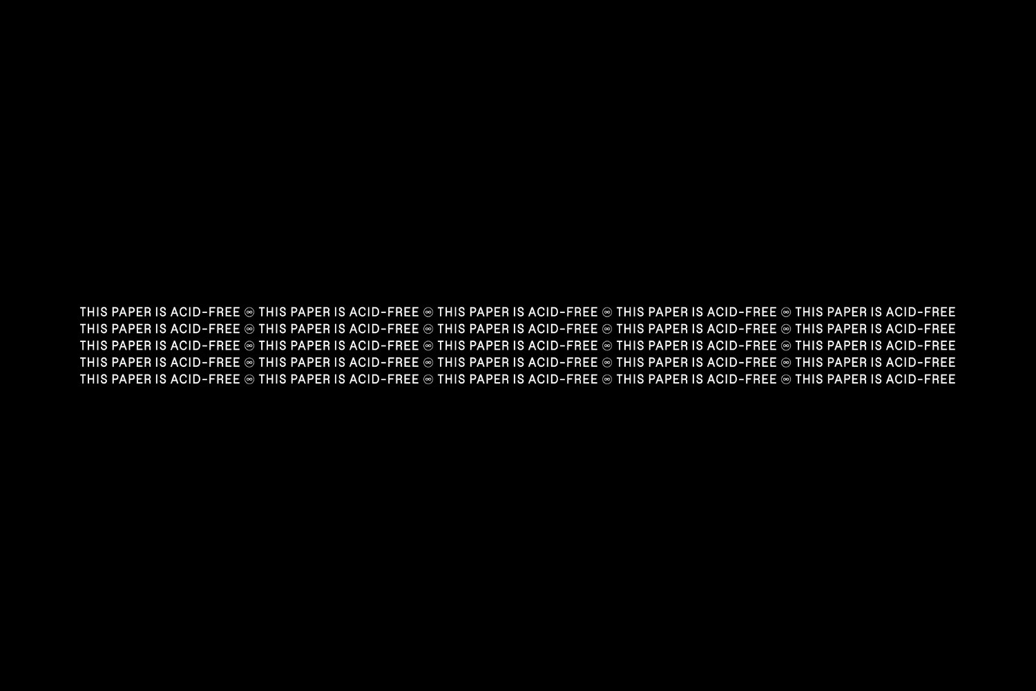
A bespoke typeface, Malingue Grotesk, was designed in collaboration with the Italian design studio Think Work Observe. Malingue Grotesk is modern one-weight sans-serif with some curious characteristics and special glyphs, which is used across all of the gallery’s printed and digital communication.
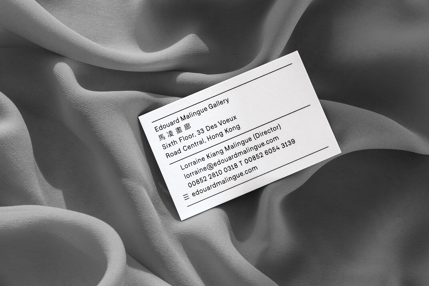
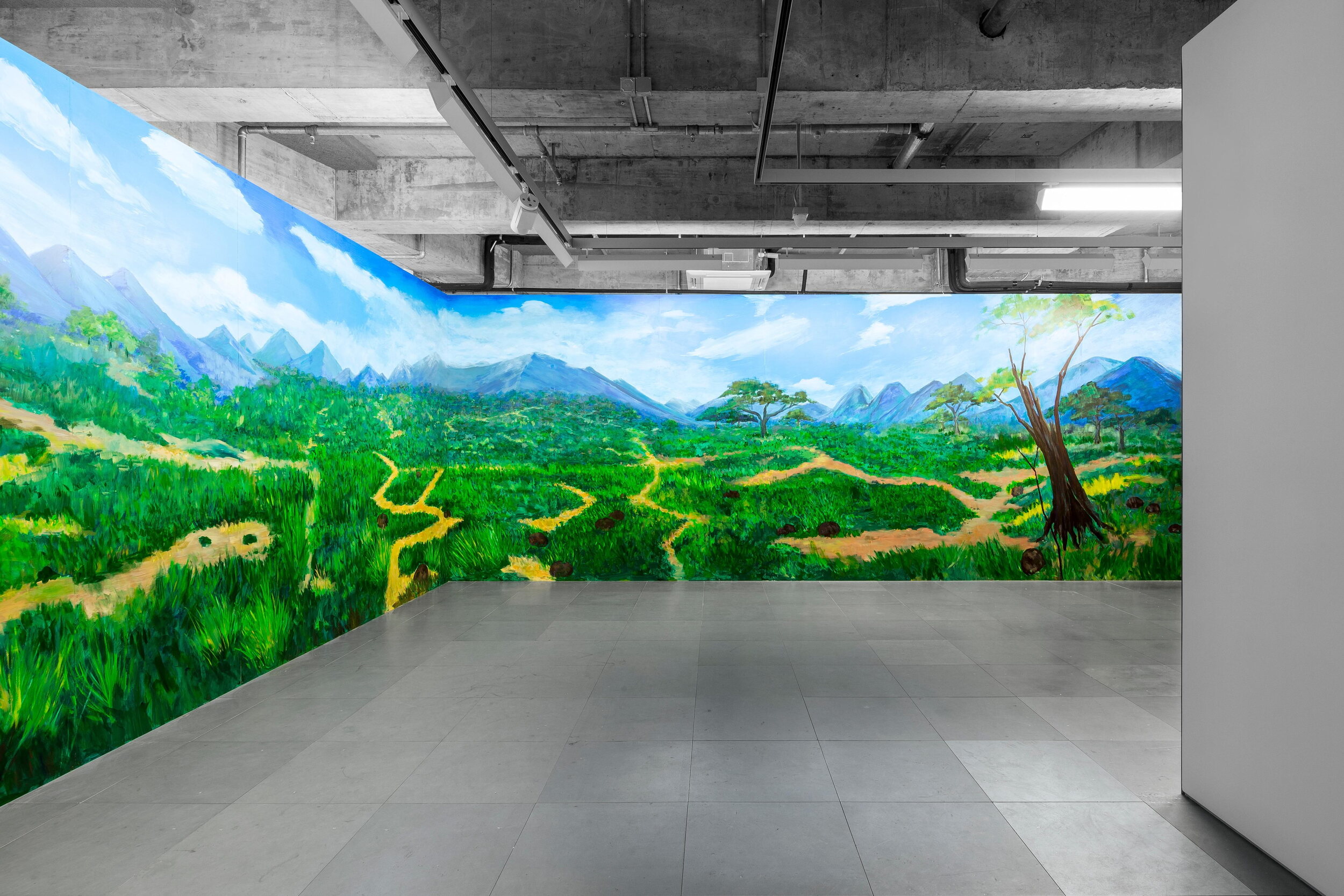
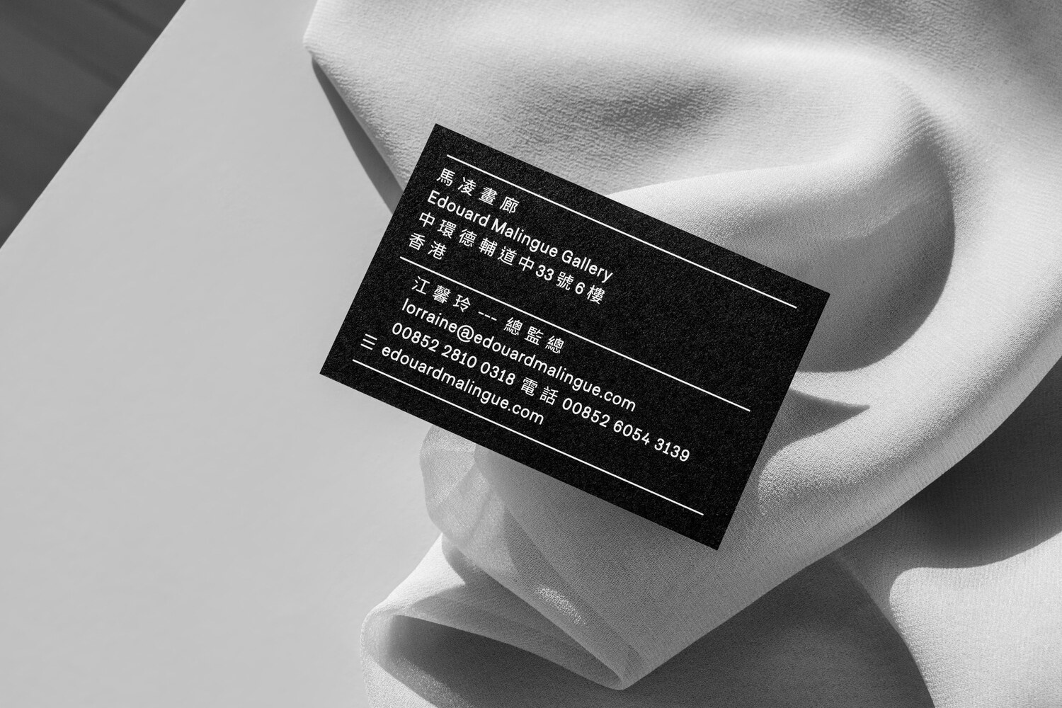
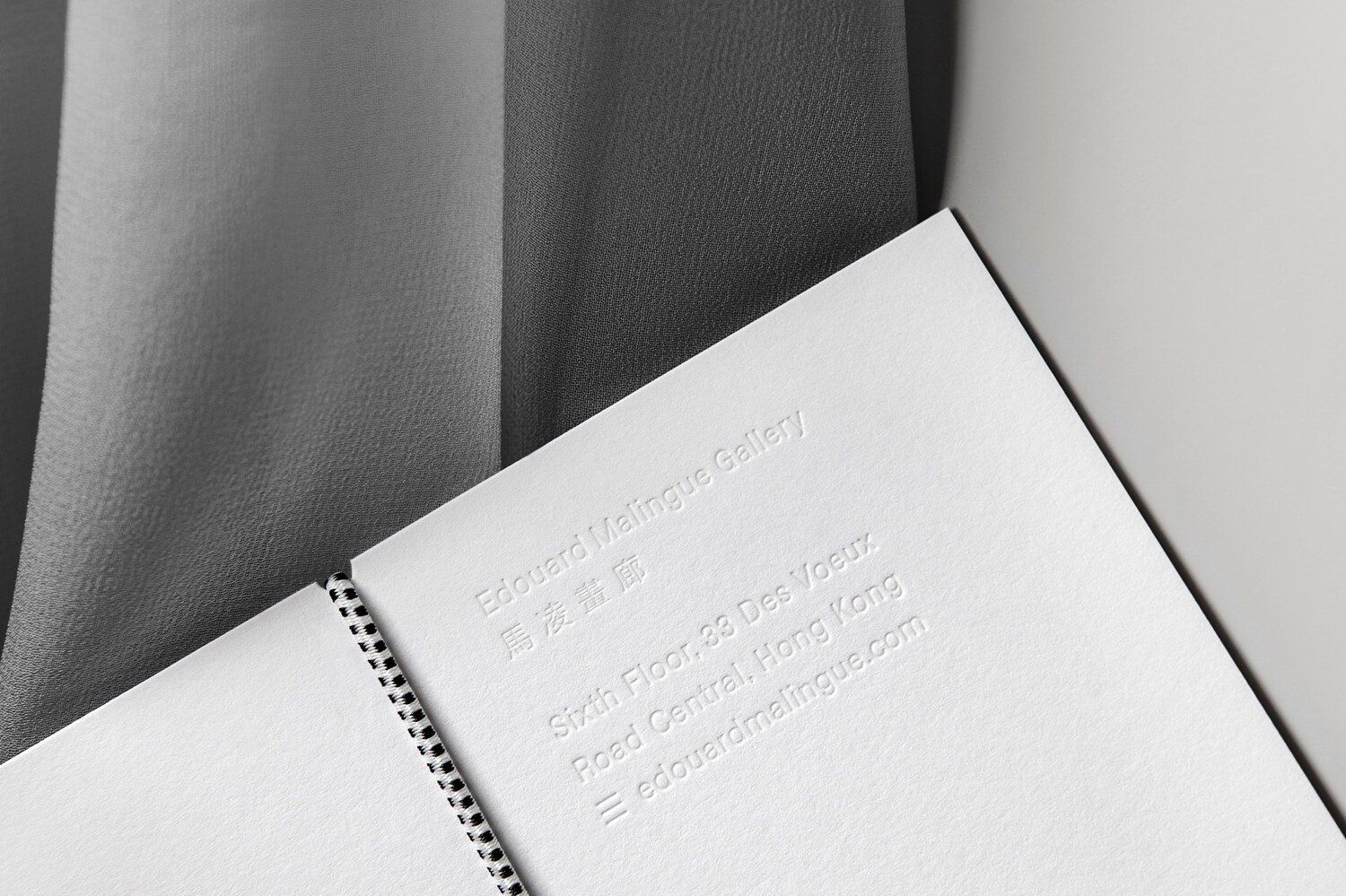
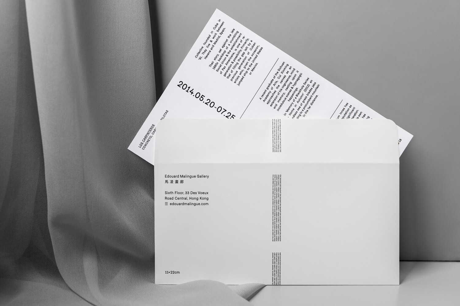
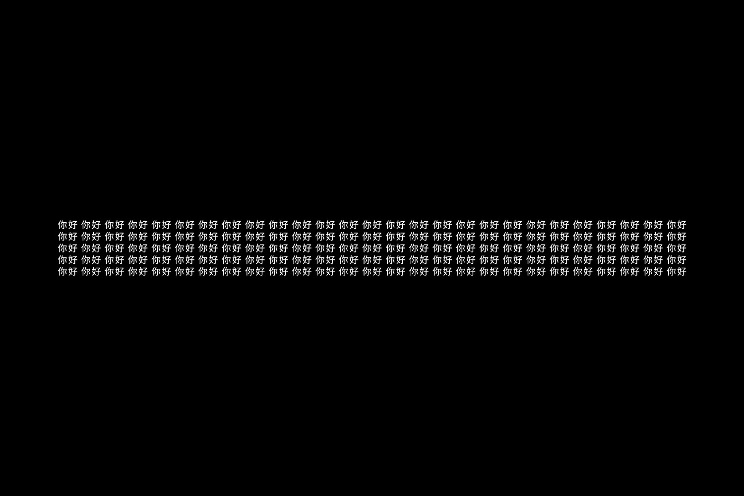
The gallery’s stationery was printed on delicate uncoated Takeo stock. For the bespoke envelope, which employs special manufacturing techniques to achieve the required precision, we used a semi-transparent off-white plastic paper (also from Takeo), which provides an interesting contrast to the letterhead. The business cards and correspondence cards are letterpressed with one side in English (white) and one side in Chinese (black) and set to be turned vertically rather than horizontally. Across all applications, the measurements of the present pieces are given, relating back to the precision with which the works are labeled and handled.
We continue to work closely with Edouard Malingue Gallery on expanding the new visual identity and the gallery’s digital presence.
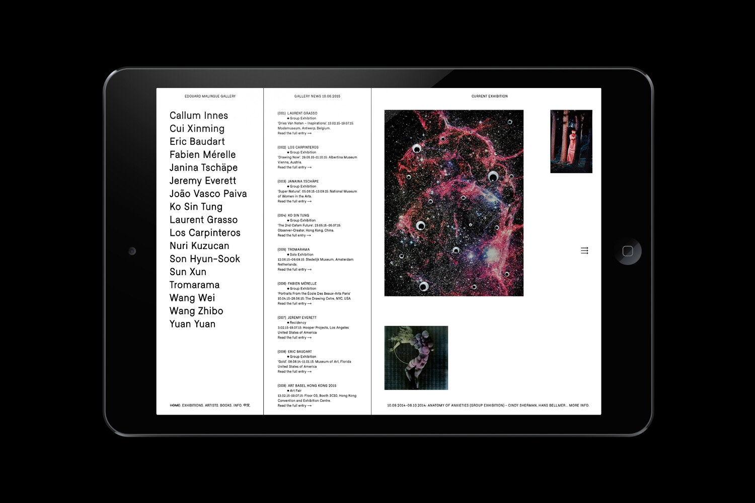

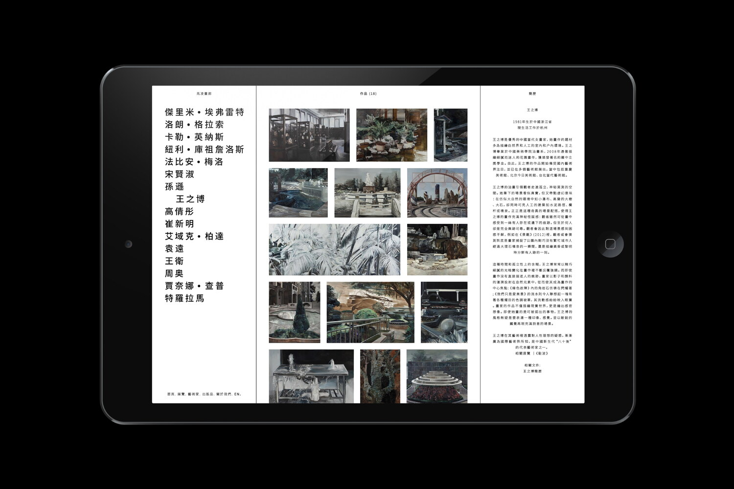
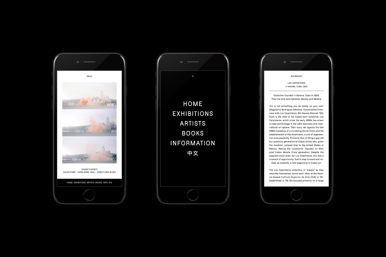
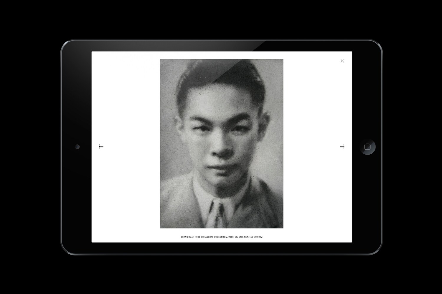
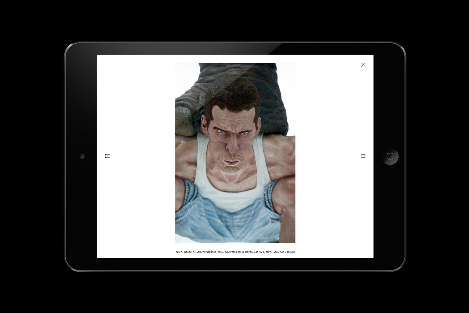
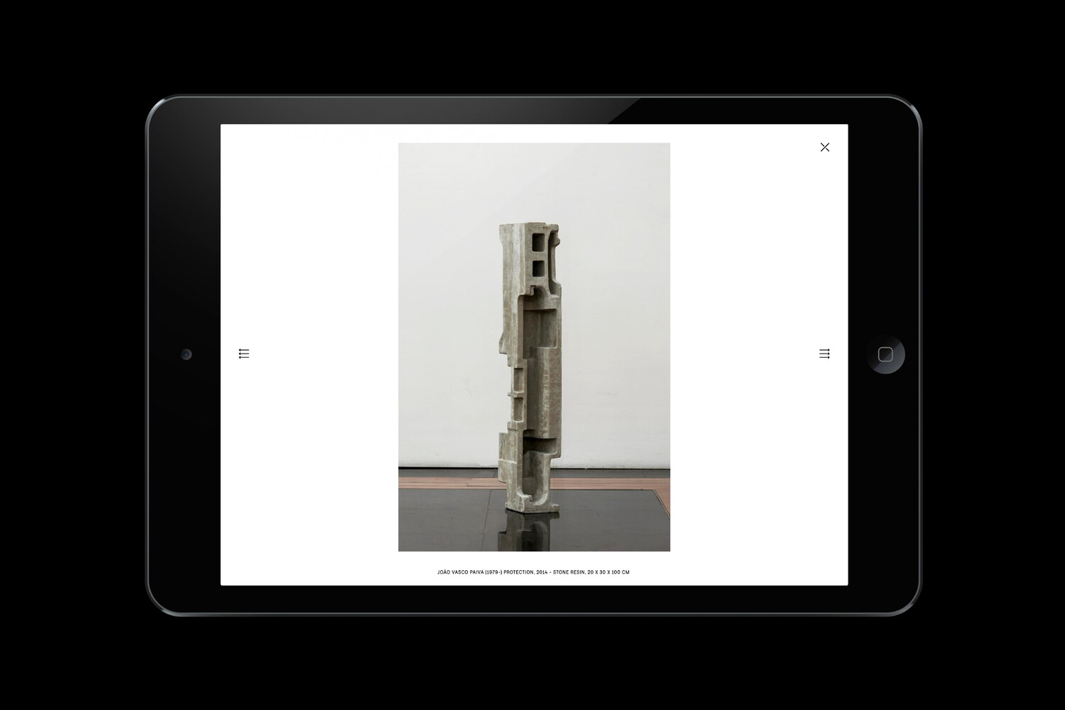
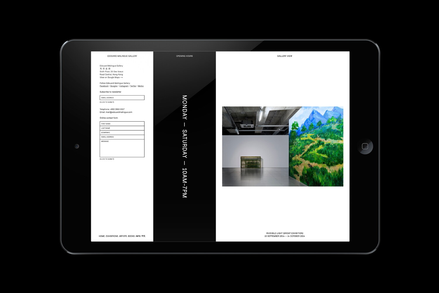
The website is built around three columns, relating back to the number three, one of the central concepts introduced with the new visual identity. The columns are flexible and adapt to the varying content throughout the site. In the website’s start section, the right hand column is built as a digital pin board, which displays a randomly ordered selection of images uploaded by the gallery.
With a lot of content inherited from the gallery’s previous website, each section of the new site has been carefully planned to provide the visitor with an engaging, in-depth presentation of the gallery. On mobile, the three columns are stacked on top of each other to best utilise the more narrow screen width. With a demographic spread out across the world, the content is made available in different languages. At the date of writing this text, the website was set in two languages, English and Traditional Chinese, with a version in Simplified Chinese in progress.
A sparse use of design elements and functional features make sure that the content always stays in focus. The bespoke typeface designed for the new identity is allowed to set the tone, paired with strong imagery, primarily represented by the work of the represented artists. The pared-down UI is complemented by smooth transitions and swipe functionality, for an intuitive and seamless experience.