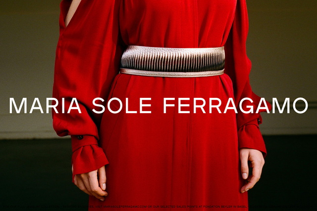
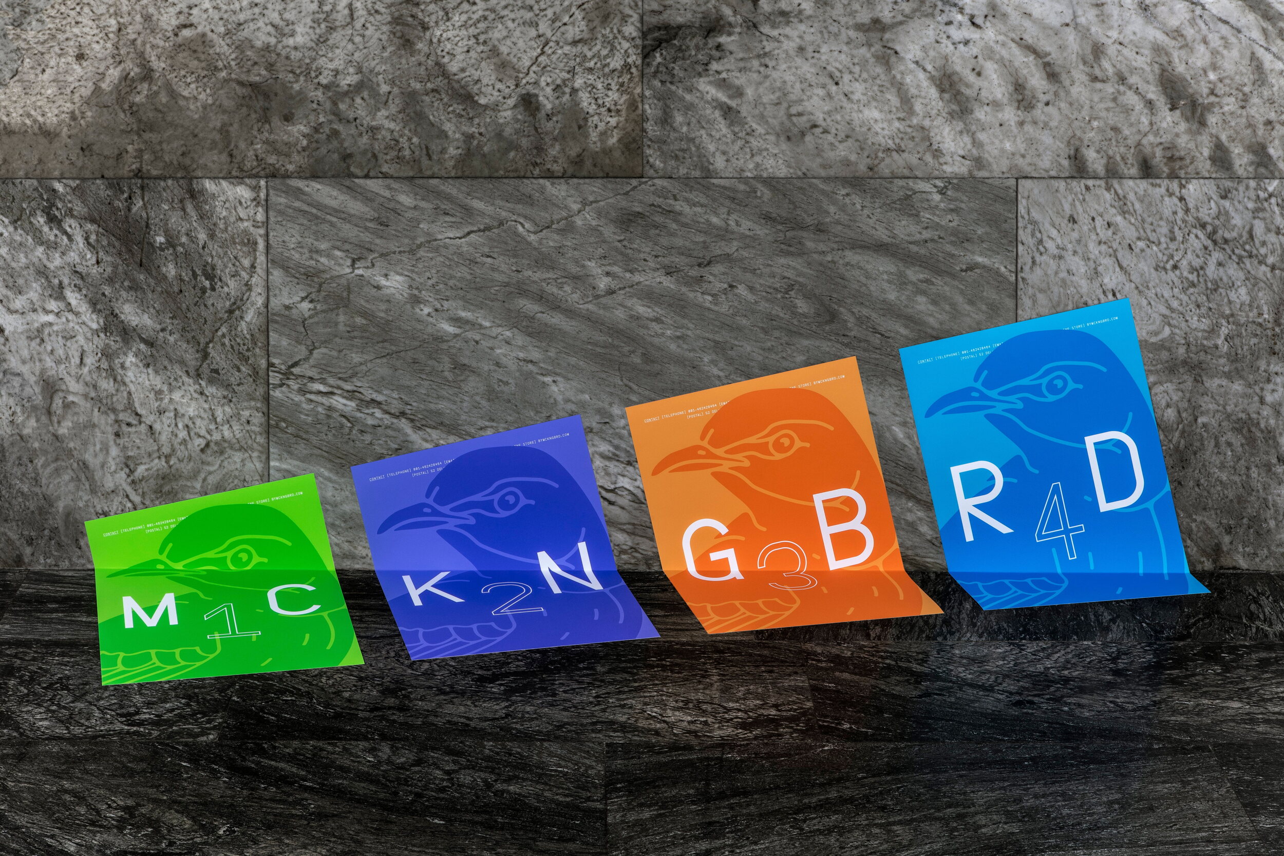
By removing the vowels of the brand name, we created a shorter and more distinctly unique wordmark, prompting the reader to interact with the brand through filling the gaps in the familiar word. This also allowed the brand to secure all necessary social media handles and URLs.
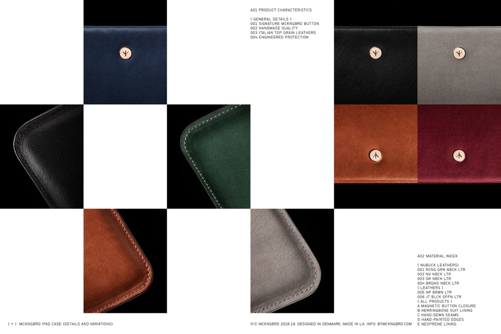
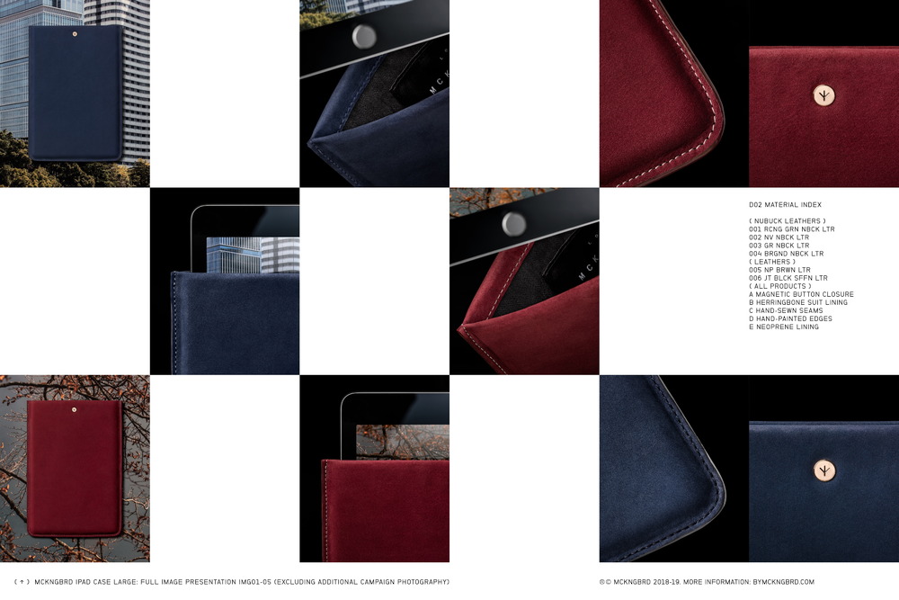
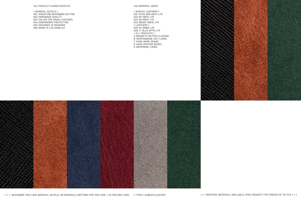
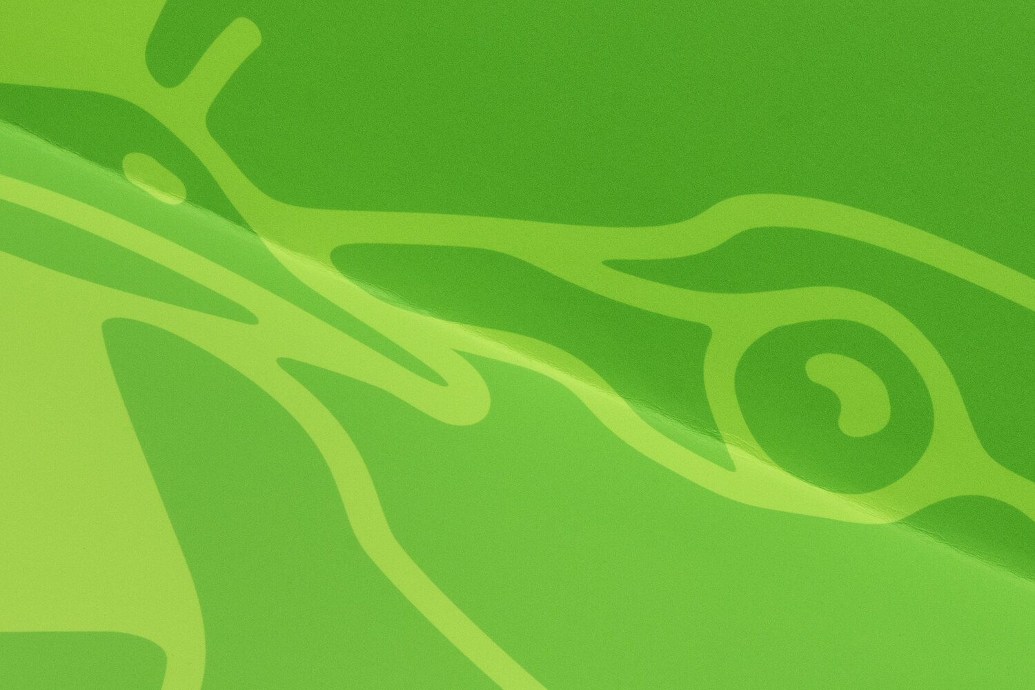
The brand's primary colour palette is made up of three colours; black, white and orange/copper. In physical applications, the orange colour is sometimes replaced with copper foil. A secondary colour palette offers a wider range of options for campaign material and includes a bright green, blue and purple.
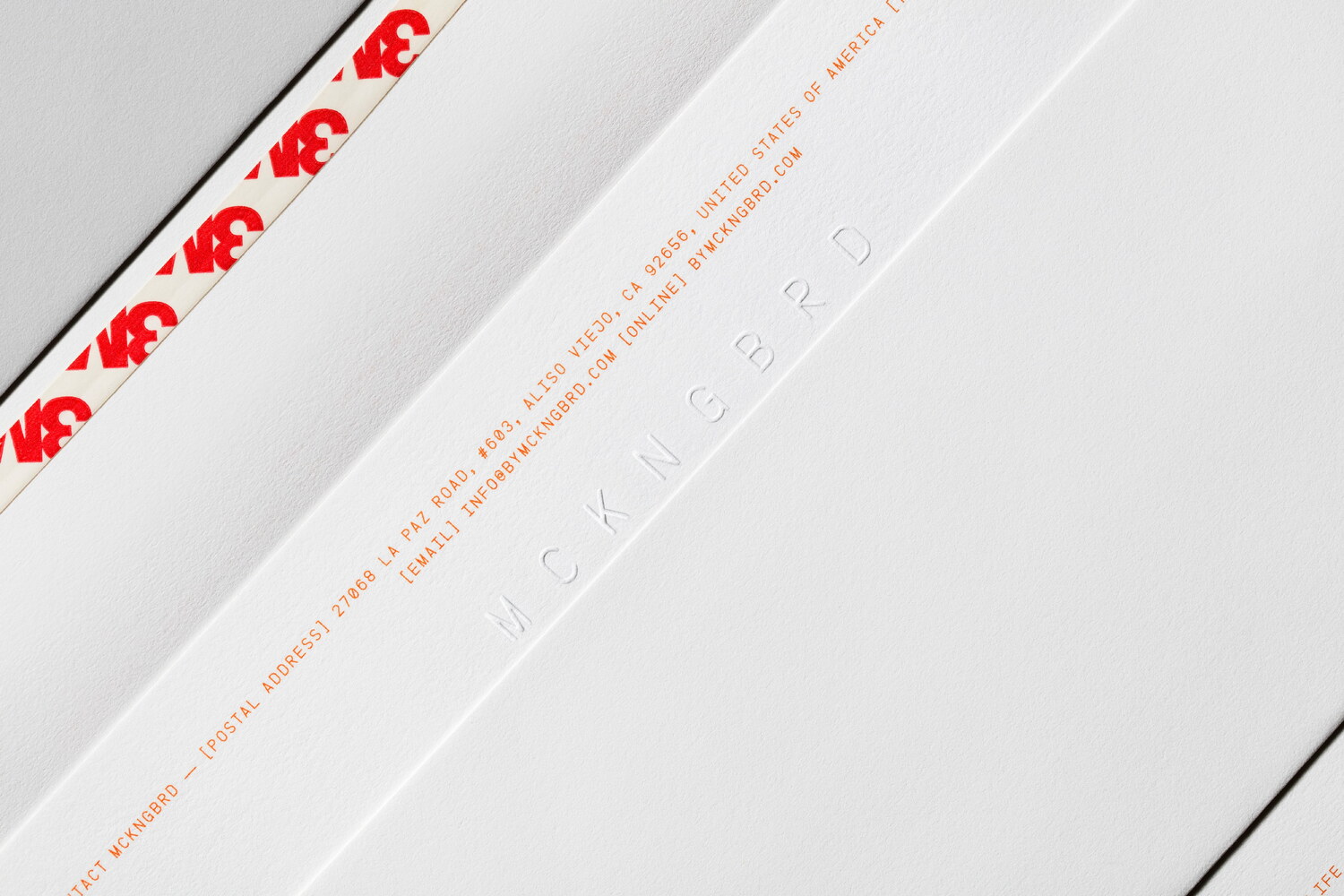
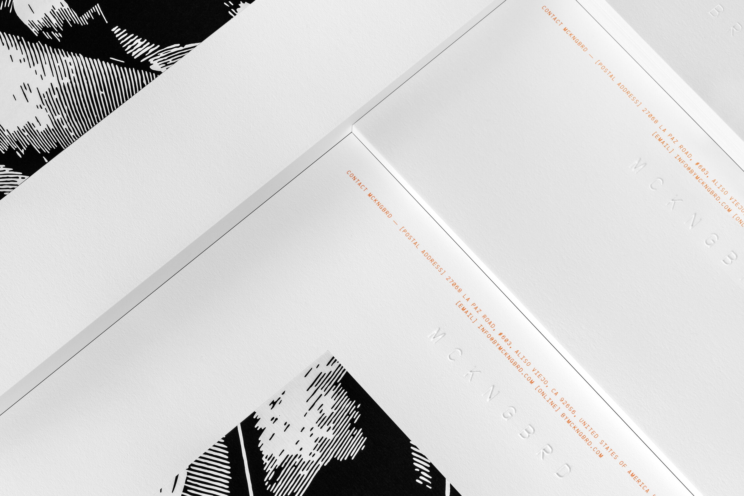
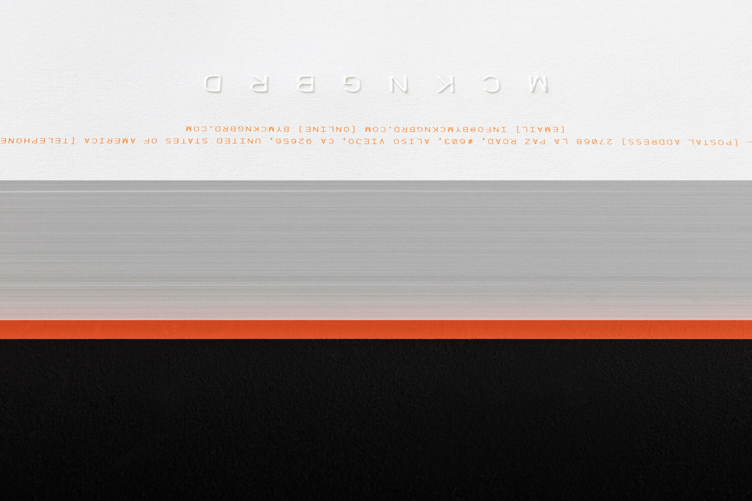
An elegant range of stationery was designed, using subtle means to great effect. Archival quality paper made of 100% cotton was used, both for its elegant look and feel and because of how well it responds to blind embossing. Bespoke envelopes were designed and manufactured, to hold letters and invoices.
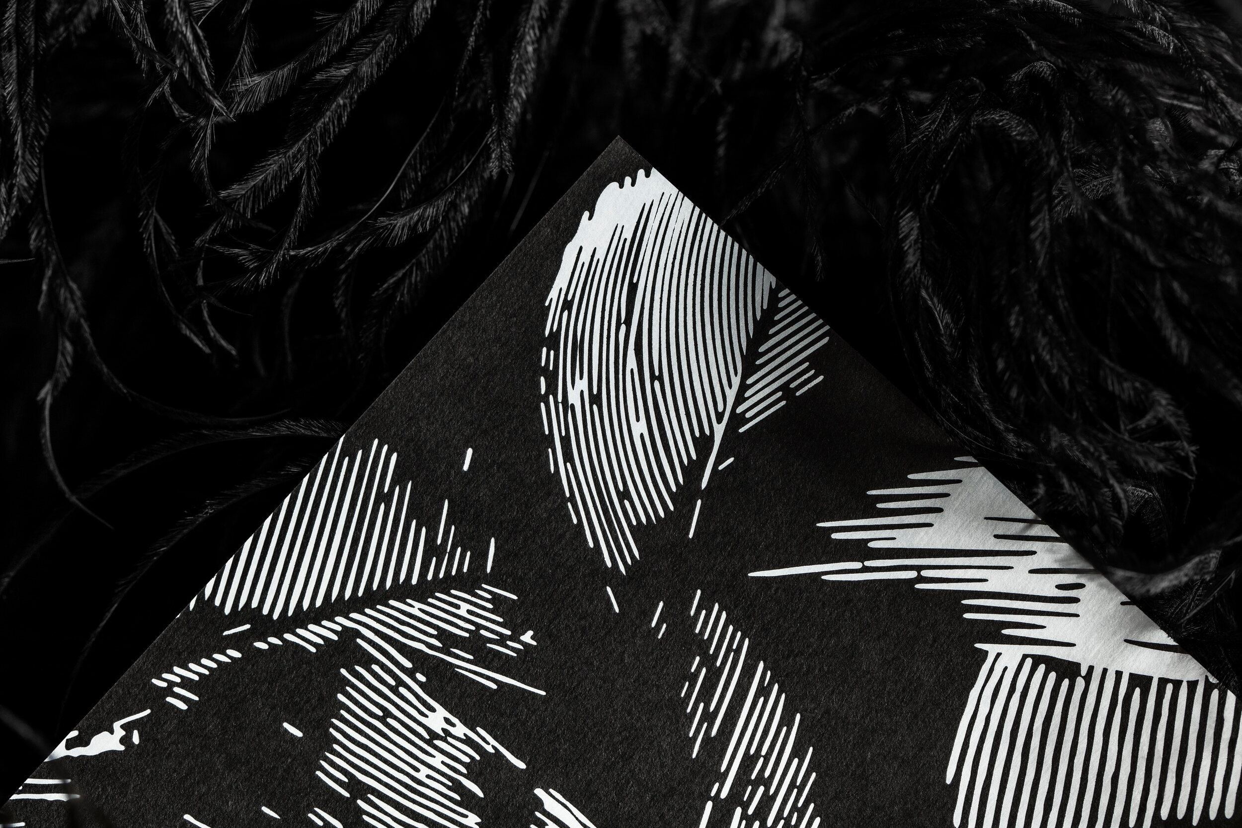
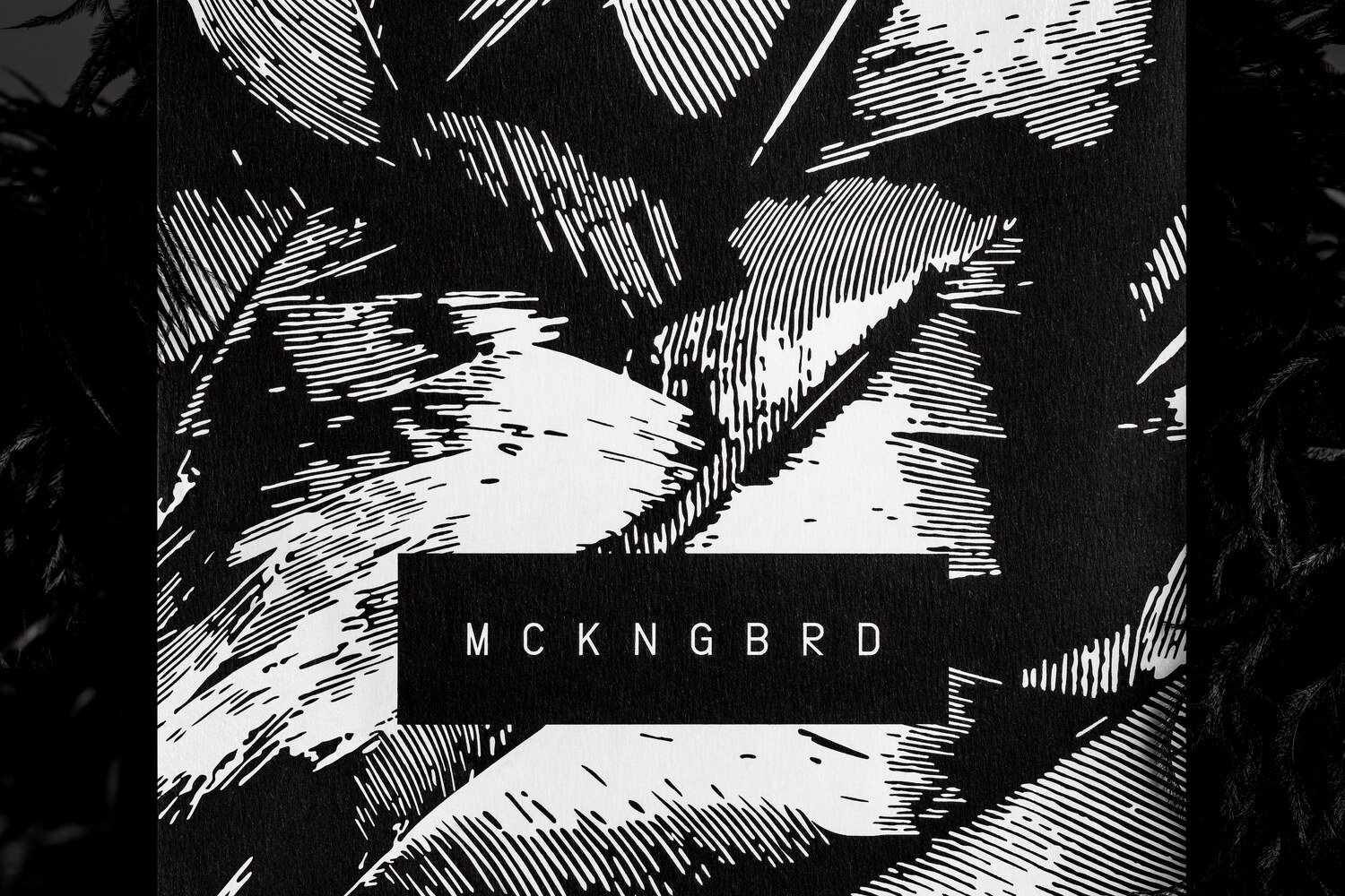
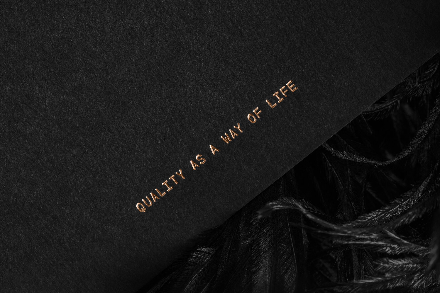
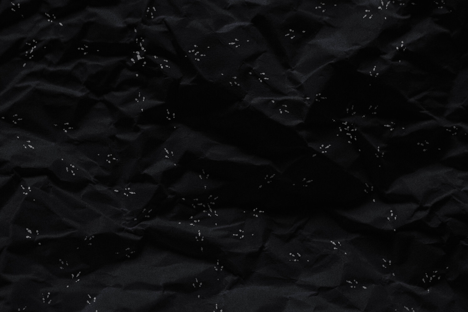
Also included in this case study is a promotional card that was included with each purchase, sometimes with a small thank you-note from the founder himself. The card features an abstract illustration of feathers which was flat-foiled onto Fedrigoni Ultra Black paper stock. On the reverse, the contact details are hot-foiled in copper, with the brand tagline - ’Quality as a way of life’ - featured at the bottom of the page.

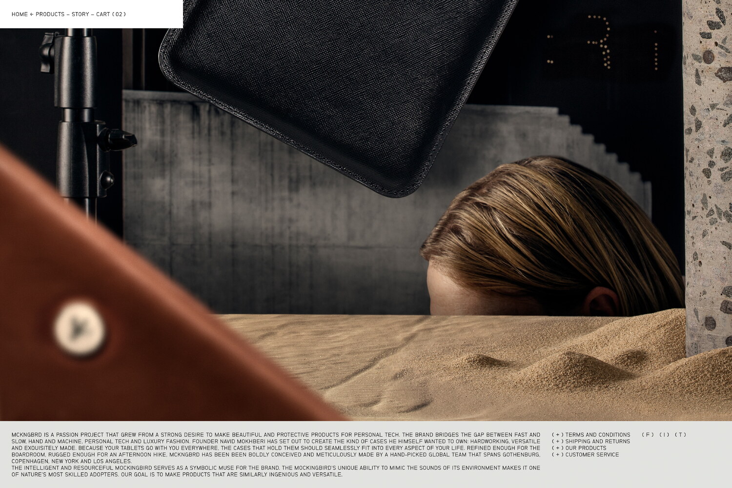
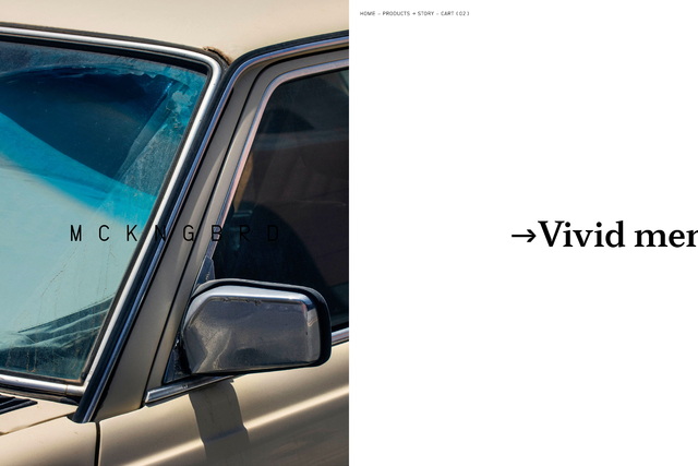
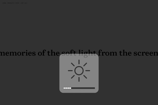
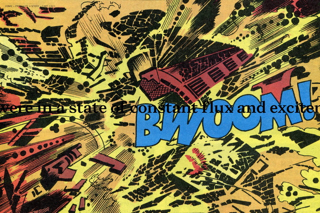
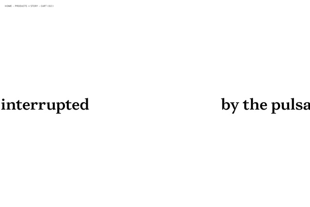

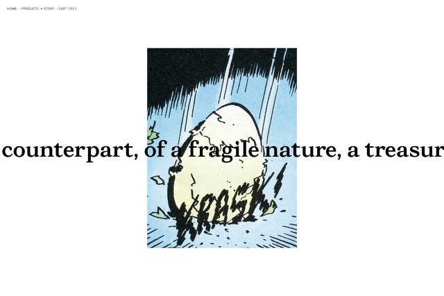
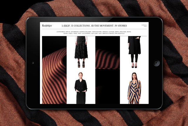
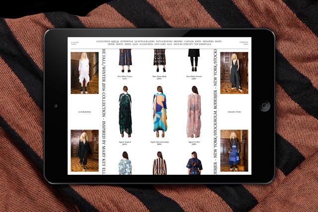
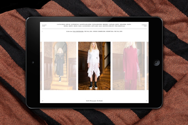
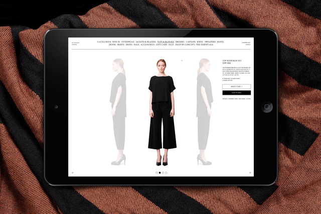
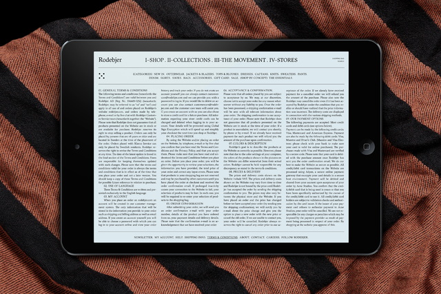
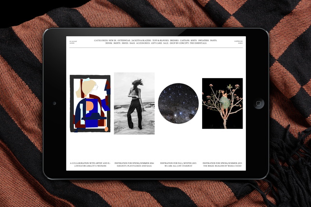
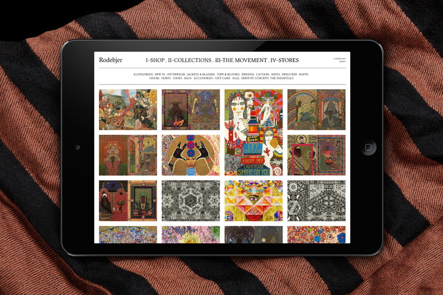
As the product development reached its final stages, Lundgren+Lindqvist was commissioned to design and develop an e-commerce platform and brand site for MCKNGBRD. The site was built around two main sections; the Shop and the Brand. While the Shop section employs a modular grid with asymmetrical shifts, the brand section tells the story of the brand in a continuous, single line of type, traveling horizontally. Throughout this stream of consciousness, the text is continually intersected by images and videos, illustrating the story. This collage of imagery was painstakingly sourced, collected and scanned from old comics, magazines and films. The text is based around a story provided by MCKNGBRD’s founder, which Lundgren+Lindqvist rewrote and formatted for the website.
A bespoke typeface, MCKNGBRD Serif, was designed in collaboration with type designer Tor Weibull of Kanon Foundry. The typeface is used for display purposes across the site, and most prominently in its Story section.
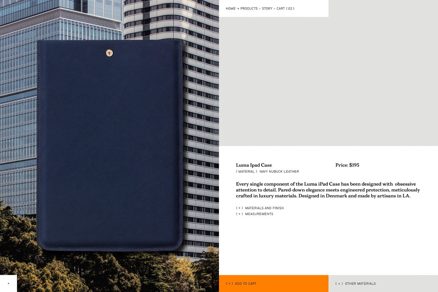
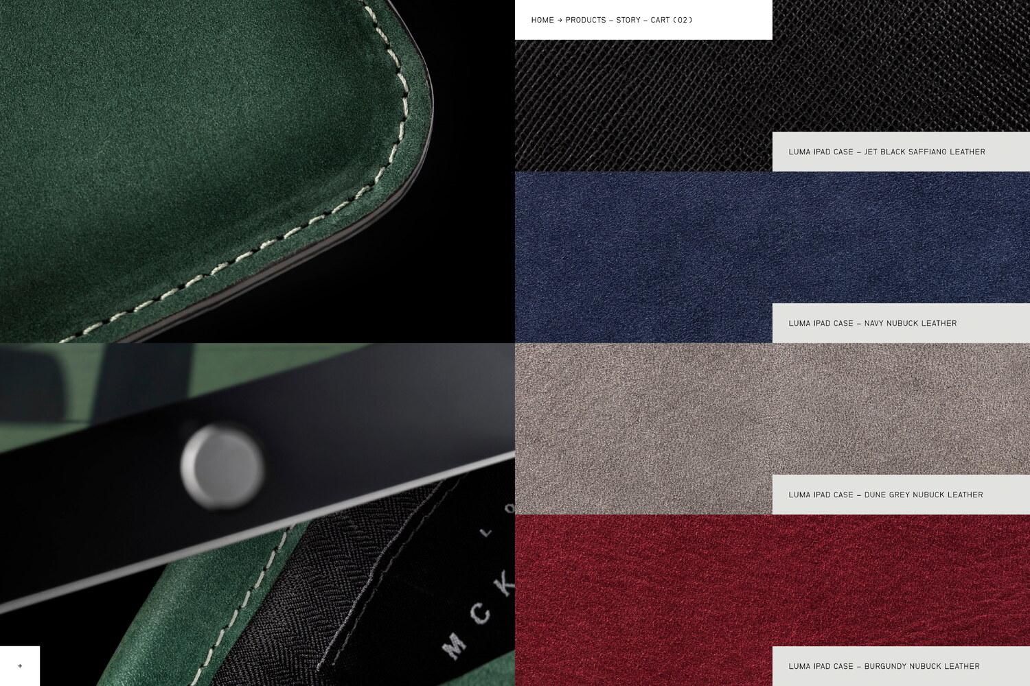
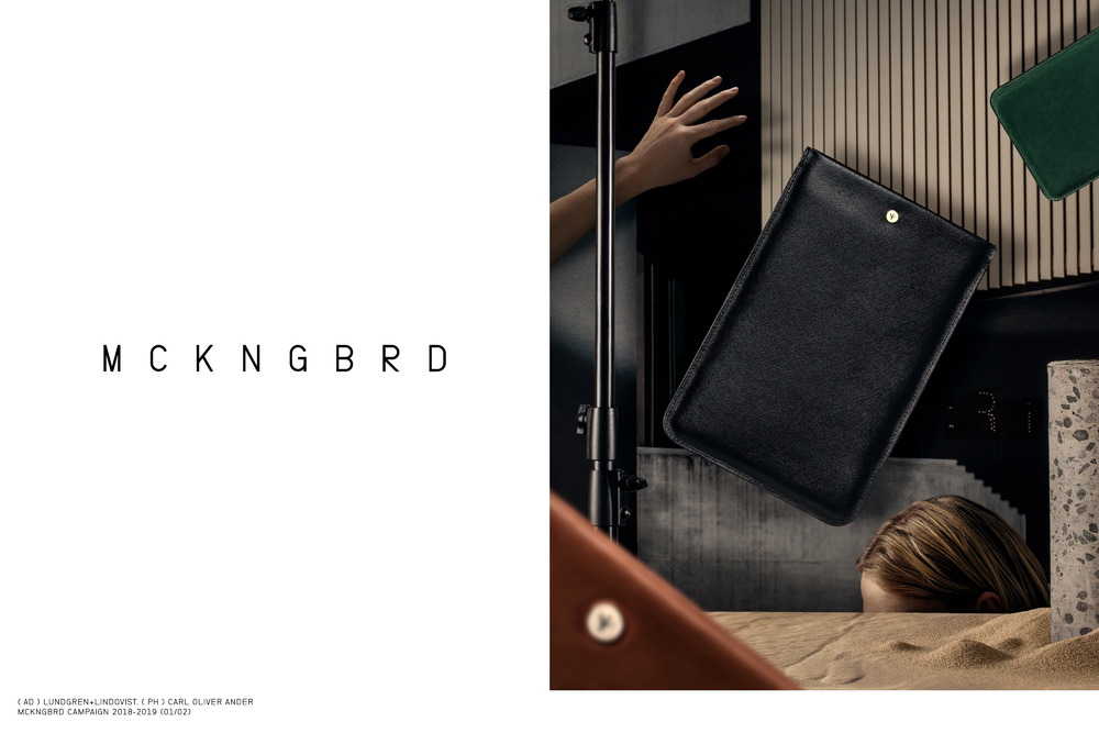
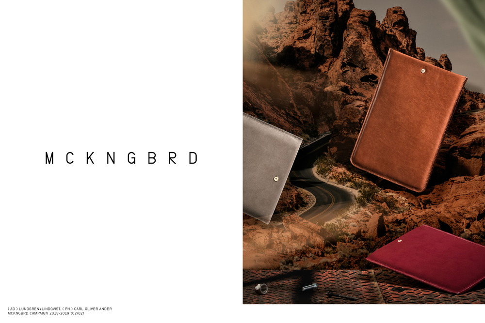
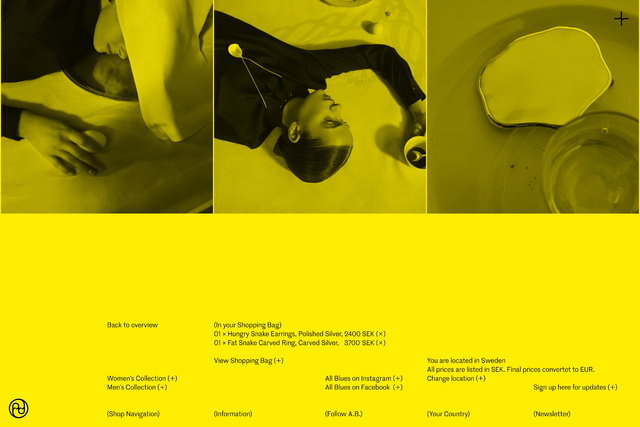
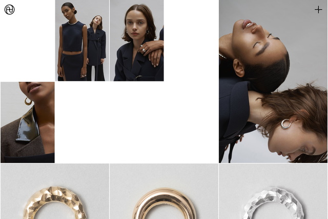
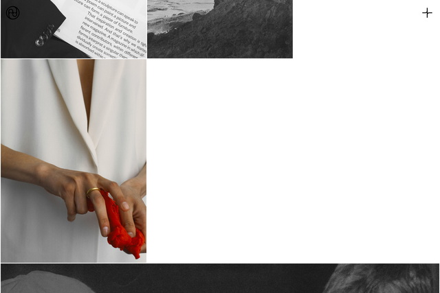
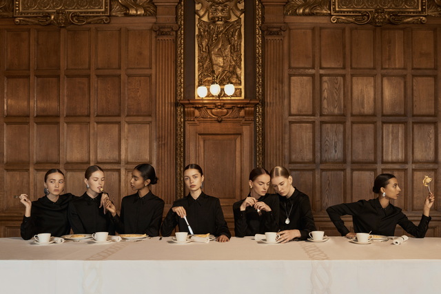
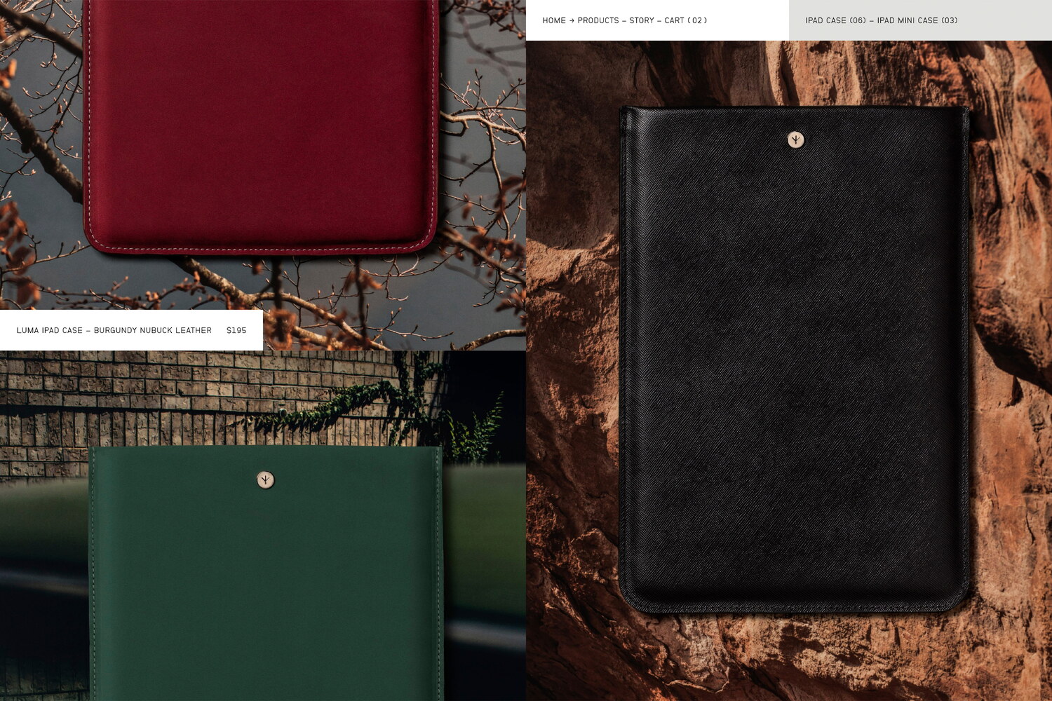
Lundgren+Lindqvist has art directed a series of photoshoots, both encompassing the product imagery for the webshop and campaign focused images. Working in close collaboration with photographers Carl Oliver Ander and Erik Gustafsson, who both move seamlessly between the worlds of art and commerce, we have carefully crafted a visual tonality and narrative for the brand.
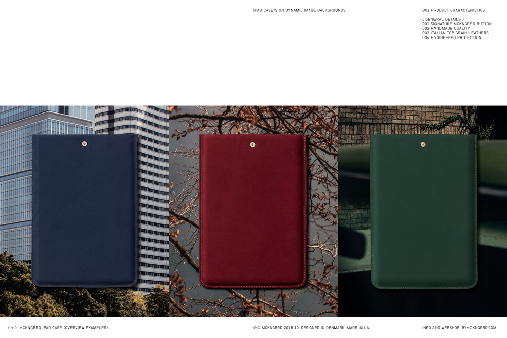
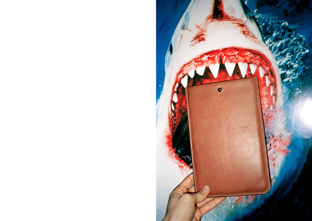
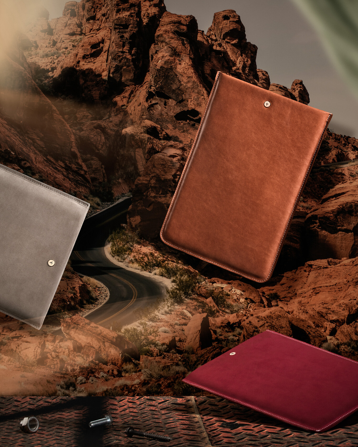
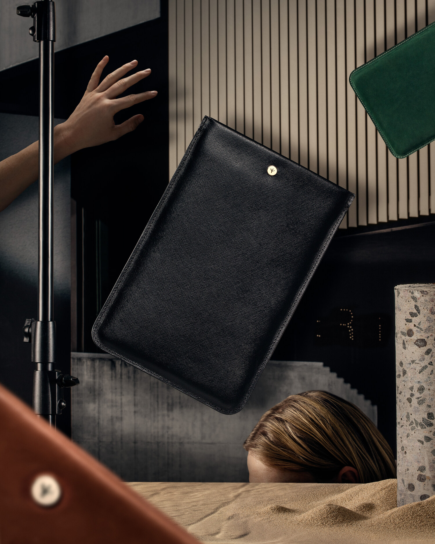
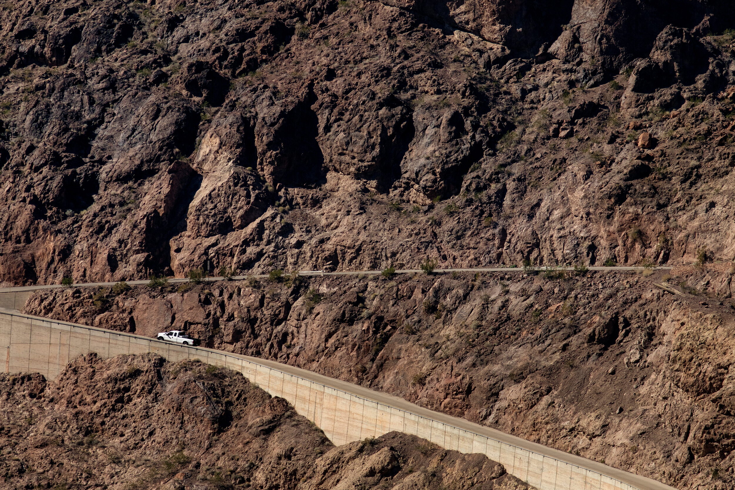
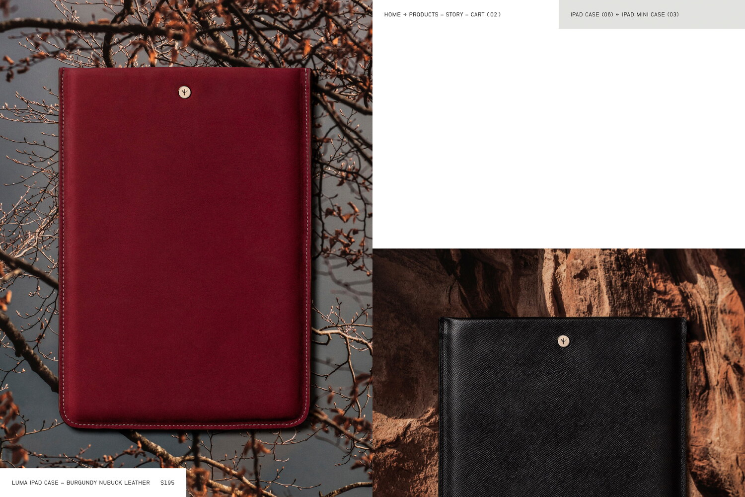
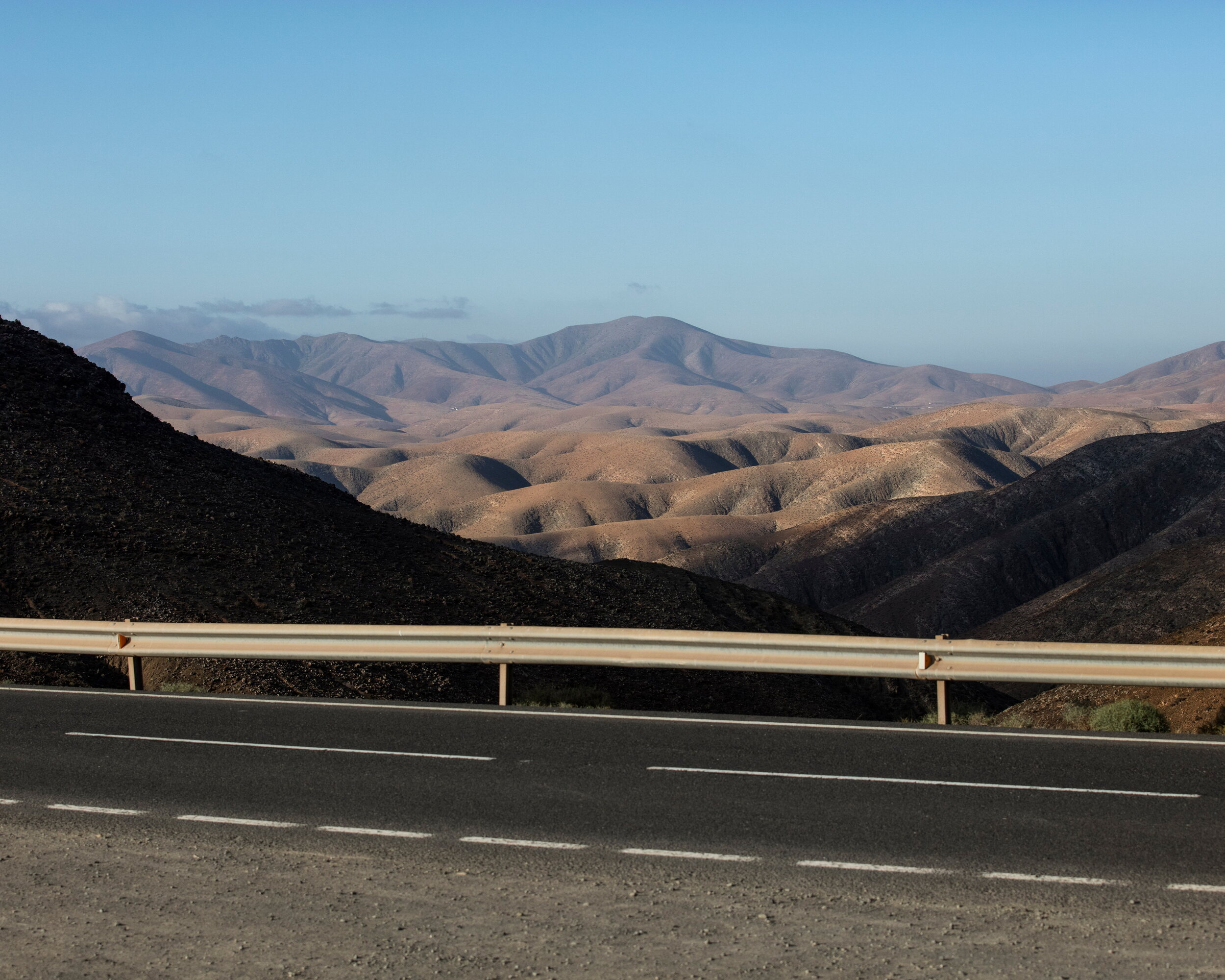
For the product imagery, we aimed to emphasise the adaptability of the products by superimposing them on large format printed image backgrounds. The image backgrounds were all shot by Ander on numerous locations around Europe and in the US. Much like the Mockingbird’s ability to mimic the sounds of its environment, making it one of nature’s most skilled adopters, the images create a tromp l’œil, where it is sometimes hard to distinguish between 2D and 3D. The campaign images expand on this idea, with their multiple layers of images mixed with standing and hanging physical objects, creating a theatre-like set for the products.
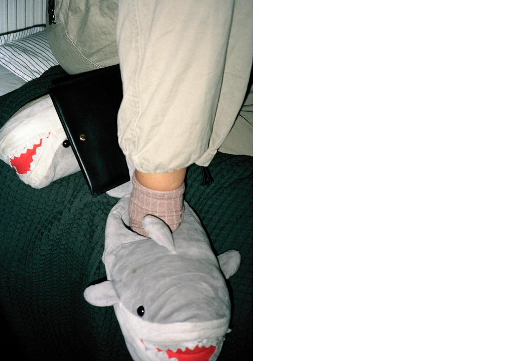
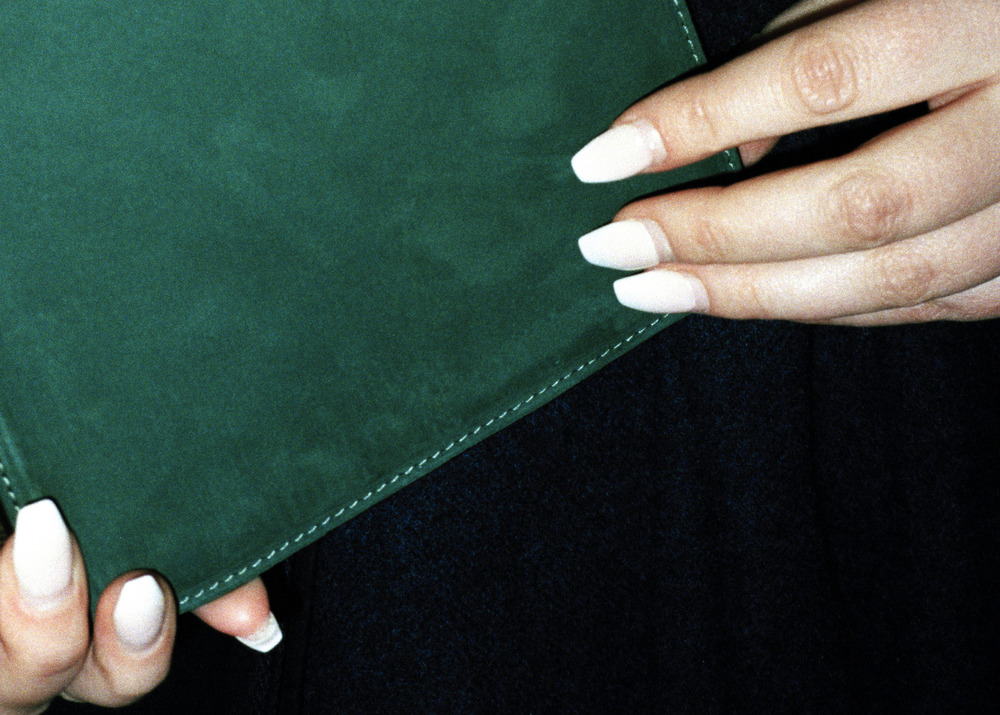
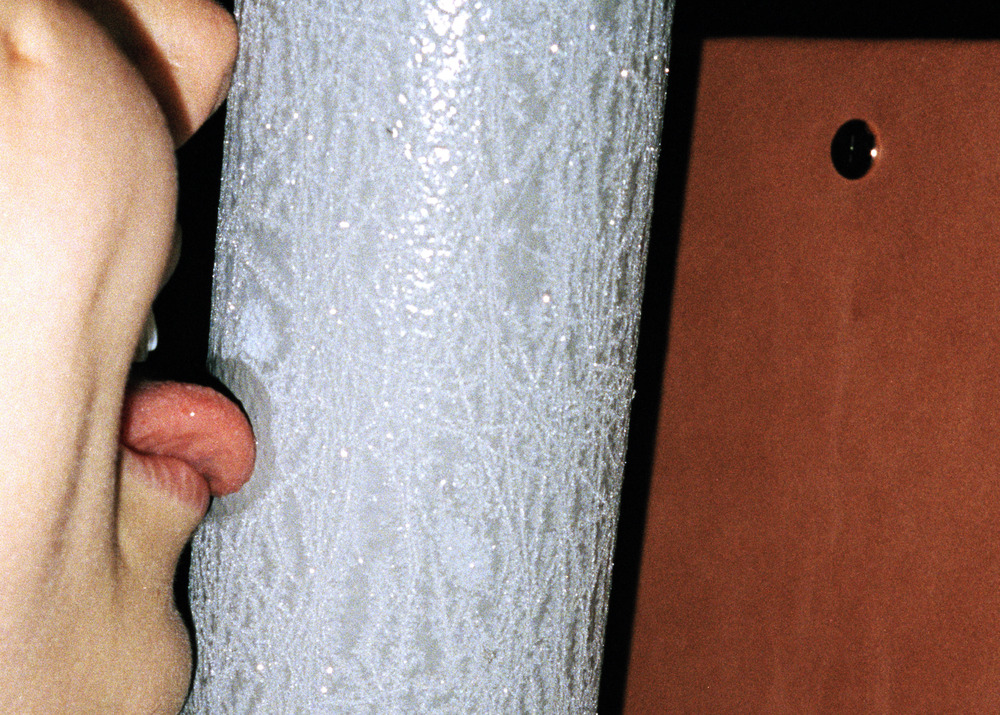
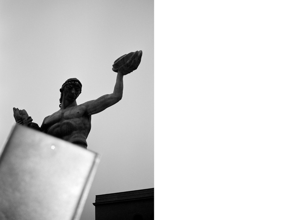
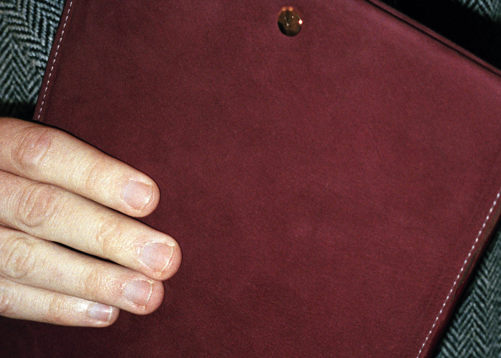
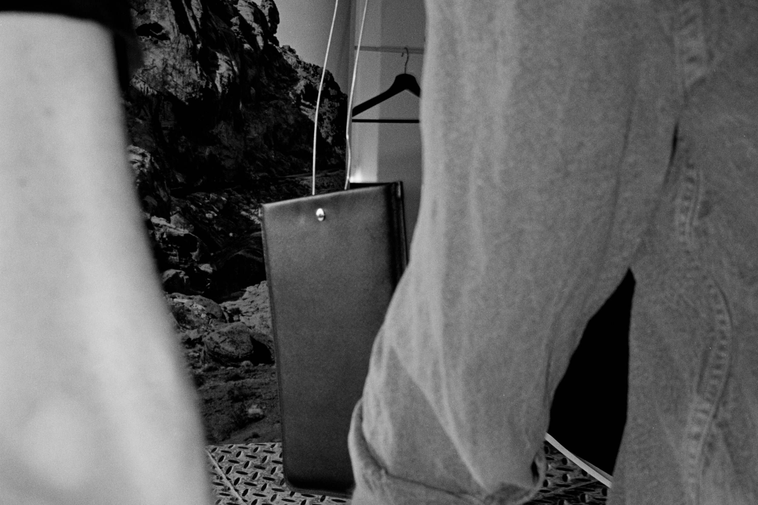
Additional campaign imagery was shot by Erik Gustafsson, who employed his signature snapshot style and made a visual diary of a day and night with the cases. To amplify the distinction between the two types of images, these were all shot on film, leaving physical discrepancies and applying only very moderate editing in post-production. Gustafsson also documented the process of making the product images.
(Credits)
Art Direction: Lundgren+Lindqvist
Photography (product images): Carl Ander
Photography (behind the scenes): Erik Gustafsson
Post-production: Carl Ander