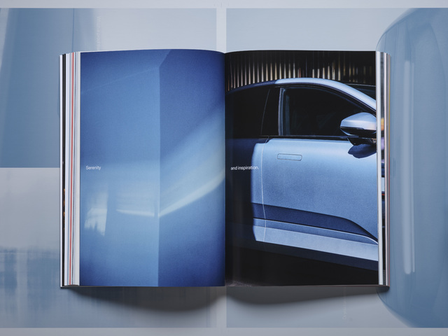
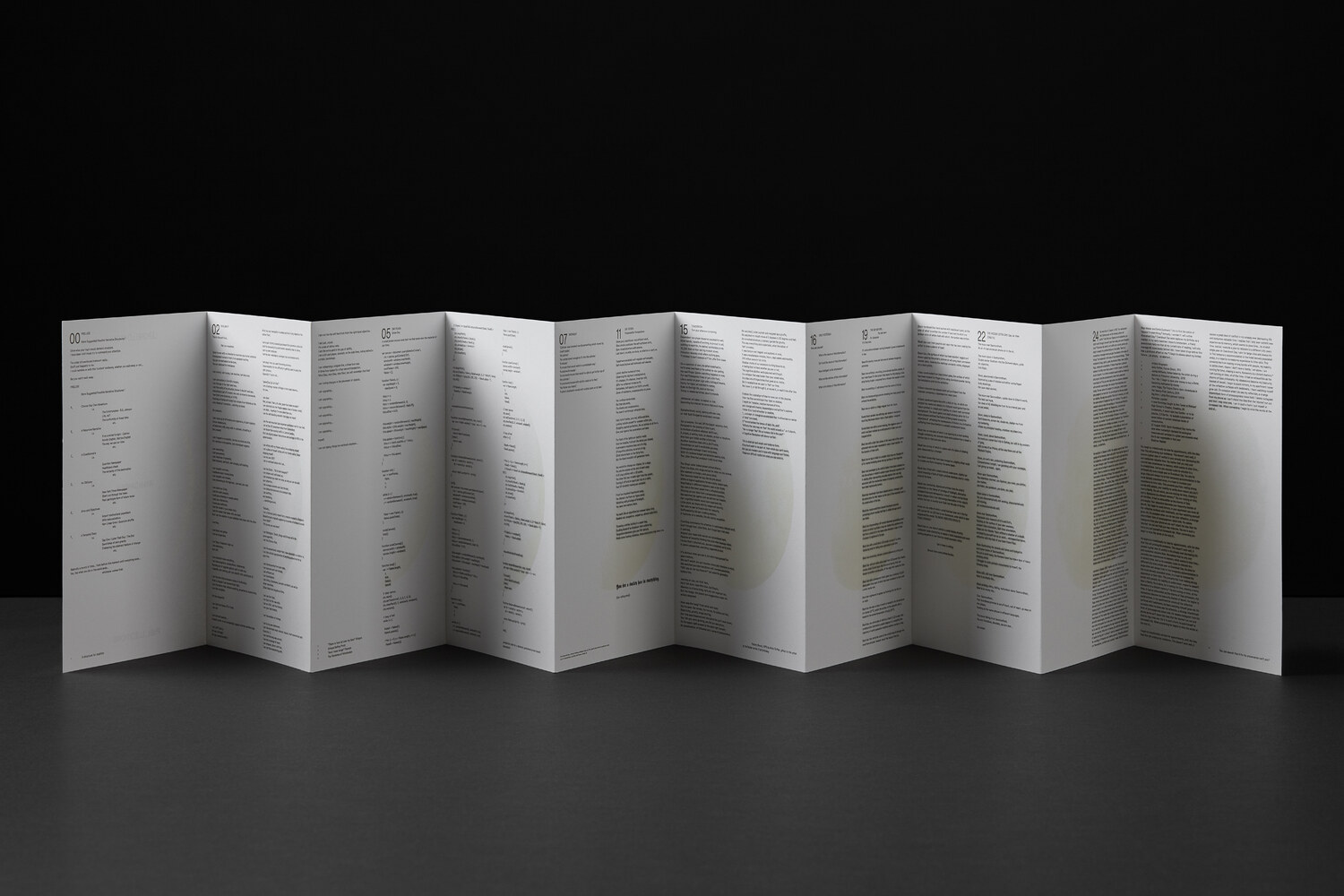


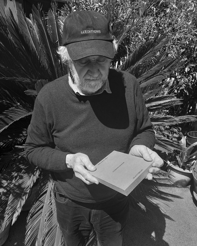


(Resources)
Want to work with us?
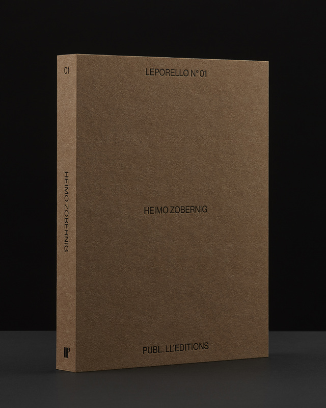
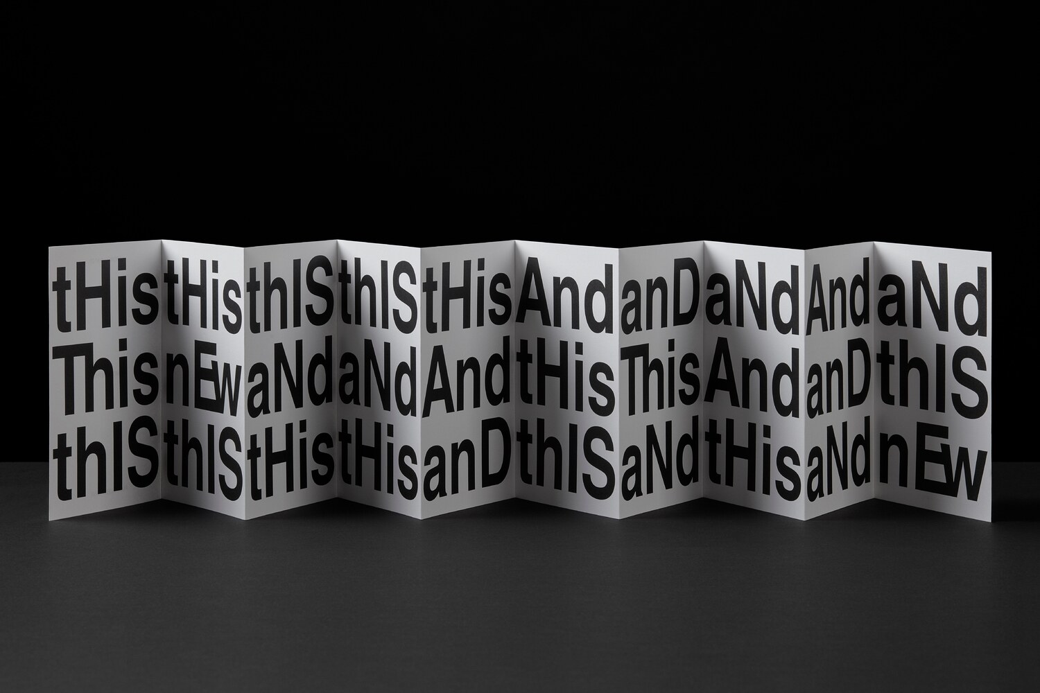
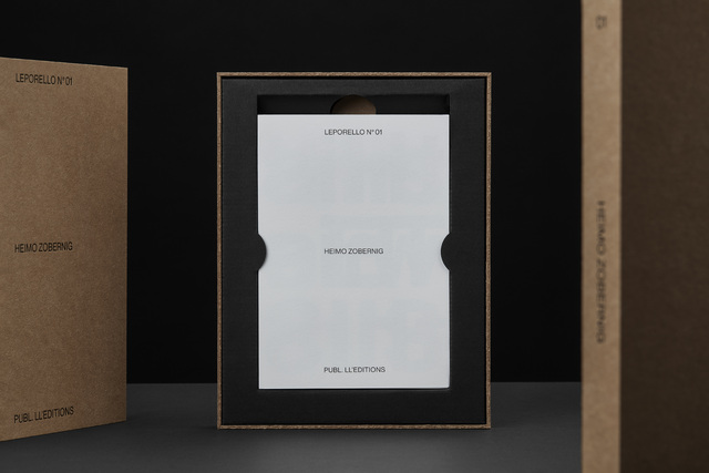
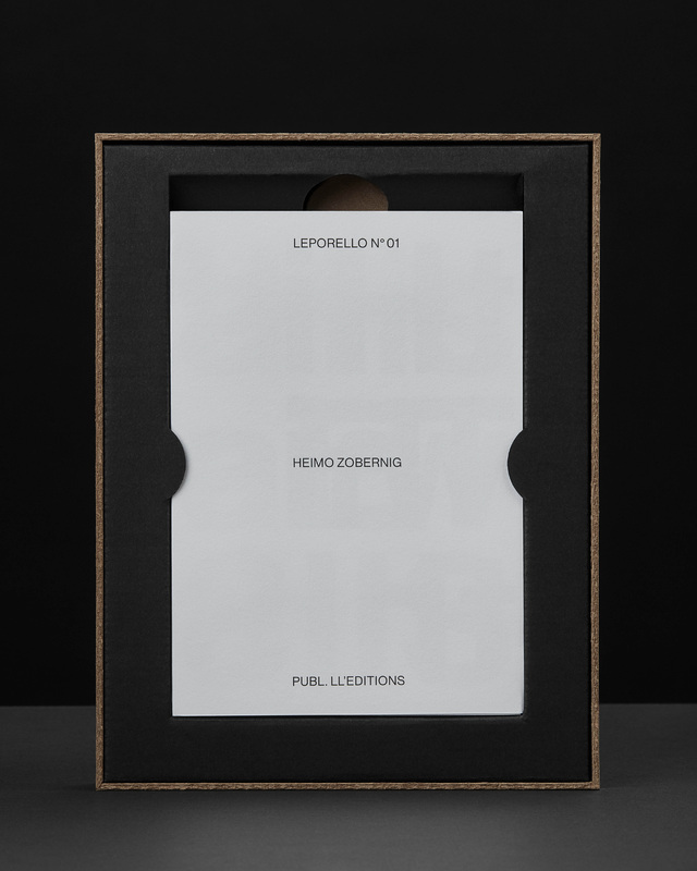
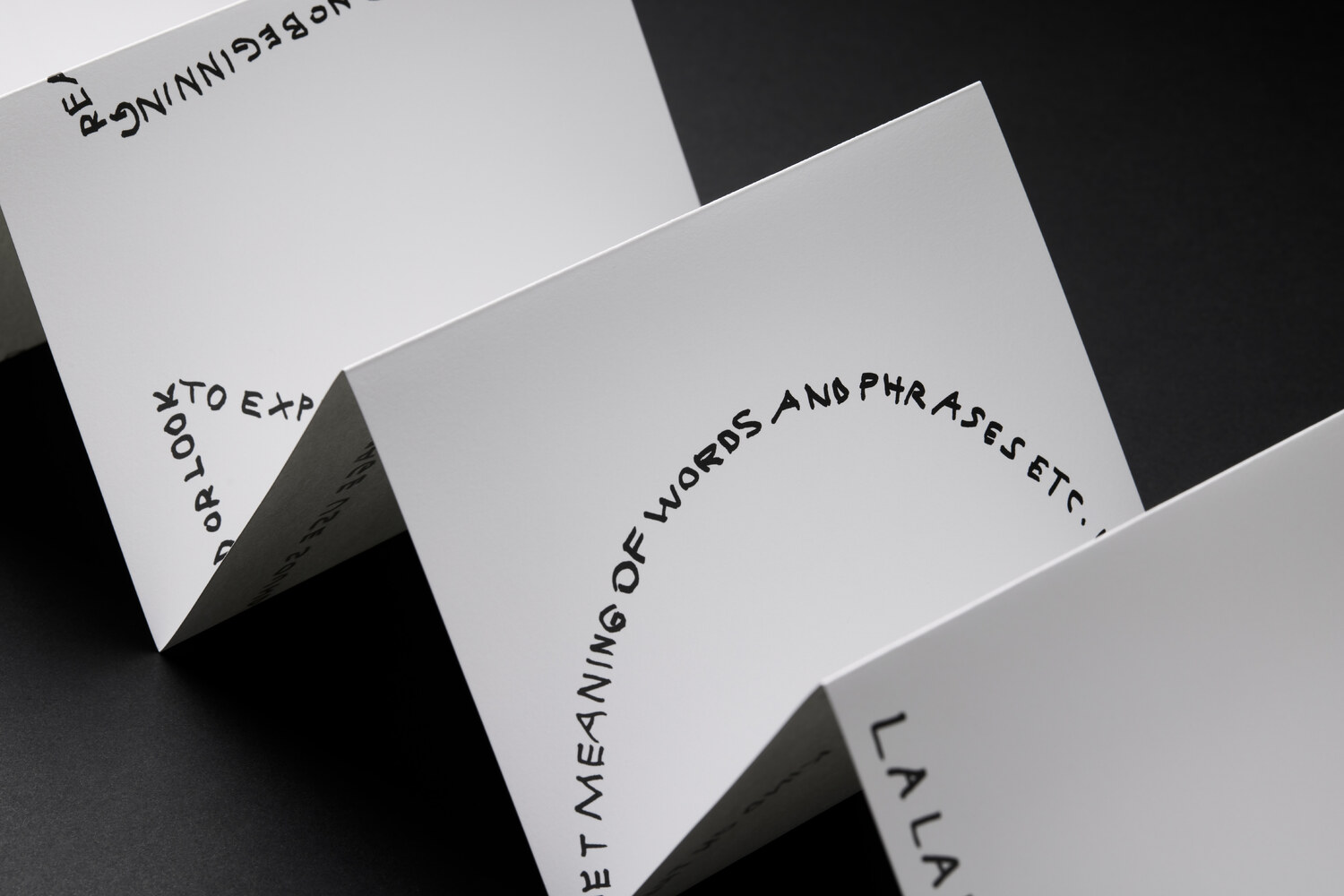
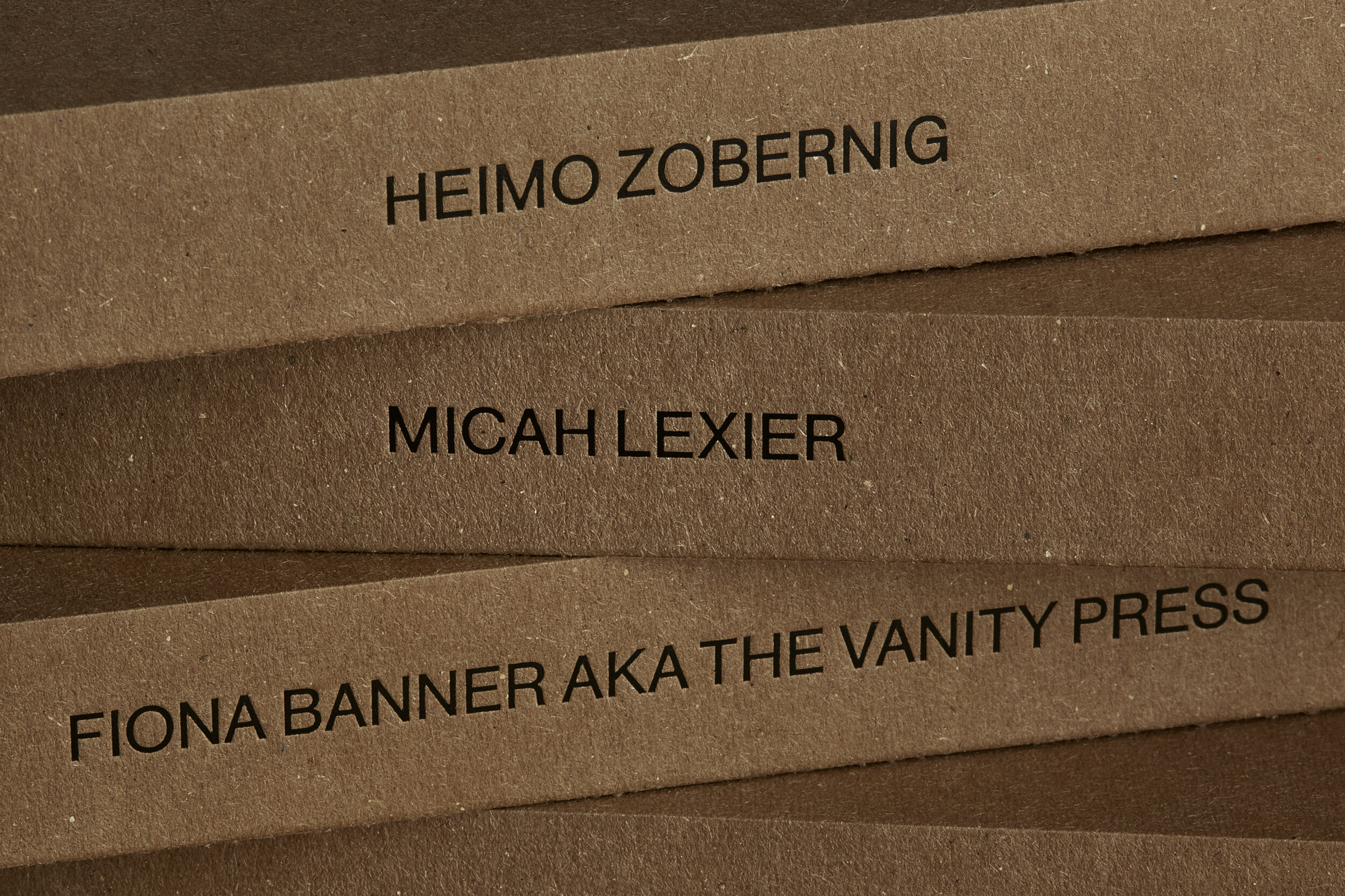
(Leporello N° 01 by Heimo Zobernig)
For the first volume in The Leporello Series, Vienna based artist Heimo Zobernig (b. 1958) makes optimal use of the accordion format, allowing rhythmic wording and typography seamlessly transcend from individual words and phrases to shapes and structure. Repetition plays an integral role as the borders between the conjoined pages blur.
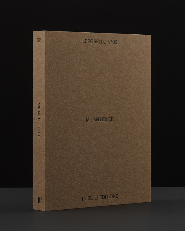
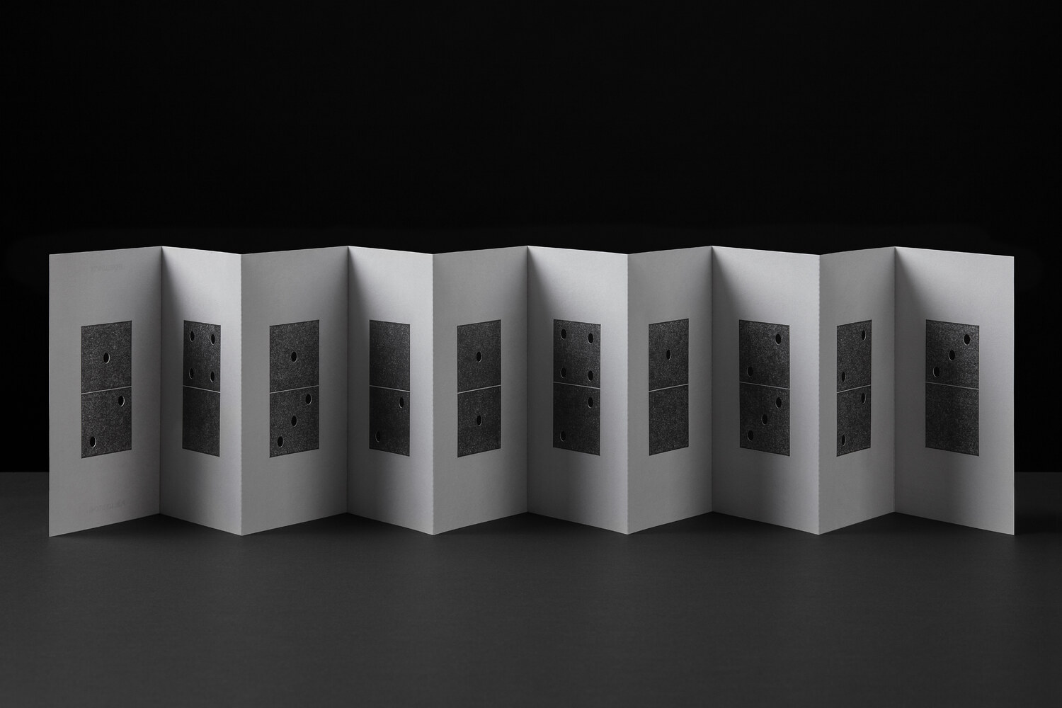
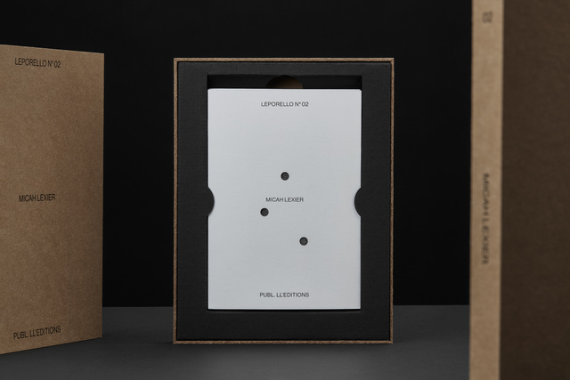
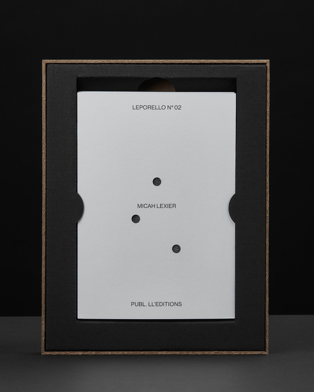
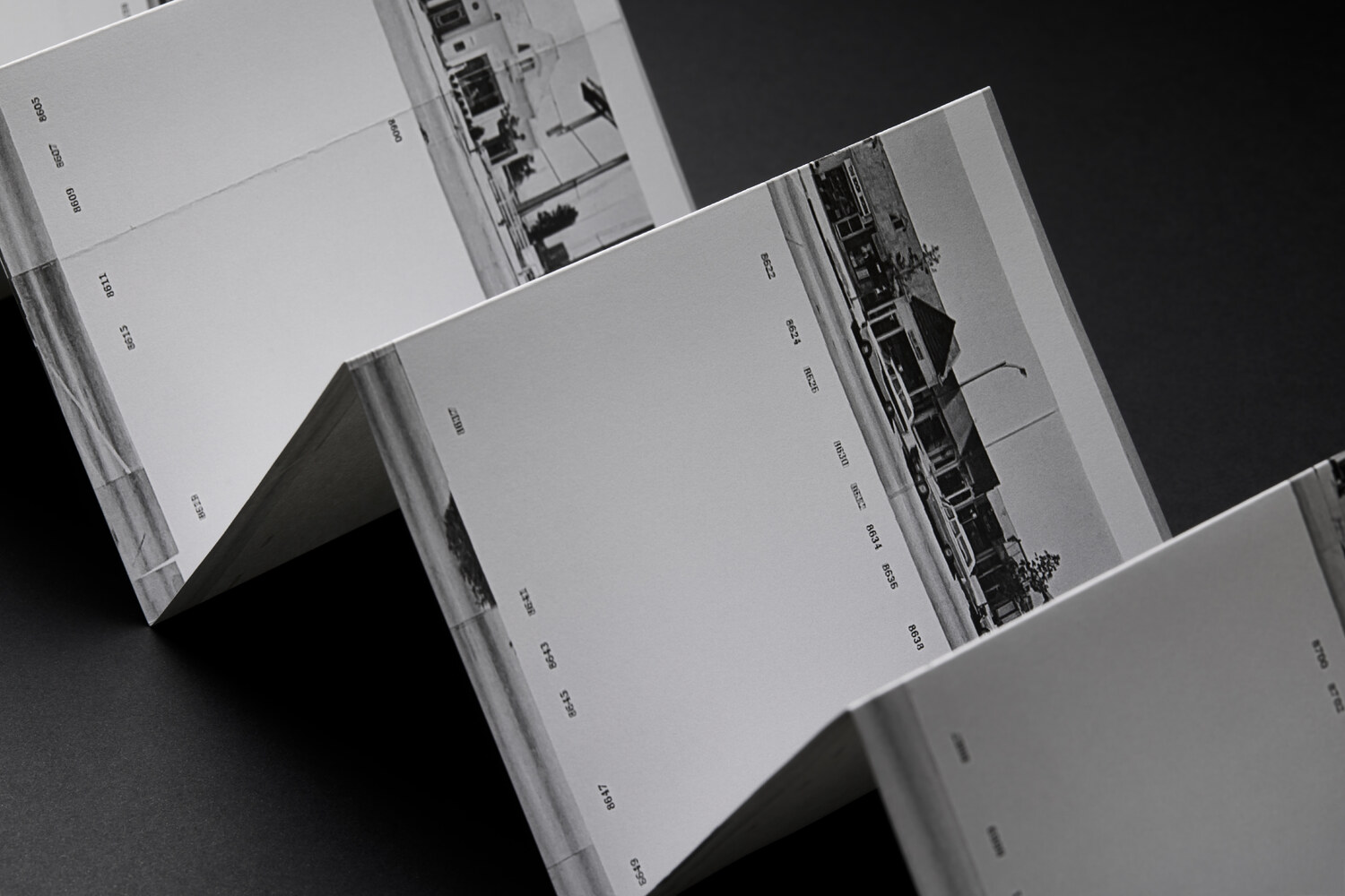
(Leporello N° 02 by Micah Lexier)
The second volume features the Toronto based artist Micah Lexier (b. 1960). A number of years ago Lexier purchased a small paperback publication about the game of dominoes. The very end of the book consisted of a series of pages that reproduced a complete set of twenty-eight domino tiles. The images were printed on right-hand pages, four to a page, while the left-hand pages were blank. The idea was that you were supposed to cut these images out of the book and glue them to empty matchboxes to create your own do-it-yourself set. That sequence of pages, combined with the quality of their reproductions, was the inspiration for Lexier’s leporello. To that, he added two favourite print techniques – perforations and die-cut holes – to create a set of ten domino tiles. Lexier chose the denomination of each tile and its order in the leporello so that none of the thirty-four die-cut holes line up with each other, allowing each hole to be misread as a printed white domino dot.
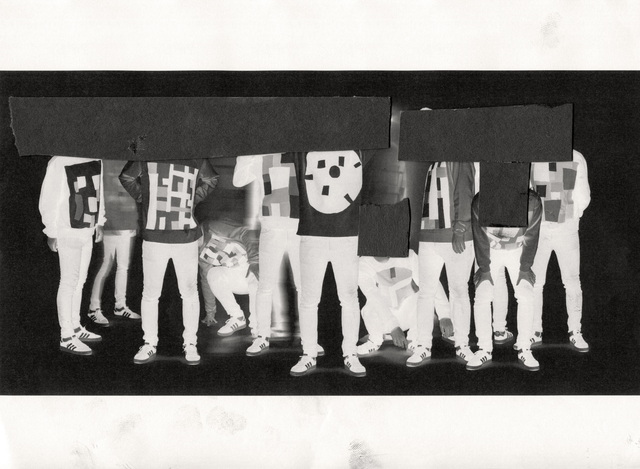
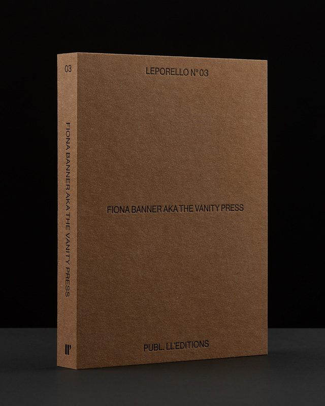
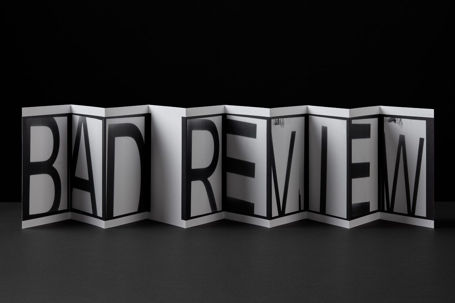
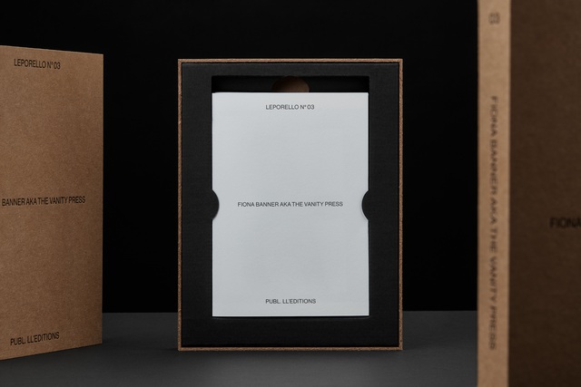
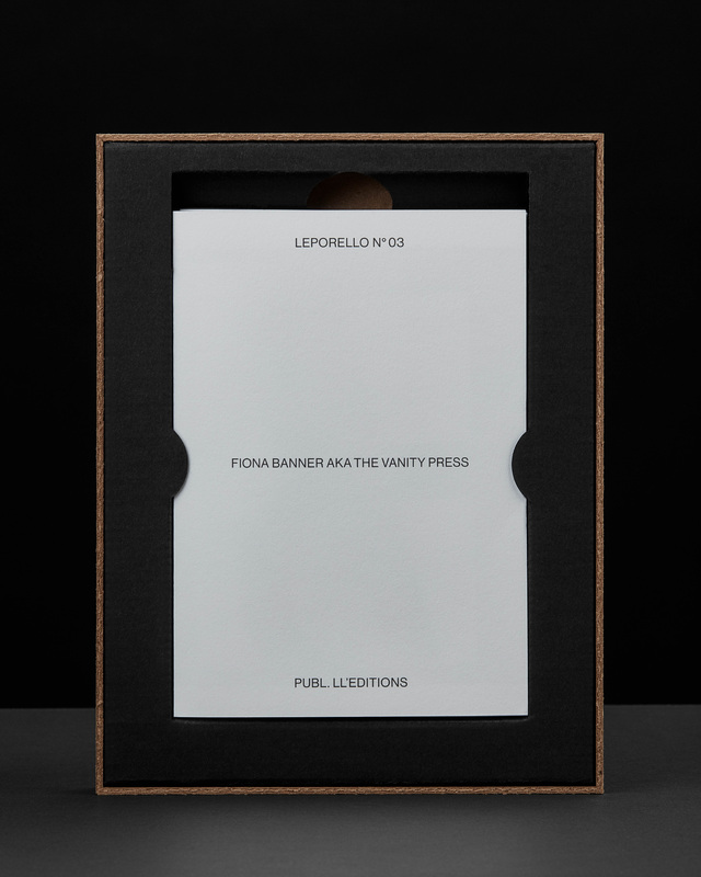
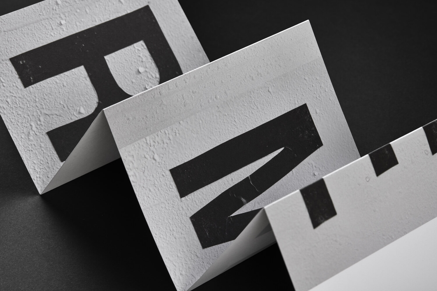
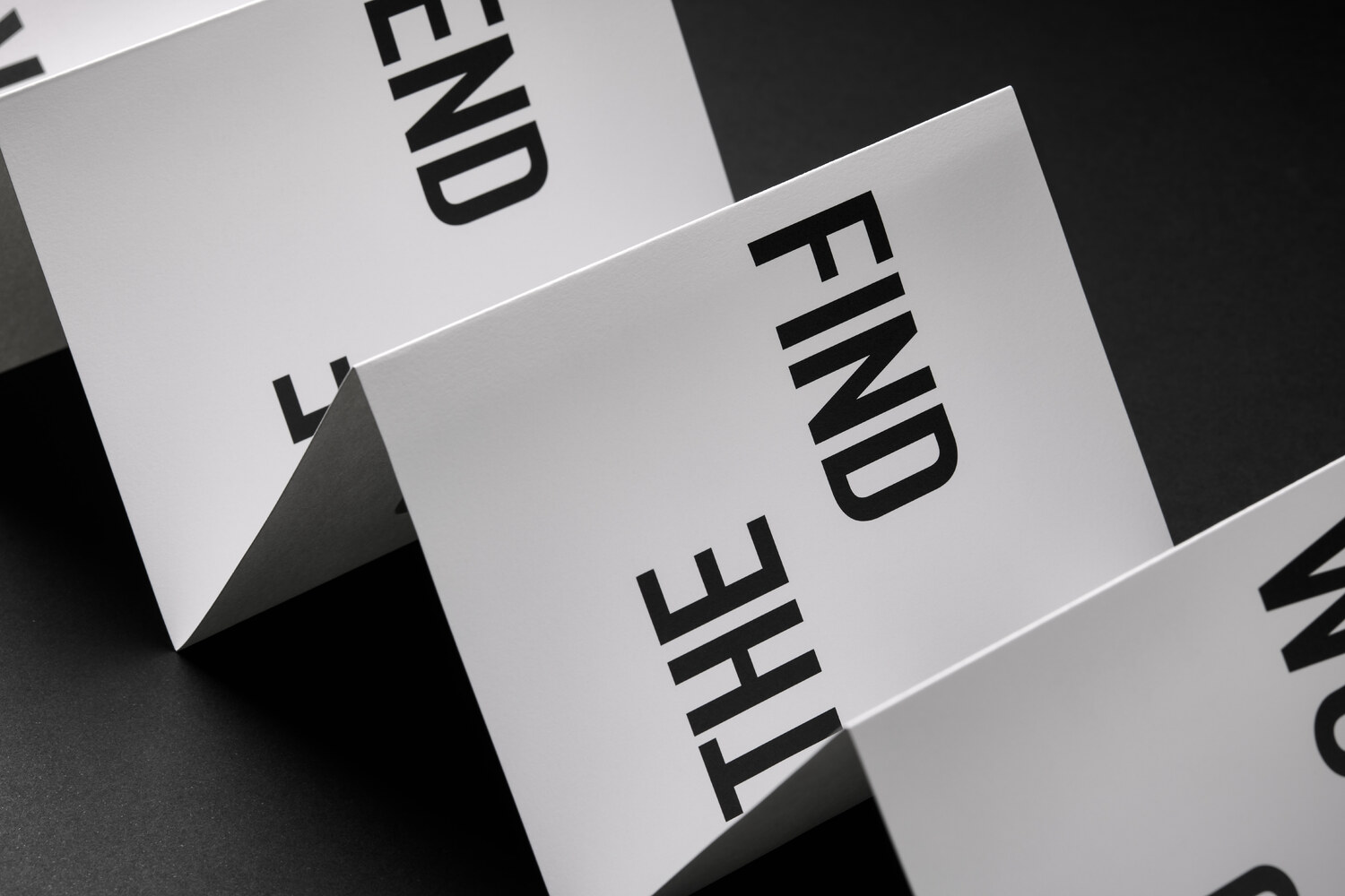
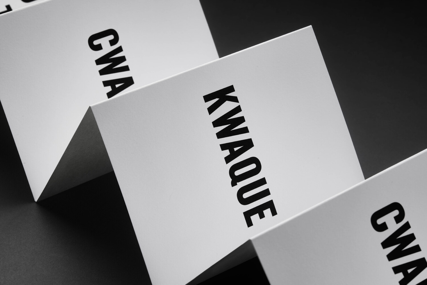
(Leporello N° 03 by Fiona Banner aka The Vanity Press)
The third volume features London based artist Fiona Banner aka The Vanity Press (b. 1966). She does not waste words in BAD REVIEW. Both deadpan and playful, Banner’s Leporello N° 03 uses images from her work Portrait of an Alphabet, 2009; a series of images made in a photo booth, reconfigured to read Bad Review. The sudden flash disrupts the notion of privacy behind the curtain in the narrow booth, only just large enough to fit a small chair. The artist is shielded by the large scale typographic print-outs she holds up. Only slight details; a glitch here and parts of a hand there, reveals the process behind the work. For Banner, often incorporating language and text in her work, the work can be seen as a form of self-portrait. A portrait of the artist as a typeface.
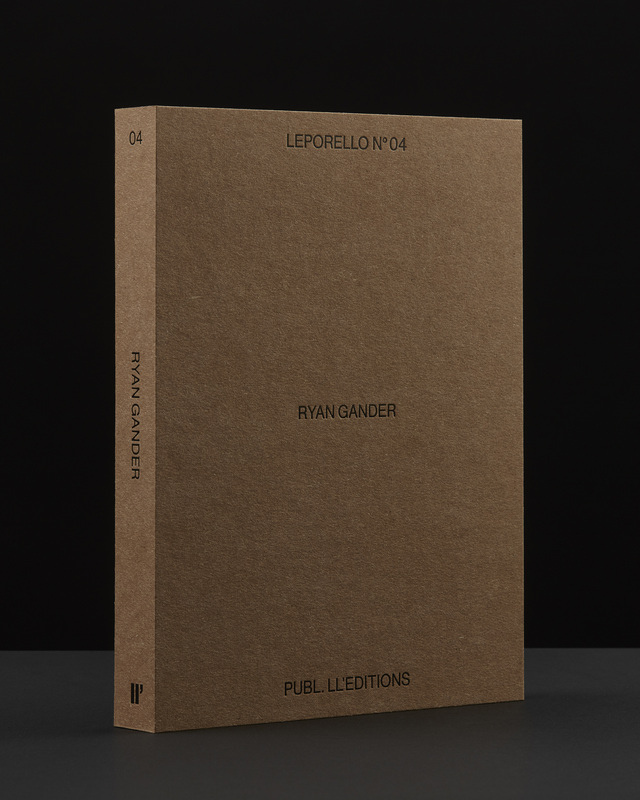
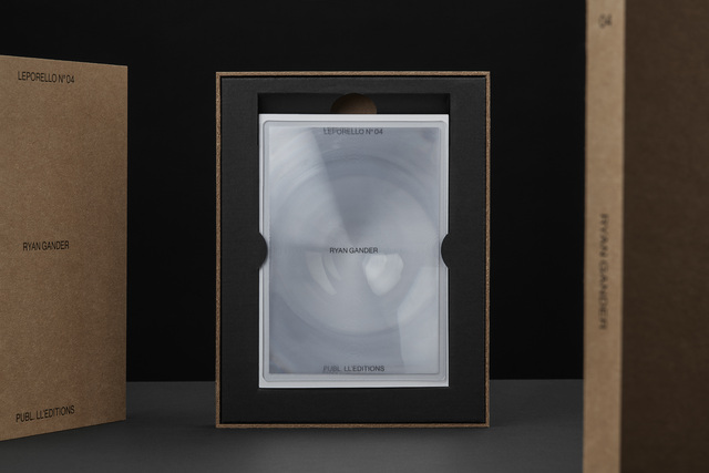
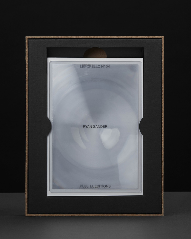
(Leporello N° 04 by Ryan Gander)
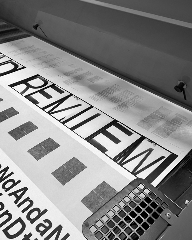
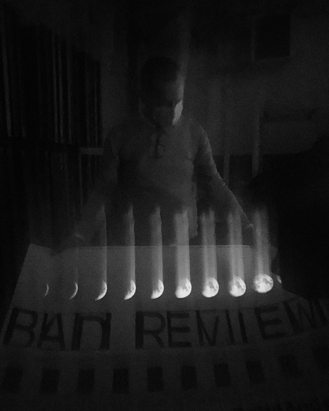
The narrative is not completely linear. Or perhaps it can be? Ryan Gander’s Leporello N° 04 presents excerpts of his digital word compositions displayed as part of the 2020 work Staccato Refractions. Presented as concrete poetry, the prose reveals intentional glitches, making the reader question the nature of the narrator. Man or machine? Is the text, or parts of it, a message transmitted by a computer, or perhaps an example of distributed thinking?
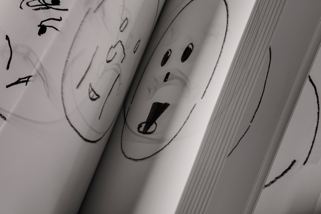
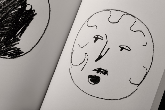
The text is rendered in minuscule typography, transforming it to shape and form. For its transcription, the use of an included magnifying sheet is necessary. In the background, a pale sequence detailing the moon’s movement is rendered. Once lights are dimmed, the moons start to glow, moving from subordinate to superior.
Ryan Gander’s Leporello N° 04 is printed in both offset lithography and silk screened with glow in the dark ink. Each copy includes an acrylic magnifying lens.
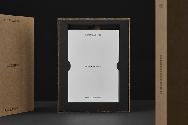
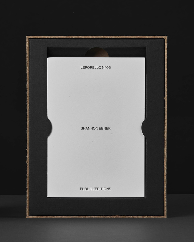
(Leporello N° 05 by Shannon Ebner)
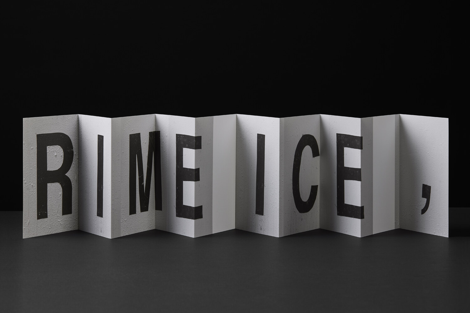
For Shannon Ebner’s Leporello N° 05, the meteorological term RIME ICE is its single subject, though the phenomenon itself falls into two categories, soft or hard rime. In either case it is rime ice that forms when liquid droplets comprised of supercooled water freeze onto surfaces. RIME ICE is an outtake from Ebner’s recent exhibition FRET SCAPES (2022). FRET is an acronym for the Forecast Reference Evapotranspiration Report, a report that is generated by climate scientists to measure the rate at which water that falls to the ground will evaporate to the sky.
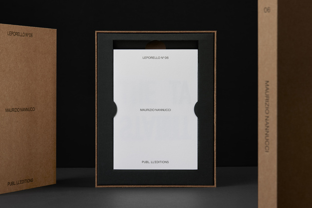
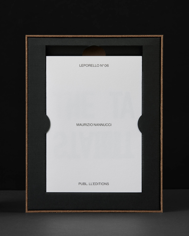
(Leporello N° 06 by Maurizio Nannucci)
A good work of art can be approached from different angles. A great one can be read upside down. For Leporello N° 06, Maurizio Nannucci continues his explorations of language, which has become a signature of the artist, as manifested across an expansive range of media over the past six decades.
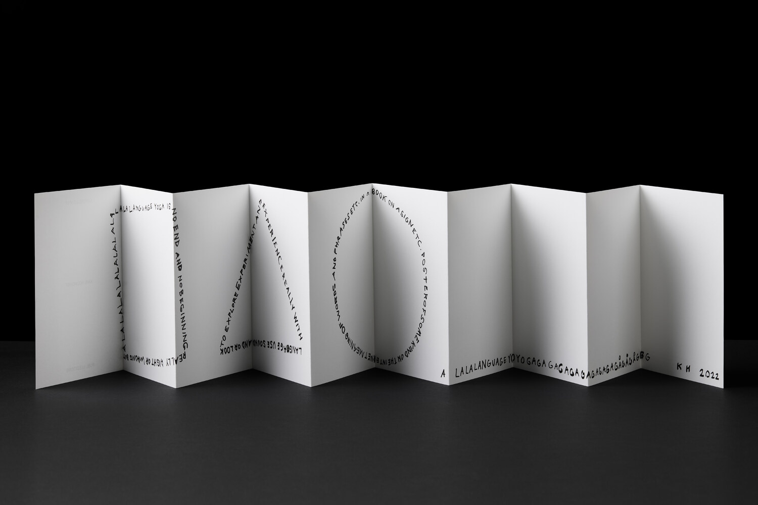
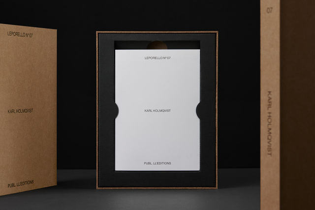
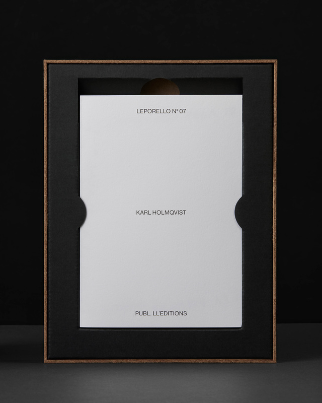
(Leporello N° 07 by Karl Holmqvist)
Listed leporello links linguistically lean language. For Leporello N° 07, Karl Holmqvist performs a session of Language Yoga; the artist’s highly subjective take on concrete poetry.
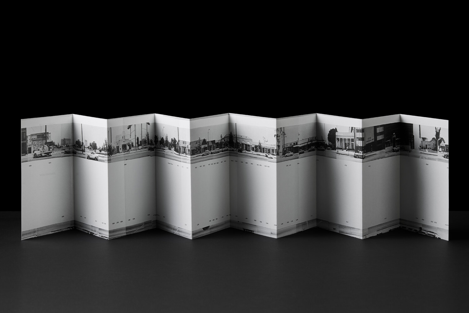
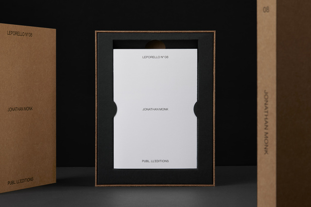
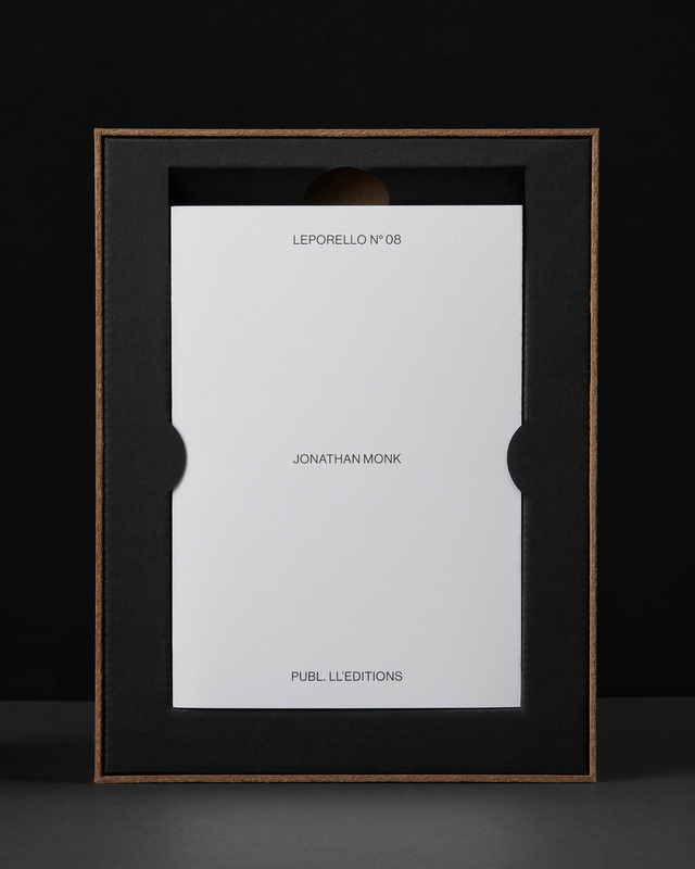
(Leporello N° 08 by Jonathan Monk)
Following Ryan Gander’s moon sequence in Leporello N° 04, Jonathan Monk proposes that a new day is dawning. Saving himself the cumbersome task of yet again* walking in Ed Ruscha’s footsteps along the seemingly endless Sunset strip, Monk captures the zeitgeist through more accessible means. With the camera of his iPhone 12 set to Panoramic mode, Monk photographed Ruscha’s 1966 milestone artist’s book – perhaps the most celebrated book to ever utilize the leporello format.
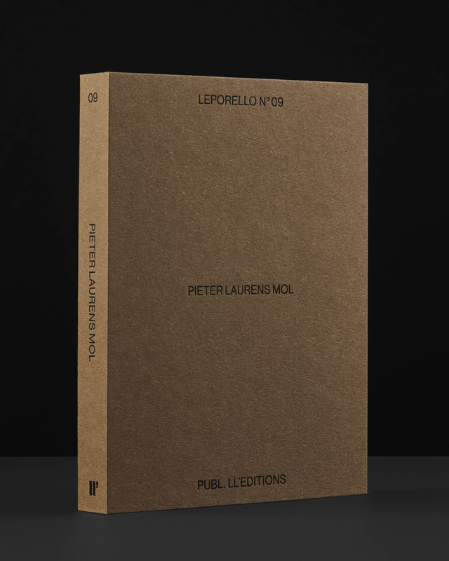
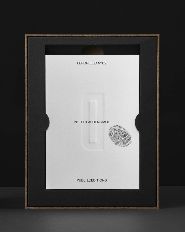
(Leporello N° 09 by Pieter Laurens Mol)
In his contribution to the Leporello Series, Pieter Laurens Mol challenges the viewer with a paradox; an artist’s book demanding tactile interaction, articulating a prohibition against such engagement. Traces of the artist’s own touch are evident on the front and back of the leporello, further prompting an impulse to experience the book by allowing one’s hand to traverse the paper’s surface. The blind embossed message appeals to our inherent mischievous nature, seemingly suggesting that established norms are subject to defiance.
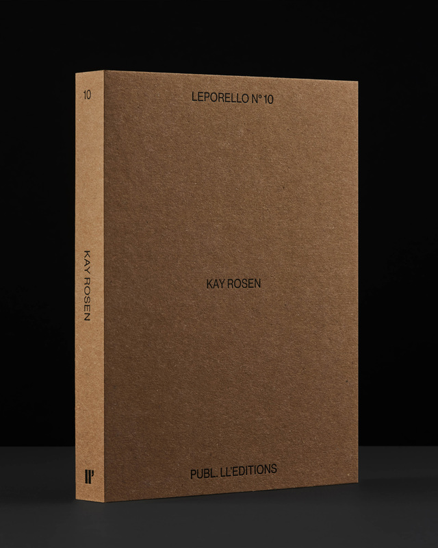
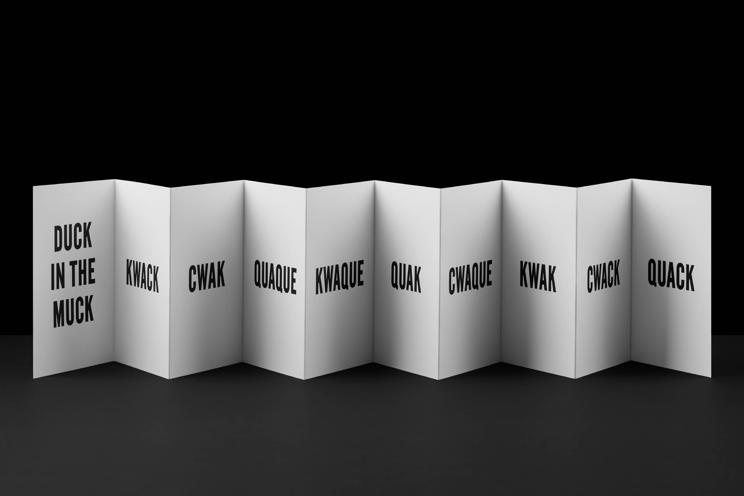
(Leporello N° 10 by Kay Rosen)
“Duck in the Muck” forms part of Kay Rosen’s Lists project, a format she has explored, separately from her painting and drawing practice, for over thirty years. The Lists organize language in serial ways, often through traditional print processes, but they have also taken the form of videos, book covers, two books, wall paintings, drawings, and bus tailgate posters. Now a leporello can be added to the list. “Duck in the Muck” was first conceived in 1989, but with the exception of an abbreviated window installation in 2013, it has not been realized in its full form until now, as if it had been waiting for this opportunity.
Although Rosen’s work always begins with a linguistic point, as language it intersects with content and subjects of grave concern, such as the environment. “Duck in the Muck” calls attention to the irresponsible behavior of the fossil fuel and chemical industries and its supporters as they cause havoc with nature. The distorted variations of “quack” reflect genetic damage to living species by oil and chemical spills, and as a worldwide disaster, the multiple spellings allude to the cries of voices from populations around the globe.
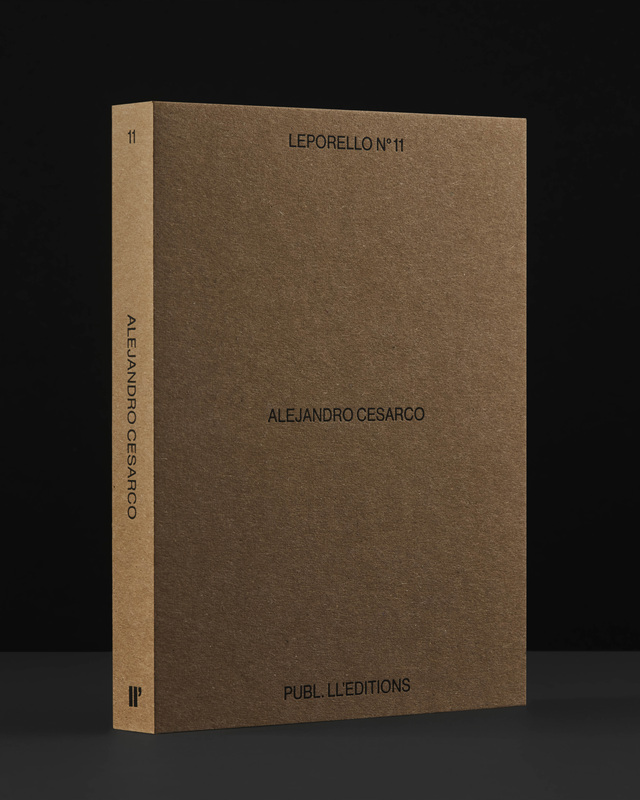
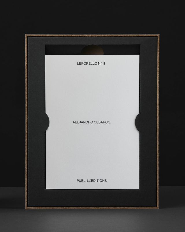
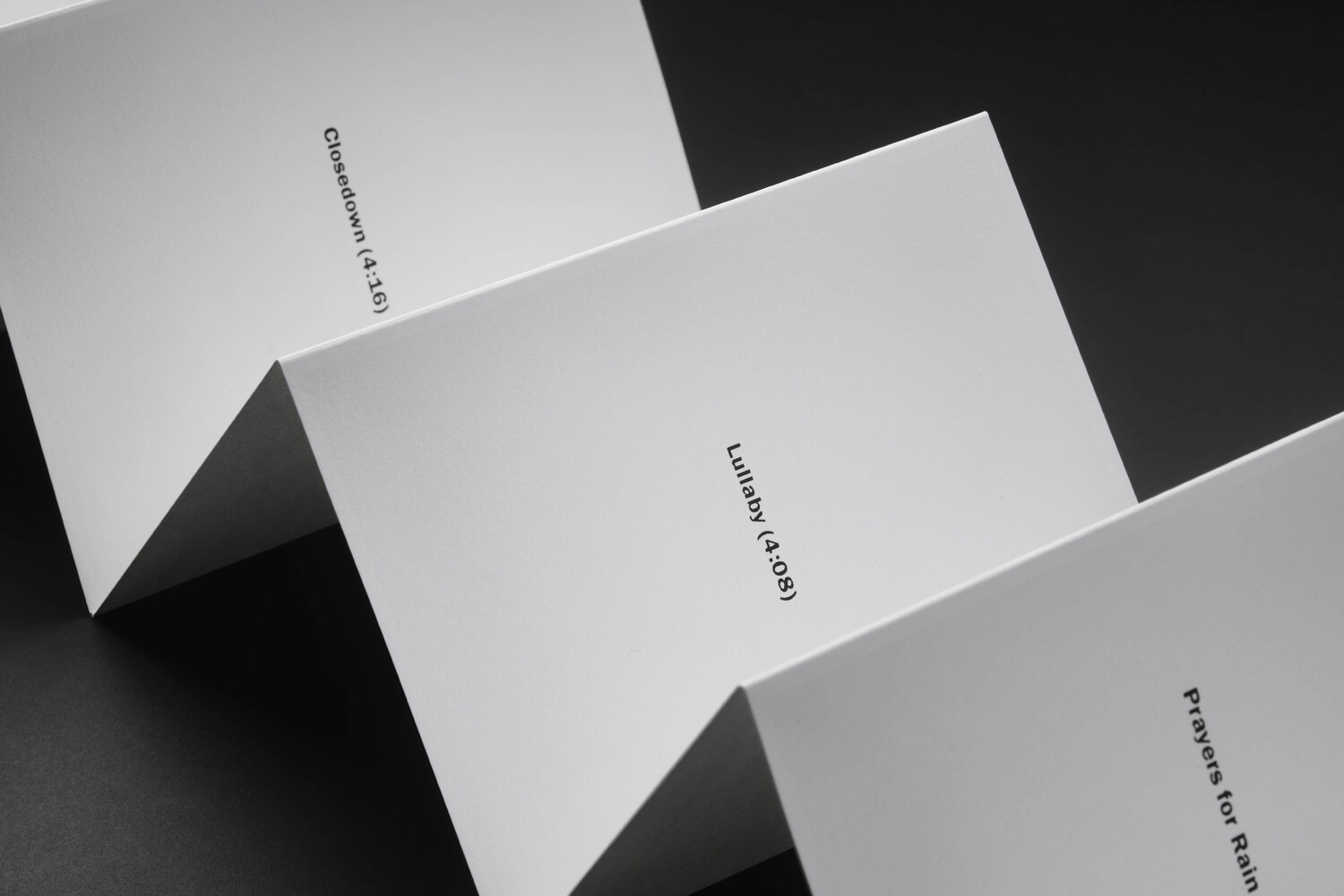
(Leporello N° 11 by Alejandro Cesarco)
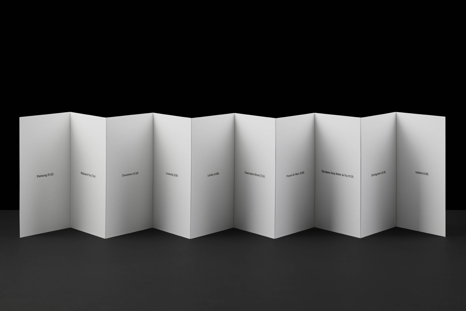
Alejandro Cesarco’s “Album” (Leporello N° 11) presents the titles and durations of each of the songs that make up The Cure’s “Disintegration”, the band’s iconic album from 1989. Each song is listed on its own panel, as if they were images in a photo album.
Admittedly, The Cure plays heavily in the soundtrack of Cesarco’s youth. These gloomy soundscapes further the artist’s investigation into questions of aging–both in relation to style, regrets, and possibilities. Curiously, Robert Smith, the band’s frontman, wrote “Disintegration” as he was about to turn thirty, supposedly fearing his best years were behind him.
The release of Cesarco’s “Album” coincides unexpectedly with “Songs of a Lost World”, The Cure’s latest, and fourteenth, studio album.
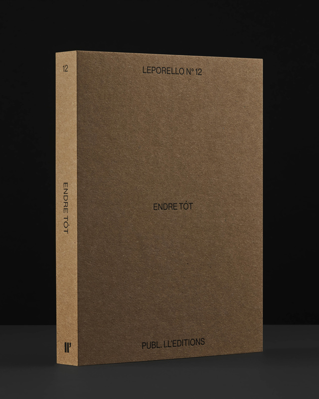
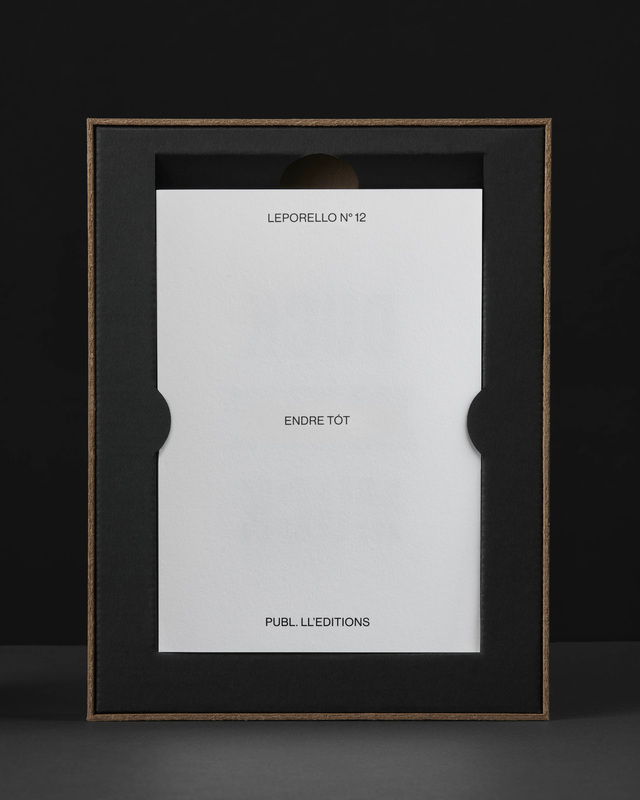
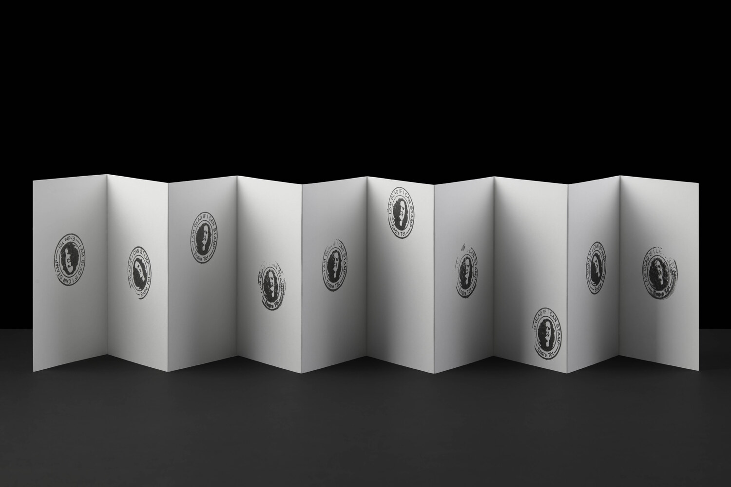
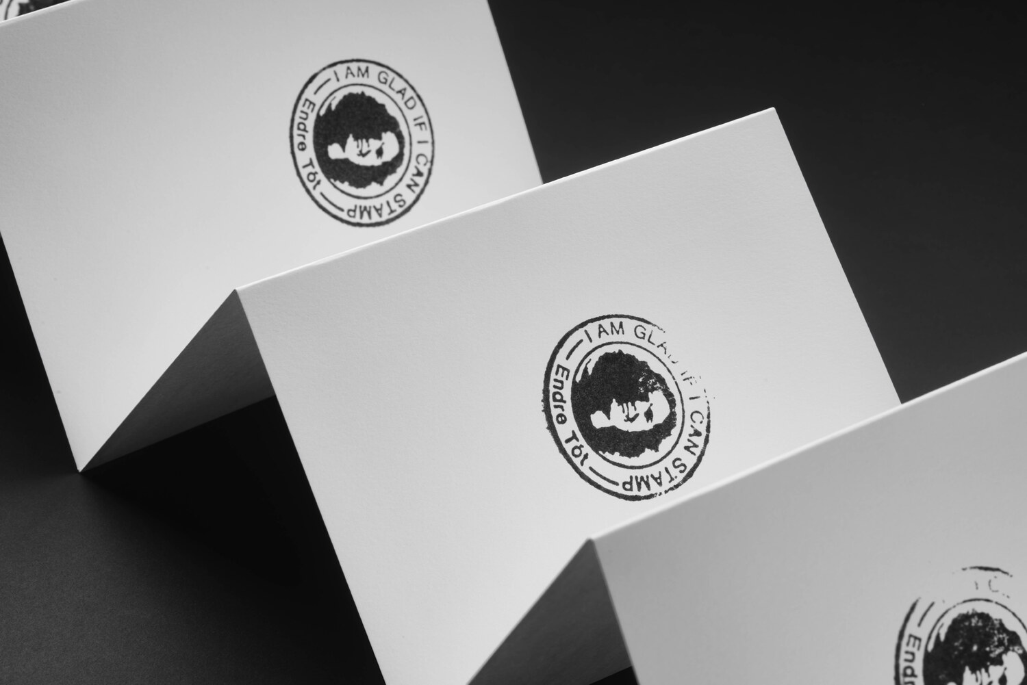
(Leporello N° 12 by Endre Tót)
DUB-DUP, DUB-DUP, DUB-DUP, DUB-DUP, DUB-DUP, DUB-DUP, DUB-DUP, DUB-DUP, DUB-DUP, DUB-DUP. I AM GLAD IF I CAN STAMP.
Since 1971, Hungarian artist Endre Tót has worked with a series titled ‘Joys’ — beginning as a reflection of the dictatorial conditions Eastern European socialism during 1970s. The absurdity of the naive and euphoric expressions of joy stood in stark contrast, not only to the oppressive political climate, but also to the intellectualism of the art world. In 1978, Tót wrote “I’d be happy if I could write on the other side too” on the Berlin Wall. Over the years, Tót has repurposed this phrase a number of times, in different contexts.