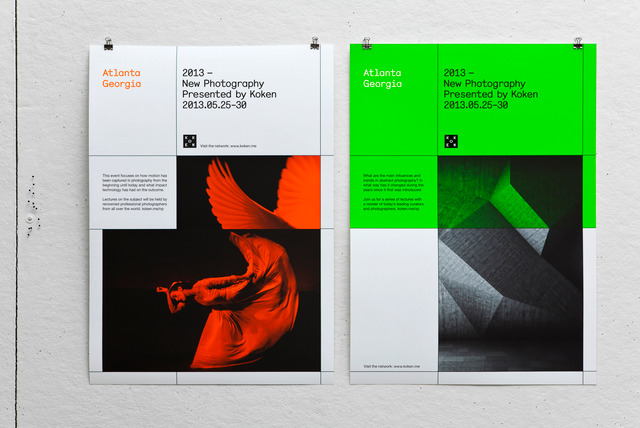
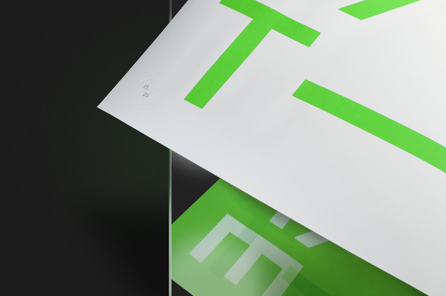
Design studio Two Times Elliott teamed up with paper company GFSmith to curate an exhibition in London, titled 'Twenty Two'. Corresponding to the number of paper ranges offered by GFSmith, 22 agencies were invited to design an single coloured A1 poster on the theme of 'Two'. These were screen printed in an edition of 22, each using a different paper stock and sold with all proceeds donated to Cancer Research.
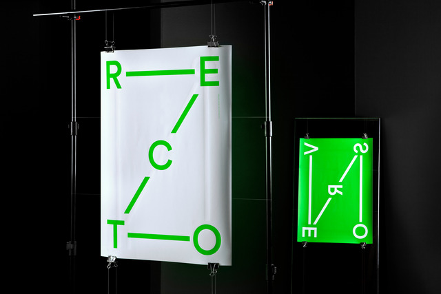
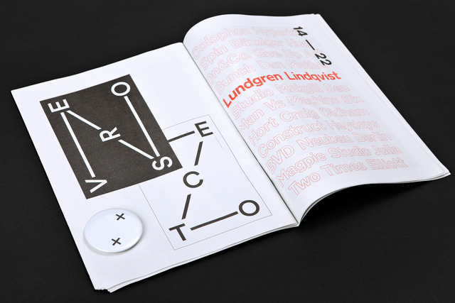
Realising that there would likely be many interpretations of the shape of the actual figure 2 in the exhibition, we decided to approach the design of the poster in a more conceptual manner. The fact that a paper distributor was one of the initiators behind the exhibition lead us to think about the physical characteristics of a poster. The terms 'recto' and 'verso' originate from the use of papyrus. On papyrus, a different grain ran across each side, hence the recto (front) where the grain ran horizontally and verso (back) where the grain ran vertically. Based on this, we set the orientation of the type on the different sides of the poster. ‘Le mode recto verso’ is an idiomatic expression in French that figuratively means that two things are basically the same. This is analogous to some idioms in English such as 'two sides of the same coin'. In Flanders, the term recto verso is also used to indicate two-sided printing.
In Sweden, it is popularly said that if you drill a hole right through the earth, you will end up in New Zealand. By connecting the characters in their reading direction, we illustrate going from our recto (Sweden) to verso (New Zealand) by drawing a big NZ with the connecting lines.