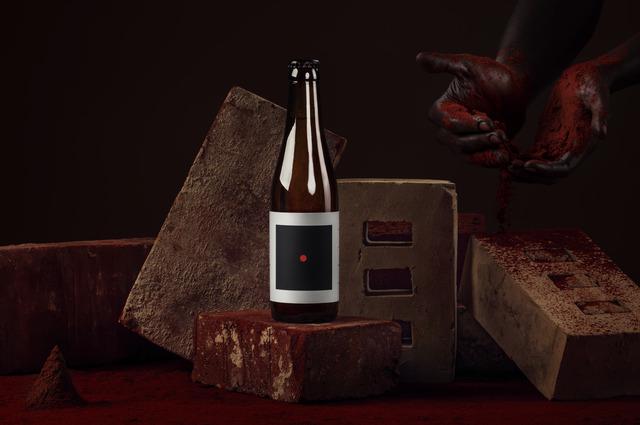
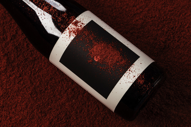
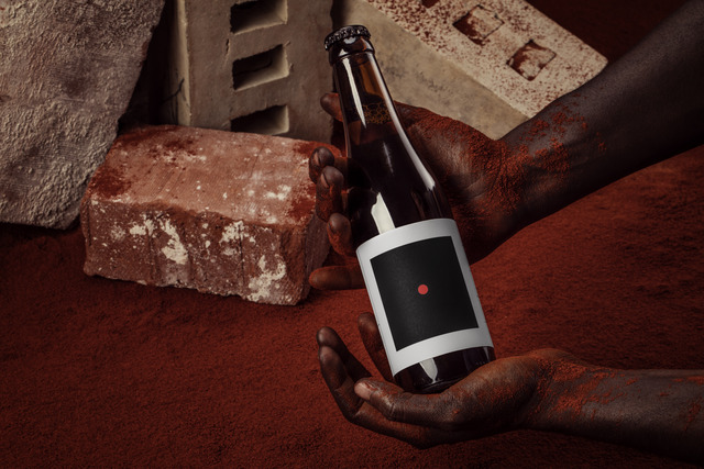
For the campaign images marketing O/O Brewing’s new beer Narangi, we built a set of found bricks. The set was then covered in bindi pigment, tying in with the concept and design of the packaging and ultimately the theme of the beer:
Narangi is a fruity IPA, with a distinct taste of oranges. The beer was named after a village in the city of Virar in India, and it also means ‘orange’. Some claim that the orange, which is not a wild fruit, but a cultivated hybrid of mandarin and pomelo originate from Narangi.
With the link to India being clearly established through the beer’s name, we looked at visual links between the fruit flavoured beer and Indian [visual] culture. The link between an orange, in its most abstract form, and a bindi* was too obvious for us to avoid.
On the side of the label, we also repeated the name of the beer (नारींगी) and updated the pronunciation guide, all rendered in hindi.