Yoshida Design is an architectural practice based in Oslo, Norway. With a founder originally from Osaka, Japan – the firm focus on blending Japanese and Scandinavian aesthetics and take on projects ranging from interior to exterior.
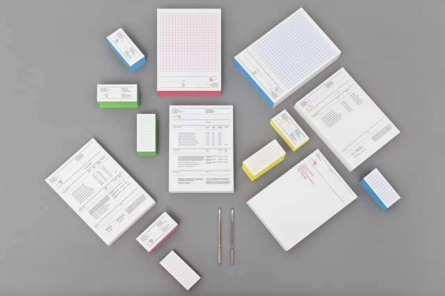
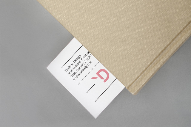
Lacking a visual presence, the firm contacted us to design their visual identity including the design of the firm’s stationery, two different gridded blueprint sketch pads and a website. To tie the printed matter together with the firm’s approach to their architectural projects, high-end materials and printing techniques were employed.
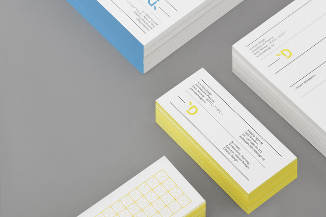
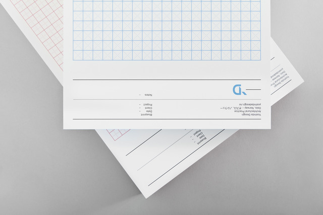
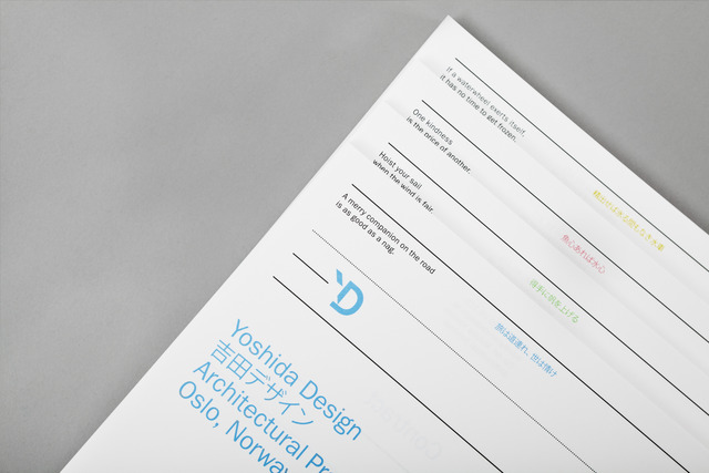
When designing printed matter, the interplay between designer and printer is of outmost importance. This is especially true for stationery, with pieces meant to be scrutinized at a close distance and often kept over a long period of time. Working closely with our printer allows us to oversee the production from start to finish and to make adjustments and set the colour values with precision during the actual print run. Experimenting in the print house also open doors to
new ideas and solutions that might not have occurred to us otherwise.
Apart from that, it gives us a chance to indulge ourselves in material and ink and spend time in a place where old and new technology meet, and where you are just as sure to see a hot off the press letterpress project as piles of seemingly glowing edge printed business cards.
Design Process
Much of Yoshida Design's work is based on a combination of Japanese and Scandinavian design values. Proportions and clean lines is a reoccurring theme in the firm's projects, along with values of high functionality. We took the same approach to the design of the Yoshida Design's identity and made some of the printed pieces multi-functional. Using Franklin Gothic (complemented with 小塚ゴシック for kanji characters) as the sole typeface throughout the identity, we selected a four tint colour palette with the main purpose of colour coding the different document types.
Printed matter
Five different templates (Letter, Offer, Contract, Timeplan and Invoice), tailored to their specific areas of usage, were designed. The latter four were colour coded and each template type was paired with a traditional Japanese proverb, conveying Yoshida Design’s way of viewing the specific phase of the project connected to the template type. Two different gridded sketch pads were designed, each with a specific use in mind. The pads were bound with coloured glue and are just as suited for every day sketching as for give-aways to clients and friends.
The business cards were printed in four different colours and edge-printing, following the colour coding of the different document types, on sturdy Munken Lynx paper. With two different gridded backs for personal notes, the cards also allow for use as correspondence cards. The format of the card is rather wide, so that the business cards can be used as tabs in the many heavy project folders in which the firm archive project related documents.